Action After Strong Friday Selloffs
Today’s study is one of several that will be appearing in the Quantifiable Edges Subscriber Letter in a few hours. Quantifiable Edges Black Friday sale has been extended through Cyber-Monday. Act now to take advantage. After Monday – its gone.
Black Friday was a tough one for the market, with the major indices all closing down over 2%, and the VIX spiking over 10 points to close at 28.62.
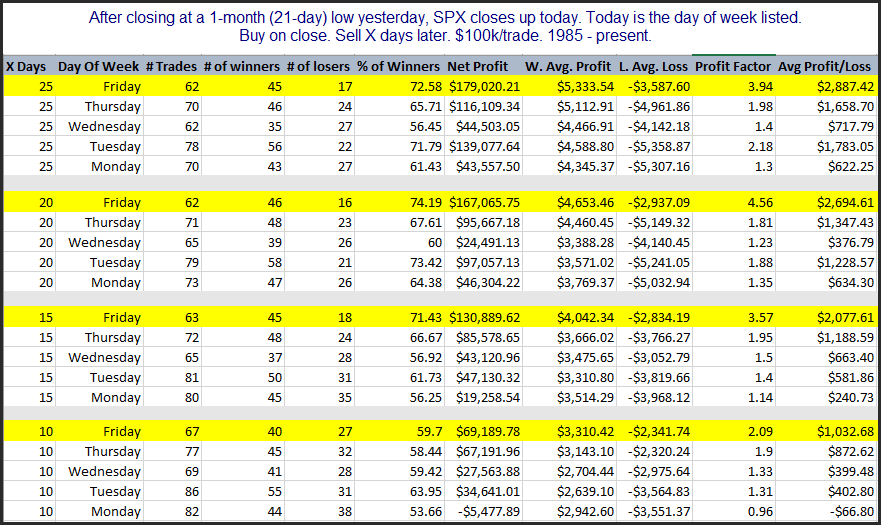
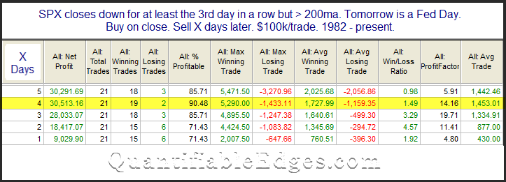
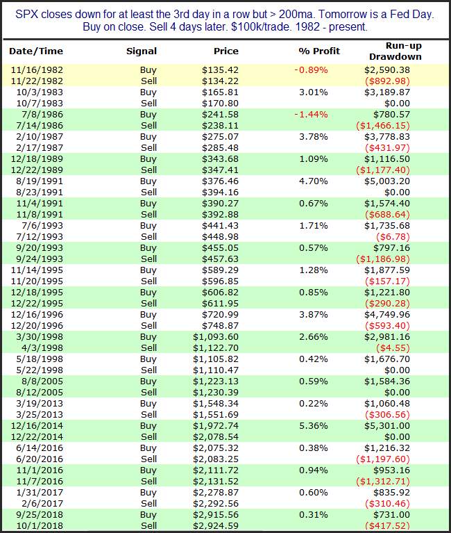
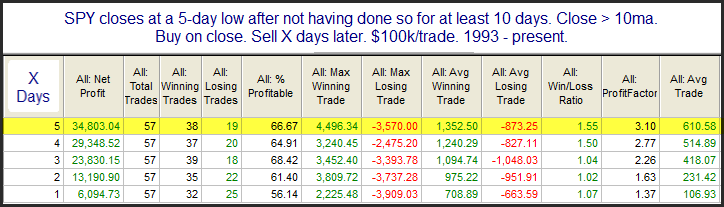
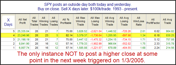
Big drops on Fridays can be interesting. Both the Crash of ’29 and the Crash of ’87 happened on Monday. The Crash of ’87 is still remembered by some traders that are active today (though it is getting less and less each year). In 1987, there was a strong selloff on Friday and then all hell broke loose on Monday. But since then, strong Friday selloffs have commonly been followed by bounces in the following days. Perhaps this is due to the fact that fear of a crash causes what might otherwise be an ordinary selloff to become exaggerated and overdone on Fridays. Or perhaps it is just that people don’t want to hold over the weekend. Whatever the reason, the tendency to bounce has been strong. The study below is one I have showed for over 10 years. It defines a strong selloff as more than 1.5x the recent (20-day) average true range.
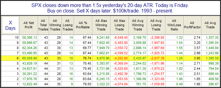
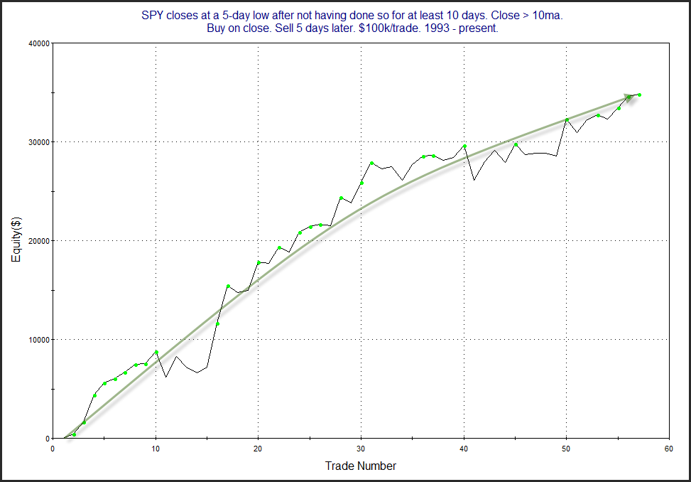
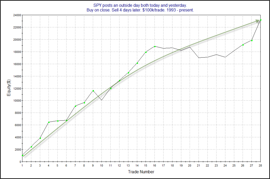
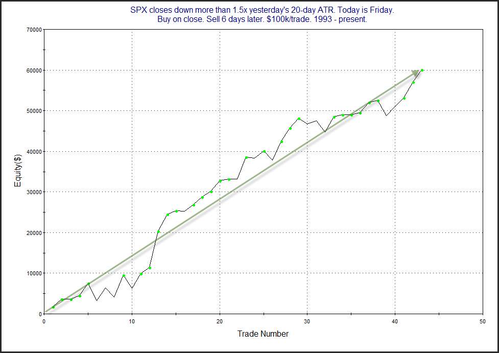
The numbers here are all very impressive and suggest a strong bullish bias. Below is a look at the 6-day profit curve.
This edge has asserted itself for a long time.
Want research like this delivered directly to your inbox on a timely basis? Sign up for the Quantifiable Edges Email List.
How about a free trial to the Quantifiable Edges Gold subscription?