Quantifying Seasonality Webinar Recoding
A recording of the “Quantifying Seasonality” webinar from a few days ago has been posted to youtube. You can find it below.
A recording of the “Quantifying Seasonality” webinar from a few days ago has been posted to youtube. You can find it below.
Perhaps the most astounding chart I saw this week was one that Helene Meisler posted in her Saturday morning chart show on Twitter. It showed the 50-day MA vs the 200-day MA of the $RUT. I have recreated the chart below and included the full history of the Russell 2000 to provide context.
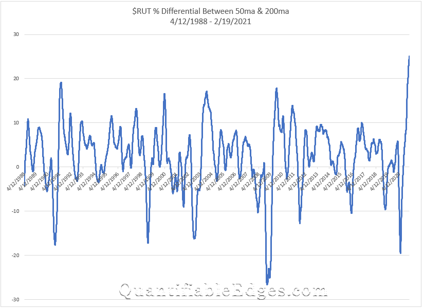
What is happening here is that the 50ma is more than 25% above the 200ma. And this is the 1st time in history that the 50ma has been this extended vs the 200ma. In fact, never before has it even exceeded 20%. So the current rally in $RUT is remarkable.
I also decided to look at a couple of other indices to see how stretched they were and what their historical charts looked like. First, let’s look at the $NDX.
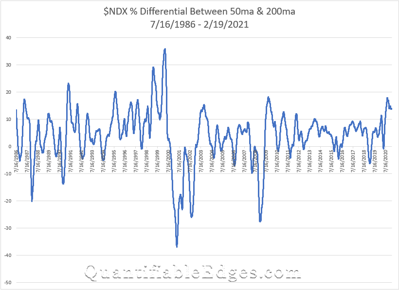
The $NDX has had some extreme historical readings as well. In 1999 it reached nearly 30, and in 2000, leading right up to the top, it exceeded 35. Then it went to hit its lowest extreme a little over a year later. But the current reading…not all that extreme. And in fact it topped out in September and has drifted lower since.
Lastly, let’s look at the $SPX. For this index I was able to go all the way back to 1929.
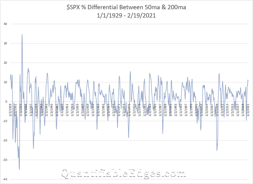
The current reading here is about 11. And as you can see, that is not terribly uncommon. There are a lot of peaks on the chart that exceeded 10. But it has not exceeded 20 since the 1930s. So neither $SPX nor $NDX appear to be all that stretched based on this metric.
So what does this all mean? Well, it appears this is some froth in small caps. This does not suggest that the momentum cannot continue or that $RUT or the rest of the market has to decline right away. But I would expect to see a reversion here at some point. There has been a lot of money pumped into the economy, and over the last few months, a big chunk of that has gone into smaller and less established companies.
In fact, it is not only less established companies, it is even shell companies that are seeing massive inflows. Take a look at this Tweet from Charlie Bilello that shows SPAC investment $$ growth:
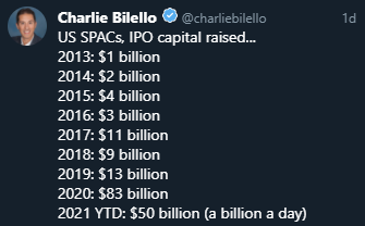
There is a lot of investment capital out there, and an oversized chunk of it seems to be flowing into the most speculative assets. This is not a trading signal, but it is something that seems worth noting. The music is still playing, but when it stops it may be difficult finding a chair.
Want research like this delivered directly to your inbox on a timely basis? Sign up for the Quantifiable Edges Email List.
How about a free trial to the Quantifiable Edges Gold subscription?
Quantifiable Edges has added GLD to our Seasonality Calendars. It is the 10th security (or index) the that we track in the new Seasonality section of the site. We also wrote up a short research paper for GLD. Using spot gold prices we were able to generate historical seasonality data back to 1981. We also showed a comparison of spot gold vs GLD since 2015. The research paper can be downloaded directly from the Seasonality page with a Gold, Silver, Seasonality, or Trial subscription. Additionally, subscribers may download the historical data to do their own research, with the aid of Quantifiable Edges tools that were built in Excel, Tradestation, and Amibroker.
On Saturday at noon EST I will be giving a webinar on “Quantifying Seasonality”. It will cover the following topics:
In the last few days, Quantifiable Edges released its Seasonality Calendar Backtesting Tool for Amibroker users. We now have tools for traders using Excel, Tradestation, or Amibroker.
The tools allow Quantifiable Edges subscribers to evaluate the Seasonality Calendars and explore ideas on how to utilize them for their own trading. Quantifiable Edges provides subscribers historical calendar data, dating back as for as 1940 for the DJI and SPX. With the tools, subscribers can produce studies like the report I created a few weeks back that looked at only holding indices when the calendars would have shown positive odds based on Win % and Profit Factor readings.
I have not posted many price-action studies to the blog lately, so I thought I would share this one from last night’s subscriber letter. A theme I have seen many times over the years is that persistent uptrends don’t often end abruptly. The study below is an example of this. It considers what happens after the market moves up at least 5 days in a row to a 50-day high, and then pulls back.
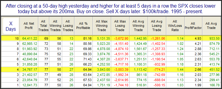
We see here a decent edge that becomes stronger and more consistent as you look out over the next several days. Short-term overbought in a downtrend can be a warning sign, but short-term overbought in a strong uptrend often suggests further strength.
Want research like this delivered directly to your inbox on a timely basis? Sign up for the Quantifiable Edges Email List.
How about a free trial to the Quantifiable Edges Gold subscription?
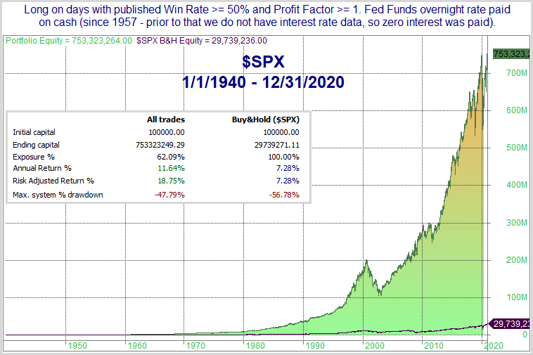
Quantifiable Edges recently released its Seasonality Calendars. The Seasonality Calendars utilize multiple inputs that I have found to be helpful over the years. The statistics they produce are based on rolling lookbacks of similar seasonal setups. In a special report I updated over the weekend, I showed how some simple filtering based on the calendars would have worked out over the long-term. The report is free to download for anyone with a Quantifiable Edges login (which you can get with a free trial or a free downloads subscription). In the report, I show results for all 9 of the indices we track with the Seasonality Calendars. Here on the blog I will just show the results for SPX.
The filters used look at the upcoming calendar day and go long or flat based on the stats shown for that day. The approach simply looks to see if there is a better than breakeven chance of seeing gains tomorrow based on 1) Win %, and 2) Profit Factor. So a Win % of at least 50% and a Profit Factor of at least 1 for tomorrow would mean we will be long at the close today. If those requirements are not met, we will exit at the close today. So if today is 12/7/2020, the system will look at the calendar for 12/8/2020 and see that the Win % is above 50 and the Profit Factor is above 1, and it will enter (or continue to hold) a long position. If the calendar on 12/9/2020 shows a sub-par profit factor, then we will exit the long position at the close on 12/8/2020.
When in “cash”, the model will earn interest at a rate equal to the overnight Fed Funds rate. I use this rate because 1) it is often slightly lower than the 3-month T-bill, which many people use, and 2) it has the longest history I could find for a short-term rate (1957). So it is conservative, and has a long history. Below are results for $SPX.
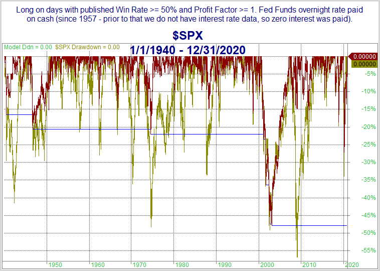
Next, let’s look at a detailed historical drawdown chart.
This past week I released some tools for subscribers that allow them to further test the seasonality calendars on their own. This can be done with either Excel or Tradestation, and I also expect to have an Amibroker version available soon. With these tools, subscribers can conduct their own backtests, change parameters, and begin exploring some of their own ideas as well.
The seasonality calendars and associated tools and functionality are included with any Gold, Silver, or Seasonality subscription.
Back in the 1/20/2009 blog I looked at inauguration day returns. I wondered at the time whether a new president brought about new hope and optimism for the market. I have decided to update that study today.
I limited the instances to only those inaugurations where a new president was entering office. I don’t think re-elections carry a sense of “new hope” the way a new president does. I also eliminated inaugurations of Presidents that weren’t elected (Ford in ’74, Johnson in ’63, Truman in ’45, and Coolidge in ‘23). I just don’t believe the same sense of excitement is generated by a replacement as by a newly elected president. The remaining presidents and their inaugurations can be found in the table below.
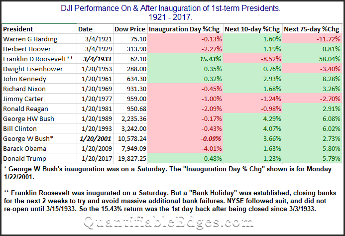
First, I found it interesting that the wonderful speeches and overall positive vibes surrounding a new president did NOT translate to a strong Inauguration Day performance. (You could throw out Roosevelt and G.W. Bush here, since the market was not open on the days they were inaugurated.) I’ll also note that Donald Trump could (and certainly would) claim he gave the greatest Inauguration Day speech of the last 100 years, since the 0.48% rise on that day was the best of any president on the actual Inauguration Day. It could also be claimed that Obama gave the worst speech in 100 years, since the Dow tumbled 4% on the day of his inauguration.
I’ll also note that looking out over the next 10 and 75 days the market did often seem to embrace the new hope that comes along with a new administration. Harding in 1921 is the only one on the list that saw the market more than 3.5% lower 75 days out. Meanwhile, there were 6 instances where the market was more than 3.5% higher.
Lastly, I’ll note that the seasonal analysis done here is different than the new Seasonality Calendar features we have. I’d encourage you to learn more about the new Quantifiable Edges Seasonality Calendars.
Want research like this delivered directly to your inbox on a timely basis? Sign up for the Quantifiable Edges Email List.
How about a free trial to the Quantifiable Edges Gold subscription?
As of this writing the Quantifiable Edges blog has published over 185 posts related to market seasonality. Seasonality can be looked at many different ways. You can factor in things like the day of the week/month/quarter/year. Or the week of the month/quarter/year. Or special days, like market holidays or Fed Days. Seasonality can take many forms, and since 2008 I have published a lot of edges related to seasonality.
In the Quantifiable Edges Market Timing Course I looked at longer-term seasonal influences. I featured the Best/Worst 6 Months of the year, and the Presidential Cycle as longer-term seasonal factors.
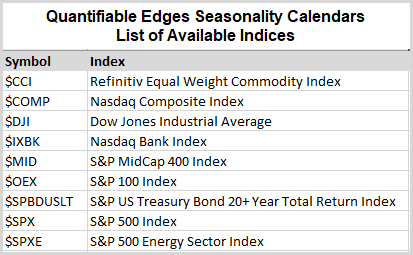
Over the years I have also privately tested a number of systems that utilized seasonality. And now I have decided to share the Quantifiable Edges Seasonality Calendars. The seasonality calendars utilize multiple inputs that I have found to be helpful over the years. The statistics they produce are based on rolling lookbacks of similar seasonal setups.
Seasonality Calendars are now available as separate subscription at Quantifiable Edges, but we have also included them with all Gold and Silver subscriptions, at no additional cost. (We may increase the price on Gold and Silver subscriptions in the coming months, but all subscribers will be locked in at their original pricing at that time.)
The current list of indices with available Seasonality Calendars can be found below:
The video below provides a short intro to the Calendars, along with the research and resources that come with them:
I’ve posted and updated the “Twas 3 Nights Before Christmas” study on the blog here several times since 2008. The study will kick in at the close today (12/22). This year I will again show the Nasdaq version of the study. While all the major indices have performed well during this period, the Nasdaq Composite has some of the best stats.
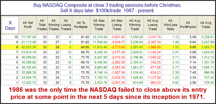
The stats in this table are strong across the board. An average year posted a gain of about 2.5% over the next 8 days. The note at the bottom shows the reliability of some kind of bounce has been nothing short of incredible. Traders may want to keep this study in mind over the next several days.
Want research like this delivered directly to your inbox on a timely basis? Sign up for the Quantifiable Edges Email List.
How about a free trial to the Quantifiable Edges Gold subscription?
In November of 2019 I decided to join my long-time friend Jeff Pietsch and become a part of Capital Advisors 360. Here’s why.
I first began trading full-time in 2001. During the late 90s I was a part-time trader while working a full-time sales job. But sales was not my passion. And the better I got at trading, the more I dreamed about quitting sales altogether and trading for myself. So in September, 2001 I set up an investment partnership. I put my own money into the partnership account with a few friends and family members. Hedge funds were the rage and so I adopted the partnership structure. In 2012 the rules around investment partnerships became stricter and more regulated. They basically prevented me from taking on new investors without changing my business model.
I ran the fund for 18 years. From time-to-time I thought about expanding, but the prospect of going through registrations, subjecting myself to greater oversight, and having to keep up with various compliance issues and other legal and regulatory work seemed daunting.
In 2011 my friend Jeff Pietsch started Eastsound Capital Advisors (now CA360) – a state registered investment advisory in Washington. Over the years he would occasionally ask me when I was going to get registered, and I would laugh it off. But in 2019 he pointed out a few things that struck a chord.
For one, the structure I’d set up way back in 2001 was antiquated at that point, and it was also expensive to maintain! Below are a few points we hashed out that suggested my clients would be better off if I managed their money in separately managed accounts, rather than within a traditional fund structure:
Software and brokerage services have changed a lot since 2001 as well. With custodians like Interactive Brokers, I can now use their modeling capabilities to mimic the partnership trades I used to do at relatively low cost. But instead of the trade going to one partnership account, it gets automatically divided among all clients participating in the “model”.
Between my clients’ expanding needs, the lower expenses, better accessibility and transparency, the ability to customize risk, the better custody solution, and the technological advances in the industry that would allow me to easily handle trading in many different accounts at once, I decided to make the switch. And best of all, by going with CA360, I did not have to tackle all the regulatory and compliance headaches on my own. Plus, I got to work closer with Jeff.
It took a while for everything to get completely setup, but after several months, I officially became registered in Massachusetts as an investment advisor representative of CA360, and I could not be happier about it.
As a fiduciary advisor, I am now able to help clients achieve their personal goals and objectives, whether they be with the more active Quantifiable Edges approaches I have honed over the decades, or in combination with additional approaches to help diversify their investments with multiple managers and methodologies.
I have written many times over the years about the bullish tendency of the market during opex week in December. I used to refer to it as “The Most Wonderful Week of the Year”. And it was…up until 2018. So below is an updated look at the stats and profit curve for owning SPX from the close of the Friday before December opex to the close on December opex.
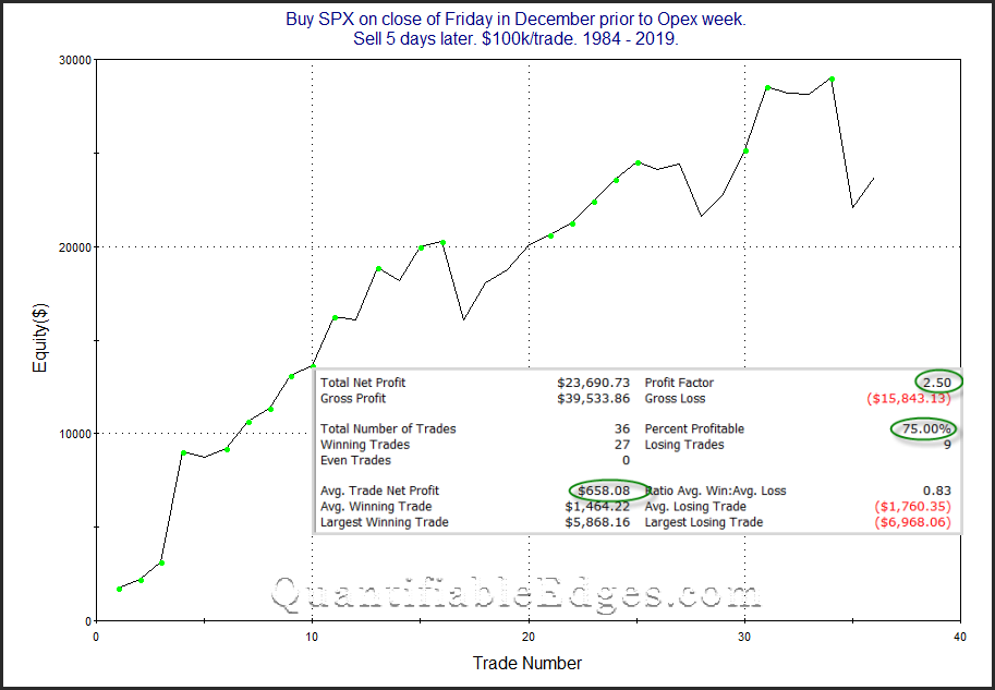
That is a 7% loss you are looking at in 2018. So that will likely take a few more years to recover. But we are entering the time of year when the market typically has the seasonal winds at its back. And despite the 2018 December collapse, that is something traders may want to keep in mind this week (and even a bit longer).
Want research like this delivered directly to your inbox on a timely basis? Sign up for the Quantifiable Edges Email List.
How about a free trial to the Quantifiable Edges Gold subscription?
One indicator that is showing extreme readings lately is the CBOE Equity-Only Put/Call Ratio. It has been coming in very low, meaning options traders have been buying a lot more calls than puts. (Why waste your money on a put when stocks only go up?) Below is a look at the 10-day average of the ratio.
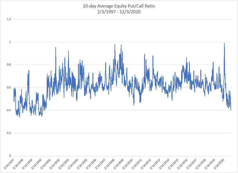
As you can see, we are reaching levels not seen since the late the late 90s and 2000. But it is also notable that such readings were fairly common back then. When I look at P/C Ratios, I will often normalize them, to see how they look vs recent times. A simple way to do this is to divide the 10-day average shown above by the 200-day average. This is what I did in the chart below, and it is shown by the blue line. The orange line is the S&P 500 index.
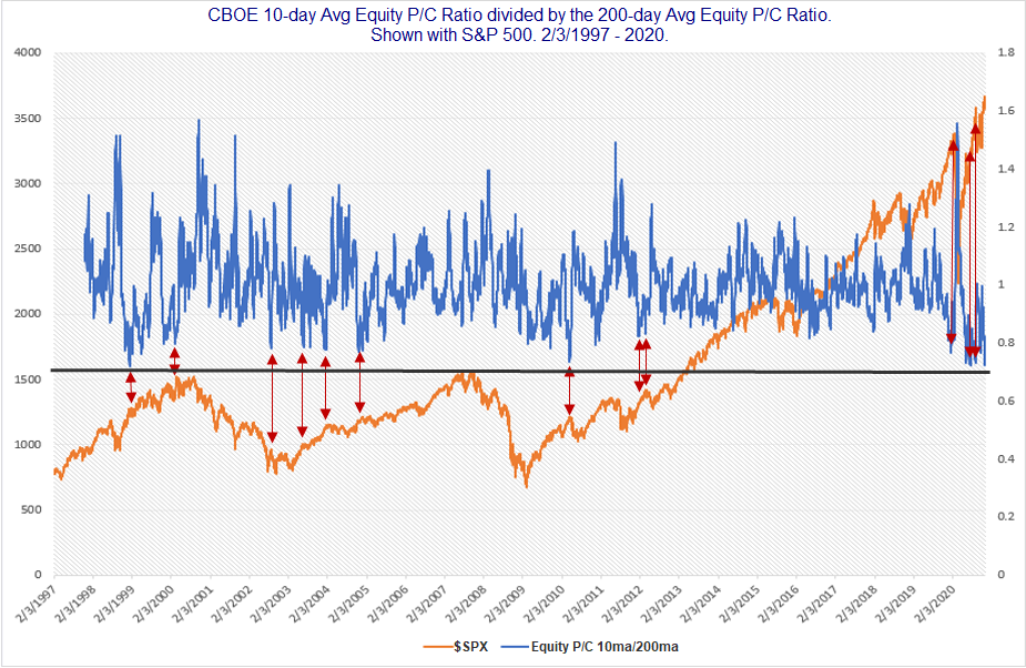
The black line that goes across near the middle of the chart shows that the lowest 10/200 P/C reading, which came on 1/11/99, was just barely below Thursday’s. Thursday’s is the 2nd lowest ever. When readings get this extreme it is difficult to run numbers, because we only have the one other instance to look at. But I drew red arrows at many of the other points where the 10/200ma of the Equity P/C Ratio got near where it is now. As you’ll note, many (not all) of them were soon followed by some short-term selling. That certainly seems to be a danger based on the extreme complacency that options traders are currently showing.
Want research like this delivered directly to your inbox on a timely basis? Sign up for the Quantifiable Edges Email List.
How about a free trial to the Quantifiable Edges Gold subscription?
A few days ago, I noted the seasonal bullishness around Thanksgiving, especially from Tuesday’s close to Friday’s close. One potential issue with seasonal studies is that they can sometimes get front-run, and then the edge weakens. It is now Tuesday, and the market is moving up strongly for the 2nd day in a row. So I decided to look back at other times where SPX closed higher on the Monday and Tuesday before Thanksgiving. The table below shows all instances since the inception of the modern S&P 500 in 1957.
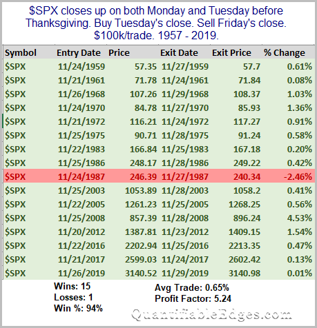
In this case, it does not appear that the Monday-Tuesday rally has eliminated the seasonal bullish tendency. In fact, it appears that the momentum has carried well through the holiday. Happy Thanksgiving to you and yours!
Want research like this delivered directly to your inbox on a timely basis? Sign up for the Quantifiable Edges Email List.
How about a free trial to the Quantifiable Edges Gold subscription?
The time around Thanksgiving has shown some strong tendencies over the years – both bullish and bearish. I have discussed them a number of times over the years. In the updated table below I show SPX performance results based on the day of the week around Thanksgiving. The bottom row is the Monday of Thanksgiving week. The top row is the Monday after Thanksgiving.
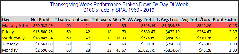
Monday and Tuesday of Thanksgiving week do not show a strong, consistent edge. But the data for both Wednesday and Friday looks quite strong. Both of those days have seen the S&P 500 rise at least 70% of the time between 1960 – 2019. The average instance managed to gain about 0.3% for each of the 2 days. (This is shown in the Avg Profit/Loss column where $300 would equal a 0.3% gain.) That is a hearty 1-day move. Meanwhile, the Monday after Thanksgiving has given back a good chunk the gains that the previous 2 days accumulated. It has declined 65% of the time and the average Monday after Thanksgiving saw a net loss of 0.34%.
Want research like this delivered directly to your inbox on a timely basis? Sign up for the Quantifiable Edges Email List.
How about a free trial to the Quantifiable Edges Gold subscription?
Monday saw a massive market rotation. It could be noted by the performance in the IWM vs the QQQ, or in looking at performance among S&P 500 sectors, where Energy beat Technology by 15% on Monday. But to really see how strong the rotation was, you’d need to take a look at individual stock performance within the SPX. Below is a list of the Top 10 S&P 500 stocks, ranked by YTD performance through Friday, 11/6.
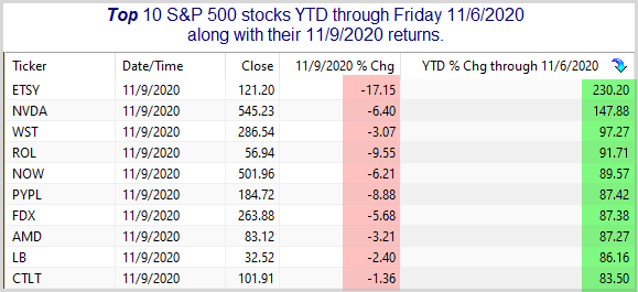
Every one of the Top 10 stocks closed down on Monday, with 6 of the 10 losing over 5%. Now let’s look at how the worst stocks of the year did on Monday.
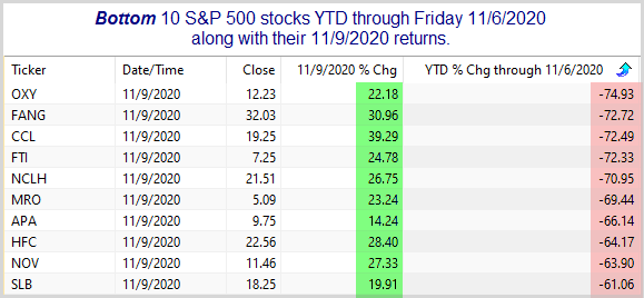
Every single one of these were up at least 14% on Monday, with most of them rising between 20% and 40%. That is a massive rotation. One way to play momentum is to get long strength and to get short weakness. That can be a profitable strategy. But on days like Monday, when the public thinks the “market” did well, you can really get served a world of hurt. Anyway, the rotation was enormous. I’m not sure what it means for the major averages going forward, but I certainly found it notable.
Want research like this delivered directly to your inbox on a timely basis? Sign up for the Quantifiable Edges Email List.
How about a free trial to the Quantifiable Edges Gold subscription?