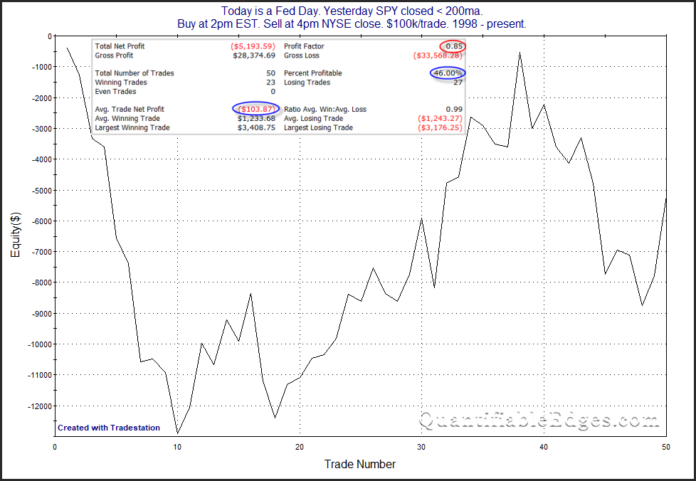
In last night’s subscriber letter I decided to take a similar look, but only examining instances during long-term downtrends. Below is a look at how the SPY has performed from 2pm to 4pm on Fed Day’s where SPY closed below the 200ma the day before.
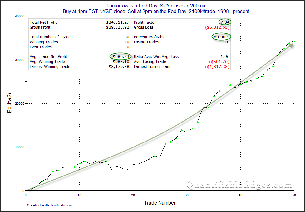
Choppy and inconsistent with net results slightly negative. Not an appealing curve for bears or bulls. But now let’s look at performance from the close the day before the Fed Day until 2pm of the Fed Day during downtrends. (Announcements are typically at 2pm EST.)
Numbers here are very strong and the curve is incredibly consistent. I’ll also note that the last 11 instances, dating back to November 2011, all saw a gain.
This all reinforces my view that it is generally better to exit Fed Day-specific trades prior to the announcement. Of course there is a risk of missing out on a bigger Fed Day rally, but over time that has been the more consistent and more profitable approach.
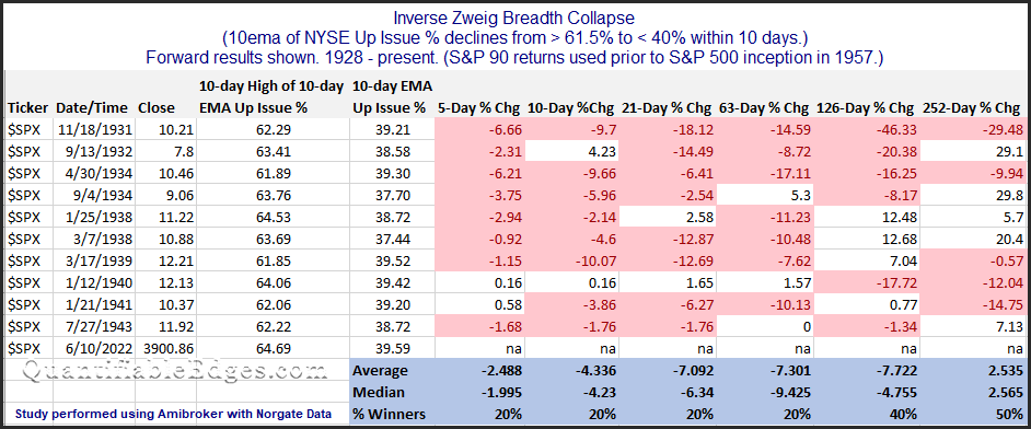
A few years back I wrote about Zweig Breadth Thrusts in some detail. The Zweig Thrust takes a 10-day exponential moving average of the NYSE Up Issues %. It looks for a move from < 40% to over 61.5% within a 10-day period to signal there has been a breadth thrust.
Over the last 3 days we have essentially what could be considered the inverse setup trigger. The NYSE Up Issues % 10ema has fallen from above 61.5% to under 40% in 10 trading days. Rather than a breadth thrust, we have seen a “breadth collapse”. I looked back at other times where such an “Inverse Zweig Breadth Collapse” has occurred. I found the setup to be rare. The full list of instances can be found below.
There have only been 10 instances dating back to 1928, and the current instance is the 1st one since 1943, when the S&P 90 was the primary S&P index. The modern S&P 500 inception occurred in 1957. So it is fairly amazing to see a breadth collapse so unusual that it has not happened in nearly 80 years. In looking at all the instances between 1931 and 1943, results were not encouraging for the bulls. On average the market was down 2.5% five days later, down 4.3% ten days later, down 7.1% one month later, down 7.3% three months later, and down 7.7% six months later. I will not put a whole lot of faith in a signal that has not triggered in nearly 80 years. But the fact that we have seen such an extreme breadth collapse the last few days does seem notable. And it sure doesn’t appear to be market positive for the next few months.
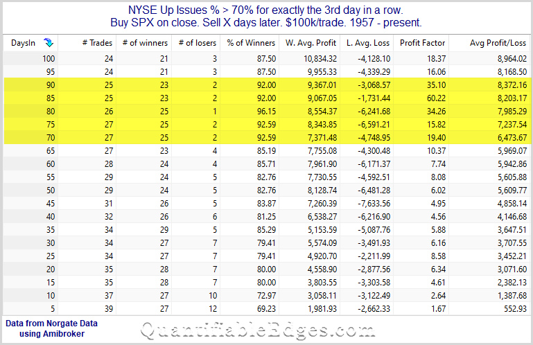
The strong breadth readings over the last few days triggered one of my oldest and most favorite breadth studies.
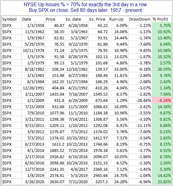
There are a lot of positive numbers and the edge appears to be to the upside. Results between 70 and 90 days appear especially strong and consistent. Below is the full list of 80-day results.
That is quite the winning record. Of course every time is different, and we are facing an unfriendly Fed at the moment. But similar breadth thrusts have a strong track record of seeing more gains over the intermediate-term.
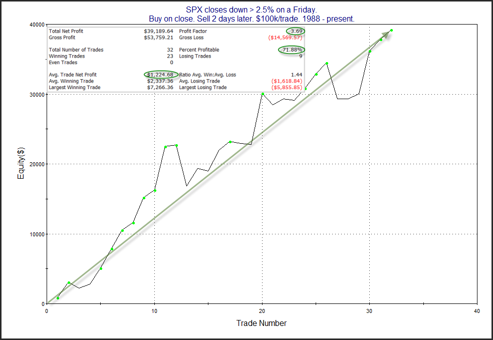
In this weekend’s subscriber letter I showed several studies suggesting the Friday selling could be an overreaction and that a bounce early this week appears likely. I noted that Fridays are often viewed as the day most likely to have a downside overreaction. This is partly because people may be looking to bail out ahead of the weekend and avoid getting hurt by further bad news. This concept is something I have discussed in the past here on the blog, mostly recently last November.
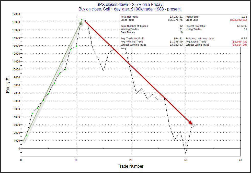
In recent years the bounce has not always occurred on Monday. Sometimes we saw more selling on Monday before the rebound started on “Turnaround” Tuesday. A couple of interesting charts from the letter are shown below. They look at performance following Fridays that close down over 2.5%. The 1st is a profit curve assuming a 1-day holding period. The 2nd chart assumes a 2-day holding period.
So in recent years the bounce has not as reliably begun on Monday, but it almost always did by Tuesday afternoon. We’ll see if form holds this week and we get a bounce in the next few days.
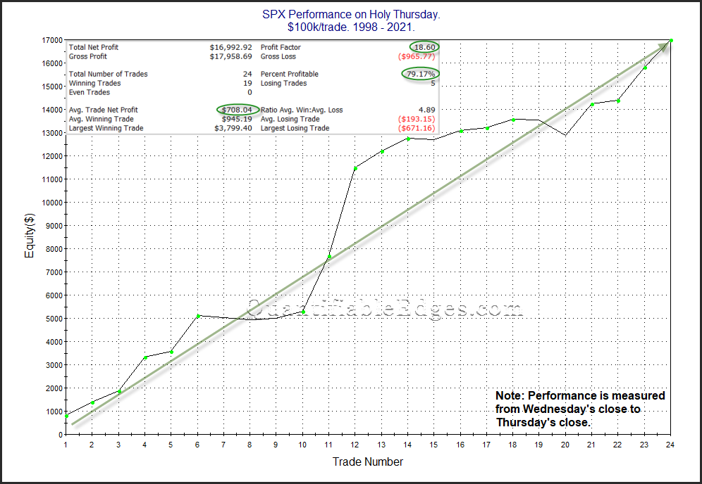
Stock market performance leading up to and around many holidays has often been bullish. This is something I have written about several times over the years. Holy Thursday is one such day that has done quite well. I have shown Holy Thursday stats a few times in the past. The chart and statistics below are all updated and zoomed in from previous studies to just show the last 24 years.
Strong numbers and an impressive move from lower left to upper right suggests the market could have a seasonal wind at its back on Thursday.
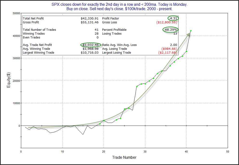
As I have documented numerous times, “Turnaround Tuesday” has generally been the best day of the week under many circumstances for the market to begin to mount a bounce. Below is a simple look at 2-day pullbacks when SPX is below the 200ma and we are heading into Tuesday.
The numbers appear quite bullish and the curve has seen an upward acceleration. Turnaround Tuesday’s have provided many edges over the years. Traders may want to keep this in mind on Tuesday.
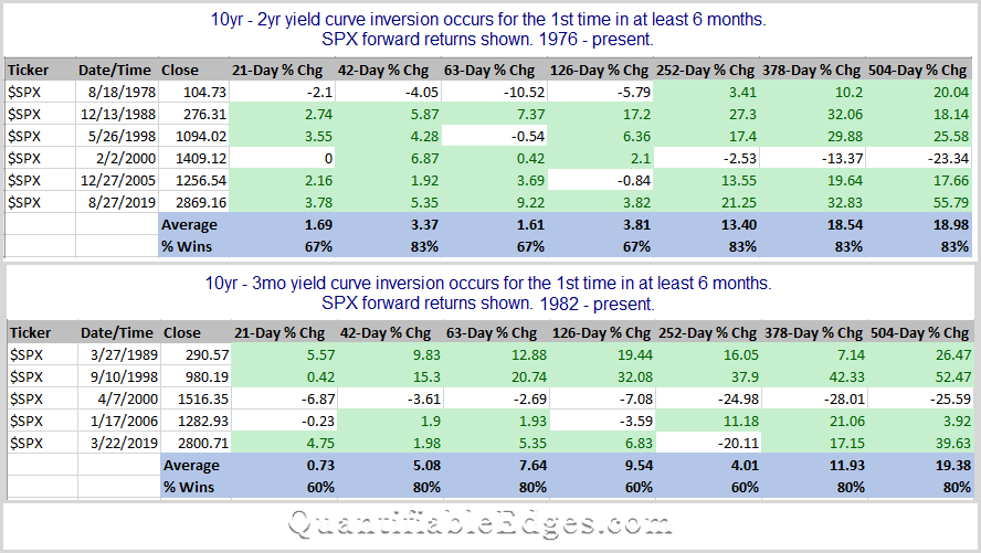
There has been a lot of talk recently about yield curve inversions and whether that means a recession is on the way, and how soon? And if there is a recession, will there also be a bear market? I decided to forget about economic forecast and just look at how the SPX did after a curve inversion. I looked at both the 2yr/10yr and the 3mo/10yr combinations. For the study I used Norgate Data, and looked back as far as my database went, which was 1976 for the 2yr rate and 1981 for the 3mo. Results can be found below.
Note that 21 trading days is approximately 1 month. So 42 days is two months, 126 days is 6 months, 252 days is a year…you get it.
Not many instances to build out a case here. Some good and some bad numbers. More bullish than bearish. Overall, the initial inversion does not seem to be a great timing signal. Academics can argue and tv talking heads can blather about potential consequences, but traders should probably look to better timing devices to make their market judgements. I don’t see myself factoring this into any trading decisions.
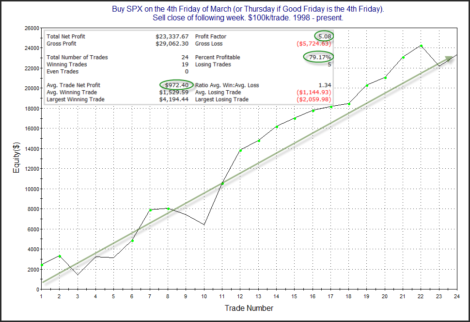
There are some bullish forces kicking in the next few weeks. For one, the week after the 4th Friday in March has been a strong one over the last 24 years. (Not as much before that.) We can see this in the study below, which I showed in this weekend’s subscriber letter.
That is an encouraging looking curve and bullish stats. Traders may want to keep this in mind as they formulate their market bias this week.
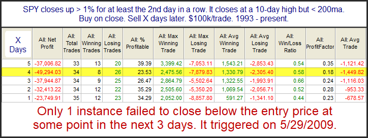
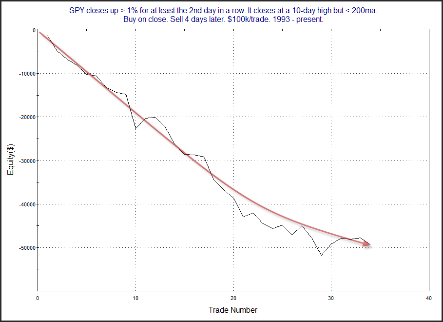
In last night’s subscriber letter I showed a few studies suggesting the market was short-term overbought in a long-term downtrend, and that there appeared to be a short-term downside edge. Below is one of those studies, which also appeared in the Quantifinder yesterday afternoon.
Those are some powerful numbers. And only 1 instance did not post a lower close in the next 3 days. Below is a look at the 4-day profit curve.
Despite the recent bump up, that is a long, persistent downslope. Traders may want to consider this as they set their market bias.
Rob Hanna talks with Ali Pashaei about using options – mostly in the context of short-term directional trades. Ali also discusses his trading journey, his Options In Practice site, and some more complex options ideas.
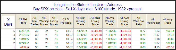
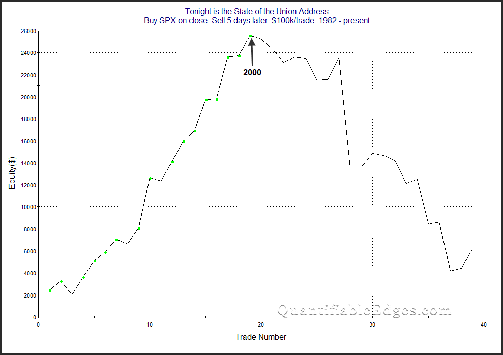
With tonight being the State of the Union Address I decided to take another look at an old study that examined SPX performance following past speeches. The data table below looks back to 1982. There were a few instances, such as 2001 and 2009 where the speech was not an official “State of the Union”, but was delivered under a different name. I have included those speeches in the results as well.
The stats do not suggest much of an edge. But the profit curves seem to tell a more interesting story. Here is the 5-day curve.
All the curves look something like this in that since the turn of the century the market has tumbled after these speeches rather than been inspired by them. I guess they just don’t write speeches like they used to.
On Thursday this week I will be hosting a Webcast with guest Ali Pashaei. You are invited to attend live and ask questions if you wish. I will also be recording and posting it up to the Quantifiable Edges YouTube channel.
I’ve known Ali for a long time. He is a professional options trader, and he also runs the Options In Practice website, where he works with traders on implementing options strategies.
Ali and I will be discussing the use of options for directional trades – primarily short-term directional trades. I’m often asked by new Quantifiable Edges subscribers about taking the trade ideas I post in the letter, or utilizing the QE Numbered Systems, and implementing an option strategy around them. Ali will be sharing insights as a professional options trader on some of his favorite approaches to take advantage of short-term directional edges. I’m really looking forward to our talk, and hope you’ll find some of the ideas beneficial as well.
So join me on Thursday at noon EST using the link below, or if you cannot make it, keep your eye out on Friday, when I will be posting it up to YouTube and the Quantifiable Edges blog.
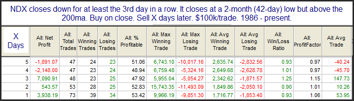
The NDX was hit especially hard last week. It fell 4.5% on the week and Friday was the lowest close since October. Many times we will see multi-day pullbacks and/or intermediate-term lows during a long-term uptrend suggest the market is primed for a bounce. But in running some studies on NDX this weekend, I found results like below.
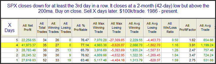
Such setups have been a tossup over the following days. SPX traders might find these results surprising. But SPX and NDX have exhibited somewhat different tendencies over the years. The SPX is more prone to mean reversion than the NDX. NDX tends to trend better. One example of this can be seen by looking at the same study using SPX.
These numbers are quite compelling. Of course, SPX is nowhere near its 2-month low. So this is not setting up.
I will note I am seeing some mild evidence that a bounce is likely in the next few days. But there could be more pain before it happens, as demonstrated by the NDX study and the fact that the SPX isn’t nearly as oversold.
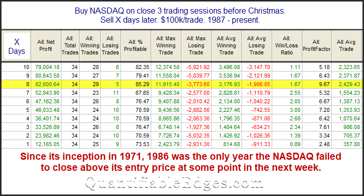
I’ve posted and updated the “Twas 3 Nights Before Christmas” study on the blog here several times since 2008. The study will kick in at the close today (12/21). This year I will again show the Nasdaq version of the study. While all the major indices have performed well during this period, the Nasdaq Composite has some of the best stats.
The stats in this table are strong across the board. An average year posted a gain of about 2.4% over the next 8 days. The note at the bottom shows the reliability of a bounce at some point has been nothing short of incredible. Traders may want to keep this study in mind over the next several days.