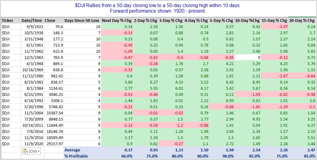
The SPX, Dow, and NASDQ all closed at all-time highs on Friday. Just 10 days ago the Dow closed at a 50-day low. That quick of a move from low to high is quite an accomplishment. Over the last 101 years this just the 21st time the Dow has managed to move from a 50-day closing low to a 50-day closing high within 10 days. Below are all the other instances, along with the $DJI performance in the following days and weeks.
The Dow has generally seen the upward momentum continue. Those are some impressive gains over the first 1-5 days, and even out through 20 days. Traders may want to keep this in mind when formulating their bias.
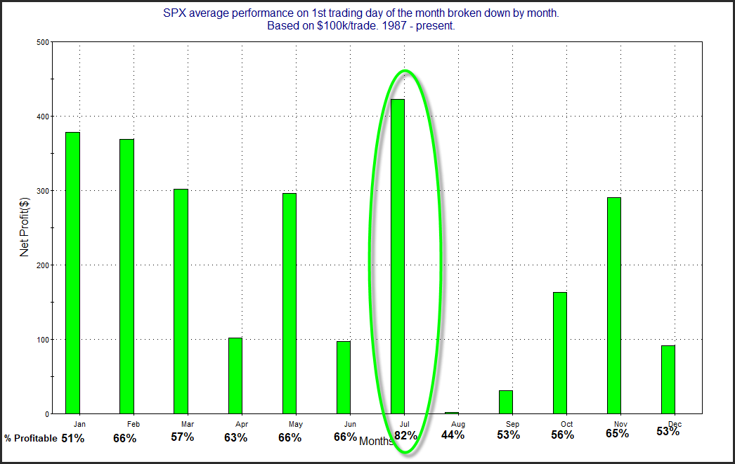
Since the late 80s there has been a tendency for the market to rally on the first day of the month. One theory on why this occurs is that there are often 401k inflows that are put to work on the 1st of the month. I examined this tendency and broke it down by month here on the blog a few times over the years. I decided to update the study again today.
The only month that comes even close to July from a Win % and Avg Trade standpoint is February. I’ll also note that August is the worst performer of any month.
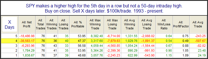
SPX managed to make an intraday high for the 5th day in a row on Friday. An interesting study from the Quantifinder looked at the possible impact of 5 higher highs occurring. The studies examined the impact of the position of the market when the 5 higher highs occurred. I broke it down again over the weekend. I wanted to see all times the 5 higher highs were accompanied by a 50-day high versus times they weren’t. First let’s look at times where 5 higher highs occur without a 50-day high.
Stats over the 1st few days suggest a possible mild downside edge. After 5 higher highs the market will sometimes need a breather.
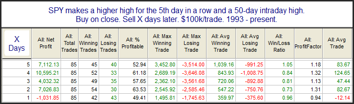
But what of times (like now) when a strong uptrend exists, and the market is also making a 50-day high? Those stats can be found below.
Interestingly, the number of instances has been nearly the same. But with an intermediate-term rally also occurring the tendency to pull back no longer exists. So the 5 higher highs are really of no concern in situations like the current one.
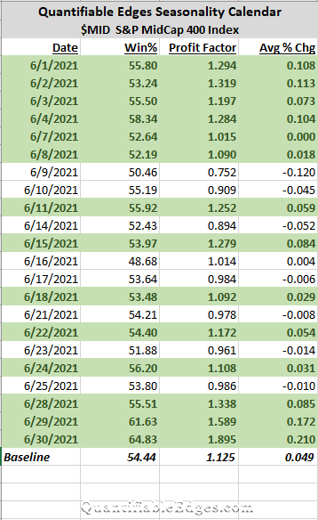
I have begun sharing one of the Quantifiable Edges Seasonality Calendars each month. This month I decided to show the S&P Midcap 400.
The Quantifiable Edges Seasonality Calendar uses multiple systems to measure historical performance on similar days to those on the upcoming calendar. The systems look at filters like time of week, month, year and so forth. Over the long run, staying out of the market on days that do not appear in green, would have been beneficial. To appear in green the date needs to show a historical Win% of 50% or more and a profit factor of 1.0 or more.
We see some solid seasonal numbers to start off the month. Then it is a mixed bunch for a few weeks. The strongest numbers in June appear in the last 2-3 days. Of course there will be many other factors impacting market action. But historically, avoiding days that do not appear in green has proven beneficial across all the markets we track. This is discussed in the “50/1 Calendar Research Paper”, which is available on the Seasonality page in the client section of Quantifiable Edges. It is available to all subscribers, including those on a free trial.
In the 4/12/19 blog I showed a study about US tax day (normally April 15th). The reason tax day may be important is that it is the last day that people can make IRA contributions to count for the previous tax year. This can create a last-minute rush and you will often have an inflow of funds heading into the market right around and on the day taxes are due. Fund managers will often put this money to work immediately and it creates a positive bias for the market. Below I have updated the study.
Futures are struggling in the overnight. Let’s see if this seasonal tendency can turn it around by the close today.
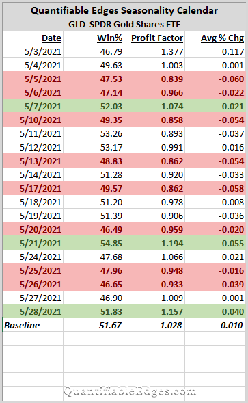
I have begun sharing one of the Quantifiable Edges Seasonality Calendars each month. Last month, we looked at the NASDAQ. This month the calendar that caught my eye was GLD, the Gold ETF. It looks lousy (technical term term for “sucky”).
The Quantifiable Edges Seasonality Calendar uses multiple systems to measure historical performance on similar days to those on the upcoming calendar. The systems look at filters like time of week, month, year and so forth. Over the long run, staying out of the market on days that do not appear in green, would have been beneficial. To appear in green the date needs to show a historical Win% of 50% or more and a profit factor of 1.0 or more.
Obviously, what stood out with regards to GLD is how bearish it appears. Only 3 “green” days all month is the worst for any of the 10 indices/securities we publish. The Baseline hurdles are fairly low, and they are rarely exceeded in the May calendar. Seasonality is just one factor, but I have found paying attention to it to be worthwhile. A couple of months ago, I published a research paper that showed the value of avoiding gold on days that did not show favorable seasonality odds. That paper is available to all subscribers, including trial subscribers, on the Quantifiable Edges Seasonality page. It is titled “Gold 50/1 Calendar Model Research”.
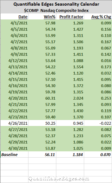
I have begun sharing one of the Quantifiable Edges Seasonality Calendars each month. Last month, we looked at long-term treasuries. This month the calendar that caught my eye was the NASDAQ Composite Index.
The Quantifiable Edges Seasonality Calendar uses multiple systems to measure historical performance on similar days to those on the upcoming calendar. The systems look at filters like time of week, month, year and so forth. Over the long run, staying out of the market on days that do not appear in green, would have been beneficial. To appear in green the date needs to show a historical Win% of 50% or more and a profit factor of 1.0 or more.
Obviously the NASDAQ stood out because its Calendar is almost all green. But not only do we see mostly green this month, I’ll also note that almost every day up until April 23rd we see numbers above the “baseline”. The baseline is simply NASDAQ stats over about the last 10 years. So the next 3 weeks we see that NASDAQ seasonality is both positive, and mostly better than average. Traders may want to keep this in mind along with other factors they consider as they establish their market outlook over the next few weeks.
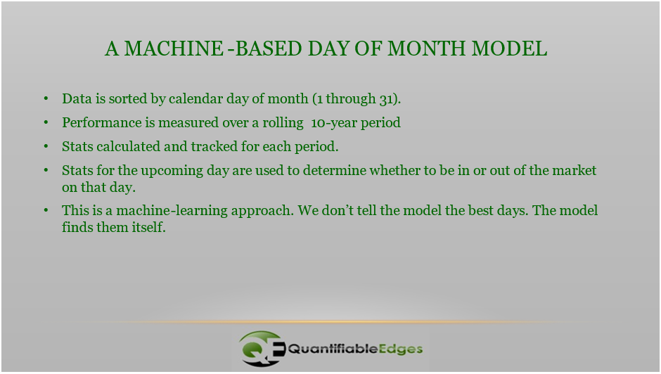
In this writeup I am going to explain how to build a simple calendar model that uses machine learning to determine the days with the best odds to trade. The I will show how the calendar model does versus “Buy and Hold” over a long time period. The approach here is similar to how the Quantifiable Edges Seasonality Calendars are produced each month. Of course they are a bit more complex, and they are also enhanced by the fact that rather than using just one model, they use an ensemble of models to generate the statistics. But as you will see, even a very simple calendar model can produce surprisingly effective results.
Below are the steps to build the model.
I’ll go through these briefly one-by-one.
Data is sorted by calendar day of month (1 through 31) – Here we are simply establishing groupings. In this model, the grouping are extremely simple. What day of the month is it? You could also use trade day of month, or normalize the number of days, or segment many other ways. But the idea is to determine whether certain groupings provide an edge vs others. Here we are just doing “day of month”.
Performance is measured over a rolling 10-year period – To see what groups provide an edge, you need to measure the performance of each group over a specified time period. In this case, I chose 10 years. With 31 groups and 252ish trading days per year, this means each group will have about 81-82 instances, though a little less for the 29th – 31st. Performance can be measured multiple ways. For instance, Win %, Avg Gain, Profit Factor, or by any other performance measure you deem important. The time that is measured can be whatever you determine appropriate. I used 10 years as a nice, round number that is long enough to typically include both bull and bear market phases. You can use much longer or much shorter.
Stats calculated and tracked for each period – Once ten years (or whatever length you choose) of data is available, the performance stats can be generated. They should then be rolled forward continuously. This will allow the machine to adapt to changing market conditions, and for the old data to roll off, no longer including it in forward decisions.
Stats for the upcoming day are used to determine whether to be in or out of the market on that day – So if tomorrow is the 5th of the month, the model will look back at performance of the 5th of the month over the last 10 years to determine whether to be long or flat at the close today. In the results I am going to share, I required a Win % of at least 50% and a Profit Factor of at least 1.0. So we are looking for the stats to be neutral or positive in order to have a long position. Otherwise, we get flat.
This is a machine-learning approach. We don’t tell the model the best days. The model finds them itself – Again – nowhere in the code do we specify that we view the 1st or the 5th or any other day as bullish. Bullish/neutral/bearish are evaluated on a rolling basis by the code.
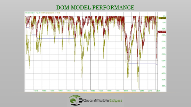
These results are fairly remarkable. The model is only exposed to the market about 52% of the time, and yet the annual return beats the market by 1.35% per year. When it is out of the market, it has earned interest at the rate equal to the 30-day Fed Funds rate. (I used that rate since 1) it is generally the lowest published rate, and 2) I had data back to 1957. Prior to 1957, 0% interest was earned by the model.) Over a long period of time, the 8.63% CAGR vs the 7.28% CAGR makes a very big difference. Also interesting about this is the fact that it is 100% in or 100% out. There is no ability to leverage in this model. So it cannot outperform when the market is rising. It can only outperform by side-stepping unfavorable days. And since it did outperform, you would think it did a decent job of reducing drawdowns. Below is the drawdown chart.
The model is represented by the red line and the SPX by the gold line. Interestingly, in almost every major drawdown over the 81 years, the model managed to avoid a portion of the drawdown. And that is how the performance difference became so large over time.
As I stated earlier, this is similar to the approach used by the QE Seasonality Calendar models. I also thought it was a decent example of machine modeling. (Note: This approach can be used with any kind of data. It does not need to be calendar-based.) I also thought people would find it interesting how a simple day-of-month filter could be so effective over such a long time period. Day-of-month seasonality IS a thing. And based on this, it appears worth paying attention to. I hope you found the above exercise thought provoking.
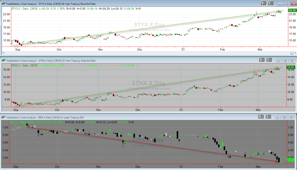
Over the last few months bond investors have been hit with the worst combination of rate moves. Intermediate and long-duration bonds have been rising rapidly while the very short-term rates have actually continued to decline. This can be seen in the charts below, which show the 30-yr Treasury Rate, 10-yr Treasury Rate, and the 13-Week Treasury Rate.
The rise in long rates has led to TLT (iShares 20-yr Treasury Bond ETF) losing over 20% from its 8/4/2020 closing high – that includes dividends paid over this time. A decline that large can be tough to make back when the current yield is just 2.1%.
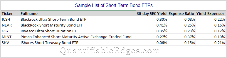
But the drop in rates on the short end has also been painful. Many short-term bond ETFs are struggling to keep their yield above their expense ratio. And the only way they are managing to do so is with a big chunk of their bond holdings in BBB or lower rated securities. Of course yields below expense ratios over an extended period means a negative return is likely in those assets. Below is a list of some of the more popular short-term bond ETFs along with their stated 30-day SEC yield and their expense ratios.
The Fed is not likely to remove pressure on short-term rates anytime soon. But right now it means bond investors are losing on the long end, and are even struggling to breakeven on the short end.
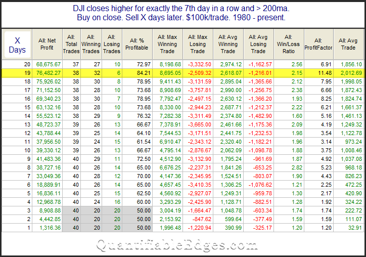
Monday was the 7th day in a row that the DJI closed higher. This triggered a study from the Quantifinder that looked at performance after 7-day win streaks in the Dow Industrials since 1980. I’ve updated the stats table below.
There is not much of an edge over the 1st few days. But once you get out a little further, the stats appear solidly bullish. The 16-19 day returns show a very high win %. Momentum tends to carry, and this study is just a simple example of that concept. Traders may want to keep it in mind as one factor when determining their intermediate-term market bias.
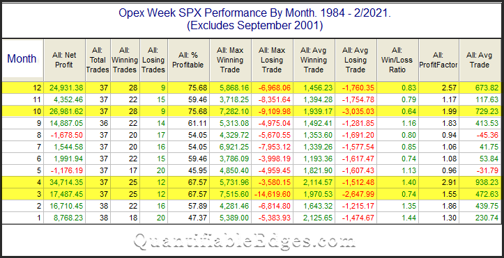
There is a seasonal influence that could have a bullish impact on the market this week. Op-ex week in general is pretty bullish. March, April, October, and December it has been especially so – at least until last March. S&P 500 options began trading in mid-1983. The table below is one I have shown and updated basically every year since 2008. It goes back to 1984 and shows op-ex week performance broken down by month.
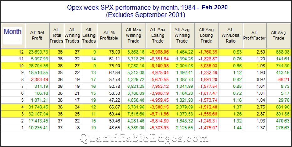
March has a strong win rate, but the gains are not as high as the other highlighted months. Some people may recall that March used to have the largest average trade of any month. The table below is the one from last year.
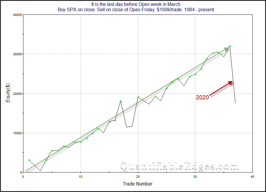
So how did the average trade change so much? March 2020.
Last year really changed the look of the curve in a big way. A 1-week decline of 15% will do that. It is most likely just an outlier, and March opex still seems to offer a potentially bullish seasonal opportunity. But the historical stats sure weakened a substantial amount.
A couple of weeks ago I shared the March Seasonality Calendar for Long-Term Treasuries. I have copied it again below. I wondered whether the negative seasonality early in the month would even matter, since TLT appeared so strongly oversold at that point and perhaps due for some kind of bounce.
As of Friday morning, TLT is down nearly 5% on the month. (It is also down over 20% from its August closing highs – even including dividends.) So the oversold bounce did not materialize. But seasonality is now starting to turn positive. Numbers still appear somewhat muted for the next week, but starting on the 19th through the end of the month TLT should have a seasonal wind at its back to help with any rebound. Let’s see if it can mount one.
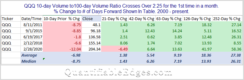
My friend and colleague Tom McClellan writes the excellent McClellan Market Report. In his report last night he noted that big spikes in QQQ volume are often a bottoming sign for QQQ. He shared a chart showing that the 10ma of QQQ volume was now at an extreme level. I decided to study this idea a bit more. So I took the 10ma of QQQ volume and compared it to the 100ma of QQQ volume, in order to normalize it for historical comparisons. On Monday the QQQ 10/100 Volume Ratio rose from 2.23 to 2.33. That is a very high level – more than twice “normal”. I looked back at all other times the ratio crossed above 2.25. This is only the 6th such instance since QQQ inception in 2000. Below is the list of others along with their 1, 2, 3, 6, and 12-month returns.
A few things to note here:
All 5 previous volume spikes occurred with a selloff over the last 10 days. Fear related to the selloff is typically what will cause such spikes. You don’t see big spikes in volume due to rallies. The current instance is no different. QQQ has declined 7% over the last 10 days.
Intermediate-term returns are bullish across the board. All 5 instances were higher 2, 3, 6, and 12 months later – and by substantial amounts.
Now this study is not to be taken as any kind of guarantee. The number of instances to examine is very low. Additionally, they have all occurred over the last 10 years, which is a period of time that the QQQ has rallied strongly. So multi-month gains would generally be expected. But even with flaws in my study, the concept appears to have merit. Similar spikes in QQQ volume have always occurred during selloffs, and have always been followed by intermediate-term gains. So Tom’s observation certainly seems worth keeping in mind. (Not a surprise – he has lots of interesting and worthwhile observations.)
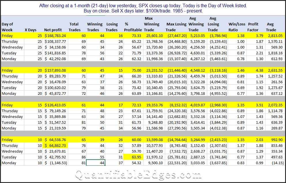
Fridays are interesting in that they are the least likely day of the week for a selloff to end or a rally to begin. But when rallies do start on a Friday, they have shown the best odds of success of any day of the week. I’ve seen this a number of ways over the years. The study below describes the current market setup. It looks at times the market closed up the day after closing at a 21-day low. Results are broken down by day of the week, and also by holding period.
Looking out 10,15,20, and 25 days, Friday has the best stats of any day. And in some cases, like 15 and 20 days out, none of the other days are even close. So if you are looking for an encouraging intermediate-term sign based on Friday’s action, this appears to be one.
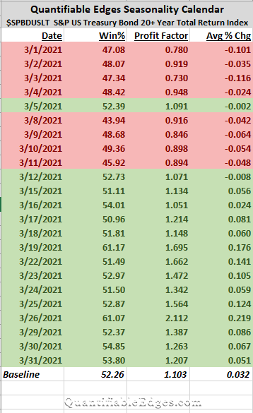
For the next several months, I have decided I will share one of the Quantifiable Edges Seasonality Calendars for the upcoming month. This month the calendar that caught my eye was the US Treasury 20+ Yr Total Return Index. This index is very similar to TLT. It is one of 10 seasonality calendars that we publish at Quantifiable Edges.
Treasuries have been in a big swoon over the last month. TLT closed down 5.7% on a total return basis in February, leaving it down 9.2% so far in 2021. That is a rough start to the year for TLT.
The Quantifiable Edges Seasonality Calendar uses multiple systems to measure historical performance on similar days to those on the upcoming calendar. The systems look at filters like time of week, month, year and so forth. Over the long run, staying out of the market on days that do not appear in green, would have been beneficial. To appear in green the date needs to show a historical Win% of 50% or more and a profit factor of 1.0 or more.
So Treasuries look like they will face a seasonal headwind for much of the first two weeks of March. After that, they may have seasonality on their side. Whether seasonality will matter much in a market that is so overdone right now will be interesting to monitor over the next month. But it is an input that has mattered over the long haul, and traders may want to consider it when forming their trading plan.