SPX Golden Crosses Since 1928
SPX will post a Golden Cross on Thursday afternoon. A Golden Cross occurs when the 50ma crosses over the 200ma. Having the 50ma above the 200ma is commonly considered a bullish market condition – and generally it is. In the 7/9/20 blog post I looked at SPX Golden Crosses dating all the way back to 12/31/1928. I have updated that research tonight with Amibroker Software and Norgate Data. Below is a list of all Golden Crosses since then. (Note that prior to 1957, S&P 90 data was used. The S&P 90 is considered the predecessor to the S&P 500.)
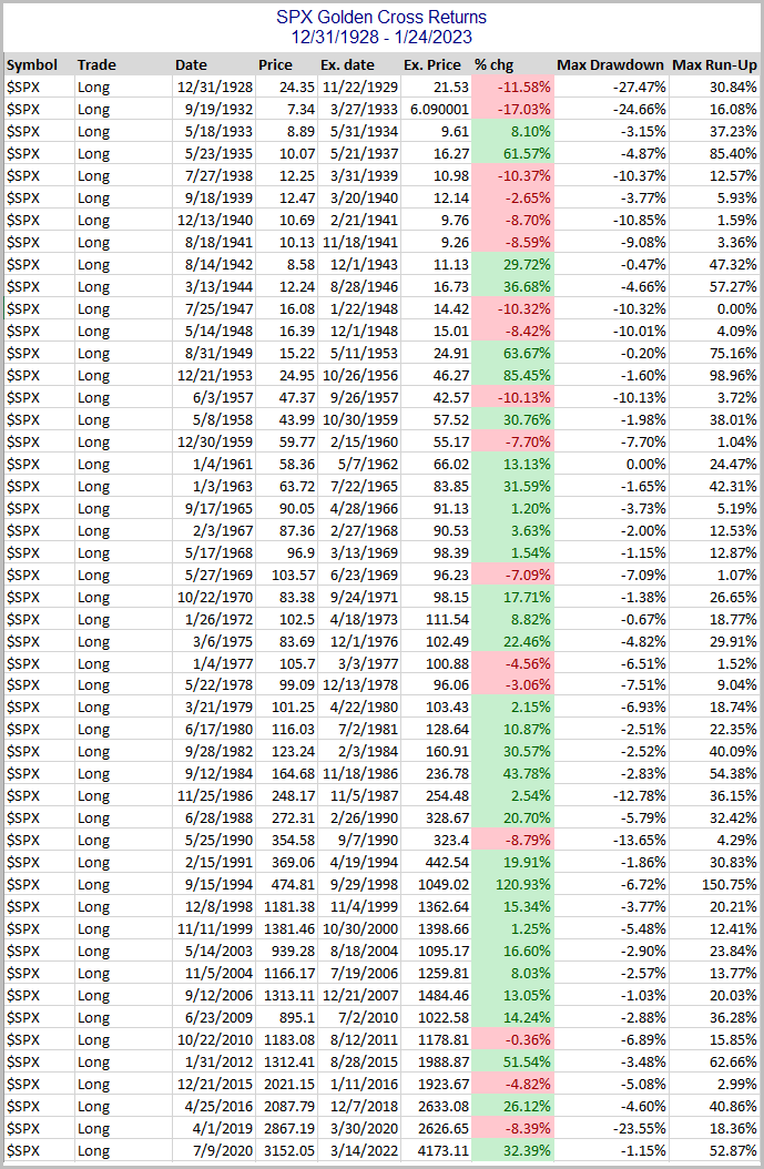
Since the 1961 trigger, the Golden Cross has generally served as a fairly good timing device to sidestep large portions of bear markets. Prior to that it was not nearly as effective. This can be seen in the drawdown chart below. (Note: Overnight Fed Funds rate was used to calculate nightly interest starting in July 1954, which is as far back as my data goes. Prior to that, no interest rate was assumed when out of the market.)
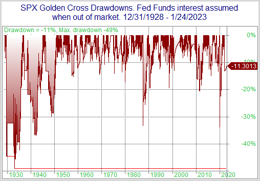
While drawdowns have been mostly fairly moderate since the mid-50s, prior to that there were some very large drawdowns to endure. The 2020 drawdown was the biggest since the 40s. Despite some fairly sizable drawdowns, the Golden Cross would have beaten “Buy and Hold” handily. Over the time period measured, the SPX had a compound annual growth rate (CAGR) of 5.57%. Simply incorporating a Golden Cross filter would have raised the CAGR to 7.25%. It is a bullish long-term trend indication. But it is not a bulletproof long signal.
Want research like this delivered directly to your inbox on a timely basis? Sign up for the Quantifiable Edges Email List.
How about a free trial to the Quantifiable Edges Gold subscription?