Black Friday Returns to Quantifiable Edges…HUGE savings on Gold Subscriptions and all 3 courses are at their lowest prices ever!
We have decided to bring Black Friday back to Quantifiable Edges this year. We rarely have special sales at Quantifiable Edges, and have not had any since last year, so if you have been thinking about a Gold subscription, or the Swing Trading Course, or the acclaimed VIX Trading Course, or our Market Timing Course, now is the best opportunity you’ll see for a long time. Check out our best offers below to start trading with a Quantifiable Edge!
Quantifiable Edges Gold Annual (with access to the Market Timing Course and Amibroker Code for the Quantifiable Edges Numbered Systems) – $875 for the next 13 months! That is $755 savings versus a monthly subscription and separate Market Timing Course and Amibroker code purchases! After the initial 13-month period, subscription will renew at the annual rate of $1000.
Quantifiable Edges Swing Trading Course – $351 off. Down from $950 to $599! Created in 2019, this is a sizable discount for our highly rated course that teaches a quantified approach to swing trading.
Quantifiable Edges 2023 Expanded Market Timing Course – $36 off. Down from $125 to $89! Originally released in 2014, our most popular course was updated last year! In the 10 years since the original release, all 3 of the combination models handily outperformed the S&P 500, with lower drawdowns. And the 2023 version incorporates our Fed Liquidity indicator with new combinations and RealTest and Amibroker code as well!
The Quantifiable Edges Black Friday sale won’t last long, and it won’t be back for another year. To take advantage, simply use the link below now to sign up.
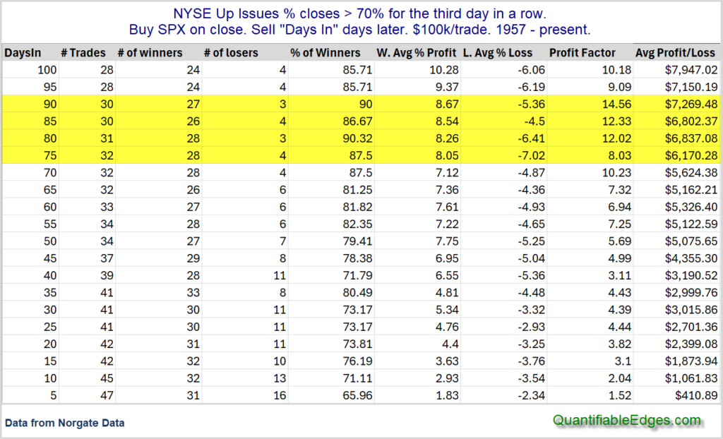
The strong breadth readings over the last few days triggered one of my oldest and most favorite studies. It looks at other times that breadth came in strong for 3 days in a row. I have shown this study many times over the years. I often refer to it as a Triple-70 Thrust, because it requires the NYSE Up Issues % to close at 70% or greater for 3 days in a row. Stats are updated.
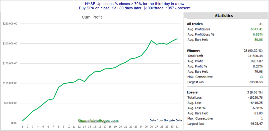
There are a lot of positive numbers and the edge generally appears to be to the upside. Results between 70 and 90 days appear especially strong and consistent. Below is the profit curve and stats assuming an 80-day holding period.
The curve and stats remain encouraging. The broad rally we have seen over the last few days appears to be a positive breadth thrust for the intermediate-term.
On Tuesday October 15th I will provide followers with a webinar on “My 5 Favorite Methods for Beating the Indices”. I will discuss long and short-term approaches designed to reduce drawdowns and enhance long-term returns.
This special free webinar will be held on Tuesday, October 15th at 12:30pm Eastern US. Registration details can be found below. All registrants will receive a link to a recorded copy of the presentation.
Date and time: 10/15/24 at 12:30pm (Eastern Time) Duration: 45 minutes + Q&A Description: The webinar will discuss 5 approaches that can be used with the objective of long-term index outperformance. Registration Link: https://quantifiableedges.com/subscribers/signup/BeatTheIndex
The webinar will be recorded and all who sign up will receive a link to the recording.
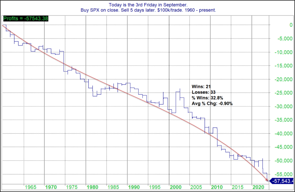
I believe the 1st time I posted a blog on the “Weakest Week” was 2011. Historically, the week after options expiration has been the most bearish of the year. Since 2011, the downside edge has certainly persisted. Below is a look at SPX performance during this week dating all the way back to 1960.
You’ll note the average return this particular week has been -0.9% since 1960. The downward persistency of the curve shows that the bearish tendency has been quite consistent over the last 64 years. There was a stretch in the late 80’s where there was a series of mild up years. Since 1990 it has been pretty much all downhill. Traders may want to keep this in mind this week.
About a month ago, I hit a major milestone with Quantifiable Edges. I passed Cal Ripken. For those that don’t know, Cal Ripken was a Hall-of-Fame shortstop (and also a 3rd baseman) with the Baltimore Orioles from 1981-2001. He holds the record for consecutive games played (2,632). His streak lasted over 16 years – from May 30, 1982 – September 19, 1998.
Quantifiable Edges subscriber letter was 1st published on February 18, 2008. I made sure to write a letter for every market day that year. At the end of the year, I told subscribers that I would likely take a few days off next year. But I didn’t. At the end of 2009 I said the same thing. Again I ended up writing a letter for every day the NYSE was open. Now it has been about 16 ½ years. And in mid-June my streak officially went beyond the 16 years and 4 months that Cal Ripken recorded.
There has been plenty that has happened on a personal level over the last 16 ½ years, both good and bad. But through it all, I have run my studies, done some research, and posted a letter every single night. They haven’t all been good letters. Some were admittedly abbreviated, such as when I had the flu or when I was laid up with COVID. And some were dead wrong with my market interpretation. But they were published and distributed, and not a day was missed.
Like Ripken, I intend to step down from my streak at some point. I can’t do it forever. Right now I am leaning towards changing to an abbreviated version of the letter twice a week (Monday and Wednesday nights? Or a couple of nights when the market hasn’t done much?). I will likely start incorporating this new twice-a-week abbreviated format in 2025. And I may fiddle around with abbreviated formats some this year when I take vacation. (Yes, I have written every night on vacations as well.)
So I may slow down at some point, but it has been a great run, and I fully intend to keep it going a good while longer. Thanks to all my subscribers, who have helped keep me motivated for the last 16 ½ years! And thanks to Cal Ripken who kept me motivated the last couple of years as I realized I was approaching the length of time his streak lasted!
We’re excited to unveil the RealTest module for the Quantifiable Edges VIX Trading Course! To celebrate, we’re offering an exclusive discount: get $200 off the course, and enjoy a whopping 90% off the RealTest module, available only through July 15th!
Initially released in late 2022, our VIX Trading Course has been a favorite among traders, providing comprehensive studies, and models that can be tested and customized with your own ideas. All students receive detailed Excel spreadsheets, making all the information and strategies accessible even without advanced software or programming skills. However, for those using Amibroker or RealTest, the course also offers the ability to explore and adapt the studies and models with these powerful tools.
Whether you’re new to VIX-based trading or a seasoned pro, the Quantifiable Edges VIX Trading Course offers unparalleled insights and strategies. Take advantage of this limited-time sale and elevate your trading game. Already enrolled? Upgrade with the RealTest code now!
Since the late 80s there has been a tendency for the market to rally on the first day of the month. One theory on why this occurs is that there are often 401k inflows that are put to work on the 1st of the month. I examined this tendency and broke it down by month here on the blog a few times over the years. I decided to update the study again today.
As you can see, July has both the highest Win % and the largest Avg Trade. So maybe some of that July magic will help the bulls on Monday. I’ll also note that August has had the worst Day-1 performance of any month. Below is a more detailed look at how July has played out.
Impressive stats and curve. And the last 13 instances have all been winners. Traders may want to keep this in mind.
I had the pleasure of joining Andrew Swanscott on the Better System Trader podcast on Wednesday afternoon. We had a detailed discussion about VIX trading and my recent whitepaper that won the NAAIM Founders Award. It had been a long time since I was last on Andrew’s podcast, but he is always a fun person to speak with! I hope you enjoy it.
You can also find it on your favorite podcast channels. If you haven’t listened to Better System Trader before, be sure to check it out. Andrew is a great interviewer and has a long list of interesting guests.
Starting on Tuesday, May 28th the trade settlement process is moving from 2 days to 1 day. This may not sound like a big deal. And if you trade primarily long-term strategies, or only with a margin account, then it isn’t. But for people that would like to incorporate short-term models into their IRA, this is of massive importance.
To demonstrate why, consider a simple model that trades 2 instruments: SPY and SHV. Most brokers will allow you to sell a security and then buy a new security with the cash in an IRA these days. But you can’t flip flop multiple days in a row, because you can not sell a security that you bought with unsettled cash and re-use the unsettled cash before the original trade settles.
Example with current 2-day settlement process:
Day 1: Holding 100% SPY
Day 2: Sell 100% SPY and buy 100% SHV (allowed)
Day 3: Sell 100% SHV and buy 100% SPY (This is not allowed because SPY sale from Day 2 will not settle until Day 4. So you cannot sell SHV and buy back SPY here with a 2-day settlement cycle.)
To make it worse, with all brokers I know, the buys and sells would actually go through, but the account holder would be hit with a violation notice. If this occurs 3 times in a year, then most brokers will halt all trading in the account for an extended period. Others will take away the ability to trade anything on unsettled cash.
If you are trading in a portfolio with lots of securities and frequent ins and outs, tracking what you are allowed to trade and what you aren’t gets even more complicated.
On May 28th with the movement to a 1-day settlement process (T+1), this potential problem goes away. As long as you are not making multiple buys and sells in and out on the same day, these “freeride” violations will not occur.
With my own trading, I utilize several models that are capable of flipping positions after 1 day. The current T+2 settlement has prohibited me from trading some of these models in retirement accounts. But with T+1 arriving, it opens up many new opportunities for IRA holders to take advantage of these short-term models.
It was an exciting week here at Quantifiable Edges as it was officially announced that Rob Hanna won the National Association of Active Investment Managers (NAAIM) Founders Award, which is its annual white paper competition.
The paper: Chicken & Egg: Should you use the VIX to time the SPX? Or use the SPX to time the VIX? challenges prevailing market wisdom by suggesting that S&P 500 Index (SPX) action offers a more reliable basis for forecasting the CBOE Volatility Index (VIX) movement than VIX action does in forecasting SPX movement.
If you find the information in the paper appealing and would like to explore VIX-based trading in more detail, you may want to consider checking out the Quantifiable Edges VIX Trading Course.
About the NAAIM FOUNDERS AWARD:
Launched in 2009, the NAAIM Founders Award (formerly known as the NAAIM Wagner Award) is designed to expand awareness of active investment management techniques and the results of active strategies through the solicitation and publication of research on active management.
The 2007-2008 bear market, following on the heels of the 2000-2002 decline, led many investors to question the wisdom of buy-and-hold investing.
NAAIM members have always believed active is better. This competition is designed to support this position through sound research and shine the spotlight on those individuals advancing this field of study. Since 2009 the call for papers resulted in an international response, with authors from New Zealand, Great Britain, Canada, Germany, and India as well as the U.S., submitting research demonstrating advancements in active investment management and it’s potential.
The competition is open to all investment practitioners, academic faculty and doctoral candidates who submit an innovative topic in the area of active investing. This can be either a documented and justified investing approach or an exploration into the validity of active investing. Active investing topics can involve making investment decisions using technical analysis, quantitative analysis, etc. Papers can also address related topics such as position sizing techniques, money management approaches, scaling into and out of trades, exit strategies, etc.
The National Association of Active Investment Managers (NAAIM) is a non-profit trade group of 125 member firms nationwide, collectively managing over $15 billion annually. NAAIM’s purpose is to promote the common interests of those investment advisors who provide active investment management services to clients. NAAIM’s many professional development opportunities are headlined by its annual conference – Uncommon Knowledge – which is held each spring in locations around the U.S. Other events are held several times a year on timely topics for our members, as are teleconference and webinar events. For more information, visit www.naaim.org
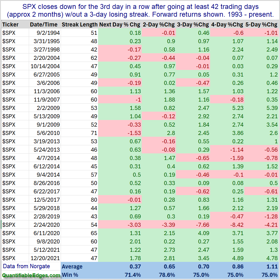
Friday on X (Twitter) I noted that the 3-day pullback for SPX would be the 1st one since early January. SPX had gone 48 days since the last time it had a 3-day pullback. I looked back at other times SPX went at least 2 months without a 3-day pullback, and examined performance after it finally arrived. This can be seen in the table below.
Results over the next 1-5 days are compelling, and suggest a strong bullish tendency. Traders may want to keep this in mind when setting their short-term market bias.
I was honored to be interviewed by Brian McAboy last week on the Consistent Profits Podcast. You can find it using the link below. It is also available on all the typical podcast platforms.
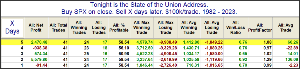
Joe Biden will be giving his State of the Union Address tonight, and people are wondering how his talk might impact the market over the next several days. I have looked at performance following State of the Union before and decided to update that research today. The data table below looks back to 1982. There were a few instances, such as 2001 and 2009 where the speech was not an official “State of the Union”, but was delivered under a different name. I have included those speeches in the results as well.
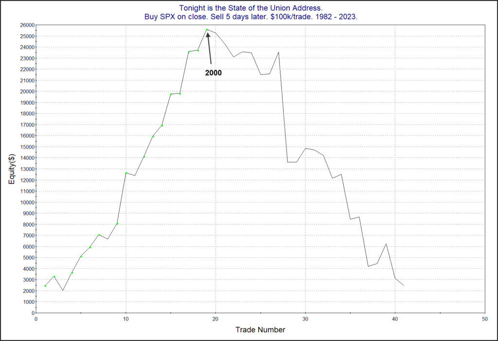
The stats do not suggest much of an edge. But the profit curves seem to tell a more interesting story. Here is the 5-day curve.
All the curves look something like this in that since the turn of the century (Bill Clinton’s last year) the market has tumbled after these speeches rather than been inspired by them. I guess they just don’t give speeches like they used to.
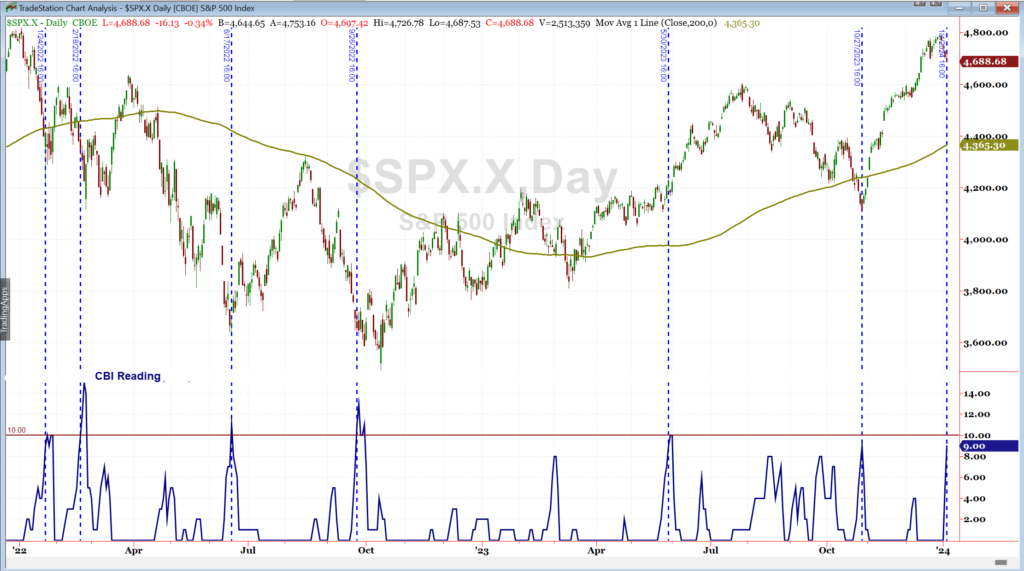
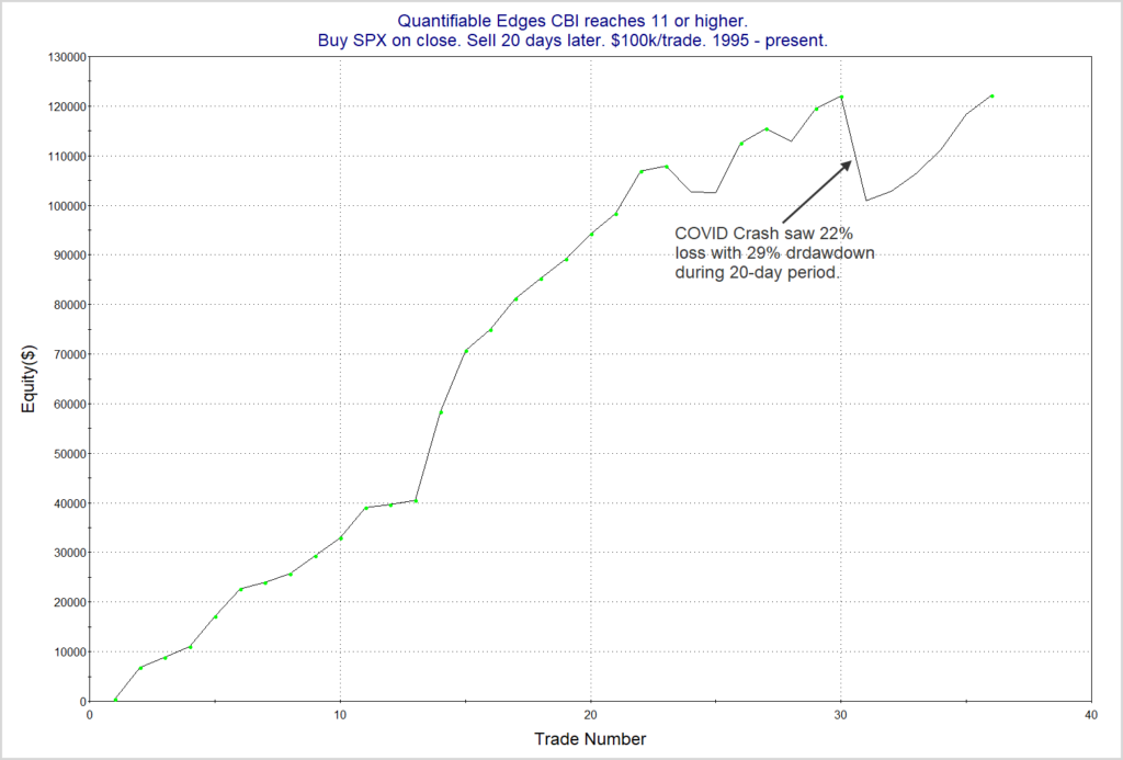
Especially notable about Friday’s action was that the Quantifiable Edges Capitulative Breadth Indicator (CBI) rose to 11. This is the highest level it has been at since September of 2022. Below is a quick look at CBI readings over the last 2 years. I have shown dotted lines each time that it reached as high as 9.
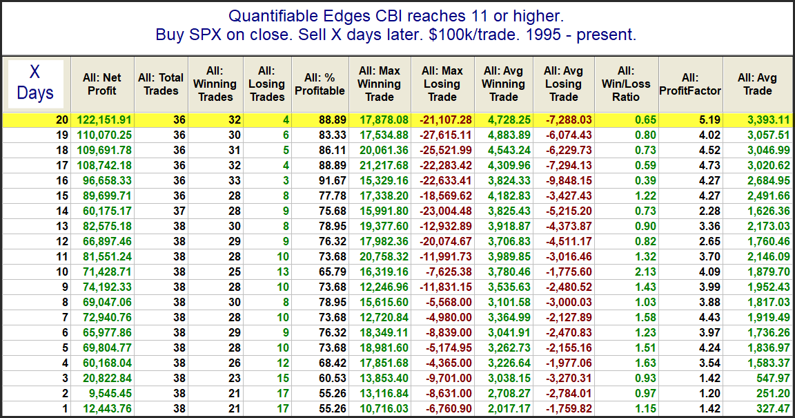
I have generally viewed 10+ as strongly bullish over the years. I have also shown in the past that readings of 11 or higher have been a bullish intermediate-term indication. This can be seen in the study below.
Looking out over the next several weeks, the stats are (almost) all very impressive. The one exception is the Max Losing Trade. That was thanks to the COVID Crash in March of 2020. Below is a profit curve using the 20-day exit strategy.
Even with the COVID Crash included, this study has made it back to new highs. Overall, I view the CBI spike over the last few days to be a favorable indication for both the short and intermediate-term.
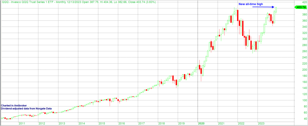
QQQ, on a dividend-adjust basis, is now up over 52% on the year and just made new highs. This can be seen in the monthly chart below.
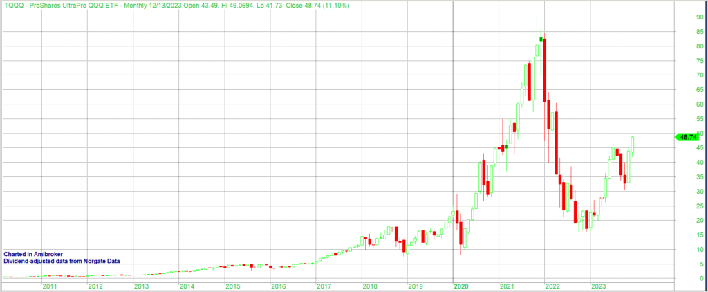
Meanwhile, TQQQ, which is the 3x version of QQQ, is up over 185% ytd (through 12/13/23). That’s a huge run, and on the surface it would seem to be an enticing long-term holding. But here is the TQQQ chart.
As you can see, TQQQ is still nearly 46% below its all-time (dividend-adjusted) high of $90.08. To get back to a new high, it is going to need to make another 85%. That is some severe underperformance vs QQQ over the last 2 years.
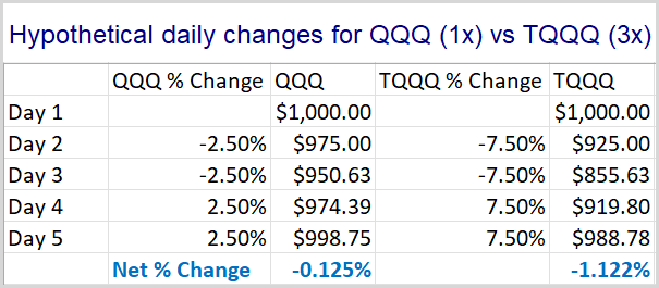
So what gives? It is mostly just a math issue. Leveraged ETFs like TQQQ utilize leverage on a daily basis. TQQQ is a 3x leveraged ETF. So a 2.5% up day for QQQ would be about a 7.5% up day for TQQQ. And a 2.5% down day for QQQ would be about a 7.5% down day for TQQQ. When the market gets volatile and choppy the swings back and forth will hurt TQQQ more than QQQ.
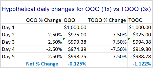
Let’s look at a simple example. QQQ goes down 2.5% for 2 days in a row, and then bounces back 2.5% for 2 days in a row. These are fairly large 1-day moves, but it demonstrates the point nicely. Below is a table showing daily changes for each and the value of the holding over the period.
Keep in mind that smaller drawdowns are easier to overcome than large ones. A 10% drawdown would bring an account from $1000 to $900. To get back from $900 to $1000, you would need to make $100 from the account that is now only worth $900. This would require an 11.1% gain on the $900. As the drawdowns get larger, you end up needing much larger % gains just to recover to the original $1000. A 50% drawdown would take a $1000 account down to $500. To get back to $1000, that account would now need to make 100%! A 90% drawdown would turn a $1000 account into a $100 account. To get back to $1000, you’d need to make 900%!!
So in the table above we see that QQQ has a drawdown that is substantially less extreme than TQQQ. Therefore, it requires much less work to get back near breakeven. At the end of the 4-day move, QQQ is down just 0.125%. But TQQQ is down nearly 1% more than that, with a 1.122% decline. And these are not huge moves, and it is not a long period of time. Larger moves and longer time periods really exacerbate the situation.
Now you may be thinking, “Yeah, but you put the two worst days first. That makes it even harder to recover. So the difference is exaggerated.” No – it isn’t. In fact, it does not matter at all what order I put the days in. The results will be the same. The spreadsheet below shows the same daily returns, except in this case, they alternate down-up-down-up.
The end result is exactly the same. You can run it in different orders yourself if you don’t believe me. The end result will remain the same. And the bigger the daily moves, the more negative the impact.
So when QQQ suffered a 37% drawdown from it November 2021 high, TQQQ was hit with a drawdown of over 82%. To get back to even from there, TQQQ would need to make back over 450%! And as we saw in the chart above, it is not even close.
You might not yet be convinced of the danger of TQQQ. After all, that long-term chart is still showing massive gains over the last 13 years or so. In fact, TQQQ opened on 2/11/2010 with a dividend and split adjusted price of $0.423931. It currently has return of 11,397% since inception. That blows away the 951% return of QQQ over the same period.
But perhaps TQQQ’s inception date was just exceptionally good timing. What would happen if TQQQ started on the same day as QQQ?
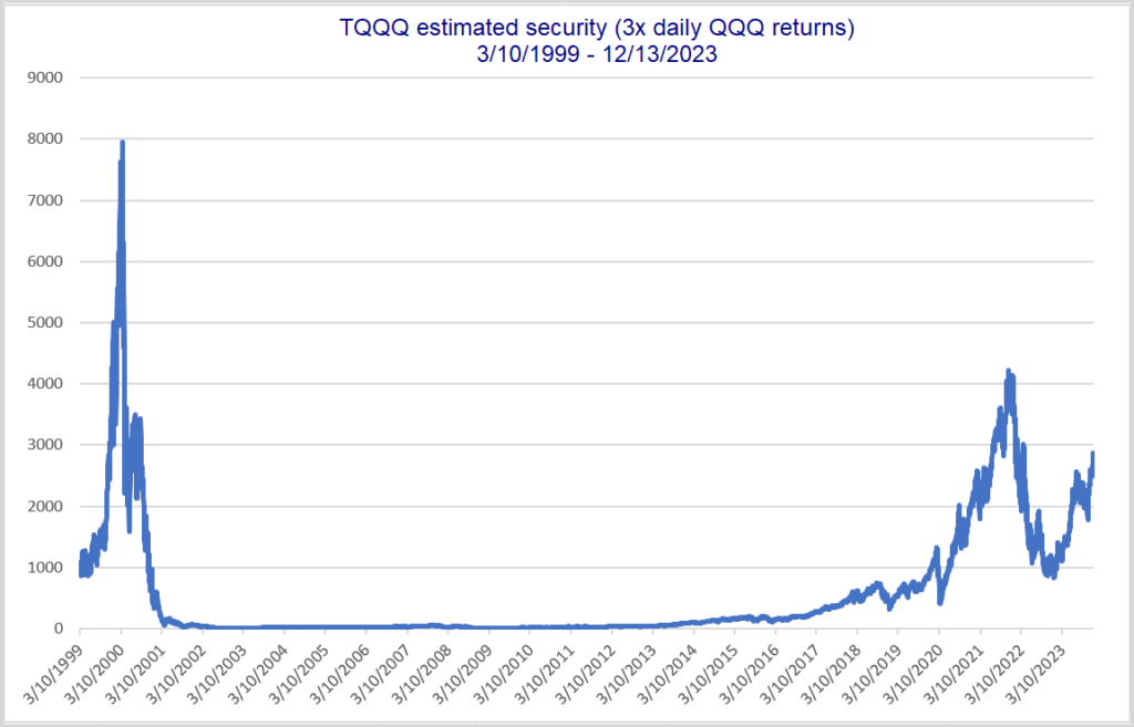
To answer this I created a TQQQ substitute security (TQQQx) with data going back to QQQ inception (3/10/99). I did 3x returns each day. Below is a hypothetical price chart for TQQQx:
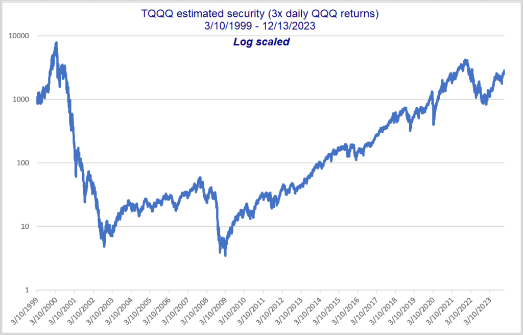
Current price of $2862 means it is still in a 64% drawdown. This estimated TQQQ would need to see a rally of 178% to get back to its high from 2000. Here is a log scale version.
You can see here more easily that the price went from a high of $7961 to a low of $3.47, which is a 99.96% decline. Anyone holding would basically have been completely wiped out – especially if they needed to make withdrawals.
Lastly, I will note that my calculation is overly generous because there are no management fees. If I plug in the split-adjusted TQQQ price of $0.423931 as the 2/11/2010 price in my spreadsheet, it shows a current value of $81.40, instead of the actual TQQQ price of $48.74. In other words, my numbers are too optimistic, and the reality would have been even worse than I show.
Over time I have encountered multiple people that made a fortune over the last 10-13 years by simply holding onto a sizable TQQQ position. But as we see above, leverage can make fortunes, and it can also destroy them. The 2000-2009 decade provides a great example of destruction. Leveraged ETFs should be used with great caution. There’s no telling what the next 10 years will look like. But there is a strong chance it won’t be as friendly as the last. If you utilize leveraged ETFs, an exit plan needs to exist. You don’t want to ride out an 82% drawdown at any age…and you especially don’t want a 99.6% drawdown! Buy(and hold)er beware.