Last week I did a presentation on VIX-based Trading Edges to Ali Pashaei’s group of traders. Ali has been kind enough to post a recording of the presentation and discussion to his website in an area that is free for the public. A link is below:
You may recall Ali from an interview I did with him about a year ago. He runs the Options In Practice website. That interview can still be found here, and contains lots of interesting ideas. So if you have some time later today or this weekend, check out my presentation to Ali’s group from last week. And if you missed it a while back, watch or listen to my old interview of Ali as well!
While the market is closed on Friday for Good Friday, the BLS will be releasing the employment report. This is only the 13th time since 1980 that this has happened. Below is a list of all previous instances along with their performance on Monday when the market was then back open.
Six instances closed down and six closed up on Monday, so on the surface this study does not seem to provide useful information. But what is notable to me is that 8 of the 12 instances saw the market close either up or down by more than 0.75%. (Those are all circled in blue.) That shows the Monday reaction has often been volatile, and suggests risk may be elevated a bit because of this.
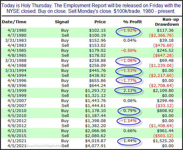
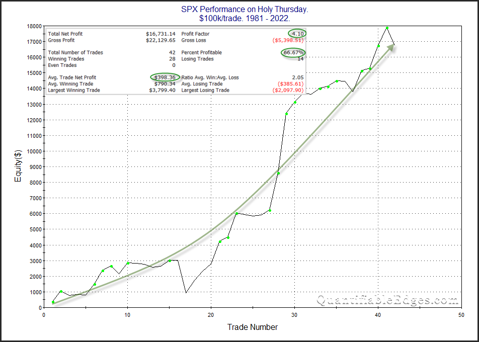
Stock market performance leading up to and around many holidays has often shown an edge. Holy Thursday is one day that has done quite well. I have shown Holy Thursday stats several times in the past. The chart and statistics below are all updated through last year.
Despite closing lower last year, the stats and the curve are impressive, and suggest a bullish seasonal tendency. Traders may want to keep this in mind when setting their bias for Thursday.
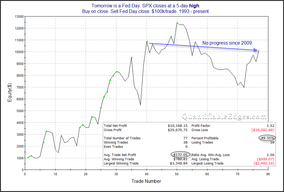
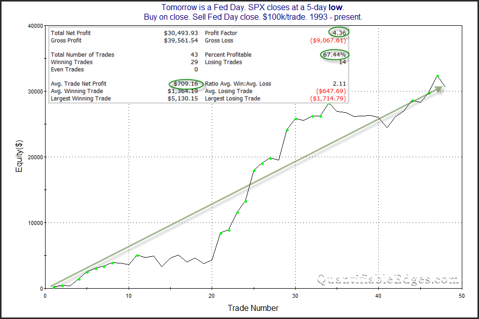
While the Fed decision will certainly play a part in how the market performs on Wednesday, another factor that has historically played into Fed Day odds is simply how the market performed leading up to that decision. A rally into a decision has often lead to disappointment (or “sell the news”). A selloff into a decision often indicated the market is preparing for the worst, and you’d see a relief rally. This is demonstrated in the studies below. They show SPX Fed Day performance when SPX closed at a 5-day high vs a 5-day low the day before. With SPX now in the middle of its 3-day range, we could easily end up at either of these extremes on Tuesday.
Clearly a 5-day low sets up for better Fed Day odds. It will be interesting to see how the market acts over the next two days heading into the Fed decision.
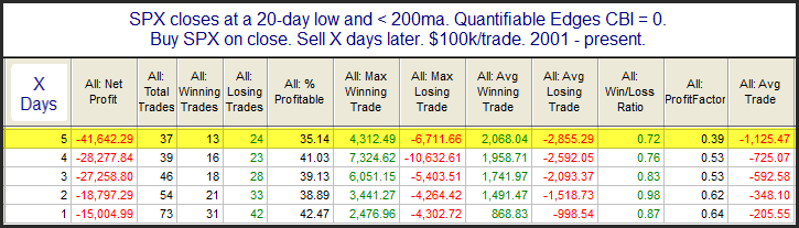
Concerning about the current selloff is the fact that the Quantifiable Edges Capitualtive Breadth Indicator (CBI) remains at zero. Most subscribers understand that spikes in the CBI can often be a strong indication that a bounce is near. But a low CBI can also be a useful indication. The study below looks at other times SPX closed at a 20-day low and below the 200ma and the CBI posted a zero reading.
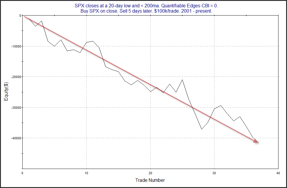
The lack of capitualtive selling seems to suggest there could be more selling to come before a bounce occurs. Below is a look at a profit curve assuming a 5-day holding period.
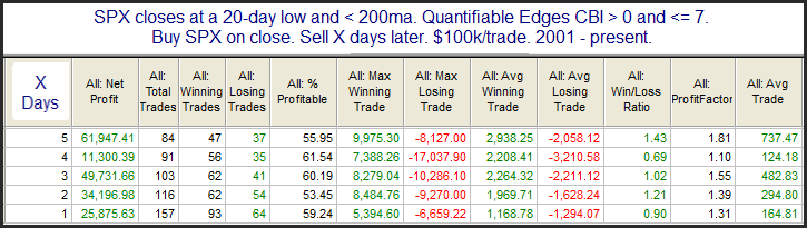
That is a strong & steady decline. To see how this contrasts with times the CBI closed above zero, I ran a couple of other tests. This next one requires readings of between 1-7.
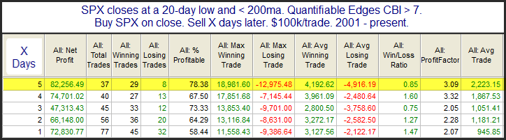
The red has turned to green in the Average Trade results. Instead of a downside edge, it appears there is a moderate upside edge. Of course the largest edges tend to occur when the CBI is giving high readings. The last study below looks at the same setup, but with a CBI over 7.
These results are strongly bullish. But this is not the current situation. The CBI of zero has us facing the first CBI study above, and that suggests more selling in the next week.
Of course the employment report that will come out before the open could trigger a large reaction either way. And we will also be faced with CPI numbers coming Tuesday. In other words, there is strong potential for large swings in either direction. This market has plenty of risk and I do not see a compelling indication that a bounce is highly probable at this point.
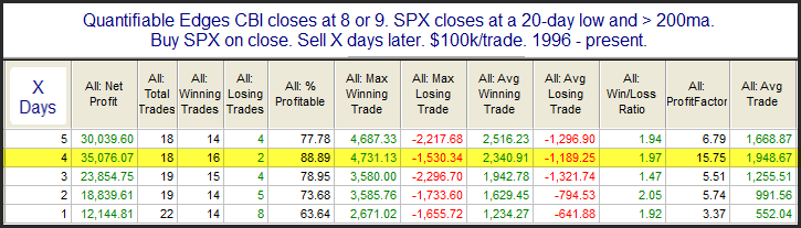
Wednesday on Twitter I noted that the Quantifiable Edges Capitulative Breadth Indicator (CBI) has begun to perk up. It closed at 8 on Wednesday. I have historically viewed readings of 10+ as bullish. But even getting near that will often generate an upside edge. The study below is from last night’s subscriber letter. It looks at other times SPX closed at a 20-day low & above the 200ma, and the CBI read 8 or 9.
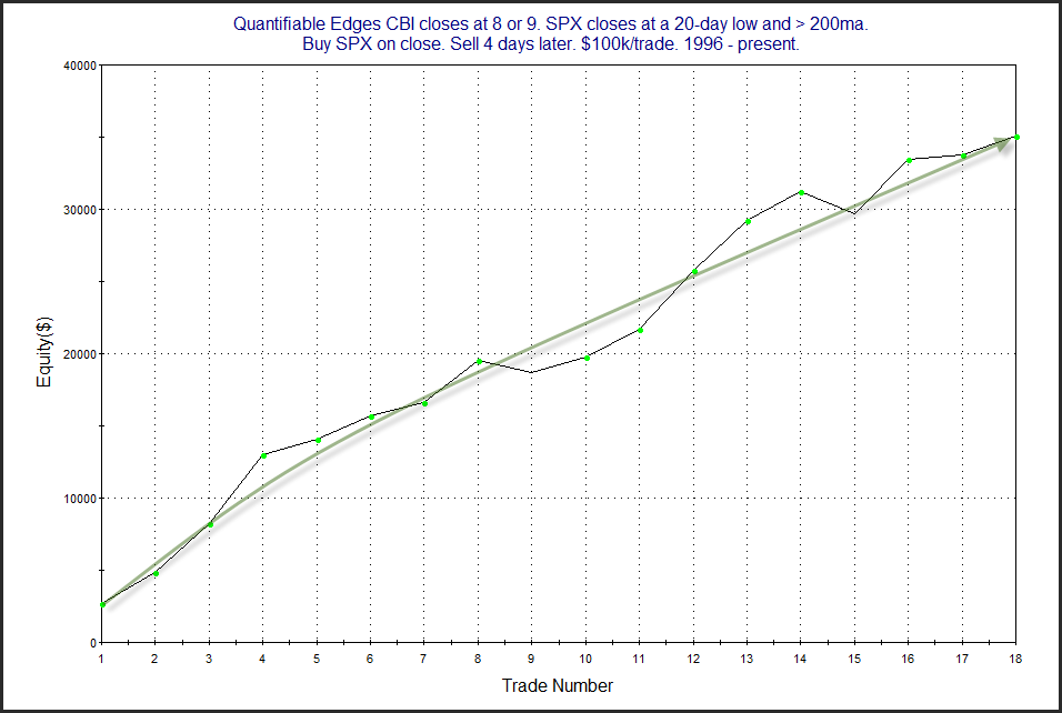
The stats appear solidly bullish. Below is a look at a profit curve that assumes a 4-day holding period.
That is a fairly straight shot from lower left to upper right. Falling a little short of a CBI reading of 10+ still seems to have led to very positive performance under similar circumstances. Traders may want to keep this in mind when setting their market bias.
I will also note that another down day on Thursday could see the CBI reach 10. That is not a magical level, but it has been a good indication over the years that a bounce is likely within a few days.
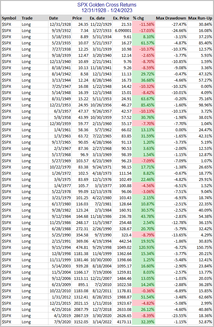
SPX will post a Golden Cross on Thursday afternoon. A Golden Cross occurs when the 50ma crosses over the 200ma. Having the 50ma above the 200ma is commonly considered a bullish market condition – and generally it is. In the 7/9/20 blog post I looked at SPX Golden Crosses dating all the way back to 12/31/1928. I have updated that research tonight with Amibroker Software and Norgate Data. Below is a list of all Golden Crosses since then. (Note that prior to 1957, S&P 90 data was used. The S&P 90 is considered the predecessor to the S&P 500.)
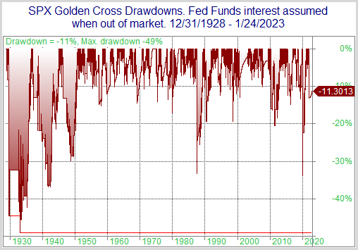
Since the 1961 trigger, the Golden Cross has generally served as a fairly good timing device to sidestep large portions of bear markets. Prior to that it was not nearly as effective. This can be seen in the drawdown chart below. (Note: Overnight Fed Funds rate was used to calculate nightly interest starting in July 1954, which is as far back as my data goes. Prior to that, no interest rate was assumed when out of the market.)
While drawdowns have been mostly fairly moderate since the mid-50s, prior to that there were some very large drawdowns to endure. The 2020 drawdown was the biggest since the 40s. Despite some fairly sizable drawdowns, the Golden Cross would have beaten “Buy and Hold” handily. Over the time period measured, the SPX had a compound annual growth rate (CAGR) of 5.57%. Simply incorporating a Golden Cross filter would have raised the CAGR to 7.25%. It is a bullish long-term trend indication. But it is not a bulletproof long signal.
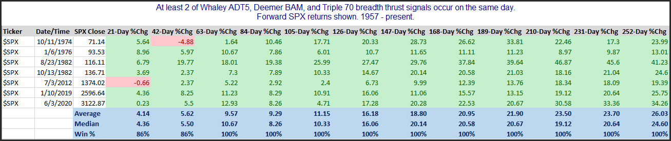
On Thursday afternoon I witnessed 3 different breadth thrust signals I watch all trigger on the same day. The signals, with link to learn more about them are:
Thursday was the 1st time ever that a Triple 70, a Deemer Breakaway Momentum (BAM), and a Whaley ADT5 thrust all happened on the same day. There have been 7 instances where 2 of the 3 triggered on the same day. They can all be found in the table below.
The signals on their own all have impressive track records, which you can see if you click through to the links. When 2 combine, it has been almost perfect 1-12 months out. All the recent breadth certainly seems to be a positive.
I am pleased to announce I intend to kick off 2023 with a new webinar for followers, “Using Elevated Interest Rates and Volatility for your Benefit”.
On Friday 1/13 at Noon EST, and then again Tuesday the 17th at 4:30pm I will be hosting a special free webinar where I will discuss an approach to utilizing current elevated interest rates in conjunction with VIX option models as a compelling strategy. Details can be found below.
Date and time: 1/13/23 at Noon (Eastern Time) & again 1/17/2023 – 4:30pm (Eastern Time)
If you would like a link to the recording of the webinar, simply register here. Recordings will be sent out Tuesday night.
Duration: 30-40 minutes + Q&A
Description: The webinar will cover the following topics:
The Lure of Treasuries
Why Treasuries & Certain VIX Options Strategies Complement Each Other so Well
A Couple Examples of Models Rob uses at Capital Advisors 360
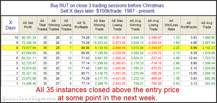
I’ve posted and updated the “Twas 3 Nights Before Christmas” study on the blog here several times since 2008. The study will kick in at the close today (12/21). This year I will show the Russell 2000 version of the study. While all the major indices have performed well during this period, the Russell has been among the most consistent.
The stats in this table are strong across the board. An average year posted a gain of about 2.1% over the next 8 days. The note at the bottom shows the reliability of a bounce at some point has ben incredible. Traders may want to keep this study in mind over the next several days.
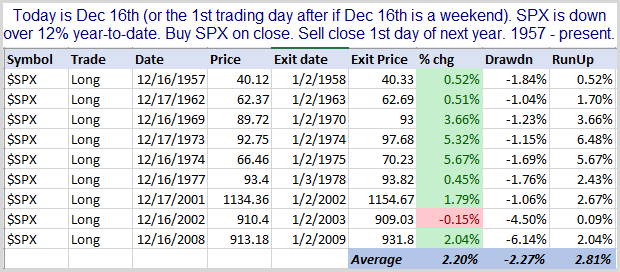
I’ve heard people saying recently that the typical 2nd half of December bullish tendency is unlikely to unfold this year. The theories suggest that the market is often up on the year. And people and institutions flush with profits tend to push it higher as the New Year approaches. There is also lots of buying chasing strong market returns heading into year end. But when it is a down year like now, players have losses, and less liquidity, and there is also tax-loss selling. All this creates selling pressure, so the bullish end-of-year turns bearish. I tested it. I looked at all other years since SPX inception in 1957 that SPX was down at least 12% (it is currently down 19%) on December 16th. If December 16th fell on a weekend, then it looked at the next trading day. The test bought on the 16th (or just after) and sold on the close of the 1st day of the New Year. Results below.
The theory sounded nice. I see no evidence that it is true. Eight of nine instances saw SPX move higher, and the lone loser only lost 0.15%. I see no reason to throw out seasonality studies this year just because the market is lower.
On Sunday 11/27 at 10:00am EST, and then again Monday at noon EST I will be hosting a special free webinar where I will preview some of the material and edges within the course and answer any questions you may have. Details can be found below.
Date and time: 11/27/2022 10am (Eastern Time) & again 11/28/2022 – 12:00 Noon – (Eastern Time)
We have decided to bring Black Friday back to Quantifiable Edges this year. We rarely have special sales at Quantifiable Edges, and have not had any since last year, so if you have been thinking about a subscription, or the Swing Trading Course, or the new VIX Trading Course, now is the best opportunity you’ll see for a long time. Check out our best offers below to start trading with a Quantifiable Edge!
Quantifiable Edges Gold Annual (with access to the Market Timing Course and Amibroker Code for the Quantifiable Edges Numbered System) –$875 for the next 13 months! That is $755 savings versus a monthly subscription and separate Market Timing Course and Amibroker code purchases! After the initial 13-month period, subscription will renew at the annual rate of $1000.
Quantifiable Edges Swing Trading Course –$300 off. Down from $950 to $650! Created in 2019, this is a sizable discount for our highly rated course that teaches a quantified approach to swing trading.
The Quantifiable Edges Black Friday sale won’t last long, and it won’t be back for another year. To take advantage, simply use the link below now to sign up.
Note: Later this week I will be having the annual “Black Friday” sale, which is the only sale I run during the year. If you think you might be interested in a subscription, then now might be a good time to take a free 1-week trial and see if Quantifiable Edges would be helpful for you. Also this week we expect to release the new Quantifiable Edges VIX Trading Course! More to come on that…
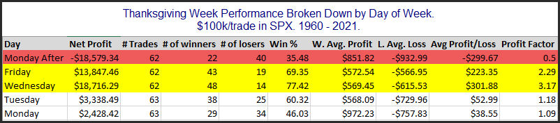
The time around Thanksgiving has shown some strong tendencies – both bullish and bearish. I have discussed them a number of times over the years. In the updated table below I show SPX performance results based on the day of the week around Thanksgiving. The bottom row is the Monday of Thanksgiving week. The top row is the Monday after Thanksgiving.
Monday and Tuesday of Thanksgiving week do not show a strong, consistent edge. But the data for both Wednesday and Friday looks quite strong. Wednesday has had the most consistent gains (77.4%), and the largest average p/l of 0.3% ($301.88 on $100k.) Friday’s stats look fairly impressive, but it has not performed nearly as well over the last dozen years as it had previously. Meanwhile, the Monday after Thanksgiving has given back a good chunk of the gains that were realized on Wednesday and Friday. The worst “Monday After” came in 2008 with a 9% 1-day decline. Since then, Monday After performance has been basically breakeven.
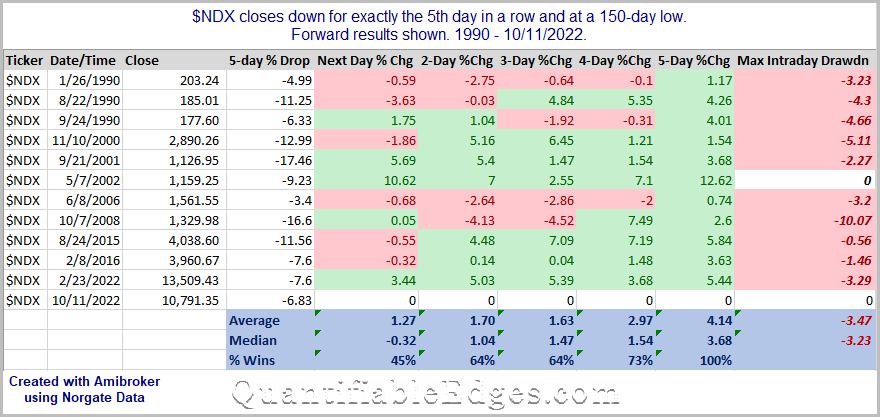
The two big up days to start last week have now been followed by 5 down days in a row. And the 5-day selloff has put the NDX at a new bear-market closing low. The study below looks at other times since 1990 that NDX closed down for the 5th consecutive day and at a 150-day low.
These results suggest an upside tendency. Five days later all 11 instances closed higher, with the average instance up 4.14% and the median up 3.68%. But it is also notable that the gains were not achieved without some short-term pain. The average drawdown of the 11 instances was nearly 3.5%.