Looking at 7-day Win Streaks

The recent rally has left the market short-term overbought by most measures. Short-term overbought often triggers some studies that suggest a downside edge, but when the overbought condition gets very strongly overbought, then those downside edges often disappear. And at some point, rather than strength leading to weakness, the strength will beget more strength. The strong move higher over the last several days has turned the market so overbought that we are seeing this scenario begin to unfold. The study below looks at the 7-day win streak in the Dow Jones Industrial average. It exemplifies this concept.

Performance after 7 up closes for DJI. Bullish.

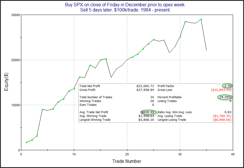
There is not much of an edge over the 1st few days. But once you get out a little further, the stats appear solidly bullish. Below is a look at the profit curve assuming a 19-day holding period.

7 up days. 19-day later profit curve

The strong move from lower left to upper right appears to offer some confirmation of the bullish tendency. In last night’s subscriber letter, I also looked at the same setup with SPX, since SPX has also posted 7 higher closes. Results were very  similar. Short-term momentum has been so strong recently that it appears likely to carry through some on an intermediate-term basis.

Want research like this delivered directly to your inbox on a timely basis? Sign up for the Quantifiable Edges Email List.

How about a free trial to the Quantifiable Edges Gold subscription?

SPX Golden Cross History Since 1928

SPX will post a Golden Cross on Thursday afternoon. A Golden Cross occurs when the 50ma crosses over the 200ma. Having the 50ma above the 200ma is commonly considered a bullish market condition – and generally it is. In the 4/2/19 blog post I looked at SPX Golden Crosses dating all the way back to 12/31/1928. I have updated that research tonight with Amibroker Software and Norgate Data. Below is a list of all Golden Crosses since then. (Note that prior to 1957, S&P 90 data was used. The S&P 90 is considered the predecessor to the S&P 500.)
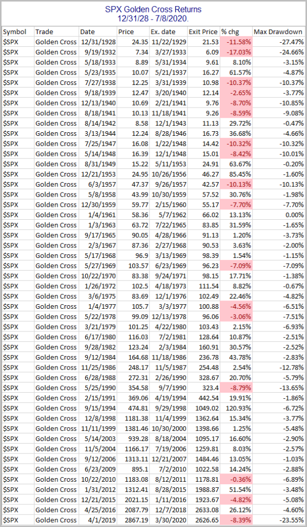
SPX Golden Cross results since 1928

The most recent Golden Cross formation got slammed by the March COVID crash. But since the 1961 trigger, the Golden Cross has generally served as a fairly good timing device to sidestep large portions of bear markets.  Prior to that it was not nearly as effective. This can be seen in the drawdown chart below.  (Note: Overnight Fed Funds rate was used to calculate nightly interest starting in July 1954, which is as far back as my data goes. Prior to that, no interest rate was assumed when out of the market.)
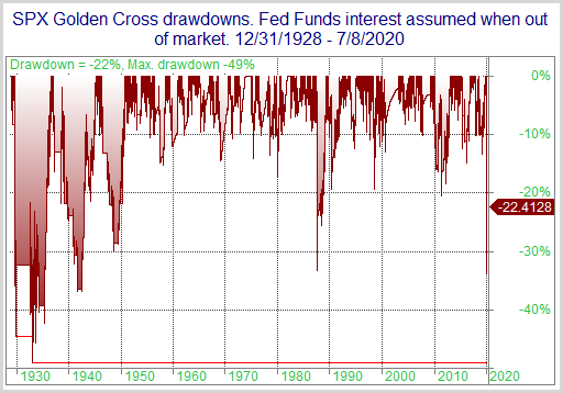
While drawdowns have been mostly fairly moderate since the mid-50s, prior to that there were some very large drawdown to endure. Of course, the 2020 drawdown is the biggest since 1940 – and we still have a good ways to go for the system to dig out of it.  Despite some fairly sizable drawdowns, the Golden Cross would have beaten “Buy and Hold” handily.  It is a bullish long-term trend indication.  But it is not a bulletproof long signal. 

Want research like this delivered directly to your inbox on a timely basis? Sign up for the Quantifiable Edges Email List.

How about a free trial to the Quantifiable Edges Gold subscription?

First Day of Month Based on Month

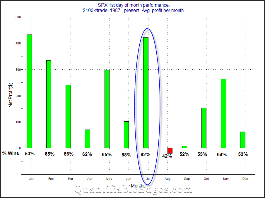
Since the late 80s there has been a tendency for the market to rally on the first day of the month.  One theory on why this occurs is that there are often 401k inflows that are put to work on the 1st of the month.   I examined this tendency and broke it down by month on the blog in 2013 and 2009.  I thought it would be interesting to take another look at it today.  Below is an updated version of the study.

SPX 1st day of month broken down by month

July has been the most reliable month in term of closing positive. And when looking at the size of the average gain, it comes in 2nd.  You also note that August is the worst on both counts.

Want research like this delivered directly to your inbox on a timely basis? Sign up for the Quantifiable Edges Email List.

How about a free trial to the Quantifiable Edges Gold subscription?
What Friday’s Action Suggests About Short-Term Volatility

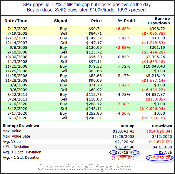
It was unusual on Friday to see such large opening gap (+2.54%) filled, and then SPY still managed to close positive. This can be seen in the study below, which I showed in the subscriber letter over the weekend.

SPY 2% Gaps Up that fill and then close positive.

Four instances closed higher, and 6 closed lower over the next 2 days. So there does not appear to be a strong directional bias. But the takeaway is that the volatility did not just disappear. At the bottom you’ll see I circled stats looking at avg “run-up + 1 standard deviation” and avg drawdown – 1 std deviation”. What those mean is that it would not be unusual to see the market rise as much as 6% or decline as much as 9% over the next couple of days. That is a huge spread for a 2-day time span. It speaks to the potential risk of being wrong.

Want research like this delivered directly to your inbox on a timely basis? Sign up for the Quantifiable Edges Email List.

How about a free trial to the Quantifiable Edges Gold subscription?
SPX Historically Bullish On Thursday After Memorial Day

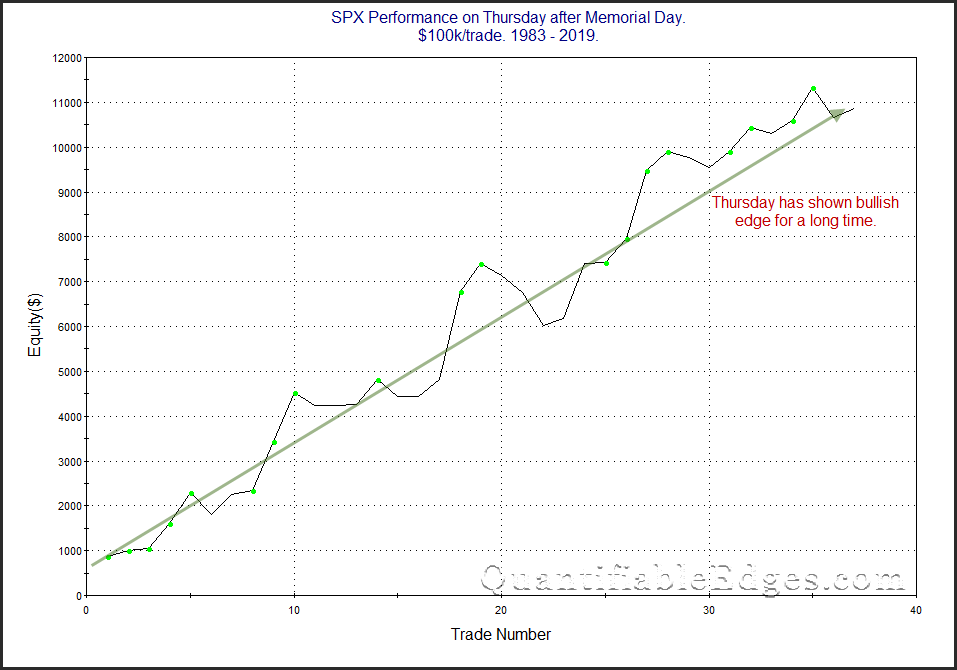
Thursday after Memorial Day has been a day that has exhibited a bullish bias for many years. I last showed this on the blog a couple of years ago. The chart below shows updated results.

SPX Perfromance on Thursday After Memorial Day

Single-day seasonality can certainly be overrun by other forces, but the Thursday after Memorial Day has been a good one for many years. That may be something that traders want to keep in mind for Thursday.

Want research like this delivered directly to your inbox on a timely basis? Sign up for the Quantifiable Edges Email List.

How about a free trial to the Quantifiable Edges Gold subscription?
A Big Gap Up That Wipes Out A Big Loss Yesterday

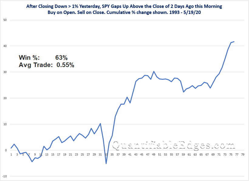
After closing down more than 1% yesterday, SPY is set to open up enough to erase all of yesterday’s losses. I decided to look back at other times this has happened.

SPY Big Gap Up Erases Yesterdays Loss - Open to Close Results

Not exactly a consistent edge, but I thought the general upside tendency might be worth noting for some intraday traders. Good luck trading today!


Want research like this delivered directly to your inbox on a timely basis? Sign up for the Quantifiable Edges Email List.

How about a free trial to the Quantifiable Edges Gold subscription?
Is this the pullback you’ve been waiting for?

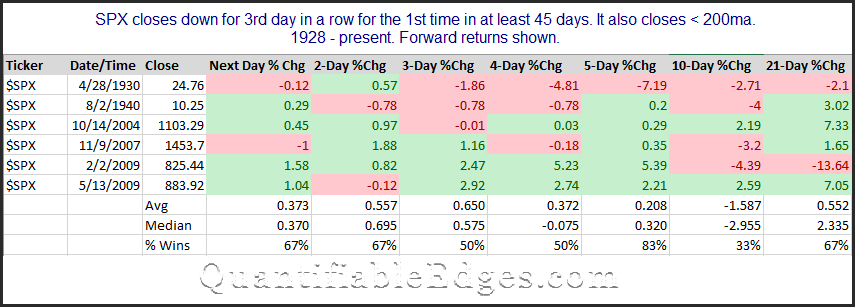
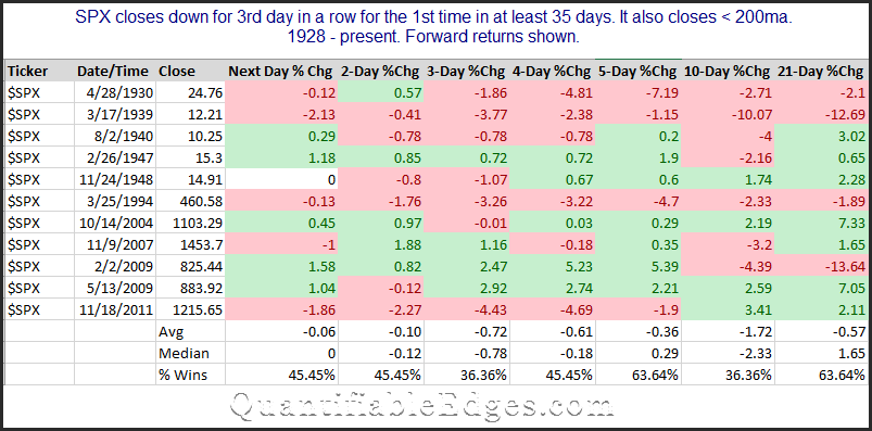
It has been 47 trading days since SPX posted its last 3-day pullback. That is a long time. And it is especially long considering SPX is still below its 200ma. Should SPX fail to rally out of this early hole this morning, we will finally see the 1st 3-day pullback since March 9th. Bulls could look at it and exclaim “Finally, the 3-day pullback I have been waiting for to load up!”. Bears might be saying “This signals a change in behavior. Watch out below!”. Quants say, “Let’s see how similar setups have done in the past.” That’s where I generally fall. So let’s check it out.

SPX 1st 3-day pullback in 45 days

Only 6 instances in the last 90+ years. Results mixed. Tough to get excited about these results. I also loosened the criteria to see what happened if we only required a 35-day streak.

SPX 1st 3-day pullback in 35 days

Still just 11 instances. Still not terribly exciting for either the bulls or the bears. So the study was a bit of a flop, but I thought the concept was interesting enough to share. I’ll be looking for other evidence to help formulate my bias.


Want research like this delivered directly to your inbox on a timely basis? Sign up for the Quantifiable Edges Email List.


Massive Unemployment and a Massive Market Rally

The employment report on Friday was (expectedly) horrifying. 14.7% of the work force is now unemployed. The most interesting chart I saw with regards to unemployment came from @adrewvandam (h/t @byheatherlong). It showed that this is the highest unemployment rate since the Great Depression. I have copied it below.

130 years unemployment data

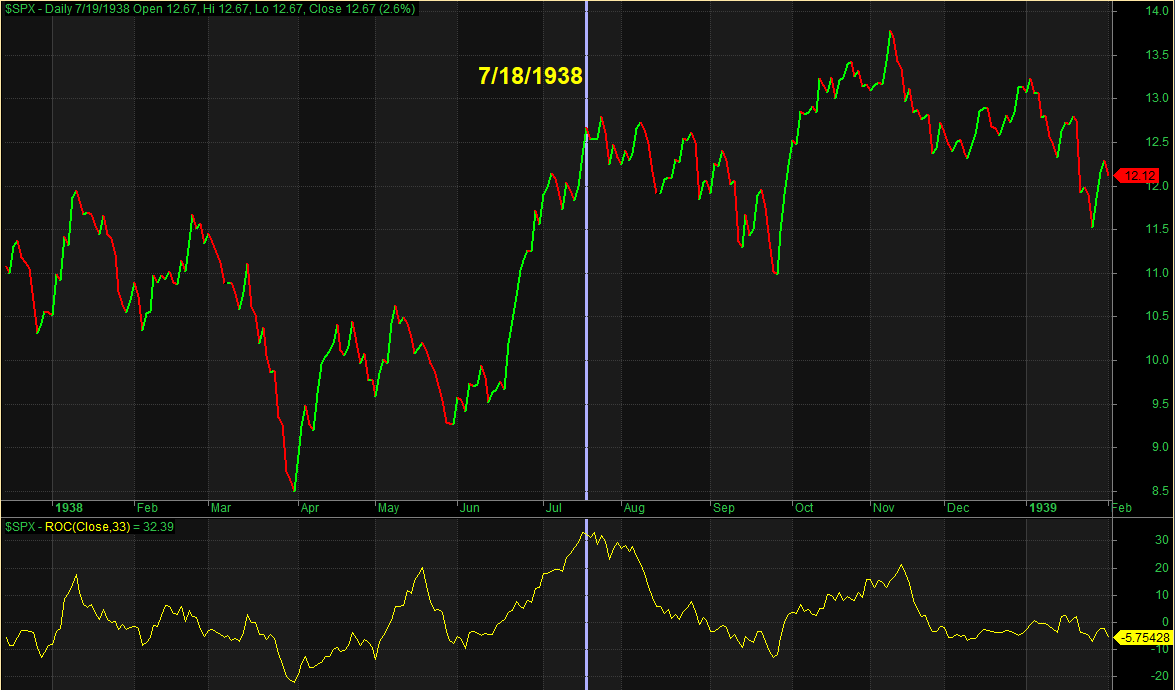
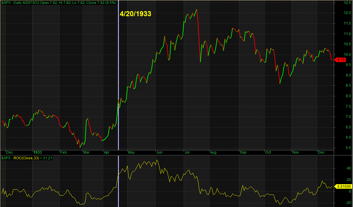
When looking at a chart like this it appears quite shocking. 14.7% unemployment can’t be good for the economy, and most people would think that the stock market would be struggling mightily in the face of such a number. But the SPX has now risen nearly 31% in the 33 trading days since the March 23rd bottom. Using S&P 90 data as a substitute for the S&P 500 pre-1954, I looked back to 1928 to identify other times the SPX has risen > 30% in 33 days. There have only been 3 other instances. All during the Great Depression. They were in 1938, 1933, and 1932. I have produced charts of those periods below. Let’s start with 1938.

1938 stock market rally

The vertical line is the date that the 33-day rate-of-change 1st exceeded 30% (7/18/1938). The 33-day rate of change can be seen on the bottom of the chart. This 33-day rally in 1938 was basically it for that move. It immediately began chopping lower for the next few months. Next let’s look at 1933.

1933 stock market rally

April 1933 was followed by significantly more rallying over the next few months before the next bear market emerged starting in July. Lastly, let’s look at 1932.

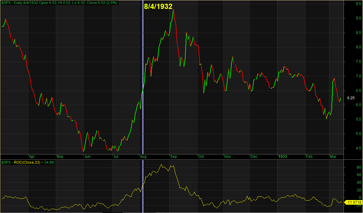
1932 stock market rally

As you can see, there was plenty more upside over the next month and a half before the index gave back most of the gains. Incredibly, the 33-day rate-of-change actually spiked up to over 80% at one point during August of 1932. Bottom line with the instances shown is that the market was wild and it seemed to remain wild for months to come. Now let’s recall the 1st chart I showed, with the unemployment data. Do you recall where the unemployment data hit its peak during the Great Depression? It was August of 1932. And from early July to early September of 1932 the SPX rallied over 100%.

The market has had a massive decline (like none seen since the 1930s), followed by a massive rally (like none seen since the 1930s). We have unemployment like none seen since the 1930s. Outsized declines and outsized rallies could very well persist for many months, if not years, to come. Being able to remain nimble, open-minded and adaptive to changing conditions may be more important over the next several years than it has been for a long time.


Want research like this delivered directly to your inbox on a timely basis? Sign up for the Quantifiable Edges Email List.


My Market Huddle Interview

I have been slow to post it to the blog, but below is my interview from last weekend with Market Huddle.

You can also find Market Huddle on iTunes.

They have a new guest every weekend. Patrick and Kevin do a great job. I recommend checking it out. Their Twitter handle is @MarketHuddle

Performance After 10% Up Months

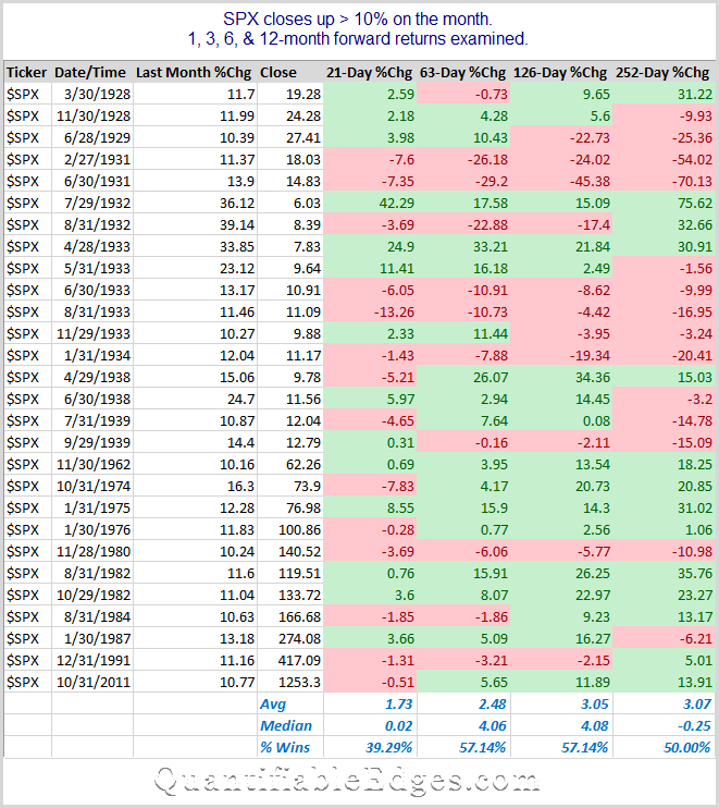
April finished with a 12.7% gain for the SPX. That is the strongest 1-month gain since January of 1987. In last night’s subscriber letter I decided to look back at all other instances following 1-month SPX (or its predecessor the S&P 90) gains of 10% or more. The table below shows all instances since 1928.

2020-05-01

The averages, medians, and % wins all look very mild, suggesting there may not be a clear edge looking forward. Of course a lot of the instances occurred in the 1930s. If you only look back to 1962, then the forward returns other than the 21-day (1-month) all look quite favorable. So for a 3-12 month view, perhaps it is worth considering whether the current market environment is more similar to the one we have seen over the last 60 years, or the one seen in the 1930s. I would say that arguments could be made in either direction.


Want research like this delivered directly to your inbox on a timely basis? Sign up for the Quantifiable Edges Email List.


Big Gaps Down In Already Bad Markets

SPX futures are locked limit down 5% as I write this Sunday night. The small study below looks at all other times 1) SPY was already short-term oversold (closed at a 5-day low), and 2) gapped down at least 3%, and 3) opened below the lowest close of the previous 50 days. Below is the full list of instances along with performance following each:

2020-03-08

A few notes:

  • These numbers look pretty wonderful. Don’t get too excited.
  • Performance only goes back to the inception of SPY. I did that because historical open/high/low prices for SPX are not accurate. Just closes. So measuring gap sizes and high/low levels is impossible. Hence the somewhat short history.
  • There are only 6 instances. You generally do not want to make too much of just 6 instances. What this does do well is make the point that the market is acting far outside of normal.
  • Not listed among these 6 instances is the 10/6/2008 instance, because that “only” gapped down 2.89% to start the day (just missing the 3% criteria). From the open that day to the low of the next 5 days, SPY lost as much as 22% intraday.
  • Had SPY existed in 1987, Black Monday would almost certainly have qualified.
  • It is tough to identify a high-probability play on a combination of forces unlike anything seen prior.

I also ran the study without the requirement that the day before closed at a 5-day low. There were a few more instances. Here is that table.

2020-03-08-2

Good luck trading this week!


Want research like this delivered directly to your inbox on a timely basis? Sign up for the Quantifiable Edges Email List.


An Updated Look At Huge 1-Day CBI Spikes

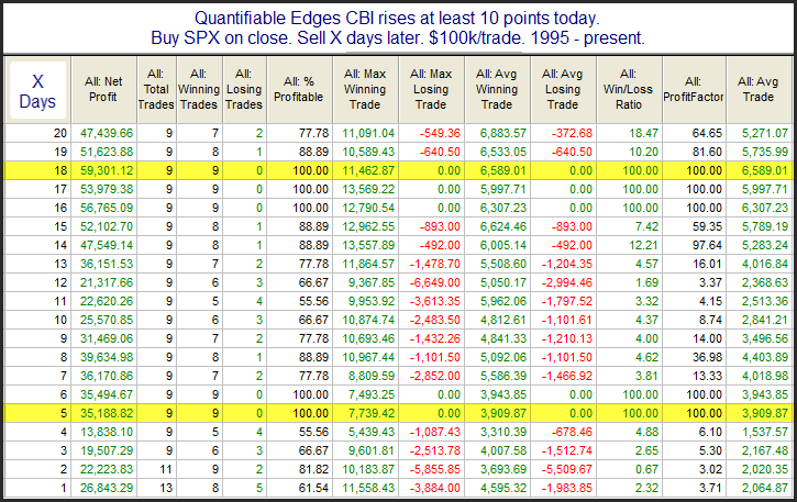
The Quantifiable Edges Capitulative Breadth Indicator (CBI) spiked up 14 points on Tuesday – rising from 5 up to 19. In the CBI Research Paper I showed that a CBI total of 10 or more has generally been a bullish sign. So 14 is a very strong 1-day change. In June I examined all other instances where the CBI spiked by at least 10 points in 1 day. I have updated that research below.

2020-02-26

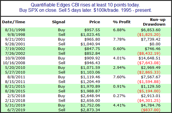
The setup is rare, but there are some very strong numbers here. Over the next week the average instance gained 3.9%, and the average 18-day % gain was 6.6%. Below is a look at all the individual instances.

2020-02-26-2

Here we see that the bounces have typically been strong, but they have not always been immediate. 2002, 2008, and 2015 all show some additional scary selling before the big reversal arrived. The CBI is suggesting a strong chance of a sizable bounce over the next week or more. It may or may not begin on Wednesday.


Want research like this delivered directly to your inbox on a timely basis? Sign up for the Quantifiable Edges Email List.


When The Market Gaps Down Huge During A Long-Term Uptrend

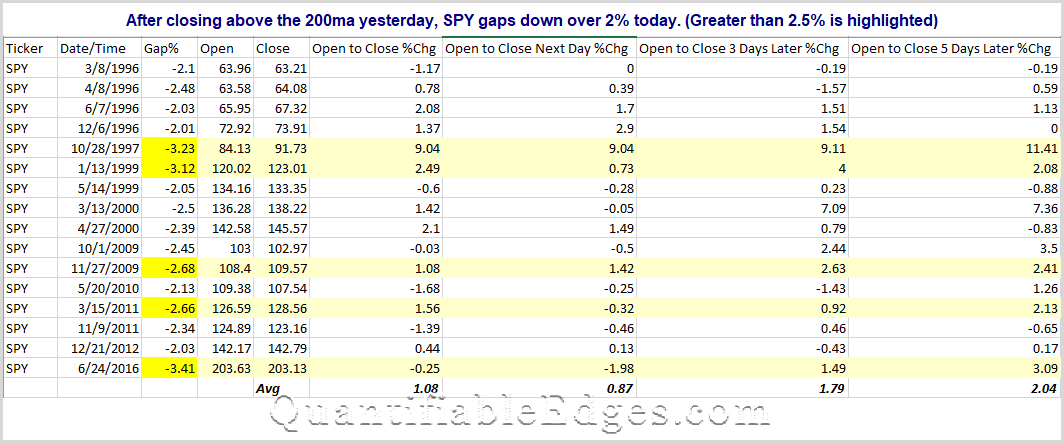
With corona virus news scaring the market pre-open today, I decided to look back at other time SPY has gapped down more than 2% when it had been in a long-term uptrend. As you might suspect, instances have been fairly rare. Looking ack to SPY inception, there were only 16 other instances. And upping the filter to 2.5%, the instances drop to just 5. (As I type, SPY is indicating 2.4% below Friday’s close with about 1 hour until the open.)

2020-02-24

Every scare is different. But most of the time in the past we have seen a decent bounce at some point in the next few days. Today, and the next few days should be interesting. (But the market is often interesting to me, and 2020 does not appear like it is going to be dull.)


Want research like this delivered directly to your inbox on a timely basis? Sign up for the Quantifiable Edges Email List.


Persistency Beyond Almost All Other Rallies

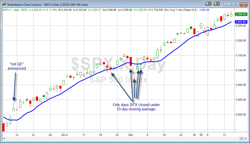
Last week I noted the current rally was reaching historical extremes for persistency. Here I will look at another study from the subscriber letter, and then update last week’s study. In last night’s letter I looked at all times back to the inception of the NASDAQ in 1971 in which both SPX and the NASDAQ Composite closed above their 10ma for at least 30 days in a row. The short list is below.

2020-01-22

Only 3 previous instances. And one of those was in the current move higher during November. Of course another way to look at it is how I did last week, in that SPX has only seen 5 closes below the 10ma since October 10th. We have now reached the point where just 5 of the last 70 trading days have closed below the 10ma. Other times where that has happened are 1972 (March), 1965 (Nov), and 1933 (Jul). That is it. And if it reaches 5 out of 71 days on Wednesday, then it is just 1972 and 1933 that you can point to.

Finding short-term trading opportunities in such a market can be difficult. It is tough to find a meaningful historical edge when the market is trading so far beyond historical norms.


Want research like this delivered directly to your inbox on a timely basis? Sign up for the Quantifiable Edges Email List.