The Great Rotation Continues
Tuesday night on Twitter I showed how Monday and Tuesday saw a massive rotation among S&P 500 constituents. The top stocks over the 1-year period leading up to last Friday had all seen substantial selling during Monday and Tuesday. And the bottom stocks had all rallied strongly. This all happened with almost zero net change to the SPX index. I decided to follow up on that study today to see how those stocks made out with the SPX rally on Wednesday. Below are updated tables. The right-hand columns show performance on Wednesday.
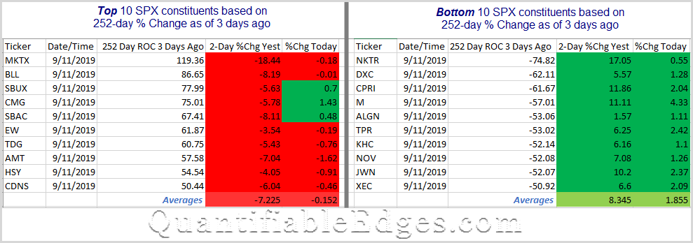
We see that even with the market rally on Wednesday the Great Rotation continued. All 10 of the bottom ranked stocks rallied further on Wednesday. Meanwhile, 7 of the 10 top ranked stocks underwent further selling. The split was not as drastic as Mon-Tues. Wednesday the bottom ranked stocks outperformed the top stocks by about 2% on average. Over the Monday – Tuesday period it was a 15.5% outperformance. Still, anyone running a long-short momentum strategy was not provided any relief on Wednesday. I am working on some deeper research exploring historical implications of violent rotations like these.
I will note at this point that swing traders may be able to find some decent bounce candidates on the Top ranked list. Strong short-term pullbacks during longer-term uptrends will often create solid short-term buying opportunities. The stocks on the left generally fit that description nicely. But with such unusual market action, this is not your typical pullback for many stocks, and risks could be elevated. Caveat emptor.
Want research like this delivered directly to your inbox on a timely basis? Sign up for the Quantifiable Edges Email List.
Learn how to identify edges and formulate swing trading strategies with the Quant Edges Swing Trading Course!