Seasonality May Again Flip This Week…To Bullish

With regards to seasonality, we are in an interesting period right now. The last couple of weeks the market played out well according to seasonal patterns. We saw March opex week put in nice gains as it often does. And then we saw the week after Quad-witching suffer losses this past week. Interestingly, the week after the 4th Friday in March has been a strong one over the last 21 years. (Not as much before that.) We can see this in the study below.

2019-03-18-1

Numbers here are very good. I’ll note that the following week could be 4 or 5 days since it is sometimes impacted by the Good Friday holiday before Easter. Below is a look at the 4-day profit curve.

2019-03-18-2

No red flags based on the curve. There appears to be a good chance the market will have a seasonal wind at its back this upcoming week. But I do have 2 concerns about the above study: 1) As already mentioned, Easter sometimes falls during this time, so some of the positive seasonality may be due to the holiday. 2) The turn of the month often offers good numbers. And early April has seen a lot of good returns over the years. Often you will get a little early-April action in the week following the 4th Friday of March. But that also is not the case this year. So the market MAY have a bullish seasonal wind at its back this week, but my confidence is a little lower in that than the seasonal studies I have shared the last couple of weeks.

Want research like this delivered directly to your inbox on a timely basis? Sign up for the Quantifiable Edges Email List.

Is the $SPX Prone to a St. Patrick’s Day Hangover?

St. Patrick’s Day was yesterday. Traditionally known as the biggest drinking holiday, I wondered whether the stock market often suffered a hangover the next day. The study below looks at performance for SPX on the day after St. Patrick’s Day from 1978 – 2018.

2019-03-18-1

The numbers appear impressively bullish. Below is a look at the profit curve.

2019-03-18-2

This, too appears impressive.

Unfortunately, if we go back any further in time, the results are not nearly as compelling. So I am not sure there is a real seasonal edge here. But it does appear that the market is often able to bounce back from a night of drinking without any negative effects.


Want research like this delivered directly to your inbox on a timely basis? Sign up for the Quantifiable Edges Email List.

Amibroker Code Now Available For Quant Edges Numbered Systems (and free for Annual Gold subscribers)

One favorite feature for Quantifiable Edges subscribers is access to the “Numbered Systems”. The Numbered Systems are 8 long-side setups and 2 short setups that include entry and exit rules for trading stocks or ETFs. Quantifiable Edges subscribers are able to access the complete rules, the Tradestation code, and even a spreadsheet published each night that shows any S&P 500 stocks or ETFs (from our list of about 100) that are setting up for entry the next day. I am pleased to announce that in the last week, I just made Amibroker code available as well. The Amibroker code allows users to run backtests and explorations for the Quantifiable Edges Numbered Systems. It is free for all Quantifiable Edges Gold Annual subscribers. (Gold Monthly subscribers may purchase it as an add-on for $100.) I am excited to be able to make Amibroker code now available, and anticipate there will be more Amibroker code packages available soon.


Free 1-week trials to Quantifiable Edges are available here. No credit card required. Just an email to send the letters to.

The Bearish Aftermath Of Quad Witching

A Twitter follower ( @SonnyRico ) asked me about weeks following Quad-witching, which occurs in March, June, September, and December. As I have shown in the past, the 2nd half of December has shown bullish tendencies historically (ignore 2018), but those other 3 have NOT been good weeks for the market. In fact, back in September I discussed the “Weakest Week”, which is the week after September opex. In the Quantifiable Edges subscriber letter that same week (free trial here) I showed a table with the best and worst weeks of the year since 1988. Below is an updated version of that table, showing just the bottom 8 weeks. (Note I did not include weeks after the 5th Friday of the month, since instances for those were greatly reduced.)

2019-03-15

We see here that the week after opex for September, June, and March have in fact been the worst 3 weeks of the year over the last 31 years. You’ll also note that the whole group shown follow either the 1st or 3rd Friday of the month. And if I were to show the best weeks of the year, you’d notice that they all follow the 2nd and 4th Fridays of the month. Below is a look at results if someone were to have bought opex Friday’s close in March, June, and September since 1988.

2019-03-15-3

The stats are poor as we knew they would be. The strong, steady downslope is also supportive of the idea of a seasonally bearish edge. Traders may want to keep this in mind next week.


Want research like this delivered directly to your inbox on a timely basis? Sign up for the Quantifiable Edges Email List.

Options Expiration Week Performance By Month – 2019 Update

Next week is monthly options expiration week. I’ve noted several times over the years that Op-ex week in general is pretty bullish. March, April, October, and December it has been especially so. S&P 500 options began trading in mid-1983. The table below is one I have showed in March each of the last several years. It goes back to 1984 and shows op-ex week performance broken down by month. All statistics are updated.

2019-03-08

While October and December have been more reliable, March op-ex week has seen the most in total gains. Perhaps the upcoming bullish seasonality can help to market to bounce next week.


Want research like this delivered directly to your inbox on a timely basis? Sign up for the Quantifiable Edges Email List.

3-day Pullbacks from 50-day High to 10-day Lows

The decline in SPX meant it was the 3rd day in a row in which it closed lower. 3-day pullbacks will often suggest an upside edge. I also found it notable that 1) the pullback originated from a 50-day high, and 2) it left SPX at a 10-day low. So I examined other times we saw such drops, and found some interesting results.

2019-03-07

Historically we see that 3-day drops from 50-day highs to 10-day lows have often by followed by a bounce in the next few days. Traders may want to keep this in mind as they determine their trading bias.


Want research like this delivered directly to your inbox on a timely basis? Sign up for the Quantifiable Edges Email List.

The Extreme Persistence Of The Current SPX Rally

The last time the SPX closed below its 10-day moving average was January 3rd. That means it has now been 35 straight trading days that SPX has closed above the 10ma. That is a very long streak. Below is a list of all streaks since 1928 of 35 days or longer. (Note: prior to 1957 S&P 90 Index data is used. This is the predecessor to the S&P 500.)

2019-02-26

I have highlighted the “recent” instances. Everything prior to the highlighted group came before the Space Invaders arcade game was released. At this point is most likely going to take a few days to drop all the way below the 10ma, since it is stretched a good amount above it right now. My takeaways from this study are 1) the market is well overdue a pullback, and 2) I am not inclined to get excited about taking on new long positions until we get this short-term reset below the 10ma.


Want research like this delivered directly to your inbox on a timely basis? Sign up for the Quantifiable Edges Email List.

Historical Performance Following State of the Union Addresses

With tonight being the State of the Union Address I decided to take another look at an old study that examined SPX performance following past speeches. The data table below looks back to 1982. There were a few instances, such as 2001 and 2009 where the speech was not an official “State of the Union”, but was delivered under a different name. I have included those speeches in the results as well.

2019-02-05-1

The stats do not suggest much of an edge. But the profit curves seem to tell a more interesting story. Here is the 5-day curve.

2019-01-05-2

All the curves look something like this in that since the turn of the century the market has tumbled after these speeches rather than been inspired by them. I guess they just don’t write speeches like they used to.


Want research like this delivered directly to your inbox on a timely basis? Sign up for the Quantifiable Edges Email List.

Why Waiting Until The Announcement Is A Tough Way To Trade The Fed

Wednesday is a Fed Day – a day in which the Federal Reserve concludes their scheduled meeting and releases a policy statement. Fed Days have historically shown a bullish inclination (up until Powell took over last year, as I showed on Sunday). One interesting aspect of Fed Days that I covered in the book is that the bullish inclinations have basically played out prior to the actual Fed announcement. Sharp moves often occur after the announcement, but they have not been consistently bullish or bearish historically. This can be seen in the two studies below.

2019-01-29-1

2019-01-29-2

A couple of notes:

1)      The 2nd test is showing 1 less instance, because my data provider was missing intraday data for 1/30/2007, which was the day before the Fed Day.  So no purchase was triggered.  But in looking at ES futures data that day, it closed up a mere 1 tick (0.25 points).  So that trade had very little impact on results.

2)      There were a few days where the Fed announcement came out before 2pm.  (Between 2010 and 2012 they had some early announcements at 12:30.)  Additionally, the formal announcement for a long time was 2:15pm.  In any case, making minor adjustments for the actual release time would make very little difference, and the point would remain exactly the same.  The bullish edge has all been realized prior to the actual announcement.  After the announcement, returns have been very inconsistent.


Have a happy Fed Day tomorrow!


Want research like this delivered directly to your inbox on a timely basis? Sign up for the Quantifiable Edges Email List.

Is Jerome Powell The Most Hated Fed Chairperson Ever?

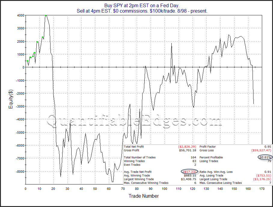
Fed Days have a long history of showing a bullish tendency, and we have a large number of Fed Day studies to refer. For those that are unaware, a Fed Day is simply a day where the Federal Reserve completes a scheduled meeting and provides a policy announcement. Meetings typically take place 8 times per year, and in recent years the meetings have all been 2 days in length, with the 2nd day being the “Fed Day”. Two good places to find studies related to Fed Days are the Quantifiable Edges Guide to Fed Days book, and the Fed Study category on the blog.

Below is a long-term look at Fed Day performance since Paul Volcker became chairman in August of 1979.

2019-01-27-1

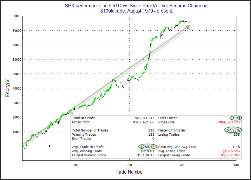
That is a long and fairly steady tendency we see for the market to rise on Fed announcement days. But recent instances have struggled. Below is a breakdown of Fed Day performance by Fed chairperson.

2019-01-27-2

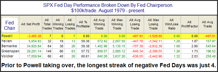
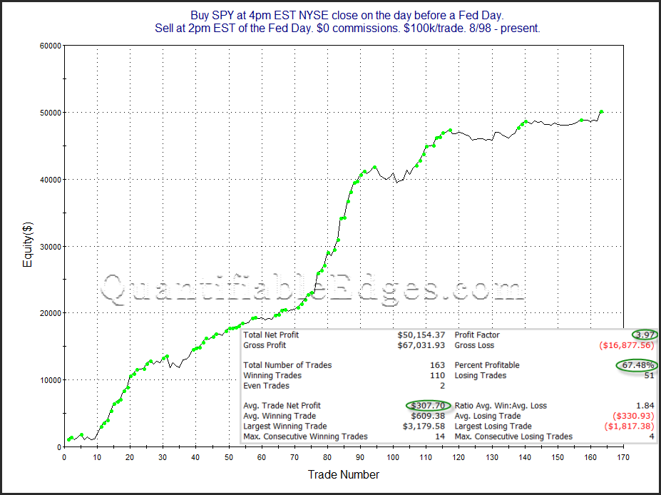
I don’t know Mr. Powell. He might be a wonderful, generous, caring person who is fun at parties, has great dance moves, and is kind to animals. But for some reason, the market sure seems to hate him. Fed Days under every other chairperson since 1979 have shown a strong upside tendency. But Mr. Powell’s Fed has garnered a negative reaction every time. Here’s the full list since he took over last year.

2019-01-27-3

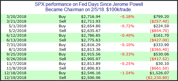
Nothing good to see here. But perhaps we should have realized the market hated him when the SPX closed down over 4% on his first day on the job (2/5/18).

Of course the Powell comments are mostly tongue in cheek, but it is worth noting that Fed Days have been mired in a previously unprecedented losing streak lately with seven negative reactions in a row.


Want research like this delivered directly to your inbox on a timely basis? Sign up for the Quantifiable Edges Email List.

QE Big Time Swing System Navigates Bear and Posts Moderate Gain for 2018

Despite a challenging trading environment, which included a bear market and a down year for the major indices, the Quantifiable Edges Big Time Swing System managed to continue its winning ways utilizing SPY signals. I’ve updated the Quantifiable Edges Big Time Swing System overview page with results through 1/2/2019. The system only averages about 1 trade per month, so I generally only update it on a semi-annual basis. For 2018 there were just 8 signals that triggered for SPY. Four of them closed positive and four negative for a net gain of about 2.4% (including dividends, commissions of $0.01/share, and an assumed interest rate on cash equal to the average Fed Funds rate of 1.8%). While that is well off the average pace for the system, and a contrast to 2017 when all 9 signals turned out profitable, it is nice to see it continue to manage gains in a challenging environment. The QE Big Time Swing System still has not posted a losing year for SPY.

The system provides easy to follow mechanical rules, with no black box component. The standard parameters are not optimized, and have never been changed since the system’s release in 2009. There are only about 11 trades per year averaging 7 trading days per trade. To make it even easier, all entries and exits are either at the open or the close. And to be sure you have everything set up properly, traders may follow the private purchasers-only blog that tracks SPY signals and possible entry/exit levels.

For system developers looking for a system that they can use as a base to build their own system from, the Big Time Swing is an attractive option. It is all open-coded and comes complete with a substantial amount of background historical research. And since it is only in the market about ¼ of the time, it can easily be combined with other systems to provide greater efficiency of capital. Once you’re ready to try and improve the system yourself you can also refer to the system manual or the purchaser-only webinar on the private BTS web page. Both of these resources discuss numerous ideas for customization.

The system has proven its worth since its release over 9 years ago. Don’t wait another year to determine if the QE Big Time Swing System is appropriate for you. For more information and to see the updated overview sheet, click here.

If you’d like additional information about the system, or have questions, you may email BigTimeSwing @ Quantifiable Edges.com (no spaces).

An $SPX Sector Breakdown & Visual Of The Rubber-Band Effect

Below are the nine S&P 500 sector ETFs and their performance for the 14 days heading into the December 24th market bottom, and then their performance for the 14 days since.

2019-01-16

As you can see, the sectors that were stretched the farthest to the downside have bounced the highest to the upside. The sectors that held up a little better during the selling have not had nearly the same bounce. This is typical of a market coming off a V-bottom. This does not mean the groups that have bounced the most to this point are the ones that are most capable of leading a new bull market. Those potential leaders are yet to be determined. It simply shows the rubber-band effect off the deeply oversold low.


Want research like this delivered directly to your inbox on a timely basis? Sign up for the Quantifiable Edges Email List.

Historical View Of Extreme Short-Term Gains In $OEX Components

As I write this around 11am EST both NFLX and CELG are threatening to close up > 50% from their December 24th closing price, just 14 trading days ago. While that sometimes happens with speculative smallcap stocks, it is very unusual to see a largecap S&P 100 stock accomplish such strong gains in such a short period of time. In fact, the last instance of a 50% close to close gain within 15 days for an S&P 100 stock occurred in 2009.  I looked back at other times since 2000 where it has occurred among S&P 100 components, and found only 38 occurrences. Below is the complete list.

2019-01-15

Note I used Norgate data to do the research. Stocks with numbers after the ticker are no longer traded. My basic observation about these instances are the following:
• It almost never happens except during extreme market conditions, and often during, or just after, a bear market.
• The common themes were Financials in 2008-09 and Tech in 2001-02, which were the hardest hit and most volatile groups of their time.
• Returns going forward appear bunched and inconsistent.

To further illustrate the last point, below are the summary forward returns for all 38 instances.

2019-01-15-2

I don’t see a strong and consistent edge among suggested. I do find it interesting that we have two stocks threatening to accomplish the rare feat today.


Want research like this delivered directly to your inbox on a timely basis? Sign up for the Quantifiable Edges Email List.

January Opex Weak

Opex week overall has typically been a bullish part of the month for the market. But over the last 20 years, January has been a major exception to this rule. The table below shows results of buying the Friday before options expiration week in January and then selling at the close of option expiration Friday, which is the 3rd Friday of the month.

2019-01-11-1

15 of the last 20 January opex weeks have closed down. And the average January opex week lost about 1%. The max run-up during the week was about 0.8%, while the average drawdown during the same period was about 3x that, at 2.2%. And the stats are all this poor despite last year posting the 2nd strongest up move on a January opex week over the 20-year sample. Here is a chart that shows how the edge has played out over time.

2019-01-11-2

January opex is not only poor when comparing against other opex weeks, it is extremely poor overall. Looking at all week/month combinations back to 1999, the only week that has shown greater losses is the week after opex week in September. In other words, January opex week has been the 2nd worst week of the year over the last 20 years.


Want research like this delivered directly to your inbox on a timely basis? Sign up for the Quantifiable Edges Email List.

Rare Zweig Breadth Thrust Signal Suggests Bullish Implications

The strong breadth we have seen recently has caused the 10-day exponential moving average of the NYSE Up Issues % to rise up to 62%. A move through 61.5% after being below 40% within the last 2 weeks is considered a Zweig Breadth Thrust trigger. This is a signal created by Martin Zweig. Over the long haul it has been a rare but powerful signal. Below is a list of all signals since 1970 along with their 20-day returns (using Tradestation data).

2019-01-8-1

All 8 instances saw a runup of at least 3% over the next 4 weeks, and only once did the market pull back as much as even 2.5%. I last showed this study on the blog in 2015. Today I decided to show SPX charts for all the signals. I have labeled the 20-day holding periods shown above on the charts as well.

2019-01-08-2

2019-01-08-3

2019-01-08-4

2019-01-08-5

2019-01-08-6

2019-01-08-7

2019-01-08-8

2019-01-08-9

I am seeing some other evidence suggesting a possible pullback in the next few days. But the Zweig Thrust Signal certainly favors the bulls for both the short and intermediate-term. Traders may want to keep it in mind as they determine their trading bias.


Want research like this delivered directly to your inbox on a timely basis? Sign up for the Quantifiable Edges Email List.