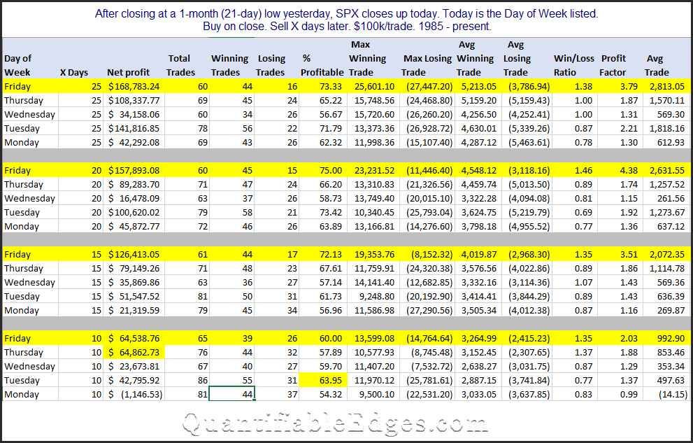
A Simple Machine-Based Day of Month Trading Model
In this writeup I am going to explain how to build a simple calendar model that uses machine learning to determine the days with the best odds to trade. The I will show how the calendar model does versus “Buy and Hold” over a long time period. The approach here is similar to how the Quantifiable Edges Seasonality Calendars are produced each month. Of course they are a bit more complex, and they are also enhanced by the fact that rather than using just one model, they use an ensemble of models to generate the statistics. But as you will see, even a very simple calendar model can produce surprisingly effective results.
Below are the steps to build the model.
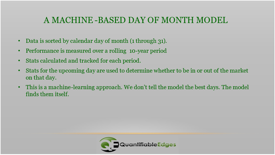
I’ll go through these briefly one-by-one.
- Data is sorted by calendar day of month (1 through 31) – Here we are simply establishing groupings. In this model, the grouping are extremely simple. What day of the month is it? You could also use trade day of month, or normalize the number of days, or segment many other ways. But the idea is to determine whether certain groupings provide an edge vs others. Here we are just doing “day of month”.
- Performance is measured over a rolling 10-year period – To see what groups provide an edge, you need to measure the performance of each group over a specified time period. In this case, I chose 10 years. With 31 groups and 252ish trading days per year, this means each group will have about 81-82 instances, though a little less for the 29th – 31st. Performance can be measured multiple ways. For instance, Win %, Avg Gain, Profit Factor, or by any other performance measure you deem important. The time that is measured can be whatever you determine appropriate. I used 10 years as a nice, round number that is long enough to typically include both bull and bear market phases. You can use much longer or much shorter.
- Stats calculated and tracked for each period – Once ten years (or whatever length you choose) of data is available, the performance stats can be generated. They should then be rolled forward continuously. This will allow the machine to adapt to changing market conditions, and for the old data to roll off, no longer including it in forward decisions.
- Stats for the upcoming day are used to determine whether to be in or out of the market on that day – So if tomorrow is the 5th of the month, the model will look back at performance of the 5th of the month over the last 10 years to determine whether to be long or flat at the close today. In the results I am going to share, I required a Win % of at least 50% and a Profit Factor of at least 1.0. So we are looking for the stats to be neutral or positive in order to have a long position. Otherwise, we get flat.
- This is a machine-learning approach. We don’t tell the model the best days. The model finds them itself – Again – nowhere in the code do we specify that we view the 1st or the 5th or any other day as bullish. Bullish/neutral/bearish are evaluated on a rolling basis by the code.

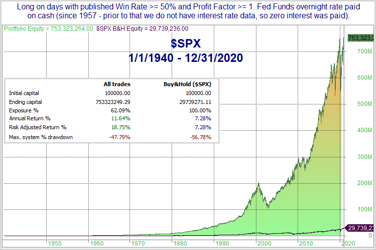
These results are fairly remarkable. The model is only exposed to the market about 52% of the time, and yet the annual return beats the market by 1.35% per year. When it is out of the market, it has earned interest at the rate equal to the 30-day Fed Funds rate. (I used that rate since 1) it is generally the lowest published rate, and 2) I had data back to 1957. Prior to 1957, 0% interest was earned by the model.) Over a long period of time, the 8.63% CAGR vs the 7.28% CAGR makes a very big difference. Also interesting about this is the fact that it is 100% in or 100% out. There is no ability to leverage in this model. So it cannot outperform when the market is rising. It can only outperform by side-stepping unfavorable days. And since it did outperform, you would think it did a decent job of reducing drawdowns. Below is the drawdown chart.
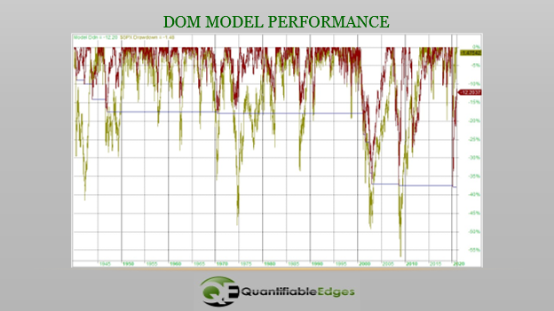
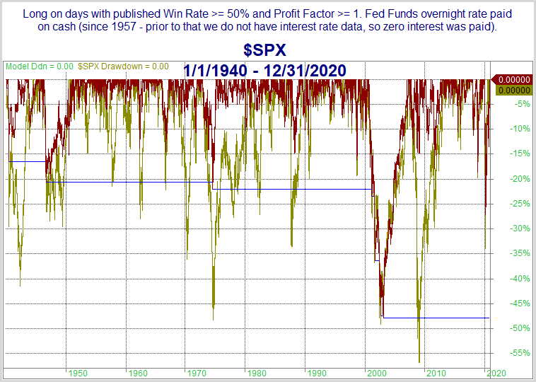
The model is represented by the red line and the SPX by the gold line. Interestingly, in almost every major drawdown over the 81 years, the model managed to avoid a portion of the drawdown. And that is how the performance difference became so large over time.
As I stated earlier, this is similar to the approach used by the QE Seasonality Calendar models. I also thought it was a decent example of machine modeling. (Note: This approach can be used with any kind of data. It does not need to be calendar-based.) I also thought people would find it interesting how a simple day-of-month filter could be so effective over such a long time period. Day-of-month seasonality IS a thing. And based on this, it appears worth paying attention to. I hope you found the above exercise thought provoking.
If you’d like to learn more about the QE Seasonality Calendars, feel free to check out the Intro Video or the Quantifying Seasonality webinar on the QE Youtube page. You can also take a free trial of Quantifiable Edges, where you can download white papers and more information in the Seasonality section of the subscriber area.
Want research like this delivered directly to your inbox on a timely basis? Sign up for the Quantifiable Edges Email List.
How about a free trial to the Quantifiable Edges Gold subscription?