Perhaps the most astounding chart I saw this week was one that Helene Meisler posted in her Saturday morning chart show on Twitter. It showed the 50-day MA vs the 200-day MA of the $RUT. I have recreated the chart below and included the full history of the Russell 2000 to provide context.
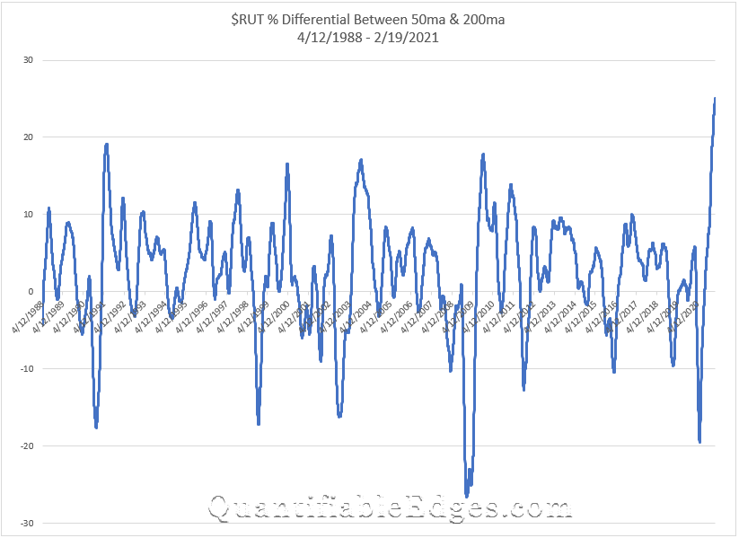
What is happening here is that the 50ma is more than 25% above the 200ma. And this is the 1st time in history that the 50ma has been this extended vs the 200ma. In fact, never before has it even exceeded 20%. So the current rally in $RUT is remarkable.
I also decided to look at a couple of other indices to see how stretched they were and what their historical charts looked like. First, let’s look at the $NDX.
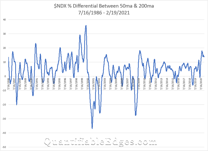
The $NDX has had some extreme historical readings as well. In 1999 it reached nearly 30, and in 2000, leading right up to the top, it exceeded 35. Then it went to hit its lowest extreme a little over a year later. But the current reading…not all that extreme. And in fact it topped out in September and has drifted lower since.
Lastly, let’s look at the $SPX. For this index I was able to go all the way back to 1929.
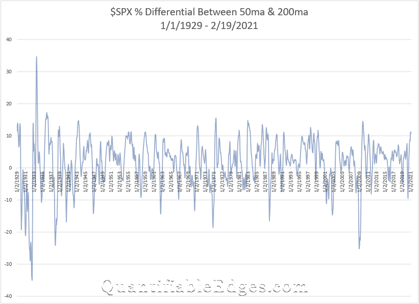
The current reading here is about 11. And as you can see, that is not terribly uncommon. There are a lot of peaks on the chart that exceeded 10. But it has not exceeded 20 since the 1930s. So neither $SPX nor $NDX appear to be all that stretched based on this metric.
So what does this all mean? Well, it appears this is some froth in small caps. This does not suggest that the momentum cannot continue or that $RUT or the rest of the market has to decline right away. But I would expect to see a reversion here at some point. There has been a lot of money pumped into the economy, and over the last few months, a big chunk of that has gone into smaller and less established companies.
In fact, it is not only less established companies, it is even shell companies that are seeing massive inflows. Take a look at this Tweet from Charlie Bilello that shows SPAC investment $$ growth:
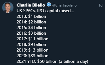
There is a lot of investment capital out there, and an oversized chunk of it seems to be flowing into the most speculative assets. This is not a trading signal, but it is something that seems worth noting. The music is still playing, but when it stops it may be difficult finding a chair.
Want research like this delivered directly to your inbox on a timely basis? Sign up for the Quantifiable Edges Email List.
How about a free trial to the Quantifiable Edges Gold subscription?