The Bearish Aftermath Of Quad Witching
A Twitter follower ( @SonnyRico ) asked me about weeks following Quad-witching, which occurs in March, June, September, and December. As I have shown in the past, the 2nd half of December has shown bullish tendencies historically (ignore 2018), but those other 3 have NOT been good weeks for the market. In fact, back in September I discussed the “Weakest Week”, which is the week after September opex. In the Quantifiable Edges subscriber letter that same week (free trial here) I showed a table with the best and worst weeks of the year since 1988. Below is an updated version of that table, showing just the bottom 8 weeks. (Note I did not include weeks after the 5th Friday of the month, since instances for those were greatly reduced.)
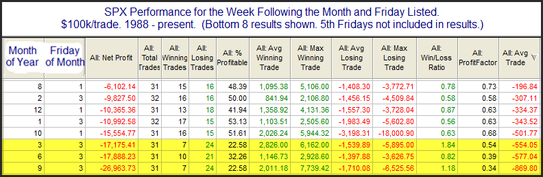
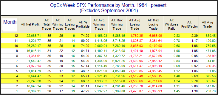
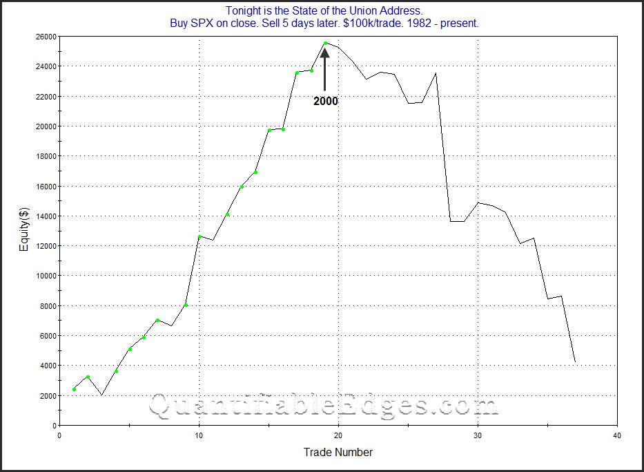
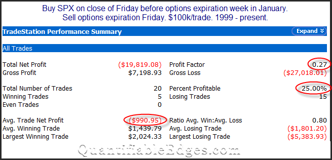
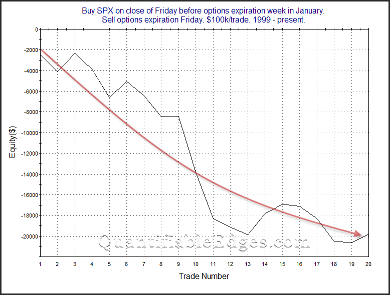
We see here that the week after opex for September, June, and March have in fact been the worst 3 weeks of the year over the last 31 years. You’ll also note that the whole group shown follow either the 1st or 3rd Friday of the month. And if I were to show the best weeks of the year, you’d notice that they all follow the 2nd and 4th Fridays of the month. Below is a look at results if someone were to have bought opex Friday’s close in March, June, and September since 1988.
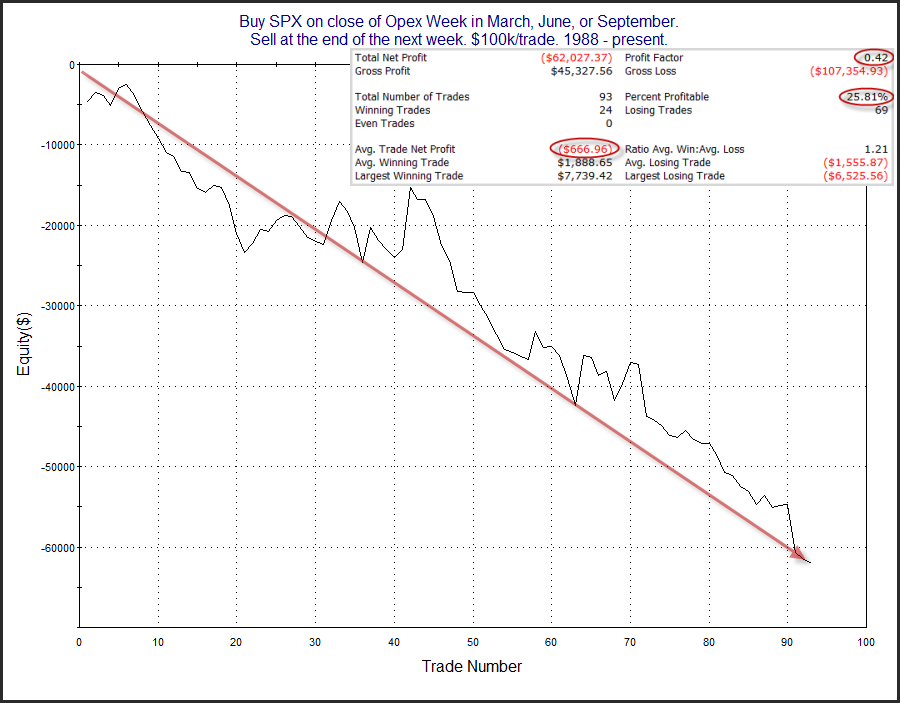
The stats are poor as we knew they would be. The strong, steady downslope is also supportive of the idea of a seasonally bearish edge. Traders may want to keep this in mind next week.
Want research like this delivered directly to your inbox on a timely basis? Sign up for the Quantifiable Edges Email List.