Why Monday’s Selloff Could Lead To More Short-Term Selling

After closing at a new high on Thursday, selling was broad but not terribly deep on Monday as measured by the SPX. The study below, from the Quantifinder, examines these kind of situations.

2014-07-08 image1

This type of broad, shallow selling will often lead to further SPX declines in the following days. Risks appear to far outweigh potential rewards when looking at metrics such as win/loss ratio and profit factor. The downside edge plays out quickly though, and has generally exhausted itself after the first couple of days.


Want research like this delivered directly to your inbox on a timely basis? Sign up for the Quantifiable Edges Email List.

QE Big Time Swing System Stays Strong In 1st Half of 2014

I’ve updated the Quantifiable Edges Big Time Swing System overview page with results through June 30. There have been no trades since then. The system only averages about 1 trade per month, so I typically update the results bi-annually. The QE Big Time Swing System has been on a roll in 2014. It has had 6 trades. Five of these trades have been to the long side, and one short. One of the long triggers was a loser and the rest posted gains. The signals produced a net return of 7.18% for SPY (including dividends, commissions of $0.01/share, and an assumed interest rate on cash of 0.1%). The system also continues to make new equity highs.

The Big Time Swing System provides easy to follow mechanical rules. The standard parameters are not optimized and have performed quite well (they are the ones used for all performance metrics). There are only about 11 trades per year averaging 7 trading days per trade. All entries and exits are either at the open or the close. And to be sure you have everything set up properly traders may follow the private purchasers-only blog that tracks all SPY signals and possible entry/exit levels. This service is free for 12 months from the date of purchase.

For system developers looking for a system that they can use as a base to build their own system from, the Big Time Swing is an attractive option. It is all open-coded and comes complete with a substantial amount of background historical research. And since it is only in the market about ¼ of the time, it can easily be combined with other systems to provide greater efficiency of capital. Once you’re ready to try and improve the system yourself you can also refer to the system manual or the August 2010 purchaser-only webinar – both of which discuss numerous ideas for customization.

For more information and to see the updated overview sheet, click here.

If you’d like additional information about the system, or have questions, you may email BigTimeSwing @ Quantifiable Edges.com (no spaces).

What SPY’s Gap & Reverse Pattern The Last 2 Days Suggests About Today

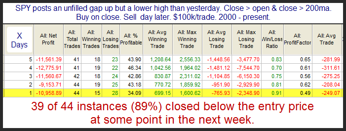
The way SPY has gapped and reversed the last couple of days triggered the below study in the Quantifinder. I updated all the stats.

2014-06-30 image1

The edge isn’t huge but risk/reward has seemed to favor the bears under these circumstances. Much of the downside has been realized by the end of day 1.


Want research like this delivered directly to your inbox on a timely basis? Sign up for the Quantifiable Edges Email List.

Implications of Tuesday’s Intraday High & Poor Close

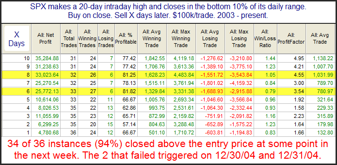
Before tanking Tuesday afternoon the SPX managed to make a new intraday all-time high. The new high followed by a poor and downward close triggered the study below, which was shown in the Quantifinder Tuesday afternoon.

2014-06249 image1

Results here seem to suggest an upside edge. The edge appears especially strong when looking out 6-8 days.


Want research like this delivered directly to your inbox on a timely basis? Sign up for the Quantifiable Edges Email List.

When Fed Days Post New Long-Term Highs

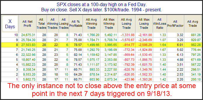
In “The Quantifiable Edges Guide to Fed Days” I discussed Fed Days that close at new highs. The basic finding was that when the market closed at a short-term high on a Fed Day, then it was likely to pull back over the next few days. But when it closed at a long-term high, then the rally was likely to continue. Below is a study from the guide that I updated for last night’s Subscriber Letter.

2014-06-19 image1

This suggests further upside is likely over the next 1-2 weeks. The consistency referenced in the note at the bottom of the table is impressive and worth noting as well.


Want research like this delivered directly to your inbox on a timely basis? Sign up for the Quantifiable Edges Email List.

Why The Weak 2-Day Bounce Could Be A Positive For The Next Few Days

SPY has now risen 2 days in a row but still failed to close above the close of 3 days ago. While this may be frustrating for those short-term bulls who were looking for a bounce, it has normally been followed by further gains. This can be seen in the study below, which was featured in last night’s subscriber letter.

2014-06-17 image1

The stats appear to suggest a bit of an upside edge over the 1st 2 days. To see the importance of the “close < 3 days ago” filter let’s also examine those times when the 2-day rally was strong enough to close above the close of 3 days ago. Those results are below.

2014-06-17-2 image1

As you can see, that small change makes a big difference. Two days out total net profit is about the same despite the fact that there are about 5 times as many instances.

Also notable about the next few days is that Wednesday is a Fed Day. For research regarding Fed Day edges, you may use the Fed Study label on the blog, or check out the Quantifiable Edges Guide to Fed Days book.


Want research like this delivered directly to your inbox on a timely basis? Sign up for the Quantifiable Edges Email List.

An Extremely Overbought Short-Term Reading That Is Good News For The Bulls

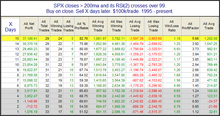
The market is short-term overbought by a number of measures. One measure that short-term traders will sometimes look at is the 2-period RSI. On Friday the 2-period RSI for SPX close over 99 for the 1st time since February. Very strong moves that put a stock or market in an extremely overbought short-term condition can mean that a pause or pullback is needed short-term. But for the intermediate-term it often bodes well. This can be seen in the study below.

2014-06-09 image1

The numbers here are basically neutral for the first week or so. But once you get out 2-3 weeks, it appears the strength has re-asserted itself and the market is often higher. This is an example of how strength can beget more strength. Traders may want to keep this in mind over the next few weeks.


Want research like this delivered directly to your inbox on a timely basis? Sign up for the Quantifiable Edges Email List.

The Bullish History of Thursday After Memorial Day

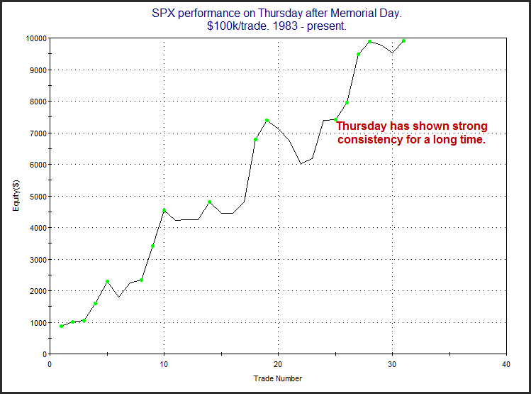
A few days ago I examined Memorial Day week seasonality. After exhibiting a positive bias for many years, the last four years have struggled. But that has not been the case on the Thursday after Memorial Day. Thursday has maintained a steady upward bias. This is illustrated in the chart below.

2014-05-29 image1

Single-day seasonality can certainly be overrun by other forces, but the Thursday after Memorial Day has been a good one for many years, and that may be something that traders want to consider today.


Want research like this delivered directly to your inbox on a timely basis? Sign up for the Quantifiable Edges Email List.

Evaluating A New SPX High & A Rising VIX

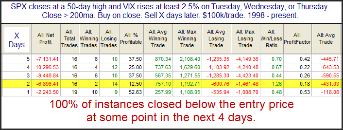
While the SPX closed up fairly strongly on Tuesday, the VIX also rose. Most often they trade opposite each other, so this kind of action is somewhat unusual. But VIX has a tendency to decline going into the weekend (Friday afternoons), and then rise when it returns from the weekend. So to see this action on the first trading day of the week is less unusual than at any other time. Still, combined with the SPX 50-day high, it has been often followed by a dip in the next few days. This can be seen in the study below.

2014-05-28 image1

Results here appear squarely bearish for the 1-2 day time period. Traders may want to keep this in mind when setting their market bias.


Want research like this delivered directly to your inbox on a timely basis? Sign up for the Quantifiable Edges Email List.

Memorial Day Week & The Changing Seasonal Picture

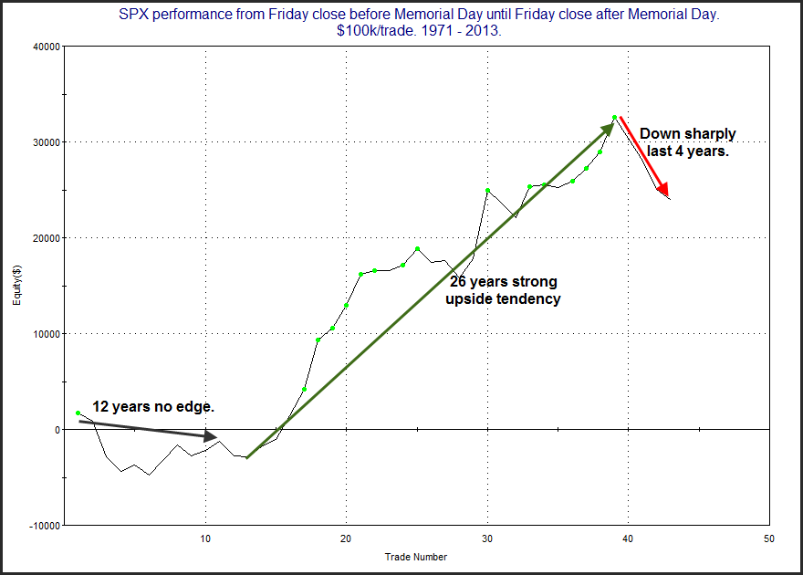
The week of Memorial Day has shown some seasonal strength over the years. But it has faltered greatly the last few. The chart below examines SPX performance from the Friday before Memorial Day to the Friday after it.

2014-05-27 image1

There was no substantial edge apparent throughout the 70s, but starting in 1983 through 2010 there was a bullish tendency. The last 4 years this week has really struggled. It is too early to tell if a permanent change in character has occurred, but traders who for years saw impressive returns during Memorial Day week may want to note the above. At the least I would say the upside tendency no longer appears as reliable as it once did.


Want research like this delivered directly to your inbox on a timely basis? Sign up for the Quantifiable Edges Email List.

Low Volume No Longer Bearish?

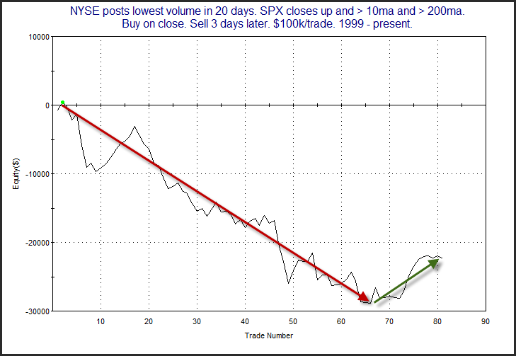
Light volume used to be a concern on a short-term basis. But light volume up days simply have not had the same bearish implications during the bull market of the last couple of years. The profit curve below is from an old study. It looks at light volume occurring when the market is above both a short and long-term moving average and closes up on the day. It exemplifies what I am talking about.

2014-05-22 image1

This curve bottomed about 15 instances ago on 2/29/12 (Happy Leap Day!). After exhibiting a consistent downside tendency for several years, dynamics appear to have changed. They could certainly change back. It could be something temporary causing this (like quantitative easing), or it could be something more permanent. I’ll continue to keep an eye on this setup in the future. But for the time being, it is something I no longer consider to carry bearish implications.  And this is not an isolated study.  I have seen numerous low-volume examples over the last several months.


Volume analysis is not the only thing that sees changes over time.  Market “truths” are not static.  They are dynamic.  And traders need to pay attention as the market evolves.


Want research like this delivered directly to your inbox on a timely basis? Sign up for the Quantifiable Edges Email List.

Quantifiable Edges Subscription Pricing Going Up – Lock In Current Pricing Now!

Quantifiable Edges subscription prices have not increased in over 3 years.  But on Wednesday 5/21 prices for Quantifiable Edges Gold subscriptions will be rising.  Fortunately it is not too late to lock in at our current pricing.  To do so, you simply need to start you subscription before the 5/21 price increase takes effect.


Since our last price increase in 2011 Quantifiable Edges has continually updated our research and greatly expanded the features available with Gold subscriptions.  What started out as just a subscriber letter has grown substantially over the years.  A few of the more notable changes just since our last price increase in 2011 include:


We believe the value of a Quantifiable Edges subscription has increased greatly over the last 3 years.  And prices will be going up next week to reflect a portion of this value increase.  Current subscribers will be grandfathered in at their initial price level.  To lock in current pricing you simply need to start a subscription before 5/21/14.

Market Timing Course Feedback & Enhancements

After the first few weeks, the Quantifiable Edges Market Timing Course  has received an incredible amount of positive feedback.  We also received some helpful feedback from purchasers who wanted to see a few more things.  Therefore, we have added some features to the Quantifiable Edges Market Timing Course and wanted to make readers aware of them.

These first few enhancements were done to the Market Timing Course Downloads page.  To be able to access it, you must first complete the course.

1) The Excel spreadsheets that show historical triggers and results for our price-action based indicators are now updated on a regular basis.  Those that purchase (and complete) the course may download these spreadsheets any time to get the most recent performance history and status of the indicators.

2) The Tradestation Code for the price-action based indicators is now downloadable in text format for people that would like to translate it to work on their platform.

3) Thanks to a Market Timing Course student, the indicators are now also available for download in Ninja Trader format.

Additionally, updated indicator charts and statuses may be found at any time on the Market Timing Course Indicator Charts page.

And the Market Timing Course now has its own Facebook page, so  if you liked it, then please Like it!

And if you want to hear what others have had to say about the course, here are just a few of the comments we have received in the last couple of weeks:

Thanks Rob. It’s an awesome course.
– Mauro (Gold subscriber)

The Market Timing Course was absolutely informative and valuable.
– Durk (Gold subscriber)

Well researched, straightforward and simple.
-Jose (Gold subscriber)

Great job on the course! Very simple approach & well presented.
Thanks,
Steve (Gold subscriber)

The format was excellent, lessons were short and to the point.
-M.A. (Gold subscriber)

I think it was very helpful how you broke the material into segments and had small testing at the end. It made it easier to digest all the material.
– Mike W (course purchaser)

I found it very useful. I liked the format – I thought the short sections aided both initial learning as well as subsequent review…this has given (me) a statistical rationale, rather than a mere “gut feeling”. Thank you.
David B. (course purchaser)

Thanks for the course, which for me was like an appetizer to dig deeper into the QE universe. I’ve been reading the blog for quite some time…the course provided new insights to me…
Thanks,
Simon (course purchaser)

I loved the course. Very detailed information on some compelling strategies.
– J.Z. (course purchaser)

Your new market timing course is friggin awesome.
Jim (@jimkoford)

 For more details, or to purchase the course, click here.
Why Monday’s Low Volume Was A Positive

One thing I liked about the breakout on Monday was the low volume. Textbooks often refer to this as a negative, but the study below, which I have shown a number of times over the years, shows that for major market breakouts it has actually been a positive This first stats table examines fresh breakouts (1st new high in a least 2 weeks) that have occurred on DECREASING volume.

2014-05-13 image1

Here we see that there appears to be a strong upside inclination over the first week. Beyond that there isn’t too much of an edge.

Next, I ran the stats when the breakout came on increased volume rather than lower volume. Those are shown below.

2014-05-13 image2

As you can see, higher volume breaks to new highs do not carry the same bullish implications. These stats appear to be almost dead neutral. So bulls should not be worried about Monday’s lack of volume. In fact, they should be encouraged by it.


Want research like this delivered directly to your inbox on a timely basis? Sign up for the Quantifiable Edges Email List.