Relatively High Put/Call A Positive

The market finally broke its consolidation on Wednesday. One intermediate-term positive I’m seeing right now is the action in the CBOE put/call ratio. Today it closed at 1.16. Over the last 4 days it has averaged 1.12. High put/call ratios are normally associated with market selloffs, yet the market made a 20-day high as recently as Monday.

Relatively high levels of put buying are indicative of worry on the part of traders, which is why they are more common during selloffs than during upmoves. I looked back to check other times when the 4-day put/call ratio was above 1.10 and the market was within three days of a 20-day high. Looking back to 1995 I only found three instances: 8/23/06, 2/23/07, and 5/25/07.

August 23, 2006 was a great buying opportunity both short and long-term. It marked a low point and the market rallied for several months following that.

February 23, 2007 was certainly not a buying opportunity. It came just two days before the market collapsed over 3.5% on February 27th.

May 25, 2007 was followed by a 5-day rally and then an extremely choppy month of June.

Not much to learn from these three examples. It should be noted, though that the put/call ratio has been significantly higher over the past couple of years than it was in the beginning of the decade. To adjust for this I normalized the data by using the 100-day moving average.

I once again looked at any time the S&P 500 had made at least a 20-day high in the last 3 days. This time I only required that the four-day average put/call ratio was above its 100-day moving average. After eliminating overlap and looking out at least 20-days I found 47 instances going back to 1995. 33 of these led to positive returns over the next 20 days and 14 of them led to declines – a 70% win rate. The average win was 2.7% and the average loss was 2.5%. The average trade was 1.1%. Not overwhelming numbers by any stretch but not bad, especially considering the market was already at a 20-day high.

In all I would consider the relatively high put/call ratios we are currently seeing a positive. They may help to provide a “wall of worry” for the market to climb.

A Rooster Egg Market

I remember a riddle from when I was a kid that went something like this:

Q: If a rooster lays an egg right at the very peak of the roof of the barn while facing north and the roof slopes east and west, which way will the egg roll?

A: It won’t. Roosters don’t lay eggs.

Now for the market:

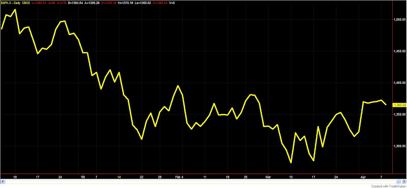
Q: If the S&P shoots up 2.5% or more in one day and then closes within 0.5% of its closing price the next five days in a row, which way will the market break?

A: The S&P doesn’t do that…until now.

Here’s a line chart of the S&P 500.

I see no short-term edge.

In other news, Alcoa (AA) released earnings Monday night. They disappointed and sold off a little bit on Tuesday. Alcoa’s earnings release always comes with great fanfare because it’s typically the first large-cap to report after the end of the quarter. Does it really deserve all the fanfare? Is it somehow predictive of how the market may perform during earnings season? I figured it was worth a look.

The test was run as follows. I looked back at the last 25 earnings announcement for Alcoa. If Alcoa rose following its earnings announcement I bought the S&P 500 and held for 25 days. If Alcoa fell following its earnings announcement I sold short the S&P 500 and covered 25 days later. Results below broken out by buys and sells:

Buys: 9, Winners: 5, Losers: 4
Shorts: 16: Winners: 9, Losers: 7

From this limited test it appears the reaction to Alcoa’s earnings is about as important to the market as scoring first is in a basketball game.

What’s a trader to do when they can’t identify a clear edge in their timeframe/market? Some thoughts on what to do between trades from Dr. Steenbarger might help.

How The Subscriber Letter Fared In March

A little delayed I’ve posted below some statistics for the first month plus of the Subscriber Letter. March was a terrific month for the Letter.

Note – this is not a performance record. I do not make recommendations in the Subscriber Letter. This is simply a listing of trade ideas. Past performance is not necessarily indicative of future results. March may turn out to be the best month ever.


A few notables I should point out:

First, some trades ideas are scaled in to. Therefore you may see more than one position in the same security on at the same time. If the method calls for scaling in, it is most commonly done in up to 3 parts.

Subscribers also receive intraday updates on many open trade ideas. The intraday updates are not reflected in the overall statistics. For instance, I sent out an update on the XLV and PPH trades above on the morning of 3/7 when they gapped up. It indicated that certain targets had been reached and traders could consider exiting these trades prior to the Monday open when the “official” exit prices would be determined. Both trades were profitable at the time of the update. A similar scenario occurred with a few stock trades during March as well, where late-day selloffs and gaps down caused hits to the official stats, while many subscribers were able to fare much better.

Those interested in checking out the Letter in more detail may shoot an email to QuantEdges@HannaCapital.com and receive 3 free issues. Just include your name and email address.

A Look At Some Negative Reversal Bars

We saw a few examples of positive reversal bars at work in the first quarter. On Monday the market formed a negative reversal bar. Below are descriptions of what I saw in the NDX and the SPY and the action of the market following similar setups in the past:

Choppy trading over the next day or two has led to a downside edge once the market is 3-5 days out from these bars. Combined with the low VIX and the overbought readings of some indicators, caution seems warranted here.

Quantifiable Edges Identified in Q1

With the 1st quarter behind us I thought a summary of what we learned on the blog through the studies would be interesting. (You should also note that most of these studies are now available in the 1st Quarter 2008 Quantifiable Edges Studies Package for Tradestation users.)

If the VXO spikes higher and the market doesn’t rebound…look out below!

Some kinds of reversal bars really do work. And so do others.

IBD Follow Through Days provide an edge – but it’s not as advertised. (FTD’s are not included in the 1st Quarter Studies Package but will be separately available soon.)

When time gets stretched, price reversals are typically close at hand.

When capitulating markets bounce, it’s the most beat up stocks that bounce the highest. (Not included in Q1 package -study done outside of Tradestation.)

When the Nasdaq and Russell get disjointed it typically means volatility and rising prices.

Large gaps in downtrends should be bought. Both down and up. (Not included in package – done mostly outside of Tradestation).

Big Arms can lead to next day buying.

Inside Days have a tendency to lead to short-term downside.

Some contracting ranges suggest more upside.

3 up days in a downtrend tend to lead to selling.

Failed gaps aren’t as bad as they seem.

Triangle breakouts are highly unreliable and may provide an edge to fade.

A late surge may or may not carry over to the next day.

Not all breakouts are good.

Nasdaq Leadership can be important.

There is a recent edge on the 1st trading day of the month.

Four months lower doesn’t mean we’re going up.

More proof reversal bars work.

Put/call ratios can help signal a reversal is near.

Stretched VXO readings are generally a short-term positive for the market.

New low divergences are nice but not overly positive.

Strong moves off bottoms can lead to intermediate-term rallies.

Sharply declining consumer sentiment tends to precede stock market lows.

Fed rallies tend to be short-lived.

Overbought in a downtrend can lead to some nice shorts.

Light volume on a pullback isn’t necessarily positive.

The market doesn’t get marked up on the last day of the quarter.

And a few more.

In all, there are 45 studies included in the Quantifiable Edges 1st Quarter package. At a time when programmers charge $100 – $150/hr, I’m offering the entire package for $195. That’s about $4.33 per study. All open coded. Flexible inputs for further research. Ready-to-import data files for those studies that need it (like the Consumer Sentiment Index study). If you want to test you own ideas in Tradestation, this group of studies can also provide some nice templates to work with. Click here to purchase and you can download and import the studies and workspaces into Tradestation in just a few minutes.

I’ll bet the 2nd quarter teaches us just as much as the 1st…

Flat-lined

After shooting up 3.5% last Tuesday the S&P 500 has flat-lined. The chart might make you think there was a takeover announced last Tuesday morning of all 500 components. Volume has dropped each day as well.

I looked back over the last 30 years for similar price action. The only other time the market followed a gain of 3% or more with 3 consecutive closes within 0.25% of the close of the 3% day was December 3, 1982. By lowering the requirement of the surge day from 3% to 0.75% I was able to get a larger sample size. A summary of those instances is in the table below.


One day out falls basically in line with random. Two to three days out there appears to be a slight upside edge when this occurs.

Below are the results if you eliminate the surge day all together and just require the coiling action to occur above the 10-day moving average.


Again, slightly better than random over the 1st three days. Nothing to exciting here, but another small hint at higher prices.

What The Low VIX May Be Indicating

With all the recent volatility in the market, many traders have noted the recent low VIX levels and wondered if that was a sign of complacency. Low VIX readings relative to their short-term moving averages do sometimes presage market pullbacks. While one use of the VIX is trying to predict the direction of the market. That really isn’t what the VIX represents. It represents options traders perception of future volatility. So perhaps the low VIX means they know something?

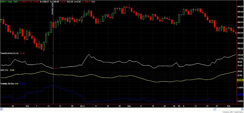
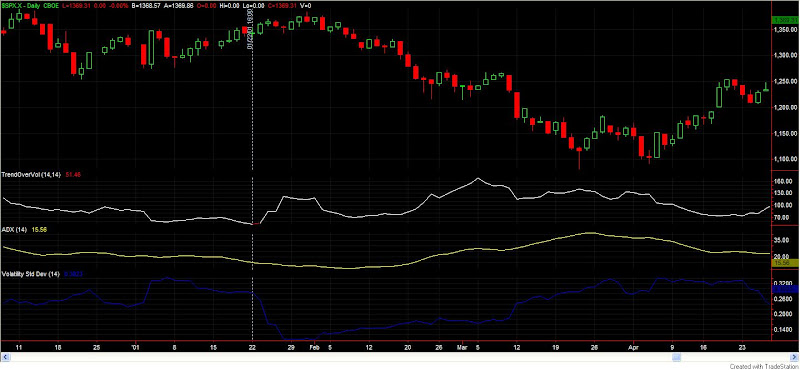
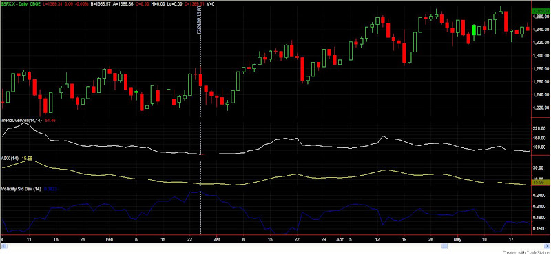
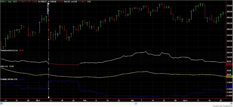
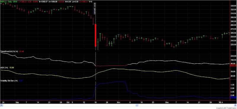
One of the most unusual aspects of the recent environment is how volatile it has been in a virtually trendless market. Wild swings within a range. Lots of chop. To quantify this action I took the 14-day ADX of the SPX (15.56) and divided it by the 14-day historical volatility (volatilitystddev in Tradestation terms), which currently stands at 0.3023. The result (about 51) is what I call trend over volatility (TOV). Charting this helps to see other times where volatility was high and the market wasn’t trending.

Going back to 1960 I was only able to find 5 other periods where the TOV was below 55. Looking at the performance of the market “X” days out gave the following results:

Four pretty strong winners and one sizable loser. Interesting, but perhaps not compelling enough for a directional bet on its own. (Combined with my other recent studies it may be.)

To try and glean a little more I looked at the charts. The top line is TOV. The yellow line is ADX. The blue line is Historical Volatility. The vertical line shows when the TOV dropped to 55 or lower. (Click charts to enlarge.)

October 2002

January 2001

February 1999
January 1988

October 1987

The one thing that stuck out to me? In every case, at some point in the next month there was a sharp drop in historical volatility. In ’87 and ’88 it took about 3 weeks. The other times it was almost immediate. Does the VIX know something? It just might.

Perhaps those uncomfortable with directional bets in the current market might prefer to use options and bet on a reduction in volatility.

I haven’t done too much with this indicator yet, but I suspect it could have applications for individual stocks as well.


Tradestation users who wish to play with this indicator and concepts more may purchase and download the indicator, study, and workspace at the studies section of the Quantifiable Edges website for $12.00. I made the inputs for length on both ADX and Historical Volatility flexible so that it can easily be fine tuned.

Will The Employment Report Cause Large Range Expansion?

Compared to the recent volatility the last two days have been very tame. One line I’m hearing is that traders didn’t want to take big bets before Friday’s employment report. The expectation seems to be that the employment report will spark a big move Friday one way or the other.

To test this I compared the 2-day average true range with the 20-day average true range. The ratio as of Thursday’s close in the SPY was about 0.53. I ran a test to see what happened when this ratio had dropped below 0.55 or lower going into a report. The basic expectation was that the contraction in volatility would reverse after the news was released and lead to an explosion in volatility.

That did not hold true. The table below shows the results.

The third column shows the true range on the day of the release vs. yesterday’s 20-day average true range. The average for the 9 instances was 0.94 – meaning the true range after the report failed to reach even average size (1). In the last column I showed the percentage gap that SPY opened the next morning.

You’ll probably hear a lot of hype about the importance of the number Friday morning. Don’t be too surprised if it turns out to be just that – hype. Historically after such contractions it hasn’t led to the volatility explosion that you might expect.

If you would like to explore the action leading up to and on employment days in more detail and you use Tradestation, you may purchase the study here.

How Markets Really Work – Free

I’ve had the pleasure of doing some work with and for Larry Connors. His ideas have inspired a good amount of the work I’ve done over the last several years. I’ve mentioned before his book “How Markets Really Work”, which has many interesting facts and observations in it. When I went to the TradingMarkets site today I noticed they were allowing free downloads of the book until Monday night. I’d highly recommend people download and read it. Here’s the link:

How Markets Really Work

Consolidating Gains

Today’s action didn’t appear spectacular in any way. The market consolidated its gains on ho-hum volume. While my blog yesterday indicated Tuesday’s big gains served as further confirmation that the market was likely to continue higher for at least a few weeks, the short-term is not as bullish. Most of the time there is some brief give back after such large moves.

I ran some numbers tonight looking at action immediately following up days of 3.5% or more in the S&P 500. Of the 35 instances since 1960 that my scan found, 31 of them traded lower than their thrust day close at some point in the next 5 days. (Make that 32 for 36 after Wednesday.) 18 of the 35 traded lower by 1.75% or more.

What’s this tell me? The pullback today was normal. In fact, continued pullback would be normal. The last two big thrust days (3/11 and 3/18) the market fell hard and fast almost immediately. If the market can get through tomorrow without a sharp selloff, that could be a positive. It would be a change in character.

Some Historical Comparisons

On Tuesday the SPY gapped up over 1.25%. Hopefully readers of the blog recalled that this was not a signal to either go short or take profits on longs. Large gaps up during downtrending markets have a tendency to trap shorts and lead to further intraday gains. This was the case today as the S&P 500 and Nasdaq Composite both finished up over 3.5%.

On March 19th I ran a study that looked at market performance following two 3.5% up days in the S&P 500 within 10 trading days. Results following this type of occurrence were quite bullish over the next 2-6 weeks. There were also some major bottoms identified. Below is a copy of the results table I displayed that day (therefore it doesn’t include the March 19th, 2008 occurrence). $100,000 per trade.

Today we once again saw the 2nd day in the last two weeks to make a 3.5% gain. In fact, that now makes 3 times in 15 trading days. That has only happened two other times since 1960: October of 1987 and October of 2002. Those dates may sound familiar. I posted graphs of those two periods in my March 20th column. They were the only two times other than March 19th and 20th that saw the market rise 4% one day and then drop 2.4% the next (since 1960).

The market continues to provide incredible volatility. In the past this volatility has been associated with intermediate or long-term bottoms. There was probably a fair amount of short covering today. There was also probably a fair amount of short covering in October 1987 and October 2002.

On its own it would be very dangerous to read too much into a study with just two prior occurrences. Taken together with all of the previous intermediate-term studies I’ve referenced over the last few weeks, today’s action acts as confirmation that the market should put in generally higher prices over at least the next several weeks.

If you use Tradestation and would like to purchase and download tonight’s study, you may do so here. (It’s also included in the March 19th package.)

Stuck In The Middle & An Announcement About Studies

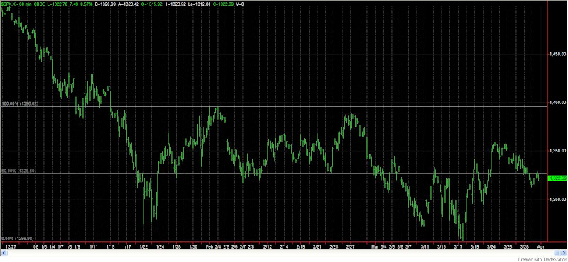
I ran several different studies tonight all of which told me basically the same thing…nothing. From a short-term perspective I am not seeing much in the way of an edge. Let me quickly illustrate why. Below is a 60-minute chart going back to January.

Seems like a lot of movement to go nowhere. The market is right smack dab in the middle again. Rather than try and pick sides here, I’d prefer to wait for a clearer edge.

One notable about tomorrow is that it is the 1st day of the month. Since 1995 the first day of the month has been profitable about 2/3 of the time. (Before that there was no discernable edge.) More details on “1st day of month” can be found here.

I have several new things in the works right now, including a volume study that I hope to complete and release in the next week or so. As some of you may have noticed, I am now making the studies available for Tradestation users to purchase and download. By sometime this weekend I hope to have nearly all studies for Q1 available. I will be offering packages of the studies so that people may either examine the ideas further or use them as templates in conducting their own research.

What Are The Chances The Market Gets "Marked Up?"

As we near the end of the quarter I’ve begun to hear quite a bit about the “end-of-quarter markup” phenomenon. I’ve also received a few questions about it. The theory is that mutual funds and other large institutions tend to “mark up” the prices of securities at the end of each quarter so that their return numbers look better. I decided to take a look.

First I ran a test which showed the return of the S&P 500 on the last day of each quarter going back to 1960. Of the 186 quarter-ends over the period, 90 have had a positive last day of quarter, 94 finished negative, and 2 were basically dead even. The average win was 0.065%. The average loss was 0.06%. The net average day was 0.001%. Not even as good as an average day over the period.

I then checked to see what happened if the market sold off the few days leading up to the last day of the quarter (like now). For instance, 7 times the market sold off at least 2.5% in the last 3 days of the month. Five saw gains on the last day and two saw more losses. Unfortunately, the losses nearly eclipsed the gains. Lowering the requirement to a 1.5% selloff in the preceding 3 days gave 18 trades. 9 winners and 9 losers. Net expectancy was slightly negative.

I then looked at what happened if the S&P was down at least 3 days in a row just before the last day of the quarter. Twenty occurrences. 10 winners. 10 losers. Slight negative expectancy.

Looking at recent history rather than all the way back to 1960 did not help these studies.

No matter how I looked I was not able to find any evidence of an end of quarter mark-up in the index. Perhaps mark-ups occur in individual securities, but it’s not apparent in the general market.

Since I figured some people might be getting sick of looking at those “Myth Buster” guys, I posted some other Busters today…

—————————————————————————————
Would you like to explore these studies more? Or customize them with your own ideas? Quantifiable Edges studies are now available for purchase in Tradestation format along with pre-set workspaces. Click here for more details and a complete list of available studies. Click the buy now button below to download and install directly to Tradestation.

EOQ Markup – $12.00

Review Of Recent Studies

The market has now sold off for two straight days. Of some concern is that I’m not seeing evidence that anything is overdone to the downside. For example, I looked at all stocks in the S&P 100 tonight along with my list of 115 highly liquid ETF’s that I track. None of them made a 10-day low on Thursday. None. Breadth is not suggesting we are due for a bounce.

Price-wise we are back to the middle of the recent range. I have very little to add tonight so I thought I’d do a quick review of outstanding studies. Earlier this week there were several bearish studies which had short-term influence. That influence is beginning to dissipate. Those studies may be found here and here.

Prior to these I had posted several bullish studies with intermediate to long-term influence. Each night in the Subscriber Letter I list all outstanding studies, their time frame and their bias. I find it a useful graphic for helping me organize my thoughts and determine my own trading bias. The bullish intermediate-term studies I consider active are listed below along with the time-frame they looked at.

March 24, 2008 Nasdaq Leadership Bullish – 1-10 weeks
March 19, 2008 Bottom Explosion 2 – 1-20 days
March 19, 2008 3.5% Up Cluster – 10-20 days
March 17, 2008 Consumer Sentiment Stretch – 1-12 months
March 12, 2008 Bottom Explosion – Now What? – 1-20 days

In reviewing them you may notice that many are just beginning to reach their sweet spot.

While the pullback may or may not have farther to fall I am not seeing evidence at this point that it will be anything more than a pullback.

Light Volume Pullback (A Good Thing?)

The standard line on days like Wednesday goes something like this:

The S&P 500 pulled back today on light volume. After the recent run-up the market was due to pull back. The light volume is a sign that selling was not aggressive and should be viewed as a positive. The pullback appears orderly. It would seem buyers just stepped away. There doesn’t appear to be any heavy institutional distribution.

Does any of the above sound familiar? It seems to make sense. Everyone claims they want the market to pull back on light volume. It’s in plenty of books so it must be true. Hmm…

I ran some tests on the S&P 500 looking for the following conditions:

1) Yesterday the 3-period RSI was above 70 (showing there has been a short-term run-up).
2) Today the market closed lower than yesterday.

Buy at the close. Sell “X” days later. Over the last 25 years here is what the S&P 500 has done 3,4, and 5 days out after this setup:

Over the next 3-5 days the market has managed very slight gains.

Next I added a 3rd condition to the mix:

3) Volume must be the lowest volume of the last 10 days.

Again I’m buying at the close and selling “X” days later. Over the last 25 years here is what the S&P 500 has done 3,4, and 5 days out after this setup:

Apparently the “buyers stepped away” on day 1. Over the next few days the sellers filled the void. Very light volume at the beginning of a pullback does NOT appear to be a good thing.

Another myth busted.