Are The Leaders Suggesting A Market Meltdown Or A Sector Rotation?

While the major indices faired well on Thursday, the IBD 100 got whacked. Only 28 stocks rose and the Index declined over 2%. (Hat tip to IBDIndex.) I noticed this has been an especially bad week for the IBD 100. While the S&P 500 is only down 2 points the IBD 100 is lower by almost 3.5%.

The IBD 100 is a group of 100 stocks compiled by Investors Business Daily that represent market leadership. Unlike more traditional indexes, it is updated weekly and turnover on the list is quite high. Since it is supposed to represent current market leadership, I was curious to see if the strong underperformance so far this week would be significant if the major indices actually managed to close positive. In other words, in a generally rising market, does a breakdown in leadership signify sector rotation, or is it a sign that the indices will soon follow the leaders south?


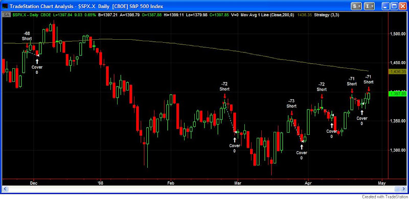
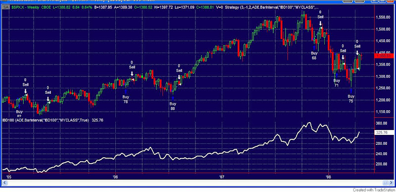
I looked back at weekly data to 3/12/2004, which is all I had available for the IBD 100. There have only been 3 times when the IBD has lost as much as 3% while the S&P has managed to finish the week positive. They were 3/10/06, 7/21/06, and 3/21/08. Below is a chart of all the instances where the S&P has had a positive week and the IBD 100 has dropped at least 1%.

I’ll let you draw your own conclusions, but I’m having trouble finding anything that would suggest a meltdown is imminent. It appears the next 3-4 weeks have often been positive following these instances.

Note: If anyone has or knows where I could find the daily IBD 100 Index values going back to its inception in 2003, please let me know. Thanks.

Intraday Extremes

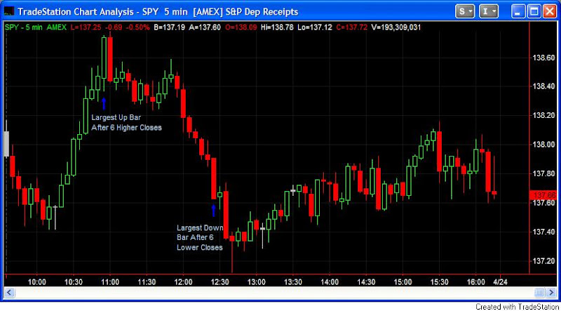
The price action on Wednesday was quite interesting from an intraday perspective. I’ve posted a chart of SPY below. What sticks out to me it the fact that there were two extreme price moves in close proximity of one another. The chart is a five minute chart, which is the intraday chart I look at most often. Notice the two arrows with notes attached.


When you get a strong and steady move like was seen from 10:10 to 10:55 or in the opposite direction from 11:55 to 12:25, one indication that it may be nearing its end is if a large range bar is posted.

To help illustrate this concept I ran some historical studies. The first one looks to sell short any time there have been at least 6 up closes and the most recent bar makes the largest rise of any bar in the move. It then sells “X” bars later or at 4:00 – whichever comes sooner. No trades are taken before 9:50.

As you can see, selling into this extreme move has a positive expectancy from 5-50 minutes out.

The second study looks at exactly the opposite formation. It buys the SPY any time there have been at least 6 down closes and the most recent bar makes the largest decline of any bar in the move. It then covers “X” bars later or at 4:00 – whichever comes sooner. No trades are taken before 9:50.

Again you can see that the edge is for a counter-move rather than a continuation for at least the next 5-50 minutes.

The large bar after the steady trend many times signals a blowoff. It can be a good place to take profits if you are in a trade, or perhaps begin to look for a reversal. This is not a daytrading system by any stretch, but it does illustrate a concept that daytraders may want to keep in mind.

Mid-Sized Gaps Down

With little notable action today I thought I’d write up the next part of my study on gaps during uptrends vs. downtrends. Last week I looked at mid-sized gaps up. Tonight I will look at mid-sized gaps down. As a refresher, a mid-sized gap is defined as a an opening between o.25% and 0.75% away from yesterdays close. A long-term uptrned is defined as a close above the 200-day moving average and a long-term downtrend is defined as a close below the 200-day moving average.

I looked at 3631 trading days going back to 11/17/93. Of those there were 368 mid-sized gaps down in uptrends and 222 mid-sized gaps down in downtrends.

Buying at the open and selling at the close when the market was in an uptrend would have resulted in 177(48%) winners and in total gained 8.5% over the 368 trades. On a per-trade basis that’s 0.02% – basically break even. Of those gaps down 213 (57%) filled at some point during the day. (A fill in this case is defined as a move back up to the previous day’s close.)

Buying at the open and selling at the close when the market was in a downtrend would have been profitable 98 (44%) times and LOST you almost 32% over 222 trades. Per trade that’s about a 0.14% loss on average from open to close. Of those mid-sized gaps down, 152 (68.5%) filled at some point during the day.

I previously showed that large gaps down in downtrends typically represented an intraday buying opportunity as they had a large positive expectancy. Mid-sized gaps do not act the same at all. They contain a negative expectancy. Interestingly, although a good percentage of them fill, they also generally fail. Fading the open could be one play. Another could be looking for a short entry after the gap fills.

As I said last week, make sure you take the following two things into account when deciding how to approach a gap opening: 1) Long-term trend of the market. 2) The size of the gap. They both matter.

Edit note: SPY was used for the above test.

Is Buying Drying Up?

When looking at the market statistics today, the one thing that really stood out was the complete lack of volume. The exchange market volume was nearly the lowest of the year. The SPY and QQQQ volume WAS the lowest of the year.

Back in March I busted the old “light volume pullback after a short-term runup signals a healthy consolidation” myth. Today I’ll look at it a little bit differently.

Only 2 conditions – 1) Today’s volume is the lightest in at least 20 days, and 2) the market is trading above its 10-day moving average. I don’t care whether the market is pulling back or not for this test. I only care if we see exceptionally light volume during a short-term uptrend.

Using these conditions I ran tests on both SPY (back to 1994) and QQQQ (back to 1999). Results below:

It appears buying interest is drying up. In the past the market has not fared well under these conditions.

Some may point out that these results differ greatly from the breadth study I showed yesterday. It appears breadth and volume are currently giving opposite indications. Studies that conflict make analysis more difficult. In the Subscriber Letter each night I discuss my take on all the recent studies. In the blog in the near future I will write some detailed thoughts on how I go about doing this.

Strong Breadth To Finish The Week

A quick breadth study to share with you this morning. Wednesday and Friday’s rallies were both accompanied by strong breadth figures as advancers outnumbered decliners by more than 3 to 1. I looked back to 1969 to see how the market performed in the past when breadth readings were at least 3 to 1 positive in two of three days. Results below:


These results appear strongly favorable. The average week over the sample period returned 0.175%. The results above beat the average by more than 3 to 1 from 1 to 4 weeks out. Last week’s action appears quite bullish.

Morning Breadth

Tonight…some indicator analysis. I think many times traders focus too much on pattern recognition and therefore only look at price. This is especially true of intraday traders. Looking at price and price-based indicators is like looking at the Grand Canyon on a black and white TV. You can see it, but throw in volume and maybe you’ll get some color. Breadth could get you HD. Sentiment gives you surround sound. Add some intermarket analysis like Dr. Steenbarger employs and some historical studies like I prefer and you might actually get to view it for real. Tonight I’m going to look at breadth.

Many traders look at breadth measures like the Advance/Decline line or the McClellan Oscillator on an end-of-day basis. But let’s examine whether intraday breadth analysis can lend some value.

I ran a test back to April of 2001 looking at 15 minute bars in the SPY, the NYSE Advancing Issues and the NYSE Declining Issues. I wanted to see if strong or weak breadth in the morning led to price strength or weakness throughout the rest of the day. The rules for this test were fairly simple.

If advancers led decliners by 4-1 at 9:45, then I would buy the SPY and sell it at 4pm.

If decliners led advancers by 4-1 at 9:45 then I would short the SPY and cover it at 4pm.

Results:

4-1 Advancers:
Trades: 33
Winners: 17
Losers: 16
Avg Win: 0.8%
Avg Loss: 0.5%
Avg Trade: 0.2%
Profit Factor: 1.72

4-1 Decliners:
Trades: 36
Winners: 23
Losers: 13
Avg Win: 1.0%
Avg Loss: 1.3%
Avg Trade: 0.2%
Profit Factor: 1.36

In general, strong advance/decline numbers in the early morning show a mildly positive expectancy in the SPY for the rest of the day while weak a/d numbers show a mildly negative expectancy for the rest of the day.

Traders may benefit from tracking early morning breadth statistics. While this is certainly not something you would want to trade on its own, it may help to confirm or filter trades you are considering. Using breadth in conjunction with price and other kinds of analysis can make for a potent combination.
——————————————————
For those who would like to explore this concept more it is available for purchase and download in Tradestation format here. The study comes with flexible inputs to adjust times and breadth requirements. A pre-set workspace is also included.

Performance After A Gap And Go Day

One test I ran tonight looked at performance following a day when the market gapped up at least 1% and then tacked on another 1% from open to close. The first table below shows the results for the QQQQ:

Results here are quite negative.

Next I looked at the SPY:

Here results were more mixed with the max loss accounting for all of the losses in most time periods.

I also looked to see how often the gap up got filled when the market was trading below its 200 day moving average. For the Nasdaq 55% of the time the gap was filled within 5 days and 74% of the time within 10 days. For the S&P the results again were not nearly as negative. Only 41% were filled within 5 days and 55% within 10 days.

A partial retracement of today’s move at some point seems likely. It may or may not be a few days before that begins, though.

Mid-Sized Gaps Up

After the close today, Intel had a good report. Everyone seems happy (unless you’re short Intel.) The Nasdaq futures are juiced and the S&P’s are even up quite a bit as I write this. We stand a good chance of seeing a gap up tomorrow morning. There are some economic reports to deal with before the opening bell so things can clearly change, but it seems like a good idea to expect we may gap in the morning and to plan for it.

Previously I’ve looked at large gaps up as well as large gaps down, and how the market reacted to them in both uptrends and downtrends. Today I will look at mid-sized gaps up.

As a reminder I previously defined a large gap as one over 0.75% for the SPY. The mid-sized gaps I’m looking at tonight are gaps between 0.25% and 0.75%. Once again I will break the results out between mid-sized gaps up in uptrends and mid-sized gaps up in downtrends. You’ll find the results to be quite different from both each other and the large gap studies.

For uptrend vs. downtrend I kept it simple and used the same definition as last time. If the market closes above its 200-day simple moving average, it’s in an uptrend. If the market closes below it, then it’s in a downtrend.

I looked at 3626 trading days going back to 11/17/93. Of those there were 613 mid-sized gaps up in uptrends and 223 mid-sized gaps up in downtrends.

Buying at the open and selling at the close when the market was in an uptrend would have been profitable about 50% of the time. In total the market would have gained 3% over the 613 trades. On a per-trade basis that’s basically break even. Of those gaps up 356 (58%) filled at some point during the day. (A fill in this case is defined as a move back down to the previous day’s close.)

Buying at the open and selling at the close when the market was in a downtrend would have been profitable 54% of the time. In total, though this strategy would have LOST you almost 66% over 223 trades. Per trade that’s close to a 0.3% loss on average from open to close. Of those mid-sized gaps up, 165 (73%) filled at some point during the day. Even with a slightly higher winning percentage these stats are significantly worse than those above dealing with uptrends.

We previously found that large gaps up typically lead to more upside during a downtrend. Most likely this is because shorts get trapped and the market runs as they scramble to cover. Mid-sized gaps are a different animal. They are not as scary for the shorts. Shorts may even see it as an opportunity to add more exposure, while longs look to take gift profits. Whatever the reason, the long-tem downtrend is generally able to re-assert itself during the day and those that bought into the early morning excitement get punished.

When deciding how to approach a gap up in the morning, make sure you consider at least two things: 1) Long-term trend of the market. 2) The size of the gap. They both matter.

What Happens When Range Rapidly Contracts

In the 1980’s Tony Crabel published research on Wide Range Bars and Narrow Range Bars. He introduced the concept of WR7’s and NR7’s. A WR7 is a bar whose range is wider then the previous 6 bars. An NR7 is a bar whose daily range is narrower than the previous 6 days. Others have done work with WR and NR bars since then including Linda Bradford Raschke and Larry Connors – both separately and together. Their book Street Smarts contains a pattern which uses historical volatility and NR4 bars to look for explosive moves.

The market’s steep selloff on Friday created a WR7 bar. On Monday the selling quieted and the market actually put in an NR7 day. While volatility tends to be mean reverting, it’s unusual to see it contract that fast. I look at the action in the NDX back to 1986 when a WR7 with a lower close was followed by an NR7 the next day. Buying on the close of the NR7 day and holding for “X” days achieved the following results:

It appears the inability of the sellers to follow-through after the wide range day down invites buying over the next several days. In the very-short term (1-3 days) the bias is strongly bullish. Consider the fact that the average day over the period tested was a 0.06% gain. The one day performance following this setup was over 10-times a normal day and over three days it outperformed and average three days by over 5-times. The high win rate and average win size consistently higher than the average loss make this setup intriguing.

A few other notes: 1) Whether the NR7 day was positive or negative had little impact on performance and was not differentiated in the results above. 2) A WR7 up bar is a less bullish setup – but I’ll look at that in more detail when the time is appropriate.

Sharp Drops In Consolidations – Bad News

Friday the market got ugly. The S&P sold of more than 2% and the NDX dropped almost 3%. My take is that we have a strong selloff within a consolidation period. The market is trading right where it has been many, many times since the 3rd week in January. The sideways action of the last 2-3 weeks is basically a continuation of the sideways action over the last 2-3 months. As most traders are aware, markets act differently depending on their overall direction. Uptrends have different characteristics than downtrends which have different characteristics than sideways markets. So I decided to take a look at market performance following a strong selloff in a sideways market. First I tested the S&P 500 under the following conditions:

1) Dropped at least 2% today.
2) Did not make a 10-day closing low. (Suggesting no breakdown.)
3) 14-period ADX is less than 20. (Suggesting congestion.)

Buying when these conditions occurred and selling “X” days later produced the following results looking back to 1960:

Negative expectations and very low % profitable. Quite negative on a small sample size even as far out as 4 weeks. For those that would like to take a closer look, here are the dates: 6/23/70,12/02/74, 1/7/81, 4/14/88, 5/14/99, 2/9/00, 1/5/01, 10/29/01, 9/12/02, 11/1/07, 12/11/07, 4/11/08.

To gain a larger sample size, I decided to look at the NDX, which historically has been more volatile. In this case I required a 2.5% drop (instead of 2%) and kept the other requirements the same – no closing 10-day low and a 14-period ADX below 20. With less historical data this test only ran back to 1986. Below are those results:


More of the same here.

Strong pullbacks in strong uptrends may be buyable. Strong pullback in consolidations, on the other hand, have historically led to more downside. Based on this study, caution seems warranted.

Mythdirection Thursdays

So Adam at the Daily Options Report on Thursday threw down the gauntlet when he said he’s never seen a study which confirmed or denied the legend of “Misdirection Thursdays”. Allegedly, whichever way the market moves on the Thursday before expirations week is counter to the general direction it will move from then until expiration. So I ran some tests.

Buying (shorting) at the close on Thursday before expirations week if the market was down (up) and selling (covering) the Friday of expirations would have netted the following results since July 1978:

Trades – 354
Winners – 171
Losers – 182 (1 breakeven)
Average trade – -0.08%

So the overall concept doesn’t seem to hold. What if we break it out by longs and shorts?

The long signals were profitable 57% of the time for an average gain of 0.24% over 6 days.

The short signals were profitable 40% of the time for an average loss of 0.39% over 6 days.

Here we see that the short signals were actually a better buy signal that the buy signals.

Meet Mr. Douglas – the newest myth-Buster.

Relatively High Put/Call A Positive

The market finally broke its consolidation on Wednesday. One intermediate-term positive I’m seeing right now is the action in the CBOE put/call ratio. Today it closed at 1.16. Over the last 4 days it has averaged 1.12. High put/call ratios are normally associated with market selloffs, yet the market made a 20-day high as recently as Monday.

Relatively high levels of put buying are indicative of worry on the part of traders, which is why they are more common during selloffs than during upmoves. I looked back to check other times when the 4-day put/call ratio was above 1.10 and the market was within three days of a 20-day high. Looking back to 1995 I only found three instances: 8/23/06, 2/23/07, and 5/25/07.

August 23, 2006 was a great buying opportunity both short and long-term. It marked a low point and the market rallied for several months following that.

February 23, 2007 was certainly not a buying opportunity. It came just two days before the market collapsed over 3.5% on February 27th.

May 25, 2007 was followed by a 5-day rally and then an extremely choppy month of June.

Not much to learn from these three examples. It should be noted, though that the put/call ratio has been significantly higher over the past couple of years than it was in the beginning of the decade. To adjust for this I normalized the data by using the 100-day moving average.

I once again looked at any time the S&P 500 had made at least a 20-day high in the last 3 days. This time I only required that the four-day average put/call ratio was above its 100-day moving average. After eliminating overlap and looking out at least 20-days I found 47 instances going back to 1995. 33 of these led to positive returns over the next 20 days and 14 of them led to declines – a 70% win rate. The average win was 2.7% and the average loss was 2.5%. The average trade was 1.1%. Not overwhelming numbers by any stretch but not bad, especially considering the market was already at a 20-day high.

In all I would consider the relatively high put/call ratios we are currently seeing a positive. They may help to provide a “wall of worry” for the market to climb.

A Rooster Egg Market

I remember a riddle from when I was a kid that went something like this:

Q: If a rooster lays an egg right at the very peak of the roof of the barn while facing north and the roof slopes east and west, which way will the egg roll?

A: It won’t. Roosters don’t lay eggs.

Now for the market:

Q: If the S&P shoots up 2.5% or more in one day and then closes within 0.5% of its closing price the next five days in a row, which way will the market break?

A: The S&P doesn’t do that…until now.

Here’s a line chart of the S&P 500.

I see no short-term edge.

In other news, Alcoa (AA) released earnings Monday night. They disappointed and sold off a little bit on Tuesday. Alcoa’s earnings release always comes with great fanfare because it’s typically the first large-cap to report after the end of the quarter. Does it really deserve all the fanfare? Is it somehow predictive of how the market may perform during earnings season? I figured it was worth a look.

The test was run as follows. I looked back at the last 25 earnings announcement for Alcoa. If Alcoa rose following its earnings announcement I bought the S&P 500 and held for 25 days. If Alcoa fell following its earnings announcement I sold short the S&P 500 and covered 25 days later. Results below broken out by buys and sells:

Buys: 9, Winners: 5, Losers: 4
Shorts: 16: Winners: 9, Losers: 7

From this limited test it appears the reaction to Alcoa’s earnings is about as important to the market as scoring first is in a basketball game.

What’s a trader to do when they can’t identify a clear edge in their timeframe/market? Some thoughts on what to do between trades from Dr. Steenbarger might help.

How The Subscriber Letter Fared In March

A little delayed I’ve posted below some statistics for the first month plus of the Subscriber Letter. March was a terrific month for the Letter.

Note – this is not a performance record. I do not make recommendations in the Subscriber Letter. This is simply a listing of trade ideas. Past performance is not necessarily indicative of future results. March may turn out to be the best month ever.


A few notables I should point out:

First, some trades ideas are scaled in to. Therefore you may see more than one position in the same security on at the same time. If the method calls for scaling in, it is most commonly done in up to 3 parts.

Subscribers also receive intraday updates on many open trade ideas. The intraday updates are not reflected in the overall statistics. For instance, I sent out an update on the XLV and PPH trades above on the morning of 3/7 when they gapped up. It indicated that certain targets had been reached and traders could consider exiting these trades prior to the Monday open when the “official” exit prices would be determined. Both trades were profitable at the time of the update. A similar scenario occurred with a few stock trades during March as well, where late-day selloffs and gaps down caused hits to the official stats, while many subscribers were able to fare much better.

Those interested in checking out the Letter in more detail may shoot an email to QuantEdges@HannaCapital.com and receive 3 free issues. Just include your name and email address.

A Look At Some Negative Reversal Bars

We saw a few examples of positive reversal bars at work in the first quarter. On Monday the market formed a negative reversal bar. Below are descriptions of what I saw in the NDX and the SPY and the action of the market following similar setups in the past:

Choppy trading over the next day or two has led to a downside edge once the market is 3-5 days out from these bars. Combined with the low VIX and the overbought readings of some indicators, caution seems warranted here.