The market gapped up huge this morning on the Fed liquidity announcement. Fading gaps and selling rallies have worked well recently for traders and in the morning that looked to be the plays once again. Readers of the blog know that large gaps up in downtrends have a sizable edge for further upside. The big money today for those who entered flat was not the gap fade, but rather finding a long entry to ride the afternoon market into the close. Buying into large gaps during downtrends provides traders a quantifiable edge. This is true for large gaps down as well as up.
With the Capitulative Breadth Indicator (CBI) up to 15 yesterday I was heavily long on individual trades and had taken on index exposure as well. I was looking for one of two things to happen before taking any more long index exposure: 1) A washout day to the downside. 2) An up close or reversal day.
We got the up close today to the tune of 3.71% in the S&P 500. That’s an exceptional one-day move. So the question now becomes, has the move come too far to chase at this point? It is better to wait for a lower entry point?
I ran some tests tonight to see how the market acted under similar circumstances. I looked at all instances where the S&P closed at a 100-day low and then exploded up 3.5% or more the next day. Looking back to 1962 I found 9 other instances Below is a table showing the results of buying at the close and holding for the next X days. (Click table to enlarge.)
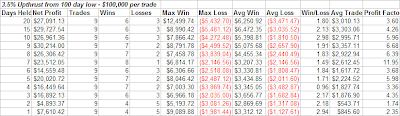
The stats are quite impressive with the average trade gaining 2% over the next week and 3% over the next two weeks. The average winning trade posted 3.4% over the next week and 5.4% over the next two weeks. There is a positive expectation going forward for the next month. The summary stats don’t tell the whole story, though.
Let’s look at the dates along with some notes:
5/27/70 – Shot higher for another 5 days in a row before resting.
7/12/74 – One more up day before 1 ½ day pullback followed by 1 week drift higher.
11/1/78 – Turned tail immediately and headed south. Took over a month to get back to closing level.
10/20/87 – One day higher then 3 day pullback before bouncing back up.
9/1/98 – 3 down days then next leg up.
4/5/01 – 1 day 2.7% pullback then back up.
9/24/01 – 1 more up day followed by 1 ½ day pullback then move higher.
5/8/02 – 2 day pullback of 3% followed by a 1-week rally that ultimately failed.
7/28/02 – 1 day pullback then rocketed higher.
Additional observations:
The only one that didn’t add on to its gains at some point in the next week was 11/1/78.
The only one that didn’t trade below its large upthrust close in the next week was 5/27/70.
The remaining 7 pulled back between 0.5% and 4.1% at some point in the next 3 days.
The average pullback was 2.75%.
Five of the remaining 7 began their pullback the next day.
September 1 1998, September 24 2001 and July 28 2002, which are all on the list above are the 3 times the CBI spiked to 15 or higher while at a new low. They are the dates I mentioned last night.
The above analysis combined with the fact that the CBI remains high indicates to me there’s still some juice left in this rally. It also appears likely the market will look to digest these gains over the next 1-3 days and traders looking for short-term gains may be able to get a better entry point.


