QE Buying Power Index & Swing Trading System

A market variable that I rarely see discussed and almost never utilized is Buying Power. And while it has become easily measurable and quantifiable over the last several years, I have found very little information on the concept. In some special webinars next week I will unveil the new QE Buying Power Index. The QE Buying Power Index can be used to help determine whether a reversal or a continuation of a move is likely. Below is a simple swing trading system that demonstrates the value of the QE Buying Power Index.

To see its impact on performance let’s examine a simple swing trading system that looks to buy pullbacks. The pullback approach is very simple. The swing system buys SPX whenever it closes in the bottom 20% of its 10-day range and holds it until it closes in the top half of its (then current) 10-day range. In the performance report below you can see how SPX performed from 2008 – 2011 when pullbacks were bought and the QE Buying Power Index reading was low.

While there were a few more winners, the size of the losers was much higher. Buying pullbacks in this way would have produced more frustration than profits. It was essentially a breakeven strategy over the 4-year period.

But now let’s look at results when the QE Buying Power Index was providing strong readings.

The numbers here are outstanding. With strong buying power present pullbacks provided high probability opportunities. Let’s take a quick look at a profit curve to see how the steady the gains were.

Profit curves don’t get much more appealing than that.

So what is the secret, and how can you compute the QE Buying Power Index yourself? Register for one of the webinars and find out! The cost is only $25.00, and while performance is never guaranteed, your satisfaction with the information presented is – 100%. For more information and to register for an upcoming webinar click here.

A Long-Term Look At Employment Days

Employment days have an interesting history and they have contributed to some worthwhile studies over the years. Below is a chart of SPY performance on Employment Days. For this equity curve I filtered to only include days where SPY was > its 200ma. Each trade was a fictional $100k.

What I find so interesting about the chart is that for a long time Employment Days in uptrends showed a strong propensity for gains. But in 2000 this edge vanished. Since then there has been no apparent advantage – bullish or bearish.

Strong Breadth & a Down SPX

When breadth posts solid numbers and the SPX declines (during an uptrend) that has often been followed by a rebound in the next few days. The study below triggered at Tuesday’s close. It is one I have shown several times in the Subscriber Letter.

The edge isn’t huge, but it does appear to be fairly reliable. Much of the edge is realized within the 1st 2 days.

The Odds That Turnaround Tuesday Lives Up To Its’ Name…

I’ve shown before that of all days Tuesday has historically shown the highest propensity to halt a short-term pullback. The study below is one from the larger Turnaround Tuesday study. All stats are updated..

As you can see the market has strongly favored a quick move higher. And when that move hasn’t happened on Tuesday it has often happened in the next few days.

When SPX Closes Just Under a 50-day High Prior to a Fed Day

Yesterday I showed that Fed Days typically carry a bullish edge, but that edge failed to hold when the SPX closed at a 20-day high just prior to the Fed Day. By closing down 0.1% Tuesday the SPX narrowly missed closing at a 20-day high. So are we now safe because the market just missed a new high by 0.1% on Tuesday? Last night I suspected not. And so I ran the below test. Since we are near a 50-day high I used that as the filter rather than a 20-day high. I looked at times where the SPX did NOT close at a 50-day high, but in fact closed less than 0.5% below it. So although it is not a new high, the environment still appears positive. Let’s look at the results.

Twenty-five instances and the result is nearly dead-even. This is very similar to what we saw with yesterday’s study. I’m not viewing today as a typical strongly-bullish Fed Day.

Intermediate-Term Highs Prior to Fed Days

Wednesday is a Fed Day.  As I have discussed many times, Fed Days generally carry an upside tendency.  But this tendency is greatly impacted by certain variables.  A large collection of these variables may be found here on the blog under the “Fed Day”label.  And many more may be found in the “Quantifiable Edges Guide to Fed Days”.
One variable I briefly discussed in the 11/3/10 blog was whether the market was already at an intermediate-term high.  Today I thought I would illustrate that study graphically.
First, let’s take an updated look at SPX performance on Fed Days when the SPX has NOT closed at a 20-day high the day before.
That’s basically 30 years of bullishness.
But now let’s see performance at times when the SPX did close at a 20-day high the day before.
No consistency and no pronounced edge in this sample of 36 instances.
Traders looking to play for a short-term Fed Day bump should be hoping the SPX does not close up and at a new high again today.

When the Market Closes Strong Just Prior to Op-Ex Day

Despite the negative seasonality that is typical during January op-ex and MLK week (which are often the same) the market has continued to rise and closed Thursday at a new rally high. The study below was last seen in the 2/18/11 subscriber letter. It examines performance when the SPX closes in the top 10% of its 10-day range on the Thursday before op-ex. Stats have been updated.

The numbers here are fairly compelling and suggest a possible downside edge.  Prior to 2003 the edge was less pronounced but still negative.

January Op-ex Week’s Recent Struggles

January op-ex week has been a tough week for the market since 1999. Interesting about January op-ex week is that it often occurs in conjunction with Martin Luther King Day. Below is a list of the last 13 January op-ex weeks with their performance results. Note that some of these weeks contained four trading days and some contained five. In either case the market was assumed to have been “bought” the Friday before op-ex Friday and “sold” on op-ex Friday.

As you can see there has been a decided downside tendency over the last 13 years. The drawdown / run-up stats at the bottom are especially compelling for the bears.

New High, Unfilled Up Gaps, but Weak Finishes

While the final numbers were good and the SPY left an unfilled upside gap, some traders may have been disappointed yesterday that the SPY finished in the lower part of its daily range. Historically, unfilled gaps and 20-day intraday highs as was put in on Tuesday have been followed by much more positive action when the rally closed meekly. Tuesday’s action actually appears bullish. This is something I examined just last week in the 1/4/12 Subscriber Letter. Below is an excerpt from that letter.

I ran a test of performance following unfilled upside gaps that make a 20-day high. Below I’ve broken out the results by times the SPY closed above the open versus times where it closed below the open.


First let’s look at those times where the finish was relatively strong:


There doesn’t appear to be any edge in either direction here. Now let’s examine times like the present where SPY closed below the open.


These results are substantially better than earlier where the finish was good. Rather than worrying about the weak finish bulls should be excited by it.

2011 (and prior) Trade Idea Results from the QE Subscriber Letter

I don’t often discuss trade idea results from the subscriber letter here on the blog. The last time I did was in June. But 2011 was another solid year and I thought it would be worth mentioning in the hope that Quantifiable Edges could help traders improve their results in 2012. I don’t post results regularly because while I’ve always tracked trade ideas in the subscriber letter, it isn’t the main focus of the service. I don’t consider Quantifiable Edges to be a stock picking service. I consider it one where traders can gain market and trading knowledge through the published research, systems, and tools. The objective is to provide tools and instruction to help traders improve their own trading and results.

But the published trade ideas have done quite well. In fact, during 2011 October was the only month where the trade ideas failed to add up to positive gains. I’ve had several letters from subscribers lately telling me they’ve done quite well following certain ideas and that is always nice to hear.

I don’t suggest position sizes, and I would never suggest that the trade ideas represent any kind of complete portfolio strategy. They are what they are – ideas about certain stocks or ETFs that have historically provided a statistical edge.

It is important to note that all of the trade ideas are in either ETFs or in highly liquid large cap stocks (almost exclusively S&P 100 components). I do this so that executing trades and getting fills at reasonable prices is not an issue. I think traders feel the most frustrating aspect of following trade ideas offered by some services is not being able to get into or out of the trades that they suggest at a similar price. I’ve addressed this problem with limit prices and highly liquid securities.

Some of my goals with a gold subscription have always been to help people improve their trading through the use of quantified research, and while doing so to help them offset the costs of the subscription by offering easy-to-execute trade ideas with a long-term positive profit expectancy. To date I believe Quantifiable Edges has succeeded in doing this.

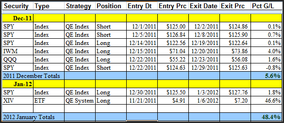
Today I broke the results down by year. Amazingly, for the 2nd year in a row the trade ideas during 2011 averaged a 1.00% gain per trade idea. I also listed all of December and January’s (so far) results below so that traders could see some examples. For tracking purposes I only count trades after they have been closed out. With most trades being of the swing variety this doesn’t normally skew results much. But we did just close out a big winner that was entered in November so 2012 results are overstated while 2011 are a bit understated due to that particular trade. First let’s look at the results by year:

Now recent trade ideas:

For those that are interested, the complete list of trade ideas from 2008 – present can be downloaded from the systems page of the members’ section of Quantifiable Edges. (Available to paid and trial subscribers.) And with the full archive of subscriber letters available on the site, gold subscribers can also go back and see what I wrote about any trade and my reasons for entry and exit when it happened.

With a subscription to Quantifiable Edges I try and provide traders with ideas and instruction to improve their trading. These ideas may come in the form of previously published studies identified by the Quantifinder, or they may be something I discuss in the current subscriber letter, or perhaps it’s a webinar focused on a certain trading approach or indicator, or any other number of tools that I’ve designed and made available. (For a more complete list of tools, see the “Using Quantifiable Edges” series of posts.) The trade ideas found in the subscriber letter are examples of how I put these tools and ideas to work. While past performance is not necessarily indicative of future results, over the long run they’ve performed well enough that many subscribers have used them for their benefit.

For more information on a gold subscription, or to subscribe, click here.

Lastly, below is the explanations and disclaimer from the Trade Ideas Results Spreadsheet.

All trade ideas ever tracked in the Quantifiable Edges Subscriber Letter may be found on this spreadsheet. I don’t suggest position sizes. The primary reason for this is I’m not acting as a financial advisor. I don’t feel it is appropriate to suggest allocation sizes without understanding someone’s financial situation and risk tolerance. Even for my own trading I run different portfolios with different levels of aggressiveness. For instance, my most aggressive may use options to sometimes get 300-400% leveraged. Other portfolios on the other hand normally take much more conservative stances and some rarely reach or exceed 100% exposure.


Since I don’t suggest position sizes this is should not be considered a performance report, but rather a trade idea scorecard. Therefore, no matter how objective I try to be the reporting of the results is always going to be skewed depending on how you approach the trades. For instance, I always recommend scaling into the Catapult positions in 3 parts, whereas the “System” trades (whatever system I unveil other than Catapult) are normally one entry. The “Index” trades I normally recommend scaling into as well. For my own trading I trade much larger size with the index trades than any of the individuals. I also control my exposure by limiting the total amount invested per day. As I mentioned, this will vary depending on the account I’m trading. My most aggressive account I may put in up to 100%/day and get heavily leveraged using options. A more conservative account may max out at 15%-20% per day.


It’s unlikely anyone would have taken all of the trades with equal amounts, so personal results would vary greatly depending on the trader’s approach. Simply adding up the results of the individual triggers as I do is an admittedly poor representation of returns. A net positive or negative does not necessarily mean a person following the ideas would have made or lost money during the period measured. And the sum total is certainly not representative of what a portfolio would return.


Feel free to contact me at support @ QuantifiableEdges.com if you have any questions.


As required by the NFA: Except where otherwise specifically stated, all trades are based on hypothetical or simulated trading. Hypothetical or simulated performance results have certain inherent limitations. Unlike an actual performance record, simulated results do not represent actual trading. Also, since the trades have not actually been executed, the results may have under-or-over-compensated for the impact, if any, of certain market factors, such as lack of liquidity. Simulated trading programs in general are also subject to the fact that they are designed with the benefit of hindsight. No representation is being made that any account will or is likely to achieve profits or losses similar to those shown. Commissions, fees, and slippage have not been included. This is neither a solicitation to buy/sell securities or listed options.

Strong Closes for Very Modest Gains

The study below was from the Quantifinder yesterday and was last seen in the 1/26/11 subscriber letter. It suggests that when SPY closes strong (in the top 10% of its range) but still only manages a small gain on the day, that the next day has a downside tendency. Stats are updated.

As you can see, the bearish inclination appears to max out after just 1 day. And while not terribly large, the edge has been fairly consistent over time. Just a little pattern to keep in mind today and in the future…

1% Gaps To Start A Month

With futures up over 1.5% as I type pre-market, we’re seeing an unusually large gap up to start the year. Below is a list of the 8 other instances since 2003 that SPY gapped up at least 1% to start the month.

A few notes:
8/2/10 was the only instance that gapped up as much as 1.5%.
Looking out over next several days there was typically a pullback following day 1.
None of the other instances started off the year.

Evidence isn’t overly compelling, but we could see some add-on buying during the day today.

NASDAQ’s Astounding Performance on the Last Day of the Year

Last year in the 12/30/10 blog I showed that while the last day of the year used to be a bullish day for the market it seems to have changed over the last decade into a seasonally bearish day. I looked at performance across a number of indices last night and found the tendencies to be fairly consistent. Below is an updated equity curve for the NASDAQ Composite on the last day of the year. Its results easily stood out the most.

Closing up 29 years in a row is fairly astounding. Just as astounding is the abrupt end to the apparent edge. I am not yet ready to fully label the last day as bearish, but it should certainly no longer be considered bullish. I have no good explanation for why this may have changed, but it obviously has.

And that is something we always need to keep in mind. The market is constantly changing. It is important to always keep studying it, keep an open mind, and adapt as it evolves. Best to all in 2012! I hope it is a prosperous year for you and I hope Quantifiable Edges proves helpful along the way!

QE Big Time Swing System 2011 Results Posted

I’ve updated the Quantifiable Edges Big Time Swing System overview page with results through December 28th. There is not a SPY trade currently open and based on the current market setup there is no chance of a trade triggering before year-end. I don’t update results that often since the system only trades about once per month on average.

The 2nd half of 2011 was a somewhat difficult period for those using the system to trade SPY. In August SPY suffered the worst losing trade in its history after it triggered long shortly before the US debt downgrade and market collapse. This 1 trade alone was responsible for an 8.26% loss. But even with the loss the Quantifiable Edges Big Time Swing System managed to finish the year with a small 0.25% gain for SPY traders (including dividends, commissions, interest, and compounding assumptions). This was certainly disappointing but in a tough year for the market, and with the SPY suffering it’s worst drawdown ever, it was nice to be able to finish in the black.

Traders who used the standard parameters and traded any of the other 29 ETFs that I discussed in the manual and have tracked for the last several years likely made out much better than this. Including SPY, the average return of the 30 ETFs was 11.54% and the median was 9.65%% (see assumptions in table). If you want to see stats for the full history of the 30 ETFs, that can be found on the Quantifiable Edges Big Time Swing overview page. I have listed 2011 trading results for all 30 ETFs in the table below.

You may have noticed that SPY shows a gain of just over 1% here.  The disparity between this 1% gain and the 0.25% gain shown on the overview page is primarily the dividends that had to be paid on short positions and the fact that it had to overcome a drawdown.  Most of the time the “raw” returns here will understate the compounded results.  That isn’t the case this year for SPY.

As you can see, EEM was the star in 2011. It has done extremely well over the last 5 years. This is the 3rd year in the last 5 that is has returned over 33%, and all 5 years it gained better than 12.5%. This isn’t typical, though. EEM has been an especially strong performer.

For those looking for a system that they can use as a base to build their own system from, the Big Time Swing is an attractive option. It is all open-coded and comes complete with a substantial amount of background historical research. And since it is only in the market about ¼ of the time, it can easily be combined with other systems to provide greater efficiency of capital. Once you’re ready to try and improve the system yourself you can also refer to the system manual or the August 2010 purchaser-only webinar – both of which discuss numerous ideas for customization.

And if system development isn’t your thing, the Big Time Swing System provides easy to follow mechanical rules that you can follow. The standard parameters have performed quite well. There are only about 12 trades per year averaging 7 trading days per trade. All entries and exits are either at the open or the close. And to be sure you have everything set up properly traders may follow the private-purchasers only blog that shows all SPY signals and possible entry/exit levels. This service is free for 12 months from the date of purchase.

For more information and to see the updated overview sheet, click here.

If you’d like additional information about the system, or have questions, you may email BigTimeSwing @ Quantifiable Edges.com (no spaces).