Introducing the Quantifiable Edges Catapult Exit Designer

The Quantifiable Edges Capitualtive Breadth Indicator (more commonly known as the “CBI”) was introduced in just the 3rd blog post I ever did on January 6, 2008. The CBI was devised from a system I use to trade individual (primarily S&P 100) stocks and sometimes ETFs. I devised the system in 2005 and refer to it as my “Catapult” system. The Catapult was designed to take advantage of extreme (often capitulative) selling in these securities. The CBI reading is basically a count of the open Catapult triggers at any one time among S&P 100 stocks. What I noticed early on was that broad triggering of this system was frequently a sign that not only were these individual stocks primed for a bounce, but the market as a whole was also very likely to bounce. I have written an awful lot on the blog about edges that could be found by entering the market when the CBI reached certain levels. Traders that would like to examine any of that research more closely are always welcome to use the “CBI” label at the right hand side of the blog. It will pull up all associated posts.

In February 2008 I began the Quantifiable Edges Subscriber Letter. As part of the letter I included signals for my Catapult System. The success of the Catapult trades over the years has made it an attractive and somewhat popular feature for subscribers. I publish any signals that occur that night in the letter. Then using a limit order the next day I track them in the letter as well. When the exit signal occurs I also note this. The standard exit for a Catapult is at the open the day following the exit trigger. (On occasion I will send intraday updates alerting subscribers that the exit will trigger at a certain level and I am going to exit the trade at the close rather than waiting for the next day’s open.) While many subscribers have profited from the Catapult trades, there has been one common complaint.

The complaint is that since the Catapult is the one system on the site in which I do not reveal the entry and exit criteria it makes the trades uncomfortable for some traders. Not knowing when (or exactly how) the exit will come has prohibited some subscribers from ever entering these trades. They have instead watched many go by and found themselves a bit frustrated that they couldn’t take advantage without understanding the exit criteria. So I set about to solve this issue. Recently I released to subscribers the “Catapult Exit Designer” for Tradestation. The Catapult Exit Designer is open code that triggers entries as listed in the Subscriber letter over the last 4 years (over 250 trades) and allows the users to test their own exit criteria. It generates files for them with results of all trades. And for those subscribers that don’t use Tradestation, I show all the code and explain all the logic behind it so that you may easily transfer it to you preferred platform. In addition I provide sample exit strategies that would have produced results very similar to the actual Catapult exits.

The Catpult trades have done very well over the years. Of those that received fills and were tracked in the letter over 72% were winners, the average trade made 3.35% and the profit factor has been an impressive 3.32. What has most attracted me to this strategy is not just the fact that it has made money, but WHEN. Catapults generally trigger when the market gets scary. They happen when other systems and techniques I employ have sometimes struggled. So they have not only made me money, but they’ve done so when other methods were losing.  This was greatly useful in helping me to limit or avoid drawdowns. The timing of the trades can be seen in the chart below. The top of the chart shows the S&P 500. The indicator on the bottom is the CBI. One way I track catapult trades is by “clusters”. A cluster of trades begins when the CBI moves above zero and it ends when the CBI returns back to zero. Historically I found over 90% of clusters would have been net winners had you taken all the trades in the cluster with equal size. (The last cluster that had a net loss was about 2 ½ years ago.) Above each cluster in the chart is a number. That number shows the net additive gains that would’ve been generated by that particular cluster.

(As an example to clarify, the latest cluster closed out in October. That cluster saw 8 Catapults get triggered and filled. They all were winners (not typical). The % gain for each was the following: 2.8%, 6.2%, 5.0%, 11.1%, 5.2%, 8.9%, 0.2%, and 0.3%. Add those numbers up and you get the 39.7% shown above the October cluster. That is what I mean by “additive gain”. It is NOT a portfolio return.)

This year all the trades have come in 4 big clusters. And they all came during sharp selloffs when other methods may have been under stress. I’d be happy to show years 2008 – 2010 but this post is already way too long. If you want to see those results you may use the link below. They are shown there.

https://quantifiableedges.blogspot.com/2011/02/using-qe-to-your-advantage-subscriber.html

The Catapult System has been a favorite of mine and of subscribers over the years. Hopefully with the new Catapult Exit Designer more people can begin to take advantage of the opportunities the Catapult System identifies. If you think there might be some tough times in 2012 and would like to implement a method that can possibly take advantage of them, then the Catapult System may be one option. Both the Catapult System triggers and the new Exit Designer are completely included in a Quantifiable Edges Gold Membership.

When BKX Drops Hard The Day Before A Fed Day

One sector that is especially sensitive to Fed Days is the banking sector (BKX). BKX closed down on Monday about 2.5%. The study below looks at drops of 2% or more on the day before a Fed Day, and how the BKX responded on the Fed Day.

Instances are a little low here but the stats are overwhelming. Below I have listed all instances.

Not shown in all the above stats is that the average run-up was 4.2% and the average drawdown just -0.6% during the Fed Day. Overall risk/reward appears strongly favorable for BKX based on the limited sample size.

The Mooost Wonderful Tiiiiiiime of the Yearrrrrrrrr!

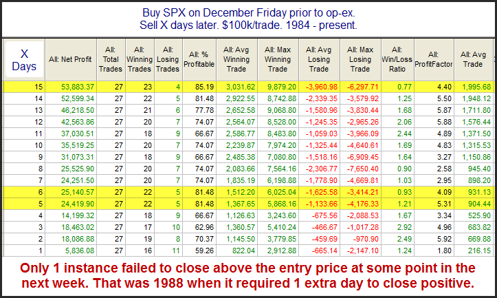
Over several time horizons op-ex week in December has been the most bullish week of the year for the SPX. The positive seasonality actually has persisted for up to 3 weeks. I demonstrated this most recently in the the blog exactly a year ago. I’ve updated that study below to include last year’s stats.

The stats still appear extremely strong. I normally only show equity curves in my subscriber letter, but I’m in a good mood this morning, so below is a curve using a 5-day holding period.

Aside from the big pullback in 2000, it has been a strong steady move higher. This would seem to confirm the bullish edge.

The Nasdaq’s Strong Tendency Under Similar Circumstances Over the Last Decade

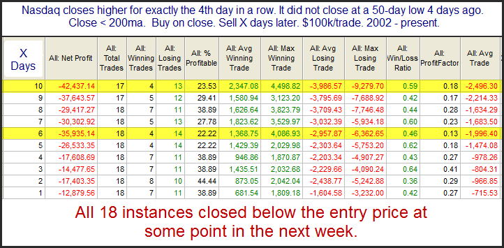
Many people are aware that several higher closes during a downtrend will often suggest a downside edge. Few people realize how strong this tendency has been in the Nasdaq over the last decade, especially once the index has closed up 4 days in a row. With the Nasdaq now up exactly 4 days in a row as of Monday’s close, the study below is triggering.

Not only has the bearish tendency been strong and consistent, but it has persisted for as long as 2 weeks in most cases.

Are you wondering why the 50-day low filter is included?  Here’s why:

https://quantifiableedges.blogspot.com/2011/10/why-shorting-in-this-environment-can-be.html

2% Gaps Up From 20-day Lows

With SPY looking to gap up over 2.5% this morning below is a quick look at all other instances since 2003 when SPY gapped up over 2% immediately following a 20-day low.

Low number of instances, but the suggestion is obvious.  I would note, though that although they all finished higher, they also saw some substantial pullbacks from the opening price.

When The Wednesday Prior To Thanksgiving Has Closed Lower

It appears the market is going to buck historical tendencies today and close down.  This will be the 11th time since 1960 that the SPX has closed lower on the Wednesday before Thanksgiving.  Below I have listed the other 10 instances along with the SPX performance on Friday (the day after Thanksgiving).

The 2 instances that I have circled are the only 2 where the SPX closed the Wednesday before Thanksgiving down over 1%.

For what it’s worth I would note that statistics associated with these 10 instances (win %, profit factor, avg. gain, etc) are pretty much in line with all Fridays after Thanksgiving.  (It has generally been bullish.)

The Wednesday Before Thanksgiving

Thanksgiving has typically shown some pretty consistent seasonality.  Both the Wednesday before and the Friday after have exhibited bullish tendencies while the Monday after has been slightly bearish.  Last year I showed a table breaking it all down by day.  Today I decided to show a profit curve that represents simply owning the SPX from Tuesday’s close through Wednesday’s close.

Futures are down quite a bit this morning, so it may be difficult to keep this curve moving higher today, but over the years the next couple of days has been a pretty good bullish bet.  And when seasonality is this consistent it is often worth keeping in mind.

A 1% Gap Down from a 20-day Low

The SPY finished at a 20-day low on Friday, and now it is gapping down large this morning. I ran a test to see what kind of intraday edge this might suggest.

The raw numbers appears to suggest a mild intraday upside edge. But take a look at the profit curve.

This curve does not get me excited about buying into this gap down. Instead I will need to see more compelling evidence in order to anticipate an intraday move higher.

Vegas Traders Expo

I am at the excellent Las Vegas Traders Expo for the next few days.  I plan on seeing several presentations and will be speaking myself on Saturday.  I’d love to meet some blog readers, so please come introduce yourself if you see me. 

More information here:

https://www.moneyshow.com/tradeshow/las_vegas/traders_expo/main.asp

And here’s the info on my presentation:

https://www.moneyshow.com/tradeshow/las_vegas/traders_expo/workshop_details.asp?wid=662DEA40711D4A5996872FB4F518F39D

Low Volume A Possible Concern

Monday’s extremely low volume could be a short-term bearish sign. The 0.96% drop did not quite qualify for this 2008 study, but below is another past study that does exemplify the low-volume issue. Rather than index volume, it uses SPY volume. Either one would yield similar results in this case.

While not the most overwhelming edge we’ve ever seen, it does seem to strongly suggest that caution is warranted.

Veterans Day Performance

Veterans Day is one of the few US holidays when the bond market is closed and the stock market is open. Columbus Day is another. But while Columbus Day has exhibited some quantifiable edges, Veterans Day has not. Veterans Day is celebrated on November 11th (or the closest weekday to November 11th) each year. For a brief period from 1971 – 1977 it was celebrated on the 4th Friday of October. Below is a profit curve that shows how Veterans Day has performed over the years.

While for a good long while it appeared Veterans Day may provide an upside edge, the curve topped out in 1992. Since then it has been mostly lower. Happy Veterans Day and thanks to all veterans!

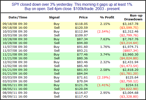
Large Gaps Up After 3% Drops

With the market set to gap up 1%+ this morning I decided to look at other times a 3% drop was followed by a 1% gap up. Below I have listed all 10 instances along with their intraday performance.

Though the numbers don’t suggest a statistically significant edge, the early indications appear to suggest a tendency for further upside by the close. It is interesting that the avg run-up and avg drawdown are both about 2.8%. So traders could consider playing the intraday oscillations rather than taking a directional bet right off the bat.

Why Inside Days No Longer Get Me Down

SPY failed to make either a higher high or a lower low than the day before. This is often referred to as an “inside day” because the range was completely inside the previous day’s range. In the past I have shown how inside days under the 200ma have often been followed by moves lower. What’s interesting is that while that held true for a long time, since the bottom in 2009 it has not been the case. Let’s first look at an updated results table based on this setup.

As you can see the statistics still appear bearish, with the downside edge basically playing out over the 1st 3 days.  But now let’s take a look at the profit curve.

As you can see over the last two years (and 15 or so instances) the setup has not provided a downside edge.  Both the 1-day and 2-day profit curves looked very similar to this. 

It is important to understand when historical instances provide a directional edge.  But the market is always evolving.  And sometimes setups that provided an edge for a long time will either stop working or will go a period of time without demonstrating the same tendency.  It is important to monitor not only how has a setup performed over the long term, but also keep an eye on recent instances to ensure that edge is still being provided.  In this case it doesn’t seem to be.

Fed Days After Large Drops

While Fed Days have historically provided an upside edge, that edge has been substantially more powerful when there has been strong selling the day before. The last time I showed this study on the blog was 4/28/10. I’ve updated the statistics below.

Instances are a bit low, but they couldn’t get much more bullish. With a profit factor over 11 and the average trade about as positive as the worst trade was negative, risk/reward appears to heavily favor the bulls.

With the makret gapping up large this morning it may be too late to take advantage of this one. I did send a Tweet yesterday afternoon linking to the Fed Day studies where astute readers would have found this study posted in April of 2010. If you would like to follow me on Twitter you may do so at https://twitter.com/qerob