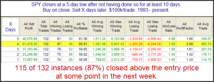
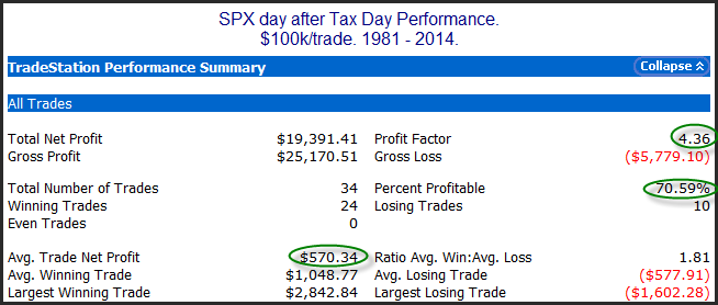
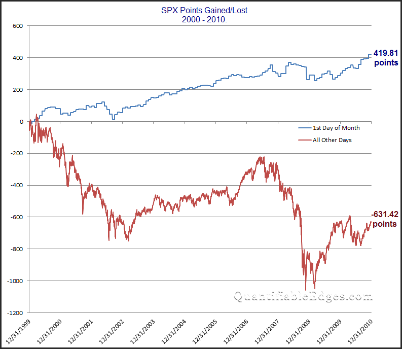
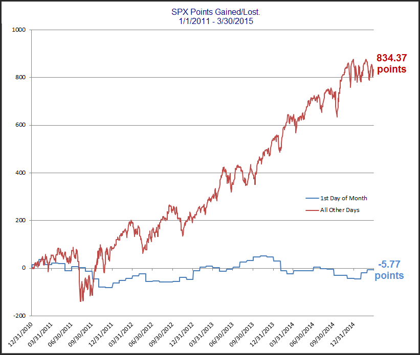
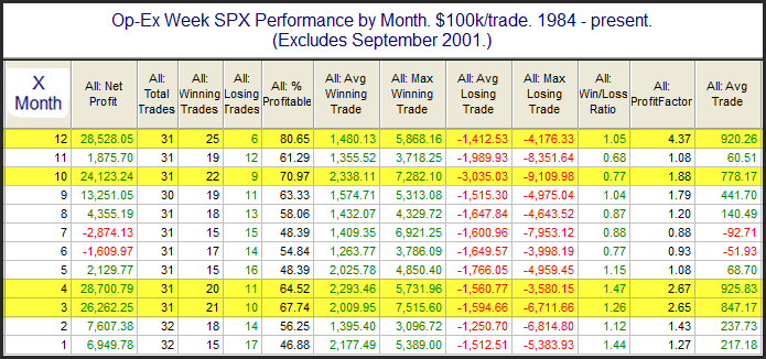
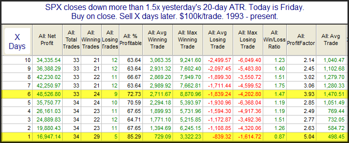
The Thursday Hot Streak
On an open to close basis, Thursdays have been on real hot streak over the last 6 months. This can be seen in the stats table below.
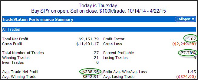
The numbers here are all impressive. Traders could be looking at some intraday strength on Thursday based on this. Of course we are looking at a pretty narrow period of time here. (Looking back to 1993, SPY intraday performance on Thursday as been nearly breakeven.) Still, it is an interesting hot streak that traders may want to note.
Want research like this delivered directly to your inbox on a timely basis? Sign up for the Quantifiable Edges Email List.