Why Today “May” See Gains

The 1st trading day of the month is often a bullish day for the market. In the past I have broken down the tendency by month. And since 1987 May has produced the most profits. Below are results for May dating back to 1987. (Note performance is measured on a close to close basis.)

2016-05-02 image1

Stats here are strongly lopsided in favor of the bulls. Winning %, win:loss ratio, profit factor, and average trade are all outstanding. So if seasonality plays out, we May see some gains today.


Want research like this delivered directly to your inbox on a timely basis? Sign up for the Quantifiable Edges Email List.

A Long-Term View of Fed Days

Wednesday is a Fed Day, which is defined as a day that a scheduled Fed meeting concludes and policy statements are released. Fed Days occur 8 times per year. Since 1982 they have shown a strong bullish propensity. The chart below is one I showed many years ago, but had not updated in a while. I decided to do so today.

2016-04-27 image1

For some comparison, the average Fed Day has gained over 9x the amount of the average non-Fed Day.

If you would like to learn more about Fed Days, numerous studies may be found on the blog, or you can check out the Quantifiable Edges Guide to Fed Days for download or in paperback.


Want research like this delivered directly to your inbox on a timely basis? Sign up for the Quantifiable Edges Email List.

Happy Tax Day?

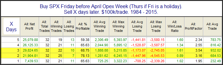
Today is the day taxes are due in the U.S. The reason tax day may be important is that it is the last day that people can make IRA contributions to count for the previous tax year. This can create a last-minute rush and you will often have an inflow of funds heading into the market right around and on April 15th. Fund managers will often put this money to work immediately and it creates a positive bias for the market. Tax Day itself seems to have benefited over the years. I showed this on the blog last year. Below I have updated the statistics.

2016-04-18 image1

The numbers are certainly impressive. It looks like the market is going to open with a gap lower this morning so it will be interesting to see if the positive Tax Day seasonality can kick in and overcome today’s weak start.


Want research like this delivered directly to your inbox on a timely basis? Sign up for the Quantifiable Edges Email List.

April Opex Week Historically Bullish

April expirations week has historically been very bullish. This can be seen in the study below, which looks back to 1984 when S&P options first began trading.

2016-04-11 image1

The consistency has been very impressive. It suggests an upside edge the first few days of this week.


Want research like this delivered directly to your inbox on a timely basis? Sign up for the Quantifiable Edges Email List.

Opex Week By Month & How March Stands Out

There is a seasonal influence that could have a bullish impact on the market this week. Op-ex week in general is pretty bullish. March, April, October, and December it has been especially so. S&P 500 options began trading in mid-1983. The table below is one I have showed on the blog in years past. It goes back to 1984 and shows op-ex week performance broken down by month. All statistics are updated.

2016-03-14 image1

While December has been more reliable, March op-ex week has seen the most in total gains. Seasonality could provide a bit of a wind at traders’ backs this week.


Want research like this delivered directly to your inbox on a timely basis? Sign up for the Quantifiable Edges Email List.

A Rare VIX Setup That Suggests A Sharp Drop May Be Near

Monday was the 2nd day in a row where the SPX and VIX both closed higher. For those unaware, VIX is a measure of options volatility. It most often will trade inverse to the SPX. So it is unusual to see both SPX and VIX close higher. It is especially unusual to see this happen 2 days in a row. And even more so when SPX is below its 200ma. The study below looks at other times this has happened.

2015-03-08 image1

Early indications from this setup suggest the market could experience a sharp drop in the next few days. Instances are too rare to make a big fuss over, but the strongly negative numbers are at least noteworthy.

 
Want research like this delivered directly to your inbox on a timely basis? Sign up for the Quantifiable Edges Email List.

A Simple Measure of Overbought in NASDAQ is Suggesting a Pullback

Friday was the 4th day in a row that the NASDAQ closed higher. While this may not seem to be a big deal, it does not happen very often when the NASDAQ is trading below its 200-day moving average. The table below shows results following all times this has occurred since 2002.

2015-03-07 image1

Results here appears to be strongly bearish. And the edge persists for up to 2 weeks.  The note at the bottom is worth considering, in that all 21 instances saw some kind of pullback in the next week.  Traders may want to keep this in mind over the next few days.
Want research like this delivered directly to your inbox on a timely basis? Sign up for the Quantifiable Edges Email List.

A Follow Through Day & A 20-day High

Tuesday posted the 1st IBD Follow Through Day (FTD) since the rally began. Unusual about this FTD is that it occurred in conjunction with SPX making a new 20-day high. The study below examines other times a 20-day high was accompanied by a FTD.

2015-03-02 image1

Results here are impressive over both the short and intermediate-term. To get a better feel for the short-term returns I have listed the instances below.

2015-03-02 image2

The run-up to drawdown ratio here is quite impressive. I’ll also note that 9 of the 12 instances went on to have “successful” rallies. (“Success” means it either hit a new 200-day high or at least rose 2x as much as it had already risen off the bottom.) The 3 instances whose rallies did not succeed (circled in red) all saw run-ups of at least 2% before they eventually rolled over and made new lows.


A summary of some of my past FTD posts can be found here.  Or for the complete list of past FTD studies click here.


Want research like this delivered directly to your inbox on a timely basis? Sign up for the Quantifiable Edges Email List.

Long-Term Implications of Last Week’s Breadth Thrust

Friday’s rally generated the 2nd 90% Up Volume day within 5 days. In other words, on the NYSE 90% of the reported volume went into securities that closed higher. Last Tuesday we also saw this happen. In the past 2 such days in close proximity has been a positive sign for the intermediate-term. It is something I shared in the subscriber letter over the weekend, and wanted to post to the blog – but did not get a chance until now. With nearly 9 months left in the study and hardly any move on Monday, I thought it was still plenty fresh enough to share. So below is a list of the 9 (non-overlapping) instances and their 9-month performance.

2015-02-02 image1

The 2007 instance did not pan out, but every other instance was followed by a powerful 9-month rally. The “smallest” rally over the next 9 months was the 13.3% gain in ’84-’85. Those are some very strong moves. Instances are low, but the breadth thrust certainly seems to favor the bulls.


Want research like this delivered directly to your inbox on a timely basis? Sign up for the Quantifiable Edges Email List.

Repeated Hard Selling At Intermediate-Term Lows

Friday marked the 3rd day in a row of hard selling at intermediate-term lows.  The study below shows that such hard selling is rare, and has often been met with a  strong upside reversal.

2015-01-11 image1

While instances are low, the stats so far appear impressive.  I will also note that 7 of the 10 instances saw SPX close Day 2 over 2.50% above it’s entry price.  Traders may want to keep this study in mind when setting their trading bias.


Want research like this delivered directly to your inbox on a timely basis? Sign up for the Quantifiable Edges Email List.

Why The Low CBI Is A Concern With The Market Selling Off

I am seeing a number of studies that are suggesting the market is oversold and primed for a bounce. But there is one thing that concerns me about this selloff. That is the fact that the Quantifiable Edges Capitualtive Breadth Index (CBI) was still stuck at zero as of Wednesday’s close. Historically, the higher the CBI the better the chance of both a short and intermediate-term bounce when the market is making new lows. The studies below are from yesterday’s Subscriber Letter and they exemplify this.

The first one looks at performance following 50-day low closes when the CBI is 0.

2015-01-07 image1

Other than perhaps a very quick bounce this has not been a favorable setup for the bulls. From 1-4 weeks out the results have all been net negative.

Now let’s look at instances where the 50-day was accompanied by a CBI of between 1-5.

2015-01-07 image2

Still nothing I would want to place a strong wager on, but the results table has turned from mostly red to mostly green. So some improvement is certainly seen. Now let’s look at CBI readings between 6-9.

2015-01-07 image3

These are some solid bullish numbers. And the edge seems to persist from Day 1 and throughout the next 4 weeks. Lastly, let’s look at high CBI readings of 10 or above.

2015-01-07 image4

These are by far the most appealing results, from Day 1 right through day 20. And 20 days out there was just one loser and it only lost 0.2%. Of course we are not near this right now. We are in the first situation with a CBI of 0. The market is still capable of a rally. The probability is just not nearly as high. And that has me a little concerned.


Look for more on the CBI in the coming weeks!


Want research like this delivered directly to your inbox on a timely basis? Sign up for the Quantifiable Edges Email List.

The Bullish News About The End-Of-Quarter Selloff

Wednesday and Thursday were a tough way for the indices to finish the year. In the study below I show other times where the SPX closed down on the last two days of a quarter. I found that when the last two days were down, but the quarter was still positive, there appeared to be a strong upside tendency over the next few weeks.

2015-01-04 image1

The consistency and the strength of the edge is impressive. While the market is off to a tough start this morning, history says that is unlikely to persist in the coming days & weeks.  While there is more than just this that will impact market movement going forward, it may be worth considering this study when establishing your trading bias.


Want research like this delivered directly to your inbox on a timely basis? Sign up for the Quantifiable Edges Email List.

Last Day of 2015 – Should You Sell A Little Early?

In the subscriber letter last night (and last year), I showed some studies that examined SPY performance in the last 15 minutes of trading for the year.  The table below is from those studies.  It shows all “last 15 minutes” from 1998 – 2014.

2015-12-31 image1

Seventeen declines and only three gains.  And the average 15-minute period saw SPY close down nearly 0.25%.  That is a sizable amount for just 15 minutes.  Traders may want to keep this in mind as we approach the close.


Want research like this delivered directly to your inbox on a timely basis? Sign up for the Quantifiable Edges Email List.

Strong Rally Days Between Christmas & New Year’s

The week between Christmas and New Year’s is often a quiet one that is not prone to large-move days. So strong rallies like we saw on Tuesday are a bit unusual this time of year. I looked back to 1970 to see what has followed other times when SPX rose over 1% on a day between Christmas and New Year’s. Results are below.

2015-12-30 image1

The stats here all point to a bullish edge. Most of the gains were realized in the first 2 days, but the edge does appear to persist through day 5.


Want research like this delivered directly to your inbox on a timely basis? Sign up for the Quantifiable Edges Email List.

‘Twas 3 Nights Before Christmas – NASDAQ Version Updated

I’ve been posting and updating the “Twas 3 Nights Before Christmas” study on the blog here since 2008. The study kicked in at the close yesterday close. This year I will again show the Nasdaq version of the study. While all the major indices have performed well during this period, the Nasdaq Composite has some of the best stats.

2015-12-23 image1

The stats in this table are strong across the board.  An average year posted a gain of nearly 3% over the next 8 days.   The stats do not look as strong as last year though, because 2014 was the worst year so far when looking out 8 days.  The note at the bottom shows reliability of some kind of bounce has been nothing short of incredible. Traders may want to keep this one in mind over the next couple of weeks.

Want research like this delivered directly to your inbox on a timely basis? Sign up for the Quantifiable Edges Email List.