Three-day Pullback Pattern Into Turnaround Tuesday Potentially Bullish
SPY’s move lower over the last 3 days has set up a potential “Turnaround Tuesday” scenario. The fact that it made a lower high, lower low, and lower close for at least the 3rd day in a row triggered the following study.
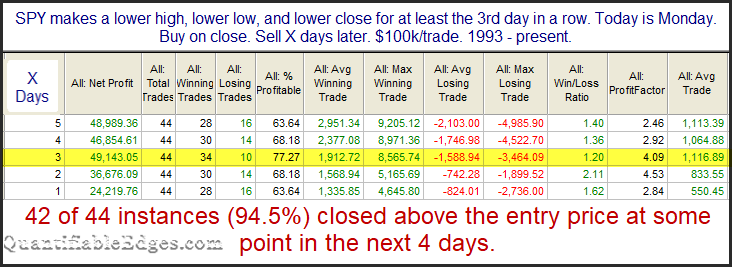
The numbers are impressive and the bounces couldn’t get much more reliable. In all but two instances SPY has managed to bounce at some point in the next four days. Much of the edge has played out in the first 3 days. Below is a 3-day profit curve that I shared on StockTwits / Twitter yesterday about 30 minutes before the NYSE closing bell.
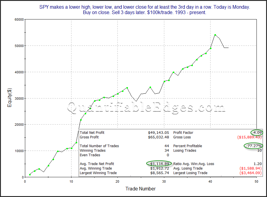
The strong, steady upslope is encouraging. I will note that while SPY closed down slightly yesterday and was able to qualify for this setup, SPX actually closed up slightly. This could leave the study in doubt. But as I discussed in last night’s subscriber letter (free trial here), QQQ clearly met the criteria on Monday. And QQQ’s stats have been similarly impressive. So traders may want to keep this study in mind when establishing their trading bias.
Want research like this delivered directly to your inbox on a timely basis? Sign up for the Quantifiable Edges Email List.