The February Barometer

In the 2/3 blog I examined the “January Barometer”.

As a super-quick review, the January Barometer suggests that a positive January will very often be followed by the next 11 months closing out the year positively. A down January (like we had this year), has led to more inconsistent returns. Use the link above for the details.

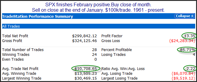
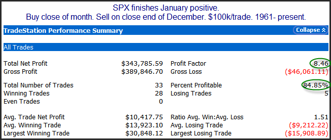
When I ran that test I also looked at other months. What I found was that a strong February actually predicted a strong next 11 months better than any other month. Below are the February results.

2014-03-03 image1

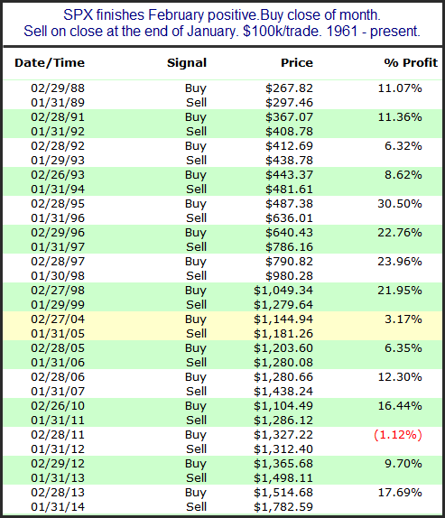
The numbers here aren’t massively better than a “January Barometer”, but if you like using a month as a barometer, February appears to be the best one. And the edge has been even stronger since 1988. Below is the list of instances over the more recent time period.

2014-03-03 image2

As you can see, 2011 was the only recent loser, with 14 of the last 15 positive Februaries leading to gains over the next 11 months.

This is not a study I plan to rely on for establishing a market bias. I view this more as an academic exercise. A few reasons for this: 1) I don’t like the way the test was developed. I did not start with a reasonable premise and test it. I data-mined to find the best month. This approach does not give me confidence in the results. Some month is bound to be best, and it could be nothing more than random noise. 2) I see no reason that February’s results should be predictive of the next 11 months. You could argue that momentum at this time of year may carry through nicely, but I think that is likely a weak explanation. I suspect this study is only slightly better than the Super Bowl indicator or the Sports Illustrated Swimsuit Cover indicator. But I did find it interesting, so I thought I would share it.


Want research like this delivered directly to your inbox on a timely basis? Sign up for the Quantifiable Edges Email List.
Short-Term Momentum From Breakaway Gaps

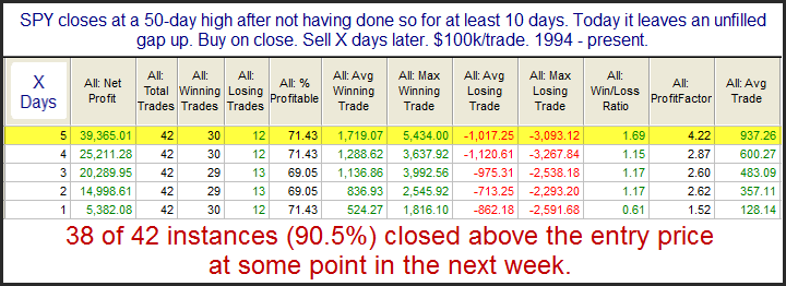
On Monday SPX broke out and made new highs for the 1st time since January. And a strong open meant that SPY left an unfilled gap up. The study below is one I have shown a number of times in the past, but I always feel it is worth a reminder when we have a new SPY breakout. It demonstrates the importance of the unfilled gap in generating momentum for the next few days.

2014-02-25 image1

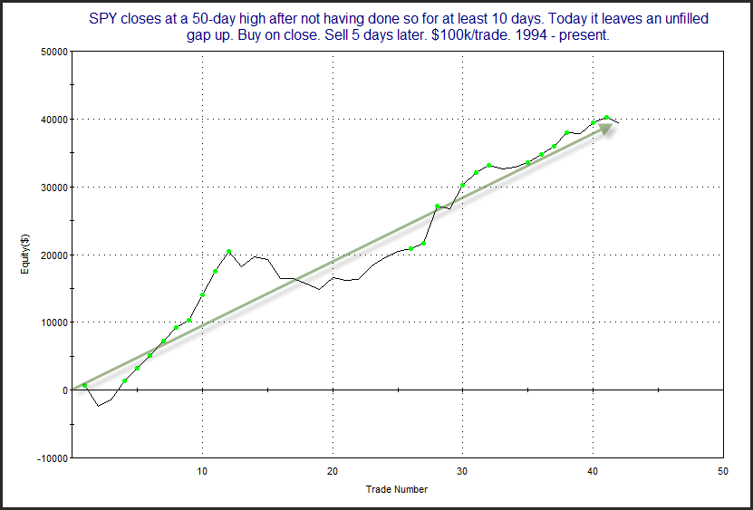
Results here are strong across the board. Below is an equity curve using a 5-day holding period.

2014-02-25 image2

The nice upslope on the equity curve confirms the bullish inclinations.

Technicians will often use the term “breakaway gap”. This suggests the gap occurs on the same day as a base breakout. The idea is that the new high causes excitement and the gap leaves a good amount of people sidelined or stuck short. When it doesn’t immediately fill, it leads these people to chase and helps to propel the market even higher.

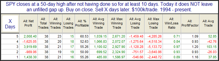
Now let’s look at instances where the 50-day high breakout was not accompanied by an unfilled gap. Interestingly, the number of instances was nearly the same.

2014-02-25 image3

As you can see these moves to new highs that don’t start with an unfilled gap are much less reliable.


Related Quantifiable Edges Studies

Want research like this delivered directly to your inbox on a timely basis? Sign up for the Quantifiable Edges Email List.
Historical Returns Before President’s Day

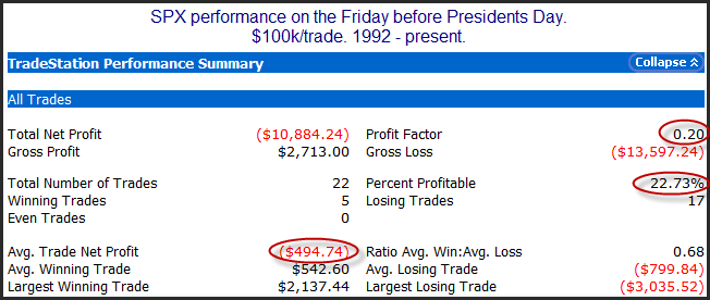
Today is the last day before the President’s Day holiday. Over the last 22 years the Friday before President’s Day has been a poor performer. I showed this a couple of years ago in the 2/17/12 blog. I have updated the results in the table below.

2014-02-14 image1

Inclinations appear squarely bearish. Not shown above is that the average run-up has been 0.2%, and the average drawdown has been -0.9% over the years. Additionally, 2003 (+2.14%) was the only year that closed up more than 0.25%. The other 4 years in which SPX closed positive saw very small gains.

Also…Happy Valentine’s Day!


Want research like this delivered directly to your inbox on a timely basis? Sign up for the Quantifiable Edges Email List.
Implications of a Persistently Stretched VXO

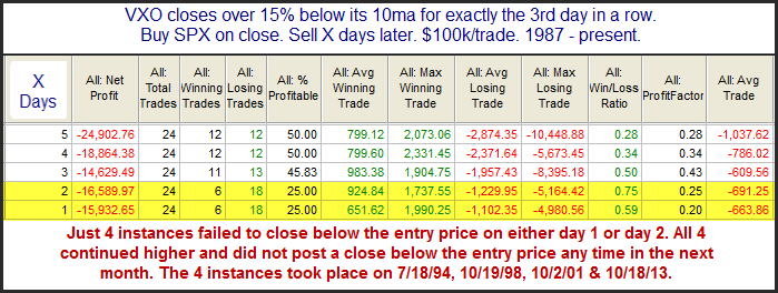
Both the VIX and the VXO have been extended to the downside in recent days. Such stretches suggest a collapse in fear among investors. The study below was last seen in the 12/27/13 blog. It looks for stretches of 15% or more that have persisted for three days.

2014-02-13 image1

Based on the stats table there appears to be a downside inclination. The note at the bottom of the study is especially interesting. Nearly every case has experienced an almost immediate pullback, but those that didn’t went without pulling back for a long time.


Want research like this delivered directly to your inbox on a timely basis? Sign up for the Quantifiable Edges Email List.
Introducing Our Newest “Numbered System” – 88

Quantifiable Edges has provided our gold subscribers access to our “numbered systems” since 2008.  But we have never taught any of them to non-subscribers, until now.  Our newest system – System 88 uses the Quantifiable Edges Double-B indicator to identify opportune times to enter pullbacks in strong uptrends.  The Double-B also provides the exit trigger.

The Double-B indicator is a Bollinger Band derivative that not only measures overbought/oversold, but also automatically adjusts based on the strength and direction of the trend.

System 88 seeks to identify high-probability entry opportunities in strong uptrends.  It then looks to ride that trend for a while.  In a special webinar Rob Hanna will teach traders all the rules and logic behind Quantifiable Edges’ System 88.  He’ll also show how the Double-B was constructed.  And he’ll discuss adjusting the parameters for your own use.

Additionally, webinar attendees will have access to the full Tradestation code for both the indicator and the system.  They’ll also be able to download a Tradestation Workspace that has the Double-B indicator and System 88 preset for viewing and testing.  Purchasers that do not use Tradestation can download the code in a text file format so that they may more easily convert it to their own platform.

The System 88 Webinar is a paid event.  And while there is no guarantee of performance moving forward, your satisfaction with the webinar and the information is guaranteed!  Our 1st two live events will be held on Monday Feb 10th and Wednesday Feb 12th!

Live webinars are anticipated to last about 30-45 minutes, depending on the number of questions.  But don’t fret if the live events don’t meet your schedule.  All System 88 purchasers will be able to view a recorded version.  And if you have any questions, email support is available.

For more information on System 88, including performance metrics and an upcoming schedule of webinars, you may go to the Quantifiable Edges System 88 signup page.

Quantifiable Edges CBI Hits 10 For First Time Since November 2012

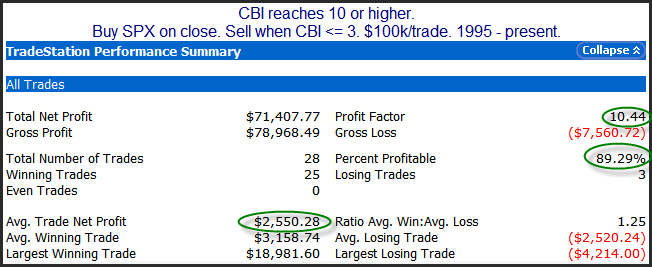
One notable about Wednesday’s action is that the Quantifiable Edges Capitulative Breadth Indicator (CBI) reached 10 for the 1st time since November of 2012. In the past I have shown a fair amount of research demonstrating CBI levels of 10 or greater have generally been enough to lead to a market rally within a few short days. One simple strategy I have shown in the past that could take advantage of a high CBI is to purchase SPX when the CBI reaches 10 or higher, and then exit this trade when the CBI gets back down to 3 or lower. CBI history is available back to 1995 (and Quantifiable Edges gold subscribers may download it directly). Results below show how this strategy would have performed from 1995 – present.

2014-02-06 image1

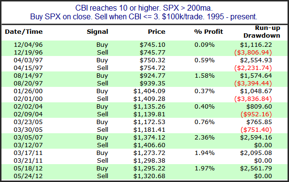
As you can see, results have strongly favored the bulls. A very high percentage of the instances would have led to winning trades, and overall gains have swamped overall losses by over 10x. Another thing to consider it the market’s long-term trend. Personally, I have found that relatively strong selloffs during long-term uptrends are substantially different than relatively strong selloffs during long-term downtrends. In other words, CBI readings > 10 have occurred under different conditions and led to different kinds of rallies depending on whether the market was trading above or below its 200ma. Below is a listing of all 9 previous instances above the 200ma.

2014-02-06 image2

As you can see, instances above the 200ma have been more reliable, but less powerful. The average trade under these circumstances is just over 1%. And the largest winning trade was 2.36%. But the average trade when below the 200ma has been 3.2%. This is larger than the largest above the 200ma, and nearly 3x the average. So I believe it is important to make this distinction when setting expectations for the bounce over the next few days. While the bounces have not been as strong, the drawdown has been much more controlled under these circumstances. The largest drawdown so far has been less than 4%. Of course nothing is certain, and new history is constantly changing the odds. But as far as short-term indicators go, the CBI is one of my favorites for predicting a short-term bounce.


Want research like this delivered directly to your inbox on a timely basis? Sign up for the Quantifiable Edges Email List.
One Look At The January Barometer

The January Barometer is a fairly famous study from the Stock Traders Almanac. It says that “as goes January, so goes the year”. In other words, a positive January will typically lead to a positive year, while a negative January can be a warning. Let’s look at how the SPX has done for the remaining 11 months of the year based on how January performed.

2014-02-03 image1

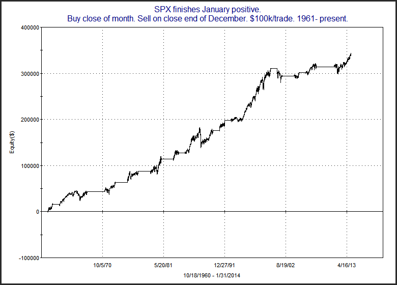
The numbers show that in years that January has done well, the rest of the year has typically fared well also. Below is a profit curve.

2014-02-03 image3

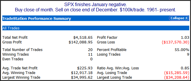
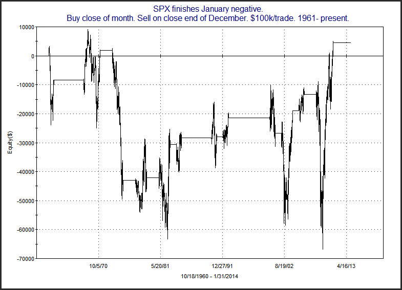
Now let’s look at how Feb-Dec has done after a down January.

2014-02-03 image2

Not as many instances, but there does not appear to be the same kind of bullish tendency here. More of a crapshoot. Below is a curve.

2014-02-03 image4

Certainly not a chart to trade off of. So it would have been nice if January finished positive. But it is not a sign of impending doom. Just that we don’t have the kind of momentum that would be preferable.


Want research like this delivered directly to your inbox on a timely basis? Sign up for the Quantifiable Edges Email List.
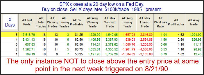
Performance After A 20-Day Low On A Fed Day

One potential positive about the intermediate-term low Wednesday is that it came on a Fed Day. I looked back at other times SPX made an intermediate-term low on a Fed Day.

2014-01-30 image2

Results over the first few days are underwhelming, but once you get out 1 week they look quite impressive.


Want research like this delivered directly to your inbox on a timely basis? Sign up for the Quantifiable Edges Email List.
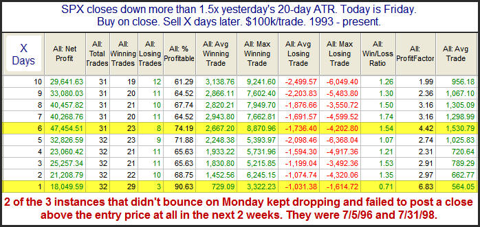
Historical Reactions Following Very Bad Fridays (updated)

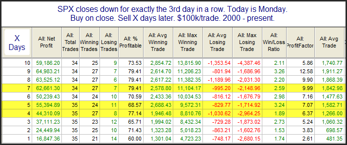
The study below appeared in the Quantifinder on Friday. It is one I last showed on June 3, 2013 and it examines large drops on Fridays. Both the Crash of ’29 and the Crash of ’87 happened on Monday. The Crash of ’87 is still remembered by many traders that are active today. There was a strong selloff on Friday and then all hell broke loose on Monday. But since then strong Friday selloffs have commonly been followed by bounces on Mondays. Perhaps this is due to the fact that fear of a crash causes what might otherwise be an ordinary selloff to become exaggerated and overdone on Fridays. Or perhaps it is just that people don’t want to hold over the weekend. Whatever the reason, the tendency to bounce has been very strong. All results are updated.

2014-01-27 image2

The numbers here are all very impressive and suggest a strong bullish bias. Traders may also want to take notice of the note at the bottom of the table. A failure to bounce today could be a warning that the market is not following historical norms and the environment is becoming more dangerous.


Want research like this delivered directly to your inbox on a timely basis? Sign up for the Quantifiable Edges Email List.
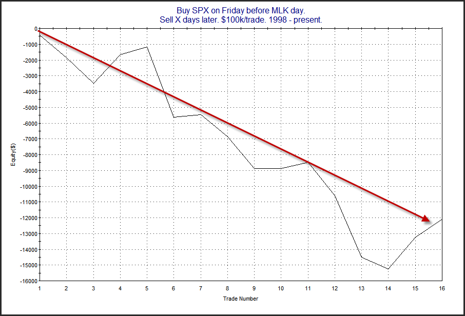
Historical Market Returns During MLK Week

Martin Luther King Jr. Day was on Monday. The NYSE has only observed MLK Day as a holiday since 1998. But over that 16 year period the market has not done too well during MLK week. I showed this last year in the 1/22/12 blog. I’ve updated the chart below.

2014-01-21 image2

MLK week has seen the market rise the last couple of years, but prior to that it had some real struggles. Maybe the downside tendency is fading, or maybe it was just a blip and the downward inclination will reassert itself. It’s tough to tell at this point. I’m still inclined to view seasonality as favoring the bears this upcoming week.


Want research like this delivered directly to your inbox on a timely basis? Sign up for the Quantifiable Edges Email List.
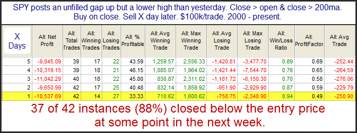
Another Look At A Potentially Bearish Inside Day

The study below looks at days like Tuesday where the market gaps higher, never fills, and moves higher from open to close without making a higher high. It was last seen in the 3/27/13 blog. I have updated the results.

2014-01-15 image2

Implications here appear somewhat bearish, with most of the damage occurring on day 1. This may be worth keeping in mind as traders formulate their plan.


Want research like this delivered directly to your inbox on a timely basis? Sign up for the Quantifiable Edges Email List.
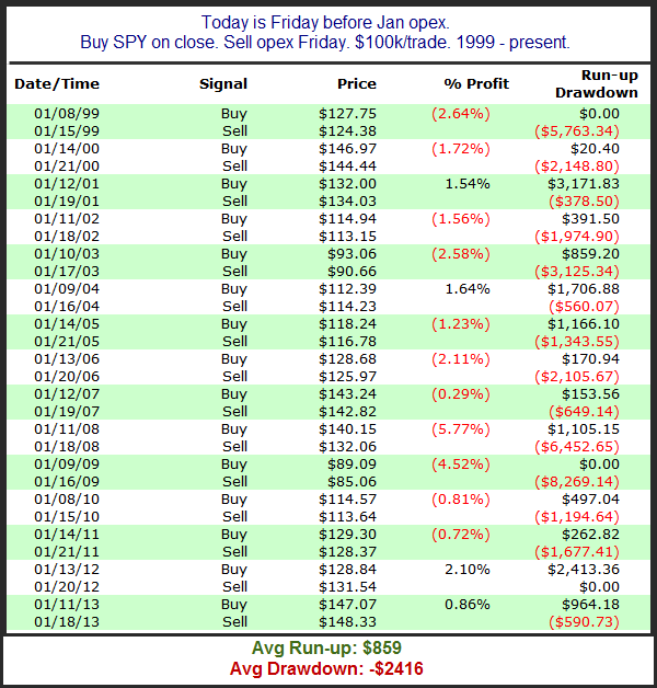
January Opex Weak (revisited)

As I discussed last month, opex week in December has historically been wonderful. But January – not so much. Below is a list of the last 15 January opex week returns (updated from the study shown last year). While it is not the case this year, January opex week often occurs in conjunction with Martin Luther King Day. So some of these weeks contained four trading days and some contain five.

2014-01-13 image2

Even with the positive performance the last 2 years there has been a decided downside tendency over the last 15 years.  The drawdown / run-up stats at the bottom remain quite compelling for the bears.  This study still appears worthy of some consideration.


Want research like this delivered directly to your inbox on a timely basis? Sign up for the Quantifiable Edges Email List.
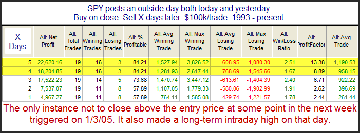
Back to Back Outside Days for SPY

Thursday marked the 2nd day in a row that SPY posted an outside day. (An outside day is a day where the security or index makes a higher high and a lower low than the day before.) It’s quite unusual to see 2 consecutive outside days. I last examined back-to-back outside days for SPY in the 5/23/13 subscriber letter. I have updated that study below.

2014-01-10

The numbers look very impressive.

It is also worth noting that this pattern has also done well with QQQ in the past.

A Turnaround Tuesday Setup

I’ve discussed many times in the past that Tuesdays have a well-earned reputation for being a day when the market will often halt a decline. The study below is one from the larger Turnaround Tuesday study published in the 9/25/12 blog. All statistics are updated.

2014=01-07

As you can see the market has strongly favored a quick move higher. And when that move hasn’t happened on Tuesday it has often happened in the next few days.

Some Evidence It Is About Time For SPY To Pull Back

SPY has now gone 11 days without closing below its 5ma, and it closed Tuesday at another new high. The study below is one I’ve shown a few times over the years, most recently in October. It looks at other instances in which SPY has traded above the 5ma for at least 2 weeks and is now closing at a 10-day high. All results are updated.

2014-01-02

In the past this setup has commonly been followed by a short-term pullback. The downside edge doesn’t last long, though. It seems to pretty much play itself out over the first 2 days. It is not an overwhelming edge, but it is still worth noting that SPY has been short-term extended for a while and the normal course of action at this point is a little pullback.