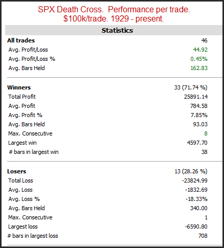
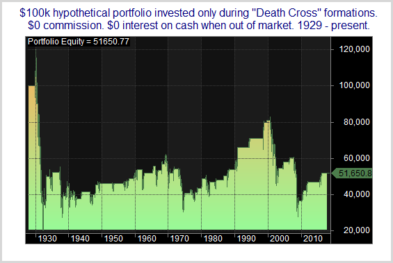
The time around Thanksgiving has shown some strong tendencies over the years – both bullish and bearish. I have discussed them a number of times over the years. In the updated table below I show SPX performance results based on the day of the week around Thanksgiving. The bottom row is the Monday of Thanksgiving week. The top row is the Monday after Thanksgiving.
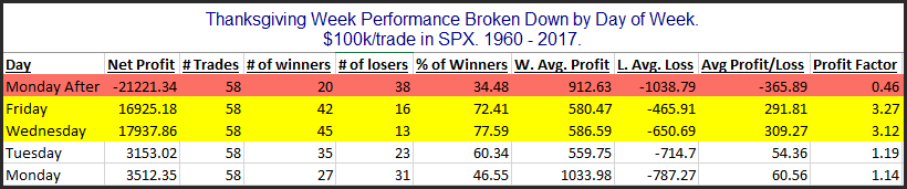
Monday and Tuesday of Thanksgiving week do not show a strong, consistent edge. But the data for both Wednesday and Friday looks quite strong. Both of those days have seen the S&P 500 rise over 70% of the time between 1960 – 2017. The average instance managed to gain about 0.3% for each of the 2 days. (This is shown in the Avg Profit/Loss column where $300 would equal a 0.3% gain.) That is a hearty 1-day move. Meanwhile, the Monday after Thanksgiving has given back over half the gains that the previous 2 days accumulated. It has declined 66% of the time and the average Monday after Thanksgiving saw a net loss of 0.37%.
Of course I am not the first person to notice this. Strong Thanksgiving seasonality has been noted by many analysts over the years. So one (valid) concern that traders have with well-known seasonal tendencies is that they can be easily front-run. If people know there is a good chance that the market will rise Wednesday through Friday, they will look to get long on Tuesday. And if all the people buy ahead of the bullish period, then that may either dilute or eliminate the seasonal edge.
From 1960 – 1986 someone who bought Tuesday’s close and sold Friday’s close would have seen the SPX decline only 1 time. But from 1987 – 2017 there were 8 instances where SPX did not close higher on Friday than it did on Tuesday. So perhaps the edge became so well known that it was diluted by front-running.
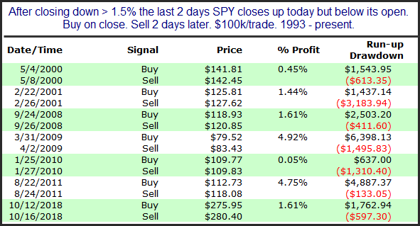
To determine whether the Wednesday – Friday Thanksgiving edge may have been front-run a particular year, you could examine price action. I have repeatedly found that a market that is oversold going into a strong seasonal period will perform better than a market that is overbought going into a strong seasonal period. A very simple metric that could be used in this case would be to see whether the market closed in the top or bottom half of its intraday range on Tuesday of Thanksgiving week. To do this I used SPY instead of SPX, because it had better intraday data.
Since 1993, I found that years in which SPY closed in the top half of its intraday range on Thanksgiving Tuesday posted a 9-5 record from Tuesday’s close to Friday’s close. When SPY closed in the bottom half of its range on Tuesday the performance over Wednesday to Friday was 10-1. And the average instance posted a 0.8% gain these years versus a 0.1% average gain the other years. So Tuesday’s action appears worth watching as we approach this potentially seasonally bullish period.
Want research like this delivered directly to your inbox on a timely basis? Sign up for the Quantifiable Edges Email List.