Quantifiable Edges Gold Subscriber Letter 2008 Index Trade Idea Results

While 2008 was an incredibly difficult year for buy and hold, it was an especially good year for the Quantifiable Edges Subscriber Letter. The trade ideas listed in the Letter are generally short-term in nature. They come from either mechanical systems that are published by Quantifiable Edges, our proprietary Catapult system (which is used to measure the CBI), or as index trades through our detailed market analysis and studies. Only large-cap stocks (primarily S&P 100) and highly liquid ETF’s are used for the trade ideas. This helps to assure subscribers wishing to trade some of the ideas that liquidity won’t be a problem.

The trades ideas that are most popular among subscribers are the studies-based index trades. Frequently I will use the Aggregator tool to help time entries and exits.

After several inquiries I have decided to simply show a listing of all the index trades closed in 2008. A few notes:

I typically scale in to index trades. Most often ¼ at a time. Therefore in the listing below you will notice there were times where more than 1 entry was open at once. The max is 4.

These are just trade ideas. I never suggest allocation percentages. A ¼ index position could mean a 5% allocation to one person or a 75% allocation to another (who may eventually get 300% or more leveraged).

The index trade ideas are tracked using either SPY or QQQQ. Some subscribers may use options, futures, inverse or ultra ETF’s or some combination of the above to better suit their trading. I never suggest ultra etf’s in the Subscriber Letter. While I believe they are a worthy trading vehicle and utilize them myself on occasion, I prefer not to use them in the trade ideas section as it could appear I’m simply trying to inflate my results.

Trade ideas are all published in the Subscriber Letter each night. In many cases the exits are also established in the nightly Letter. In response to subscriber feedback, in May I began sending out intraday updates on open positions when appropriate. The intraday updates are sometimes used to set stops or targets or suggest an exit at the close of the day. Intraday updates are NEVER used to suggest new positions.

So while personal results would vary greatly depending on the traders approach to the ideas, below is the complete listing of closed index trade ideas from last February’s inception through the end of 2008 (Summary results shown further down. Commissions not included.):

(click to enlarge)

Past results are not necessarily indicative of future returns. But if you’d like to improve your market timing and think Quantifiable Edges could help then click here for a free 1-week trial. For complete subscription information to the Gold package click here.

Inauguration Day – A New Hope For The Market?

Many people throughout the United States and the world are viewing the inauguration today with a sense of hope. Hope that things (whatever things are important to each individual) are going to get better. This sense of hope is not unique to Barack Obama. It comes with every new President to take office. The question for us as traders is, “How has this sense of hope translated to stock market returns?”

I decided to look back to 1920 using the Dow to see how the market has reacted to past inaugurations. I limited the instances to only those inaugurations where a new president was entering office. I don’t think re-elections carry a sense of “new hope” the way a new president does. I also eliminated inaugurations of Presidents that weren’t elected (Ford in ’74, Johnson in ’63, Truman in ’45, and Coolidge in ‘23). I just don’t believe the same sense of excitement is generated by a replacement as by a newly elected president.

That left me with the following 11 instances:

March 4, 1921 – Warren G. Harding
March 4, 1929 – Herbert Hoover
March 4, 1933 – Franklin Roosevelt
January 20, 1953 – Dwight Eisenhower
January 20, 1961 – John Kennedy
January 20, 1969 – Richard Nixon
January 20, 1977 – James Carter
January 20, 1981 – Ronald Reagan
January 20, 1989 – George H.W. Bush
January 20, 1993 – William Clinton
January 20, 2001 – George W. Bush

First I looked to see how the market performed on the day of the inauguration. Surely the wonderful speeches and overall positive vibes would have had a positive affect on the market:

Then again, perhaps not. Eisenhower wins the award for most market-friendly speech by juicing the Dow for 0.35%. Herbert Hoover’s presidency got off to a bad start immediately as the Dow lost over 2% on the day he was sworn in. (And we all know it got much worse after that.) George W. Bush and Franklin Roosevelt are not included on the list since their 1st inaugurations were on weekends.

What if we look out a little longer, though? Buying on the close of inauguration day (or 1st day after for W. Bush and Roosevelt) and holding for 10 days offered significantly more positive results:

82% winners and an average return of 2.35% over the 10 days suggests a bullish bias. Roosevelt is the hero here. Carter is the goat. Overall downside was limited and upside was fairly strong. The last 3 have been especially good.

For an intermediate-term perspective below are the results for the 1st 75 trading days of the new presidency:

Mostly positive here. Obviously what stands out in these results is the 1933 mega-rally. The market bottomed in July of 1932 near 40. After spiking to over 80 by mid-September it began to pull back again hard. In February of 1933 it dipped back below 50 – less than a week before Roosevelt took office. That dip led to another massive rally as prices went up about 120% in the next 5 months. Even that rally didn’t pull the economy out of the depression. And as nice as those 5 months must have been the market then settled into a range lasting about 10 years. It wasn’t until the 4th quarter of 1942 that the 1933 high around 110 was surpassed for the final time.

I’ve shown numerous studies the past few months comparing the current environment to the 1930’s. Perhaps the sense of hope brought on by new leadership today could help to ignite a strong (bear market) rally as it did 76 years ago.

Of course the main issues with this line of tests is that we are dealing with only 11 instances in 90 years. It would be quite dangerous to base any trades on just these results. I do find them interesting and somewhat notable, though.

CBI Remains Flatlined

I’ve had a few questions about my Capitulative Breadth Indicator (CBI). (For more information see “CBI” label on the right hand side of the page.) When the market sells off hard it typically will begin to rise. So far in this selloff it hasn’t budged. Still zero.

I track CBI percentages for 24 sectors each night in the Subscriber Letter. As of Thursday’s close here was the breakdown: (click on table to enlarge)

So while there has been some sharp selling over the last week or so it isn’t the type that my indicator would consider capitulative. This doesn’t mean the market won’t bounce. It just means we don’t have evidence from the CBI that it will.

To put the above numbers into perspective, below is a snapshot from the November 20th close: (click on table to enlarge)

Big Gap Down -A Past Study

The S&P is gapping lower by more than 2% this morning. I’ve studied this in the past. Click here to read that blog entry.

Blog readers should also be aware that the blog is searchable. If you see the market is gapping down a lot then you could just type “2% gaps” into the search bar at the top and several studies related to large gaps would apppear.

Edit: Today’s gap while over 2% in the futures was “only” 1.8% in the SPY. Therefore is would have missed qualification for the particular study that was referenced.

Turnaround Tuesdays

Many traders have heard the term “Turnaround Tuesday”. And with the market a bit short-term oversold after the selloff the last few days many traders are also hoping we see a Turnaround Tuesday. But are they just a myth? I recently put them to the test.

First I looked at performance if the market closed lower 1 day. In the table below I show all the days of the week. The day listed is the trigger day – not the performance day. In other words, if Monday was the 1st down day then the S&P would be bought at the close and sold at Tuesday’s close. So the Monday trigger tracks Tuesday’s performance. Tuesday’s trigger tracks Wednesday’s performance…and so on.

Here we see going back to 1960 that Tuesday had the only positive results of the week.

What if the market was down 2 days (as it is now) instead of just one?

Tuesday is again positive, but in this case Thursday has actually performed a little better.

How about 3 days in a row?


Here again Tuesday is the star of the week.

But these tests all went back to 1960. What if we instead just look at more recent times? Below I show results for just this decade:

In all cases Tuesday shows by far the best potential for a turnaround. The results are even better recently than if you look back 58 years. It appears Turnaround Tuesdays are real…and they’re not just for old folks.

Gold Level Subscription Scorecard For December

December was an extremely quiet month for trade ideas. There were only 7 trade ideas closed during the Month. April and July both had 13 trade ideas closed, which was the previous low. This was due to a few reasons.

First, there were several trade ideas that didn’t receive fills. This was primarily due to the market gapping in our direction and not providing an entry opportunity.

Another reason for the low number of “official” trade ideas was the fact that no Catapults triggered. Catapults were plentiful in October and November. Typically 2-3 times each year there will be a decent sized cluster of catapult trades for traders to try and take advantage of.

Lastly, the action itself in December was extremely choppy. The S&P didn’t close in the same direction 3 days in a row at all in December. Several of the strategies are mean-reverting and mean-reverting strategies don’t trigger when you don’t get far from the mean.

Now for my usual caveats and explanations before unveiling the results.

I don’t suggest position sizes. The primary reason for this is I’m not acting as a financial advisor. I don’t feel it is appropriate to suggest allocation sizes without understanding someone’s financial situation and risk tolerance. Even for my own trading I run different portfolios with different levels of aggressiveness. For instance, my most aggressive portfolio is my IRA. Here I may use options to sometimes get 400-500% leveraged. Other portfolios on the other hand normally take much more conservative stances and some rarely reach or exceed 100% exposure.

Since I don’t suggest position sizes this is should not be considered a performance report, but rather a trade idea scorecard. Therefore, no matter how objective I try to be the reporting of the results is always going to be skewed depending on how you approach the trades. For instance, I always recommend scaling into the Catapult positions in 3 parts, whereas the “System” trades (whatever system I unveil other than Catapult) are normally one entry. The “Index” trades I normally recommend scaling into as well. For my own trading I trade much larger size with the index trades than any of the individuals. I also control my exposure by limiting the total amount invested per day. As I mentioned, this will vary depending on the account I’m trading. My most aggressive account I may put in up to 100%/day and get heavily leveraged using options. A more conservative account may max out at 15%-20% per day.

It’s unlikely anyone would have taken all of the trades with equal amounts, so personal results would vary greatly depending on the trader’s approach. All that aside, below are December’s results (click to enlarge):

In the next couple of days I will post a 2008 summary.

For anyone who would like to trial the Quantifiable Edges Gold Subscription you may do so by simply clicking here.

Links

I’m a little under the weather today, so rather than producing research myself, I’ve decided to add a few links to the blogroll and point out some recent articles I found interesting.

First the articles:

From Active Trader Mag I recently came across this interesting article which places bands around RSI levels rather than looking at absolute levels.

Market Rewind with tests of consistently oversold and overbought RSI readings. Incidentally, one feature of the new Market Rewind ETF tools shows 5-day historical short-term RSI’s on a massive number of sortable ETF’s. I’ve beta-tested the tool. ETF traders should definitely check it out when it goes live.

Can’t get enough RSI talk? Check out MarketSci and Woodshedder.

For those looking to improve their intraday trading, it’s not uncommon that Traderfeed comes up with a gem like this one last week.

Now few a few blogroll additions that are long overdue:

Behind the Headlines – Barrons columnist Michael Kahn offers more insights on his blog.

Skill Analytics – Would’ve thrown this one up there a while ago but he just didn’t post that often. Postings have picked up recently and he now provides a nice ETF correlation tool as well.

The Deipnosophist – Smart reading about the market.

I’ll save further additions for another sick day.

SOX Drop Could Be Negative For NDX

One bit of action I did find notable today was that the Nasdaq 100 gained over 1%, but the SOX closed lower on the day. It’s quite unusual for the NDX to put in such a strong performance without some help from the SOX. Historically this has had slightly bearish short-term implications for the NDX:

How The Market Has Reacted To 2.5% – 5% Drops During The Bear

The SPX closed lower by 3% today. I’ve looked at drops of 5% or more in depth in the last few months and found there to be a tendency for a short-term bounce following such steep drops. Tonight I decided to see how drops between 2.5% and 5% have fared since the beginning of the bear market.

In these cases further downside was more common. 84% of instances closed below the trigger price at some point in the next 3 days.

Quantifiable Edges Aggregator Suggesting A Short Bias

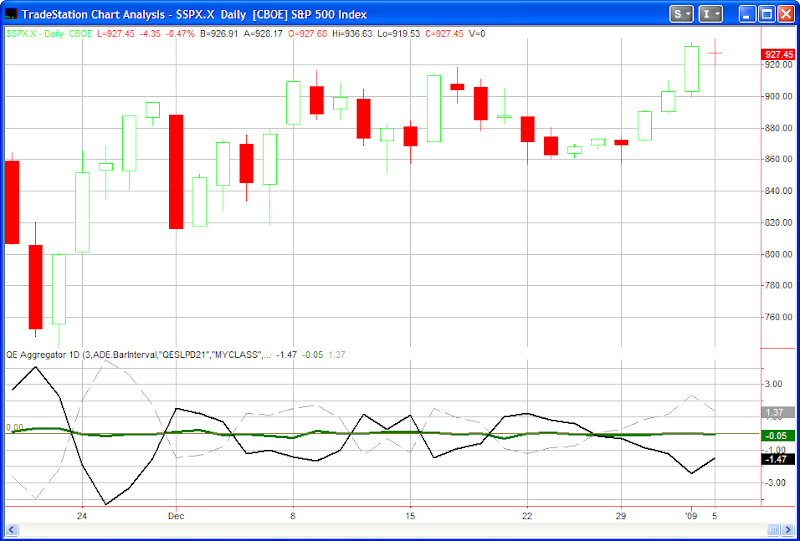
It’s been a long time since I’ve discussed the Quantifiable Edges Aggregator (click here for the July post and detailed explanation), and I’ve never posted a live chart of it to the blog, but I decided to do so today. As a quick refresher the Aggregator compiles all of the current short-term studies I have outstanding and consider “active”. Some of these studies are posted to the blog. Some only appear in the nightly or weekly subscriber letters. The Aggregator then produces a number which estimates how the studies collectively suggest the market will perform over the next few days. This is represented by the green line in the chart below.

The dashed line shows the average return of the S&P over the last few (in this case 3) days. The solid black line I refer to as the Differential line. It subtracts recent performance from recent expectations. When the Differential is negative it indicates the market has outperformed expectations over the last few days. A positive Differential indicates the market has underperformed expectations over the last few days.

As of last night’s close the green Aggregator was slightly below 0 and the black Differential line was squarely below 0. This means that the studies are indicating a slightly bearish bias over the next few days while the market has outperformed expectations over the last few days and is overbought. This is a configuration I will typically look for to enter short trades. A configuration to enter long trades would see both the green and black lines above 0. It’s important to note that the Aggregator is not a mechanical system. It is simply a graphical representation of my studies vs. the S&P 500.

For a free trial to the Quantifiable Edges members area and to see how I incorporate the Aggregator in my analysis simply click here.

When the S&P Jumps Higher Yet New Highs Contract

The number of new 52-week highs on NYSE came in lower on Friday than it did Wednesday. It’s fairly unusual for the S&P 500 to make a significantly higher high than the day before and see the total number of new 52-week highs contract. Friday’s high was over 3% above the previous day’s high.

To get a decent sample size I loosened the parameters to look at all times the S&P made a higher high by at least 1.5%. The results are below:


Twenty-seven of the thirty-one instances (87%) posted a close lower than the trigger price within 4 days.

New Years After Bad Years

With 2008 performing so bad, I decided to see how other years started off based on the prior year’s performance. Most often the 1st week of the new year following bad years in the stock market has done quite well – and substantially better than 1st weeks coming off positive years:

Should You Time The Entries Into Your 401k?

With market action slow over the last week I thought I’d address a question I received about 401k timing and RSI(2). From David recently:

“Could 2 period RSI be used to produce better dollar cost averaging returns in a 401k?Instead of doing 401K contributions on 15th and 30th of every month, what do you think of having the contributions go into a money market account, and waiting for the next RSI
I ran a test from 1/1/98 to sometime last week. If someone placed $100 into their 401k twice a month for the last 11 years the total invested would be $26,400. (I used the 1st day of the month and the 1st trading day after the 14th for simplicity.)

If their returns matched the S&P 500 that $26,400 would now be worth $19,748.34.

If instead of investing the $100 on or about the 1st and 15th, the person decided to enter on pullbacks to where the 2-period RSI was below 20, the $26,400 would now be worth $19,777.66.

In other words 11 years worth of effort would have made them an extra $30.

The issue is they are only making $100 trades the entire time. $30 isn’t great but it isn’t terrible when you’re only trading with $100.

The lesson here is that trying to time the entry of your money into your 401k is a waste of time. If you are going to boost your returns you need to focus on trading the account.