Very Low Volume After Labor Day

In a post two years ago I discussed how low volume on the Tuesday after Labor Day was often a bad sign. I looked at what happened when 1) volume came in lower than the Friday before Labor Day, and 2) when volume failed to hit the highest level in at least 5 days. Tuesday not only did volume fail to hit the highest level in 5 days, it actually came in at the lowest level of the last 5 days. Since 1970 this has only happened 7 other times. As you’ll see below, it hasn’t been a good sign going forward.

Instances are low, and the 1st week has been a bit of a tossup. But when traders fail to show interest after many summer vacations traditionally end, then a move down has always followed. In conjunction with the “August down greater than 4%” study from last week this study seems worth considering. We appear to be getting some warning signs of a September swoon.

Some old Large Gap-Up Studies to Review

I’m a bit pressed for time this morning so no new research. The large gap up does put us in a situation I’ve discussed a number of times before, though. See these old posts:

https://quantifiableedges.blogspot.com/2009/04/large-gaps-after-market-has-already.html

https://quantifiableedges.blogspot.com/2009/04/gaps-up-from-10-day-highs.html

https://quantifiableedges.blogspot.com/2010/06/large-gap-up-from-high-level.html

You’ll note they all suggest a downside edge from open to close on the day of the gap. I also noticed Scott Andrews of Master the Gap posted research along these lines in his video last night. His results were confirming of mine. Below is a link to that:

https://www.masterthegap.com/public/Gap_Trading_Video_Small_and_mixed_gaps_after_a_large_unfilled_up_gap_plus_research_on_fading_gaps_that_follow_a_close_that_is_35_higher_than_the_close_of_2_days_prior.cfm

Some Short-term Bearish Evidence

I’m seeing some evidence suggesting the market has quickly become overdone to the upside and is likely to pull back. Below is one study from last night’s subscriber letter that looks at other times the SPX made short-term highs on strong breadth but weak volume while in a long-term downtrend.

Instances are very low and prior to 1992 there did not appear to be an edge. So I wouldn’t try and extract too much from these results but I do think the recent downward strength and consistency is notable.

How September Has Performed After August Has Been Weak

September has a well-earned reputation as the worst month of the year for the stock market. But with August performing so poorly I wondered how that might affect September’s performance. The SPX finished August down 4.7%. Below I conducted a study showing how September has performed following August returns worse than X%.

While we’re not looking at a huge number of instances it does appear that going into September on a bad note in the past has not alleviated any risk. The worse August was the worse September was. Below I’ve listed the 7 instances where, like now, August finished down over 4%.

What stands out to me here is the size of the drawdowns. Four of seven instances saw September swoons of over 8%. While not statistically significant, I do think this is worth considering.

For those interested in reading more about September tendencies, I’d suggest checking out the below MarketSci post from yesterday.

https://marketsci.wordpress.com/2010/08/31/ugly-september/

AAII Investors Survey Reaching Extreme Bearishness

One indicator I thought it was worth taking a closer look at this weekend was the AAII Investor Sentiment survey. In general the survey is viewed by technicians as a contrary indicator when it reaches extremes.

This past week the number of bears rose to 49.5% and the bulls dropped to 20.7% so it is now at fairly extreme levels. The last time the Bull-Bear Spread was this low was in early July as the July rally was just beginning. Prior to that is was the first week of November of ’09 just as that rally was kicking off, and the time before that was early March of ’09 just before that rally began.

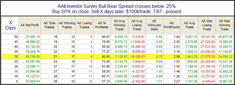
I looked at the data a number of different ways this weekend. (For those interested you may get all the data using the AAII link I provided above. Just scroll down and you’ll find a link to a historical spreadsheet on the right hand side of the page.) Below is a sample if the kind of results I saw when conducting some studies.

So what we see here is that an extremely pessimistic outlook from investors has been followed by a rise in the market on pretty consistent basis. Six weeks later the market has been higher 81% of the time and the average gain was over 7%. The problem is that the failures have been very, very large. Using the same 6-week time frame the average loss was 10% and the max loss was 27%. The max loss occurred in September/October of 2008. August of 1990 also saw a sharp decline in the spread to levels similar to current levels. That was followed by further selling that maxed out around a 12% decline between then and October. Other instances that were followed by large selloffs included July of 2002 with a 12% decline and February 2009 with a 14% decline.

So it appears the AAII Investment Survey is suggesting there is a good chance of a rally emerging over the next several weeks. But if the market can’t manage to rally then the probable alternative is a substantial selloff.

No Turnaround Tuesday…how about Wednesday?

Yesterday I showed a study related to Turnaround Tuesdays. I showed that when the market makes 3 down days going in to Tuesday there has been a decided upside edge. Well, that edge certainly did not play out Tuesday. So what happens when Turnaround Tuesday fails to ignite a turnaround? I went back to 1980 for this test to get a good number of instances.

This suggests Tuesday’s failure to turn around simply appears to be a delay rather than a bad omen.

Turnaround Tuesday

In the January 13, 2009 blog study I looked at the concept of Turnaround Tuesdays. I found the old market adage really seemed to provide an edge. And while that edge had been prevalent since at least the 60’s, it had become even stronger over the last decade. Below I’ve rerun one of the tests from that post. In this case I looked for exactly 3 dwon days in a row and today being Monday.

These results are quite compelling and suggest a substantial upside edge.

Of course this morning’s huge gap down may throw a wrench into things. I examined similar gap situations on June 29, 2010.

Inside Days

Wednesday the market posted an inside day. I haven’t discussed inside days in a while. For those unfamiliar an inside day is simply a day that makes a lower high and a higher low than the day before. Over the last decade, when the market has been trading below the 200ma, inside days have suggested negative short-term implications. Below is a table that demonstrates this.

Of course there are other nuances and filters that could be applied that could increase or decrease this edge. But generally there has been a poor track record following inside days. It’s been fairly steady, too. This can be seen in the equity curve below which uses a 2-day holding period.

When The SPY Continually Gaps Lower…

Last night both Cobra of Cobra’s Market View and Mr. Ice of ETF Prophet noted that Monday was the 5th day in a row that the market gapped down to start the day. Pre-market trading is dominated by the pros. Retail traders typically don’t trade until the official open at 9:30am EST. I’ve heard in the past that big institutions that want to buy will sometimes try and push futures lower in the morning when there isn’t as much liquidity. They do this with the intention of buying at the open (at cheaper prices) when liquidity comes into the market. Of course news and trading of foreign markets overnight will also have much to do with the open. In any event, 5 gaps down in a row is fairly rare. It raises the question, “Does a consistently cheap open provide an edge going forward?” Let’s take a look:

Instances are a little low but they sure offer some compelling evidence for the bull case.

One Study Suggesting We Bounce Today

Large gaps down rarely fail to bounce at all and sell off so persistently as happened yesterday. In the past this behavior has often been followed by a rebound the next day. The study below exemplifies this.

Unfortunately, it looks like the market is going to open today well below yesterday’s close. Of the instances listed above there were only two that gapped down the next day. They were the most recent two instances. This puts us in somewhat uncharted territory.

Low Volume / High Price A Bearish Combination

While the SPX was closing at a new short-term high yesterday the NYSE volume was coming in at the lowest level in over two weeks according to my data. Over the last several years this has not been a good combination – even when the market is in an uptrend. This is demonstrated in the study below.

This would suggest the market may be susceptible to a pullback over the next few days.

Interpreting Studies

Apologies to readers as the blog has suffered from the summer doldrums a bit lately. I thought today I would address a few comments I got regarding a post from Tuesday.

In Tuesday’s post I showed a setup that suggested the market was likely to close higher on Wednesday than it did on Monday. This statement is based on the fact that all previous 16 instances did close higher 2 days later. I showed the results table for days 1-5 (Tues through next Mon). As sometimes happens when you deal in probabilities (and not certainties) the market did not adhere to historical norms and instead sold off. After it was clear that the SPX was not likely to finish higher on Wednesday I got a few comments from blog readers about the study.

The first commenter, Daniel, noted that “the odds and ratios up to 5 days out are still appealing from the bull side – even more so now that some short-term overbought conditions have been neutralized.”

The 2nd commenter, 24/5 Trader, remarked, “Isn’t this study showing a bearish edge at the third day?” He noted that while there was a perfect record through 2 days, day 3 showed a decent number of losers as well as a drop in total profits.

Let me first say that there is no “right” answer to the question of how to best evaluate a study or consider it useful. Both of these comments showed logical interpretations of the data. Now I’ll share my interpretation.

When I look at a study like this I generally only track it as long as the results remain consistent. While I could have looked to follow it further, the real value in this study in my eyes was what occurred in the first 2 days. So regardless of whether it works out over day 1 and 2, after that I’m on to looking at my next group of studies. In this case it didn’t work out. Does this tell me anything? Assuming I don’t have a data mining issue with this study (unlikely in this case) then all I’ve really found out for sure is that the market is not reacting as it normally does to that particular setup. Again, let’s assume the setup does provide an edge and it will continue to be useful in the future. (Not always the case but an assumption that need to be made for this discussion.)

Does this abnormal reaction affect my outlook? It was supposed to go up. It went down. Does that mean it will continue to go down? Does that mean it is now oversold and will likely bounce in the next couple of days? Taken as 1 individual study it is impossible to determine.

My studies tend to look at one or two specific aspects of the market. In this case it was strong consistent breadth. While I found this study to be the most interesting and “blogworthy” Tuesday morning, there was also a short-term bearish study that triggered Monday night which was published in the Subscriber Letter. Additionally, there were 3 other short-term bearish studies from the Sunday night letter that were also in effect. So it wasn’t terribly surprising that the market struggled Tuesday and Wednesday. And while the strong breadth was saying we were going higher, these other studies that looked at things such as the overbought price action and weak volume suggested a pullback was in order.

So in this particular case, when the market didn’t react in the “normal” way to the setup studied in Tuesday’s blog, it didn’t concern me. On the other hand, if there were a large number of bullish studies, and few or no bearish studies and the market traded lower, then I might get concerned. If this abnormal behavior persisted then I would view risk as elevated and would consider adjusting my position size and trade management accordingly.

My database looks at an awful lot of information. I try and share a few tidbits on the blog each week, which I hope are often useful. But that is really all they are – useful tidbits. They are not market calls and when the market reacts the way it normally does, it doesn’t me I was right. And when the market moves opposite a study it doesn’t mean I was wrong. I do suggest trade ideas in my Subscriber Letter and I have found studies such as those I often post to the blog to be very useful in determining my bias and in making index trades. My primary tool for interpreting all the studies is the Quantifiable Edges Aggregator. The Aggregator basically takes all of my currently “active” studies and uses them to make a projection for the next few days. If you would like to learn more about the Aggregator, then below are two links.

The first one is a detailed explanation of the tool from about 2 years ago.

https://quantifiableedges.blogspot.com/2008/07/quantifiable-edges-aggregator.html

The 2nd link is to a webinar I held for subscribers about a week and a half ago. It includes a detailed overview of the Aggregator as well as a question and answer period from subscribers that posed some interesting questions. The video is about 40 minutes, so it takes some time to watch. I should also apologize for the lack of editing. I just started holding these webinars and I need to get up to speed with all the tools. It takes about 40 seconds before the presentation really gets going.

The QE Aggregator – July 19, 2010