Quantifiable Edges Big Time Swing System Overview Page Updated

I’ve updated the Quantifiable Edges Big Time Swing System overview page with results through December 21st. There is not a trade currently open and it’s unlikely we’d see a trade open and close before the end of the year so I figured I might as well do it now. I don’t update results that often since the system only trades about once per month on average. While 2010 was a subpar year, I am pleased to report that on a total of 12 trades it did post a little over a 4% gain.


It’s important not to overreact to a small sample of trades and any single year with this system is a small sample. So I’m not terribly concerned that the performance was subpar. 2010 was marked with moves that were more persistent than usual. Examples would be the March-April rally, the September-October rally and the recent December rally – all of which plugged forward without the sort of oscillations that are typically seen. For the Big Time Swing, which often looks to play oscillations, this meant some extended sidelined periods. There has only been 1 trade in the 4th quarter.

Profits were also cut in half thanks to a few positions that signaled an exit for the next morning. Exits can be taken at the close or the next day’s open. Historical analysis has shown an edge in holding certain trades overnight after the exit is triggered. Doing so in 2010 would have cost about 4%, so this did cause me some frustration. Still, I’m not inclined to change my approach due to a small number of unfortunate overnight moves. Of course since it is an open system traders have the option of tweaking it any way they want.

For those looking for a system that they can use as a base to build their own system from, the Big Time Swing is an attractive option. It is all open-coded and comes complete with a substantial amount of background historical research. And since it is only in the market about ¼ of the time, it can easily be combined with other systems to provide greater opportunities. Once you’re ready to try and improve the system yourself you can also refer to the system manual or the August 2010 purchaser-only webinar – both of which discuss numerous ideas for customization.


And if system development isn’t your thing, the Big Time Swing System provides easy to follow mechanical rules that you can follow. The standard parameters have performed quite well. There are only about 12 trades per year averaging 7 trading days per trade. All entries and exits are either at the open or the close. And to be sure you have everything set up properly traders may follow the private-purchasers only blog that shows all SPY signals and possible entry/exit levels. This service is free for 12 months from the date of purchase.


For more information and to see the updated overview sheet, click here.


If you’d like additional information about the system, or have questions, you may email BigTimeSwing @ Quantifiable Edges.com (no spaces).

How many instances are needed when considering study results?

This post is the 2nd part of a series I started a few weeks ago that will discuss using quantifiable edges to your advantage.  Today I’ll discuss a common question I get about the studies.  How many instances are needed for valid and usable results?  It will lead into “What makes a study compelling?” in the next post.

Many of the posts I put on the blog are what I refer to as studies. In this previous post I showed the layout of the studies. A study is simply test results of an idea. Most of the time the idea is based in technical analysis. It looks to answer the question, “How has the market performed in the past after…”

Some studies are fairly general. For instance, I might look at how the market performs after it has traded down 3 days in a row. Others are more specific with added filters. Perhaps I notice that not only is the SPX down 3 days in a row, but it also is trading at a 10-day low, and is above the 200ma and volume has increased each of the last 3 days.

Both studies could tell me something about the market in relation to its current condition (assuming I’m describing current conditions, which is typically my approach). If I am able to describe conditions that more closely match the current market then I have a better shot at seeing behavior over the next several days match up with the study results. Of course there is a trade-off between general and specific, and that is the number of instances.

A general test may have hundreds or thousands of instances which it can refer to in order to generate expectations. A very specific test may have an extremely low number of instances. If the number of instances is too low then the results may have little or no meaning. For instance if my parameters are run and I find that the market had only set up in a similar manner 1 other time over my test period, is it reasonable to assume that the market will act the same way this time? Most people would correctly assume “no”. What if there were 2 instances and they both had similar reactions in the past. Could I assume this suggests a directional edge? 3 instances? 4? 10? 30? 50? More? How many instances is “enough” to have some level of confidence that your results are actually suggesting an edge and they are not the result of luck?

Before answering let me address 1 common misconception people have about statistical testing. That misconception is that you need 30 instances in order to demonstrate statistical significance. This idea originates in the fact that a sample size of 30 is needed in order to calculate a Z-score or run a chi-square test. The reason that 30 instances are necessary is that Z-scores assume a normal probability distribution. Without 30 instances it is not possible to resolve the shape of the normal probability distribution clearly enough to make certain statistical measures valid. One thing traders should be aware of is that the stock market does not have a normal distribution anyway. It has “fat tails”. In other words, there are more outliers present in stock market movements than one would expect under a normally distributed curve. So relying on standard statistical measures and assuming a normal distribution could expose a trader to more risk than his results would imply.

Still, these tests are helpful in determining whether your results were likely due to a real edge or whether there is a high risk that luck played a big part. But what if you don’t have 30 instances? In that case you could use a t-table statistic.

To better understand statistical significance and see how to run some of these tests I’ll refer you to the below post from a couple of years back:

https://quantifiableedges.blogspot.com/2008/05/significance.html

Note that this post also contains a t-table. One interesting thing we can see when looking at a t-table is the minimum number of instances you would need to have different confidence levels that your edge is actually an edge and not due to luck. For instance, if all instances were followed by a market rise, you would want at least 6 instances in order to be 95% confident that there was an actual edge. A 99.9% confidence would be reached if you had 11 instances that all resulted in a rise over the next X days.

So if you look back at the study I showed Wednesday, SPY only set up in that pattern 12 times in the past, but every time it was trading higher 5 days later. This means statistically there is about a 99.9% chance that the positive results were due to more than luck. That there has in fact been a real edge in that pattern in the past. Does this mean there is a 100% chance it will be higher 5 days after the setup? No! Not even close. A high degree of confidence means there is likely some kind of an edge. It doesn’t mean the past winning % or net expectations are likely to persist indefinitely.

So how many instances do I require before I’m willing to accept a study as part of my analysis and place it on my active list? It varies depending on things like the strength of previous reactions and other stats I’ll get into in my next post, but I’ll generally use a t-table to help me decide. Will I incorporate a study with only 10 or 11 instances? Yes, but it will have to have strong win/loss stats and a high win %. Personally, I tend to favor studies that have somewhere between 20-70 instances. Too low and they are less reliable. Too high and the setup is often too broad to have much meaning.

I’ve spent far more space discussing this than I wanted, but it is an issue that has come up time and again with readers, so I wanted to be somewhat thorough.

In fact, of the list of things I look at in a study to help me decide whether it is compelling or not, the number of instances (assuming it isn’t minuscule) is near the bottom .

I intend to accelerate this series of posts over the next couple of weeks and I’m sorry it’s taken so long to get rolling. In the next post I will discuss a list of other things I examine when determining whether I find a study compelling.

Related Quantifiable Edges Studies

A Rare SPY Pattern That Has Always Been Followed by Short Term Gains

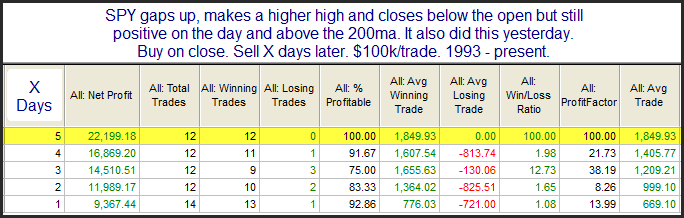
The pattern of the last 2 days is quite interesting.  Both days we saw a gap higher, a move up above the previous day’s high, and then a reversal that led the SPY to close below its open but still in positive territory.  I looked at this 2-day setup in the subscriber letter in March using a long-term trend filter.  I have updated the study below.

Only 12 instances but the results are overwhelmingly positive.  In last night’s Subscriber Letter I shared some additional details, including all the dates.  There are actually a very large number of studies I am currently monitoring.  They are somewhat mixed. This particular study makes a compelling arguement for a short-term bullish outlook.  If you’d like to trial the Quantifiable Edges Subscriber Letter a free trial is offered here.  If you have already trialed it but not in the last 6 months, you may request another trial via email to support at QuantifiableEdges dot com.

I’ll Be Speaking at the Traders Expo in New York in February

The Traders Expo will be held at the Marriot Marquis Hotel in from February 20 – 23, 2011.  I’ve decided to make the trip. 

I’ll be speaking on the 21st from 1:30 – 2:30pm.  I’ll be discussing some of of my favorite research and trading ideas.  I hope to have the opportunity to meet severall blog readers and subscribers at the event.

I’ll send out another reminder as we get closer.  Registration is free and you may sign up using the link below:

https://secure.moneyshow.com/msc/nyot/registration.asp?sid=nyot11&scode=020867

The Most Wonderful Tiiiime of the Yearrrrrr!

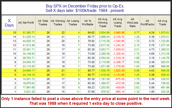
Over several time horizons op-ex week in December has been the most bullish week of the year for the SPX. The positive seasonality actually has persisted for up to 3 weeks. I demonstrated this last year in the 12/14/09 blog. I’ve updated that study below to include 2009 stats.

Last year saw the market move higher on Monday and then pull back the rest of the week before rallying into year-end. 

I’m generally seeing a mix of bullish and bearish studies right now.  Friday’s blog is an example of an active bearish study.  This one certainly favors the bulls.

SPY Consecutive 50-day Highs On Lower Volume

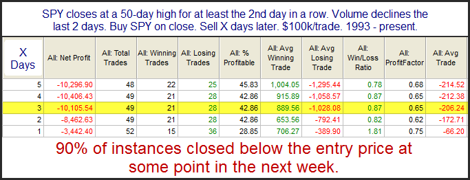
Declining volume at new highs can often lead to short-term difficulties.  Below is a study related to SPY and SPY volume that I’ve shown a few times in the Subscriber Letter.  It popped up in the Quantifinder again on Thursday.

This appears to suggest a mild downside edge.  The high probability of some kind of decline despite the fact that it always occurs in an intermediate-term uptrend makes the study compelling enough to me to take under consideration.

Large Gap to New Highs Not the Edge They Once Were?

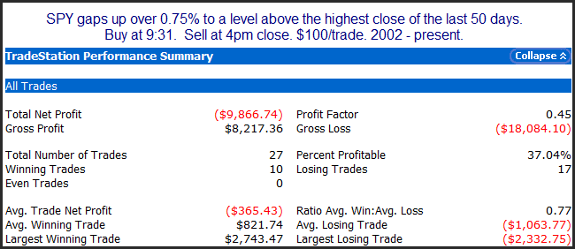
I’ve shown in the past using numerous studies that a large gap to a new high has a tendency to pull back during the day.  Below is a study that represents some of what I was looking at this morning.

The stats here appear quite bearish.  But below is the equity curve.

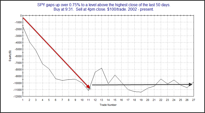
It appears over the last few years this setup has failed to deliver consistent downside movement.  I looked at this a number of ways this morning and most of the equity curves looked like this.  So be careful getting overcondfident trying to short this gap.

POMO Stimulus Indicator At New High and Still Climbing

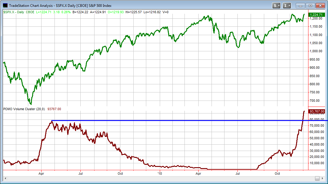
Last week on the blog I showed an indicator that measured the amount of POMO stimulus the Fed has injected into the system over a 1-month (20 day) timeframe.  As a review POMO stands for Permanent Open Market Operations and it is how the Fed goes into the open market to buy (or sell) treasury securities. The net effect of this buying is an influx of cash into the system. It appears a portion of that cash makes its way through the banking system and into the stock market. It also appears that the net effect of all this Fed buying is a positive influence on the stock market.

Today I have updated the chart from last week.  The top panel shows the S&P 500.  The indicator on the bottom is the total POMO buying in dollars that the Fed has done.  I’ve zoomed in to just show the last year and a half. 

As you can see the POMO buying over the last month has now far exceeded any 20-day period in 2009 (or ever).  According to the Fed’s website Mon-Thurs of this week are also scheduled for POMO activity.  And a new schedule is due out on Friday so there is a chance we’ll continue to see strong Fed buying in the weeks ahead.  Evidence suggests to me that this should have a bullish influence on the market.

1-Month POMO Stimulus Level Set To Hit Record Highs

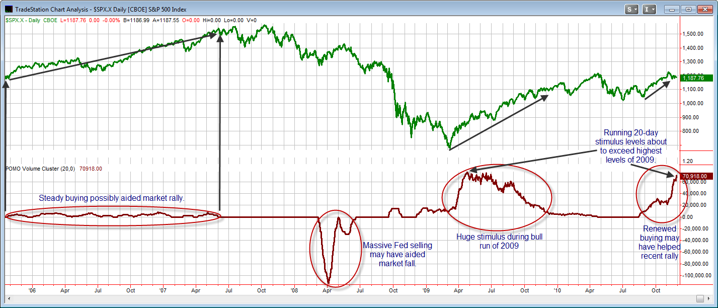
Over the last few weeks in the Quantifiable Edges Subscriber Letter I’ve posted a number of studies related to Fed POMO activity. I’m not the first to look at POMO. It is a topic I first saw on Zerohedge and have seen discussed many other places since. For those unaware POMO stands for Permanent Open Market Operations and it is how the Fed goes into the open market to buy (or sell) treasury securities. The net effect of this buying is an influx of cash into the system. It appears a portion of that cash makes its way through the banking system and into the stock market. It also appears that the net effect of all this Fed buying is a positive influence on the stock market. Conversely, when the Fed sells securities in the open market then it is pulling money from the system. This appears to have a possible negative influence on the stock market.

The chart below is of the S&P 500 since August of 2005 (as far back as the Fed’s POMO Database goes). The indicator on the bottom of the chart shows the total amount that the Fed either pumped into or withdrew from the system through POMO activity over the last month. (Running 20-day total par accepted.)

(CLICK CHART TO ENLARGE)

Note how the market has performed in accordance with past POMO activity. According to the Fed’s website, they are tentatively slated to perform buying every trading day from now through December 9th. Either Tuesday or Wednesday we should see the 20-day running total as shown on the bottom indicator exceed the highest levels in 2009. Based on the above chart, (and a number of studies I’ve conducted) it appears the old adage “Don’t fight the Fed” still holds true. If this is the case, then the Fed’s recent and scheduled activity should act as a bullish influence in the days and weeks to come.

When Monday & Tuesday of Thanksgiving Week Are Lower

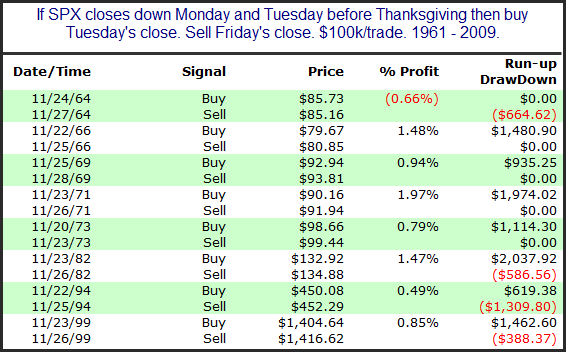
As I showed a few days ago Thanksgiving week has had some very bullish tendencies on both Wednesday and Friday.  Interesting about the current week  is that both Monday and Tuesday have closed down in the SPX.  Going back to 1961 I looked at performance on Wed through Fri after Mon and Tues were lower.  There were only eight other instances.  They are listed below.

Instances are lower than I would prefer but stats are heavily lopsided to the short-term bullish case.

Happy Thanksgiving!

Thanksgiving Week Tendencies Revisited

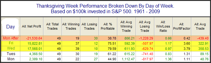
Historically Thanksgiving week has shown some very strong tendencies. Last year in the 11/23/09 blog I broke down the returns by day of the week. I have updated that table below.

Monday and Tuesday before Thanksgiving don’t seem to carry a sizable edge. Monday’s total return was actually negative until 2008 when it posted a gain of over 6%. Wednesday and Friday surrounding Thanksgiving have shown strong upside tendencies and the Monday after has shown a sizable downside tendency.

Using Quantifiable Edges to Your Advantage – Part 1 – Understanding the Study Layout

This post is the beginning in a series which will provide readers some ideas on how they can take some of the edges they see here (and elsewhere) and use them to their advantage in their own trading.

Before getting into a theoretical discussion it’s important that I make sure everyone understands what it is I’m presenting when I show these studies in the blog and the Subscriber Letter. Over time I have pretty much standardized the statistics that I show in my tables. I have tried to strike a balance between giving enough information to make the table useful and giving too much information which could make it messy and confusing. Below is a sample study (with real results but a bogus description). I’ll use this as an example to refer to.
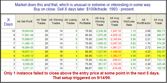
The top box of the study always lays out the conditions. Everything that was taken into account is described there. One thing to note is that I always run the studies on $100k/trade. This is because most of them look at the S&P 500. Since it trades at about 1,200 there will always be some leftover when buying into a portfolio (you can’t buy a half a share in Tradestation). The $100k makes the rounding error small enough so that it doesn’t have much of an affect. $10,000 would have too large of a rounding error. $1,000,000 would be better but then the numbers get so large it makes it more difficult to read.

With an even $100k I find the results easy to interpret. $1000 = 1% in the results columns. So in the above example the “Average Trade” shows a gain of $733 after 3 days. This is almost 0.75%.

Now let’s briefly review each column in the results table.

“X Days” – Most tests I run out over a number of days to see how the market has performed after the test conditions were in place. “X Days” just shows the length of time from the entry. The entry is normally assumed to take place at the close. The exits are also assumed to be at the close. The number of days refers to trading days – not calendar days. Note this column reads from the bottom up, which means all columns do. No reason for that. It’s just how I started doing it a long time ago.

“Net Profit” – This is the net gain or loss for the entire sample of instances included in the study. One thing to note is that I always “Buy” the setup. This is not because I am only looking for long edges. It is because it makes the table easier to read. A quick glance can tell me if the edge is bullish or bearish. Lots of positive, green numbers is bullish. Lots of negative, red numbers is bearish. A long time ago I would sometimes set the entry condition to “short” at the close. Then I could see profits from shorting. Doing this required me to read the entry conditions carefully and would occasionally lead to some confusion when I didn’t. So for purposes of easily reading the study tables, everything assumes a long position.

“Total Trades” – This is the total number of instances that triggered based on the study conditions. As in the case above, this number will sometimes be larger for Day 1 and then you’ll see a declining number of instances as you look further out. If you’re wondering why this happens, check out the June 18, 2010 blog post.

“Winning Trades” – The total number of trades that were showing a gain “X Days” later.

“Losing Trades” – The total number of trades showing a loss “X Days” later. The wining plus the losing trades typically add up to the total trades. In those rare instances when it doesn’t it means a trade was breakeven on that day.

“% Profitable” – This column simply shows the winners / total trades. Sometimes a 50% profitable situation can still show a strong edge. That would mean gains outsized losses by a large degree (or vice-versa). % profitable is important from a trading standpoint though. If a setup is 90% profitable it is generally less likely to put you through an extended drawdown as a setup that is 55% profitable with the same size average trade.

“Avg Winning Trade” – This looks at all the “winning trades” and divides them by the gross profits on those trades. (Gross gain and gross loss columns are not shown.) So in the table above, the “Avg Winning Trade” was up $692 after day 1. This means that of the 14 instances that finished higher the next day, the average gained just under 0.7%.

“Avg Losing Trade” – Just like “Avg Winning Trade”, but it is looking just at the losers. In this case after day 1, the 7 losers dropped about 0.9% on average.

“Win/Loss Ratio” – This takes the value from the “Avg Winning Trade” column and divides by the value from the “Avg Losing Trade” column. It can help you determine whether the reaction was typically more explosive on moves up or down.

“Profit Factor” – This is the stat I am asked about the most. It is a stat often cited by system traders. Profit Factor = Gross Gains / Gross Losses. Profit factors above 1 occur when there are positive net results and below 1 occurs when there are negative net results from a study. When thinking about the importance of profit factor, it is easiest to consider how 2 systems may compare. Consider 2 systems made a hypothetical $10,000 each over a specified time period. System 1 had $15,000 in gains and $5,000 in losses. Its profit factor was 3. (15k/5k = 3). System 2 also made $10,000 but it was on $100,000 in gains and $90,000 in losses. Its profit factor was 1.11 (100/90). Most people would find system 1 more appealing as it seemed to make the $10,000 with less effort and risk.

“Avg Trade” – This is simply the net gains divided by the total trades. Under most circumstances, I’ll use the information in this column to help generate estimates.

Last but not least I will often place a statement with additional information in a box below the results. This is typically information that can’t be seen in the table. A common bit of information I put here is how often the market might close up (or down) from the entry price at some point in the next few days.

In the next installment of this series I’ll give a brief discussion of attributes that would make a study compelling to me and entice me to incorporate it in formulating my market bias.

Related Quantifiable Edges Studies

A Very Powerful QQQQ Pattern

When a short-term decline that is already a bit overdone experiences a downside acceleration it will often mean an upside reversal is ready to occur.  QQQQ’s current pattern is showing a potentially powerful example.

These very simple requirements have led to some very strong results, both short and intermediate-term.  Four weeks out the average trade has produced a gain in the QQQQ of over 10%.  Even if this apparent upside edge does play out, I don’t expect to see gains this strong over the next month.  Often the outsized gains were partially due to the volatile environment that was present when the study triggered.  Many of these occurred during the wild 2000 – 2002 bear market in the Nasdaq.  The current environment is carrying low volatility, so my expectations are dampened. 

This downside acceleration concept is one I’ve found useful before.  It is included in a few of the systems available with a Quantifiable Edges Gold Subscription.  More details on the above study (and others) are available in last night’s Subscriber Letter.  Click here for a free trial.