Why The Equity Curve Is Importnat In Evaluating Studies

While I don’t always show it I do always look at the equity curve when evaluating studies to include in my analysis.  Last night while conducting my research I came across a great example of why this is important.

Inside days have generally suggested a bearish edge when the market is below the 200ma and no edge much better than upside drift when above the 200ma. I found it unusual that the inside day came with an unfilled gap down so I tested the possible effects under these circumstances.

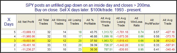
At first glance the numbers seemed to suggest a downside edge. A closer look showed the numbers to be misleading. Here are the results in table format.

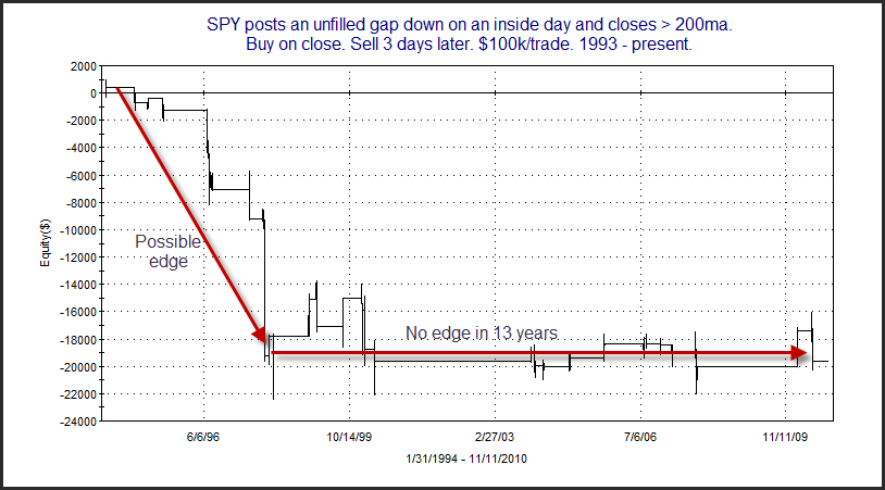
Base on this the next 1-3 days would seem to have a bearish inclination. But here is a picture of the equity curve.

As you can see it has been a long time since this setup has produced compelling odds.   Researchers should always take a look at the equity curve when considering whether to incorporate results into their analysis.
Another blogger who often makes this point is Michael Stokes of MarketSci.  He did it again in his recent Thanksgiving returns post yesterday.

Back to Back Outside Days in QQQQ Revisited

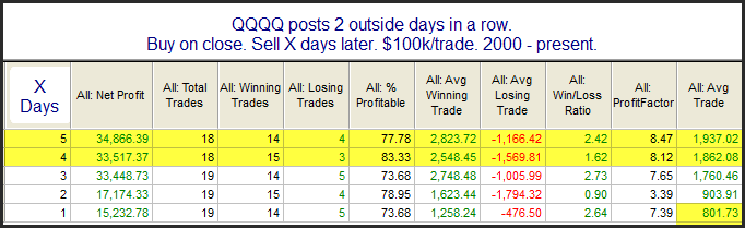
Yesterday afternoon the Quantifinder identified an interesting study that I last wrote about in the 3/23/10 blog.  It looked at back to back outside days in QQQQ.  I’ve updated the study below.

I also sliced this a few different ways (above/below 200ma, up/down close, etc.) and found little difference in the results.  Despite the low number of instances I find this a compelling setup.  You’ll also note that on December 7, 2009 I performed the same study on SPY and found compelling results there as well.

Overbought in an Uptrend

Most swing traders understand that the market has a tendency to oscillate. In other words, strongly oversold conditions will often lead to a bounce and strongly overbought conditions will often lead to a pullback. The trick in trading a swing time frame is understanding when the likelihood to reverse is strong and when it isn’t.

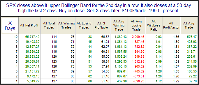
Trying to sell short when an uptrend gets overbought can be a dangerous endeavor. Often there will be no downside edge when trying to short into an overbought condition in an uptrend. When the market is strongly overbought due to a sharp acceleration in the trend as occurred late last week, it may even suggest an upside edge. Below is a study from last night’s subscriber letter that demonstrates this.

We see here a mild upside edge.

Actually the upside stretch is even more extreme that I show in this study. There were some momentum studies in last night’s letter suggesting an even greater bullish edge. There are also a few active studies that suggest a mild pullback could be in order. In any case, the point is that though the market is short-term overbought, this is by no means an ideal short setup. And in general odds seem to favor a continuation rather than a strong, immediate drop.

The Importance of Breadth & Volume Confirming A Move To New Highs

While we can learn a lot from price action, it really only gives a small piece of what the market is doing.  There are many other forces that play a role in determining the likelihood of future price movement.  Breadth and volume are 2 that I mention every night in the Subscriber Letter.

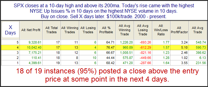
Moves to new highs are often followed by brief retracements.  This has especially been true since around the year 2000.  (This is when chop became favored over day to day trending activity as discussed here.)  In last night’s letter I showed a study that suggested strong breadth and volume in conjunction with a new high has favored further short-term upside.  That study is below.

Instances are a bit low but results are fairly compelling.  I did run the results back further last night and found the edge has been present as far back as the 1970s.  It became stronger after 1988. 

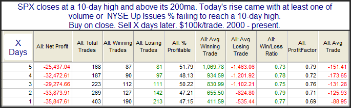
Now let’s look at what has happened since 2000 when these new highs were not accompanied by strong breadth and volume.

The difference is striking.  This is just another reminder that price action alone does not tell the whole story.

Fed Days With The Market At An Intermediate-Term High

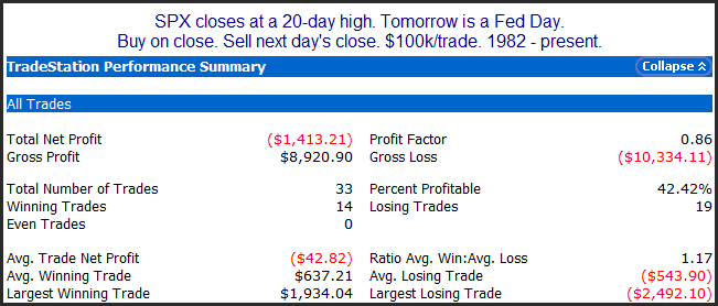
Fed Days have generally exhibited an upside bias for about 30 years.  Many times this has been thanks to the Fed giving a confidence boost to a struggling market.  But what of those times where the market is already at an intermediate-term high.  With the SPX closing at a new rally high yesterday this is the situation the market is now in.  Below is a study that take a look.

What I see here is that there has been no tendency for the market to advance under these circumstances.  There could even be a slight downside edge, but the numbers aren’t compelling enough for me to bank on that.  I’d simply view it as neutral. 

Fed Day Tomorrow

Just a quick reminder that tomorrow is a Fed Day.  Over the last few years I’ve written an awful lot about Fed Days and market behavior on and around them.  In general, Fed Days have been bullish, though there are certain nuances that substantially affect the edges.  For those that may want to review some of the edges I have identified, you can check out the Fed Day label on the right hand side of the blog, or use the link below:

https://quantifiableedges.blogspot.com/search/label/Fed%20Study

Of course the most complete collection of my Fed Day studies is contained in the Quantifiable Edges Guide to Fed Days.  For more information on the book/ebook, check out the link below:

https://quantifiableedges.com/fedguide

1st Day of November Tendency

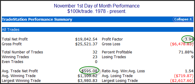
I’ve discussed before how the 1st day of the month tends to have a bullish bias.  This has been the case since the late 80s.  (Perhaps due to the rise in popularity of the 401k.)  In July 2009 I looked back to 1987 and broke down the 1st day returns by month

For whatever reason, the 1st trading day of November has shown a positive bias for a bit longer than most months.  Below are the results looking back to 1978.

A Rare Consolidation

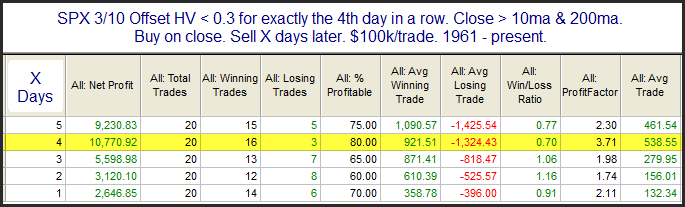
On Tuesday I discussed the 3/10 Offset HV indicator.  I used it to measure when a market has become so coiled that is is likely to have a sharp move.  We have a very unusual situation right now in that the 3/10 Offset HV has closed at a very low level for 4 days in a row.  I decided to run a test last night to look at other times SPX’s 3/10 Offset HV closed below 0.3 for 4 days in a row. I also filtered using the short and long-term trend. Results are below.

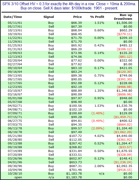
These results would seem to suggest an upside edge. But I also looked deeper. Below is a listing of all 20 instances going back to 1960.

What I find most notable are the dates of the occurrences. As you can see most of the instances took place in the 60s and 70s. Also, this is the 1st instance in over 14 years. Personally, I’m not terribly comfortable using a study whose results are primarily achieved during the 60s and 70s and with no instances since ’96. Therefore I decided not to include it when formulating my outlook.

Many more studies lead to dead ends than lead to quantifiable edges.  When deciding what to include in your analysis, it is important to be intellectually honest with yourself.  Traders should look to trade aggressively when  edges strongly suggest a bias.  It is just as important to remain patient and conserve capital when evidence is mixed or lacking.

VIX and SPX Both Close Higher for the 2nd Day in a Row

The SPX and the VIX typically move in opposite directions. It is somewhat unusual to see them both move higher on the same day. It is especially unusual to see this happen 2 days in a row as we saw on Monday and Tuesday. Below is a study that looks SPX performance following such occurrences. It only considers those instances that occurred when the SPX was trading above its 200ma.

Instances are a bit low but the stats seem to suggest a possible downside edge over the next 1-3 days.

Volatility Contraction & A Study In Memory of Bruce Hanna

Notable about current action is that the 3/10 Offset HV Indicator has fallen into “extremely low” territory. I first introduced this indicator in the July 13, 2009 blog. It looks at the historical volatility over the last 3 days versus the historical volatility over the previous 10.  Low readings in this indicator occur when there has been a sharp contraction in volatility. In that blog post I showed that these sharp contractions are typically followed by volatility expansions.

About a year ago I wrote a detailed study that examined using the 3/10 Offset HV Indicator as a filter for daytrading Opening Range Breakouts. The study is 5 and a half pages in length. I’ve never offered it through the blog before. It is only available in the members section of the Quantifiable Edges site.

I took the last week off from blogging after my father passed away. He got dementia at a young age and it took him away from us much too soon. In his memory a fund has been set up with the Alzheimer’s Association.

If you use the link below to make a donation to the Alzheimer’s Association I will happily forward you a copy of the Quantifiable Edges Opening Range Breakout (ORB) Study. The donation may be in any amount. I would ask that if you have found the blog helpful in your trading over the years that you consider a generous (tax-deductable) donation.

https://act.alz.org/site/TR?pxfid=27370&pg=fund&fr_id=1060

I will receive notification from the Alzheimer’s Association when a donation has been made, along with the person’s email. With this information I will forward a link to the Quantifiable Edges Opening Range Breakouts Study along asap. If you do not get it within a few hours, please email me at ORBstudy @ quantifiableedges. Com (no spaces) and let me know.  I apologize for not being able to automate the entire process.

About the Alzheimer’s Association (from their website):

The Alzheimer’s Association is the leading, global voluntary health organization in Alzheimer care and support, and the largest private, nonprofit funder of Alzheimer research.

More information may be found directly from their home page.

https://www.alz.org/index.asp

Thanks,
Rob

Modest Gaps Higher From High Levels

I’ve shown several times before that when the market is already at a high level and it gaps up large in the mornining there is a quantifiable downside edge for the rest of the day.  The large gap up incites profit taking.  See the link below for an example:

https://quantifiableedges.blogspot.com/2009/08/large-gaps-up-from-1-month-high.html

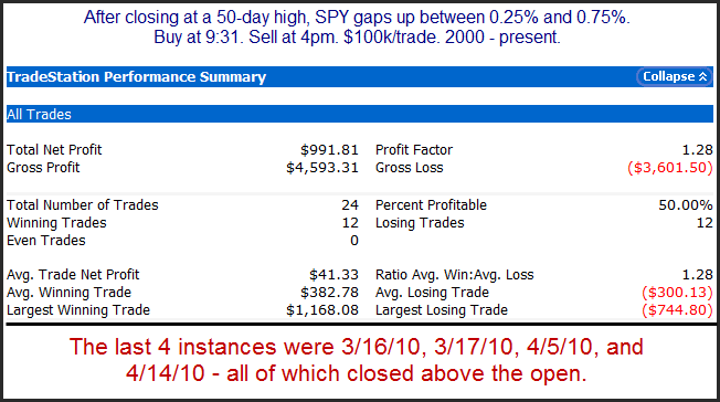
But what of times like now when the makret is at a new high, but the gap up is only modest?  Below is one way to look at it.

It appears when the gap up is of a moderate size a downside edge no longer exists.  And while a large gap up would have had me excited about shorting this morning, this study suggests no substantial edge at all. 

Low VIX:VXV Ratio At A 50-day High

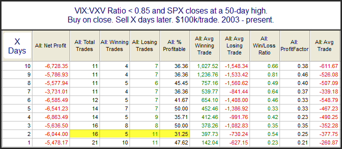
I’ve found in the past that a very low VIX:VXV ratio can often be a bearish indication for the market.  Monday we saw the ration drop sharply and the SPX close at a 50-day high.  Below is a study that examines a low VIX:VXV ratio and market at a new high.

Implications appear to be mildly bearish, but are mostly exhausted after just 2 days.

Happy Columbus Day?

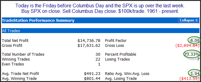
While the stock market is open on Monday, banks, schools, government offices, and the bond market are closed. In past years with the bond market closed, the stock market has done quite well on Columbus Day. Of course the most famous Columbus Day rally was in 2008 when the market gained over 11% after having crashed the week before. This year circumstances are much different and the market has put in some nice gains this week. In the Subscriber Letter last year I showed research that suggested an up week prior to Columbus Day typically made for a good Columbus Day. Below I have updated some of that research.

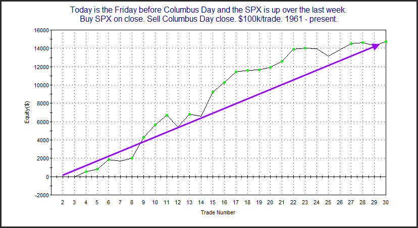
I’ve circled some of the more impressive stats here. With more than 7 out 0f 10 trades profitable and winners nearly twice the size of losers risk/reward has been very favorable. It appears positive momentum from the prior week has shown a fairly strong tendency to follow through on Columbus Day. Below is the profit curve.

We see a fairly steady upslope here. Combined with the stats above I’d say Columbus Day does appear to provide a solid seasonal edge. Happy Columbus Day!

Quantifiying how Market Analysis can Enhance Individual Stock and ETF Trading Methods

Stock traders are aware that it is generally beneficial to have the market on your side. Whether the market moves up or down will often have an influence on an individual stock or ETFs movement. As they say, a rising tide will lift all boats. Yet too often traders (especially short-term traders) either ignore the general market action or underemphasize it in their decision making. They’ll look for a trigger without carefully considering the likely direction of the market.

I have found trading with the general market on my side to be of great importance. In August I conducted a study for my gold subscribers that demonstrated and quantified this concept.

As part of their gold subscription, traders have access to 11 different swing trading systems. On the system pages they are able to see the rules, Tradestation code, and backtest results across 2 lists of securities. One list is the S&P 100 and the other is a list of about 100 ETFs. The ETF list looks just at equity ETFs. It does not include any inverse or leveraged ETFs and there are no duplicates in coverage (like SPY & IVV). Most of the systems were first published within a few months of the subscriber letter first being published over 2 ½ years ago. When updating all the original backtests in late August I decided to see how the system performed when there was a perceived market edge versus times there wasn’t.

Many readers are aware of my Aggregator tool. The Aggregator utilizes the market studies I publish in the subscriber letter (and sometimes in the blog). It uses them to generate short-term market projections. Aggregator configurations can produce a long, short, or flat bias. A more detailed description of the Aggregator can be found here. A post describing how the Aggregator has been used as a system can be found here. The bottom line is that the Aggregator is my #1 tool for setting my short-term market bias. It also has a history dating back to the inception of the subscriber letter so I can easily see what my bias was going in to any given day.

So to quantify the value of trading with the market on my side, I ran tests on all 11 numbered systems to show their performance over the last 2 ½ years. I filtered the results to show trades that were accompanied by a confirming Aggregator signal versus trades with a neutral or offsetting Aggregator signal. In general I found results to strongly favor entering trades at times when there was also a perceived market edge (confirming Aggregator signal). Below is a partial example of the results that are shown on the website. This is “System 80509”.  It looks to enter long trades in strongly oversold securities.

The discrepancy here is more substantial than was seen in many of the results. Still, the general results suggested you are much better off trading with the market winds at your back.

The lesson here is not that you need to utilize Quantifiable Edges systems or the Aggregator tool to enhance your results. It does mean that whatever trading methodologies you are using, you will likely stand a much better chance of success if you also incorporate some solid market analysis as a filter.

One last note for advanced system developers and testers. Complete historical Aggregator values are available with a QE subscription. You could easily download and apply them as a filter to test the effect on any of your own systems.