How the Market has Historically Reacted to Very Bad Fridays (Updated)

The study below is one I last showed in the October 22, 2012 blog.  It examines large drops on Fridays.  Both the Crash of ’29 and the Crash of ’87 happened on Monday.  The Crash of ’87 is still remembered by many traders that are active today.  There was a strong selloff on Friday and then all hell broke loose on Monday.  But since then strong Friday selloffs have commonly been followed by bounces on Mondays.  Perhaps this is due to the fact that fear of a crash causes what might otherwise be an ordinary selloff to become exaggerated and overdone on Fridays.  Or perhaps it is just that people don’t want to hold over the weekend (and end up paying a premium not to).  Whatever the reason, the tendency to bounce has been very strong.  I’ve updated that 10/22/12 study below.

The numbers here are all very impressive and suggest a strong bullish bias.  Traders may also want to take notice of the note at the bottom of the table.  A failure to bounce today could be a warning that the market is not following historical norms and the environment is becoming more dangerous.

Recent Closing TICK Action & The Oscillator Strongly Suggesting A Quick Bounce

One indicator now providing some extreme readings that are typically followed by bounce is the TICK Tomoscillator.  The TICK Tomoscillator is the brain child of my friend and fellow market analyst, Tom McClellan of McClellan Financial Publications (click for Tom’s article on the indicator).  It uses the NYSE closing TICK readings to measure recent end-of-day sentiment.  I first introduced the TICK Tomoscillator in the 4/19/11 subscriber letter. For those that are not familiar with the TICK Tomoscillator, you may find a detailed description in the May 13, 2011 blog.  The TICK Tomoscillator posted an extremely low reading of -236.82 on Wednesday.  This pushed the Tomoscillator % Rank down below 1%, meaning Wednesday’s reading is among the lowest 1% in the last year. Subscribers may find Tomoscillator readings on the charts page every night.  Below you can see the Oscillator reading from Wednesday’s chart page:

The TICK Tomoscillator is also included in the QE Indicators/Functions for Tradestation package which can be downloaded by all subscribers for free.

The study below uses the Tomoscillator % Rank reading rather than just the raw reading. It was last seen in the 6/13/11 Letter.  I updated the results.

While instances are a little low we see what appears to be a strong inclination for the market to bounce immediately, and then eventually follow through with more upside.

For more TICK related research from Quantifiable Edges, you may use the link below:
https://quantifiableedges.blogspot.com/search?q=TICK

Good Seasonality Gone Bad?

The week of Memorial Day has shown some bullish seasonal tendencies over the years.  But it has certainly faltered the last few. The chart below is from this weekend’s subscriber letter.  It examines returns during the week of Memorial Day.

From 1983 – 2009 Memorial Day week performed exceptionally well.  During that time span it rose 20 of 27 years.  It never closed down more than 2 in a row.  And it never had a losing week of even 2%.  But the last 3 years?  It has lost 2%+ all 3 years.  So it raises the question, has good seasonality gone bad?

It’s possible and it has happened with other seasonal edges in the past.  It will be interesting to see how it plays out over the next few years, and whether then bullish tendency returns.  For now I am simply less inclined to put weight in Memorial Week seasonality, and rather trust to my other indicators and studies.

Update: I also looked at Memorial Day week nightly performance at Overnight Edges.

SPY Closes At A 5-Day Low For The 1st Time In A Long Time

On Tuesday the SPY closed at a 5-day low for the 1st time in over 4 weeks.  This triggered the study below, which I last showed on the blog in December.

I also did a 4-week filter and though instances were greatly reduced the numbers looked much the same.  This study suggests a moderate upside edge and hints that persistent uptrends normally wither before they die, rather than turn on a dime.
 

This 3-Day Pattern Is Suggesting Caution For Today

After Wednesday’s move to a new high, Thursday put in an inside day.  With Friday closing at another new high the study below triggered, which I have only previously shared in the Subscriber Letter.  It showed that SPY closed down the next day 13 of that last 15 times following a 50-day high, then an inside day, and then another 50-day high.  Below I have listed all 15 instances.

Risk/reward here heavily favors the short side. The average drawdown is slightly over 4 times the size the average run-up. Also notable is that every instance saw drawdown of at least 0.35% the next day, but only 1 of the 15 instances saw run-up of at least 0.35%. Traders may want to take this into consideration for the upcoming day.

Revisiting Consistently Strong Closes

The market has seen a lot of finishes near the top of its daily range lately.  When the market consistently closes near the high of the day it suggests optimism on the part of traders. This end-of-day optimism is now at a level that suggests it is overdone and there is a good chance of a pullback. The study below was last seen in the 1/16/13 blog and it exemplifies this concept. I have updated all of the statistics.

While the downside edge appears to remain in place for a full week, most of the edge has been realized over the 1st 2 days.  Below is an equity curve showing how the edge has played out using a 2-day exit strategy.

The strong downslope appears to confirm the bearish edge, even with the action of the last few instances.

Note: To calculate the “8-day Average Closing % Range” I am simply measuring where in the daily range SPY closed each day. For instance if it traded at a low of $146.00 and a high of $147.00 and closed at $146.75, then it would have closed in the 75th percentile of the daily range. A close at $146.50 would have meant 50%.

I then take a simple moving average of the last 8 days. If that average goes from below 75% (where it usually is) to above 75%, the study is triggered.

What Monday’s Weak Breadth Could Foreshadow

Monday’s weak breadth could imply negative ramifications over the next few days.  In the past I looked at instances where the SPX closed higher while the NYSE Up Issues % came in under 40%. Results above the 200ma showed a steady and persistent downside edge. I have updated them below.

The numbers here appear to suggest a downside edge.  Perhaps the market is readying to lay off the gas for a day or two.

This Pattern Suggests We Could See More Upside In The Next Few Days

Short-term strength is often followed by short-term weakness, but when that short-term strength is unusually impressive, it can create a situation where that extreme strength will beget more strength. When the market leaves an unfilled up gap that is considered a sign of strength.  When it does it 2 days in a row and closes at a 50-day high, that can be considered exceptional strength. That is what happened on Friday, and it triggered the study below, which I last shared on the blog on 9/10/12.  All stats are updated to present day.

The size of the follow-through isn’t terribly large. But it has been very, very consistent that at least some follow through was achieved in the next few days.

What Happens After 6 Months Of Gains

April marked the 6th month in a row that SPX has managed a positive close.  I have seen many analysts suggest this means the market is overextended and due to correct in the coming months.  So I decided to take a look for myself.  I ran a study to examine past performance following 6 consecutive months of gains.

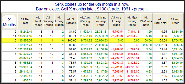
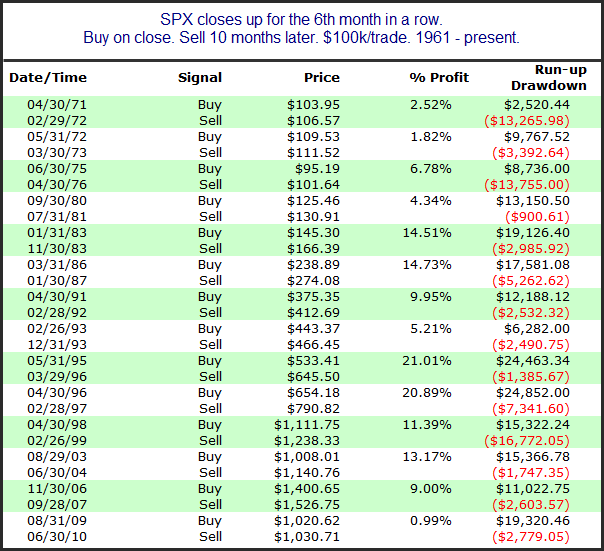
The 1st month out of the gate looks to have about breakeven odds.  After that everything points to the bullish case, with strongly positive stats across the board for the next 10 months or so.  In fact, 10 months out all 14 instances were higher.  Below I have listed the 14 instances.

Some strong results here.  Based on this, it appears that the bulls should be celebrating that 6-month rally, rather than the bears trying to use it as evidence for an overdue pullback.

Of course there has also been a lot discussed about “Sell in May” and the possible weak upcoming seasonality.  I did a detailed study on this in the intermediate-term section of the Subscriber Letter this past week.  If you would like to read it you may sign up for a free trial using the link below.

https://quantifiableedges.com/members/register.php

The Impact Of A Breakaway Gap

In the 9/7/12 blog I looked at the short-term importance of an unfilled upside gap accompanying a breakout.  With yesterday’s breakout to a new closing high occurring along with an unfilled up gapI have revisited that study below.

Results here are strong across the board.

Now let’s look at instances where the 50-day high breakout was not accompanied by an unfilled gap.  Interestingly, the number of instances was nearly the same.  This study also appeared in the 9/7/12 blog.

As you can see these moves to new highs that don’t start with an unfilled gap are much less reliable over the short-term.

Technicians will often use the term “breakaway gap”.  This suggests the gap occurs on the same day as a base breakout.  The idea is that the new high causes excitement and the gap leaves a good amount of people sidelined or stuck short.  When it doesn’t immediately fill, it leads these people to chase and helps to propel the market even higher.

Interestingly, as I showed yesterday on Overnight Edges, breakaway gaps like this have not led to a positive overnight session.

What Recent Moves Up Suggests About The Pullback That Began On Friday

Strong, persistent moves often do not roll over immediately.  Real persistency can set up a situation where strength begets more strength.  An example of that concept was triggered with Friday’s setup, where we had the 1st down day after 5 consecutive higher closes.

Initially there appears to be a moderate inclination for a bounce.  Once you get out 9-10 days the upside edge appears very substantial.  Based on this, there appears a good chance that the dip that started Friday may not get too far before the market again moves higher.

When SPX & VIX Both Rise For The 2nd Consecutive Day

I am looking at a mix of bullish and bearish studies right now.  One indicator arguing for the bears is the VIX.  The VIX is a measure of volatility and it typically moves counter to the SPX.  So it will most often rise when the SPX moves down and it will drop when SPX rallies.  Yesterday both the SPX and the VIX closed higher.  And they did so for the 2nd day in a row.  The study below is an old one that looks at other times this has occurred and the market is in a long-term uptrend.  All results are updated.

While not overwhelming, the numbers here provide the bears some hope over the next 1-2 days.

A Volatility Contraction During A Strong Bounce, And What Has Followed Historically

In July of 2009 I introduced the 3/10 Offset HV indicator.  It essentially takes a short 3-day measure of Historical Volatility and compares that to the 10-day measure of 3-days ago.  Low readings indicate there has been a contraction in volatility.  High readings indicate there has been an expansion.  Anything at or below 0.25 is regarded as extremely low.  Often after sharp contractions we see a volatility expansion take place.  

On Tuesday the 3/10 Offset HV for SPX came in at just 0.22.  I found it particularly odd that the 3/10 Offset HV was so low considering we’ve seen a fairly strong move higher over the last three days. Wondering whether that meant downside risk is now greatly increased, I ran a study.


I found it quite interesting that the numbers here all seem to suggest an upside edge. I suppose to get the 3/10 Offset HV indicator that low while the market is rising so strongly would require some volatile activity prior to the bounce. Being above the 200ma, that scary, volatile period will often pave the way for a continuation of the rally.

What The Last 2 Days Unfilled Gaps May Be Suggesting

I am seeing a real mix of evidence right now, as neither bullish nor bearish short-term evidence is dominating.  The study below is one example of a study from last night’s letter with possible bearish implications. It examines 2-day moves like SPY has just encountered.

The suggestion here is that more downside appears likely over the next few days.