Putting A Series Of Higher Highs Into Context

I’ve often spoke in the past of the importance of putting smaller patterns into proper context based on larger patterns or trends.  In Sunday night’s Gold & Silver Subscriber Letters I showed some studies that exemplified this concept nicely.

The studies looked at the possible impact of 5 consecutive days of SPY making an intraday high.  (This triggered at the close on Friday.)  I broke it down to see all times the 5 higher highs were accompanied by a 50-day high versus times they weren’t.  First let’s look at times where 5 higher highs occurred without a 50-day high.

Stats over the 1st few days suggest a possible downside edge.  After 5 higher highs the market will often need a breather.

But what of times (like Friday) when a strong uptrend exists and the market is also making a 50-day high?  Those stats can be found below.

Interestingly, the number of instances was exactly the same.  But with an intermediate-term rally also occurring the tendency to pull back no longer exists.  So 5 higher highs do not appear to suggest a bearish edge in situations like the one that set up a few days ago.

An Updated Look At Op-Ex Week Returns By Month

There is a possible seasonal influence that could have a bullish impact on the market this week. Op-ex week in general is pretty bullish. March, April, October, and December it has been especially so. S&P 500 options began trading in mid-1983. The table below is one I have showed on the blog the last few years in March. It goes back to 1984 and shows op-ex week performance broken down by month. All statistics are updated.

While December has been more reliable, total gains have been the largest during April and then March op-ex.

Book Review – Mean Reversion Trading Systems by Howard Bandy

I am just about finished with Howard Bandy’s new book, “MeanReversion Trading Systems – Practical Methods for Swing Trading”.  While I very rarely review books here on Quantifiable Edges, this one really stands out and deserves some attention.

Howard goes through every step of the systems-building process.  He examines several different oscillators.  He scrutinizes entry & exits techniques.  He discusses risk control.  And on top of it all, he provides code for everything he covers in the book.  It is $50 for the book, which is a ridiculously low price.  There are trading courses that cost many thousands of dollars that don’t provide as much good information as Howard’s “Mean Reversion Trading Systems”.  All of the coding is done in Amibroker, which unfortunately I do not use.  But since he lists it all out, those who use other programs like me can translate it into Tradestation, R, or whatever.  And here is the kicker for anyone that does use Amibroker – Howard has actually set up a web page where book purchasers can download the code at no additional cost.

I commend Howard on his efforts.  If you have an interest in developing your own trading systems, this book is a wonderful resource that I would highly recommend.

What The Recent Consolidation Hints At

After the big reversal down last Monday the market has recovered quite a bit.  What is interesting though is that it has closed within the range of that 1 bar every day for the last week.  The bears failed to follow through on that selloff, but the bulls have not managed to move the SPX back out of the range either.  This triggered the study below, which I last discussed a couple of years ago.

Over the last 24 years or so the SPX has burst higher out of this “failed selloff” and consolidation on a fairly consistent basis.  But the implications are only bullish for a few short days.  After that there does not appear to be a decided edge for either the bulls or the bears.  I have a bit of a concern, though.  Technically, the current setup does qualify.  But the last 5 days have been a fairly nice rally.  SPX just barely has missed breaking out of the range, and it has not “felt” like a 5-day consolidation.  So while the study suggests a likely pop higher in the next few days, the likelihood may not be quite as strong as suggested.

The Quantifiable Edges Study of Tops

A while back I did a study of major market tops for Quantifiable Edges Gold & Silver subscribers. The study goes back to 1970 and considers every SPX top that was followed by a decline of at least 20%. I identified two indicators that I found especially useful in determining when conditions may be ripe for a possible top. I recently updated the QE Study of Tops, and received a lot of positive feedback on it. A primary reason that I was inspired to update the study is that one of the indicators is currently flashing a warning sign. So I decided I would also make the study available to non-subscribers for a small fee.

The Study of Tops can now be purchased on the Quantifiable Edges website for $5.99. If you purchase a Quantifiable Edges subscription within two weeks of your Study of Tops purchase, your $5.99 will be refunded. 

I certainly hope everyone finds it interesting and valuable. If you purchase it and don’t feel it was worth the $5.99, then simply send me a note explaining why (relatively nicely), and I will refund your money.

Lastly, I also included a coupon (good through March 31) for a free trial of any Overnight Edges subscription as part of the Study of Tops.

You may purchase the Quantifiable Edges Study of Tops by clicking here.

A Failure of Bulls Followed by a Failure of Bears

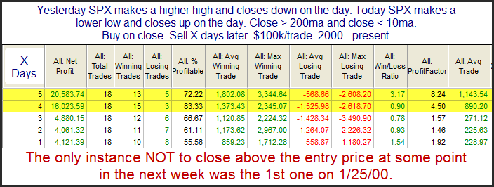
On Monday the bulls tried to make a move higher and failed, making for a higher high and a lower close.  On Tuesday the opposite happened with a lower low and a higher close signifying a failure by the bears.  This action triggered the below study in the Quantifinder.  It was last seen in the 3/3/11 Subscriber Letter.  I have updated the results.

Odds across the board, from Win % to Win/Loss Ratio and Profit Factor are all impressive, and suggestive of a short-term upside edge.

What Follows Huge 1-Day VIX Spikes

Monday saw some unusually strong action.  One index that showed a real extreme move was the VIX.  It spiked up 34% as fear struck options traders.  In the past I have shown how 1-day spikes of 20% or greater have generally suggested an upside edge.  I’ve rerun that study tonight.  I did also look at moves of greater than 25% and 30%, but that did little to change the odds and just made instances fewer.  So I simply stuck with the old 20% parameter for the study below.

Next day stats suggest a solid upside tendency.  I would also note that the size of both the “Avg Winning” and “Avg Losing” trading is quite large for a 1-day move.  So regardless of whether the market moves higher or lower, we could see some strong action today.

Relatively Sharp 2-Day Drops From 50-Day Highs

I am starting to see more evidence pointing towards a bounce.  The pullback over the last couple of days, while not large based on historical standards, has been relatively sharp compared to recent action.  Relatively sharp pullbacks from intermediate-term highs have had a tendency to bounce over years.  This is exemplified in the study below.

The stats all suggest an upside edge over the next 1-4 days.

One Pattern Suggesting The Selloff May Have Further To Go

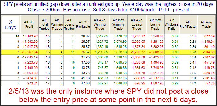
Short-term evidence I am currently looking at is mixed with both bullish and bearish studies triggering.  The study below is one that favors the bearish case.  It examines SPY performance after posting an unfilled gap down from a high level immediately after an unfilled gap up.

Instances are a bit low, but the consistency and magnitude of the moves lower are strong.  I found this study compelling enough to take under consideration.

Performance After the State of the Union

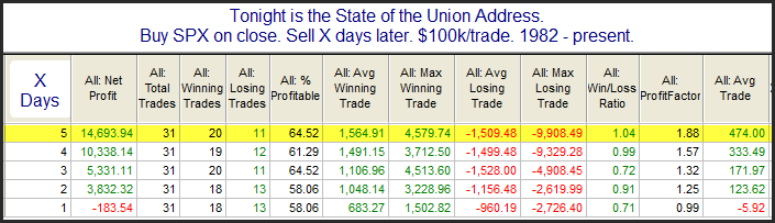
With tonight being the State of the Union Address I was inspired by a subscriber  to examine SPX performance following past speeches.  The data table below looks back to 1982.  There were a few instances, such as 2001 and 2009 where the speech was not an official “State of the Union”, but was delivered under a different name.  I have included those speeches in the results as well. 

There appears to be a possible edge when looking out a few days.  Perhaps after these speeches the country gets excited about prospects for the future?  But below is an equity curve assuming a 5-day holding period.

All the curves look something like this in that since the turn of the century there has not been a quantifiable edge.  I guess they just don’t write speeches like they used to.

Also, Overnight Edges earlier today looked at overnight performance during the State of the Union.

7-Day High to 7-Day Low in 1 Day

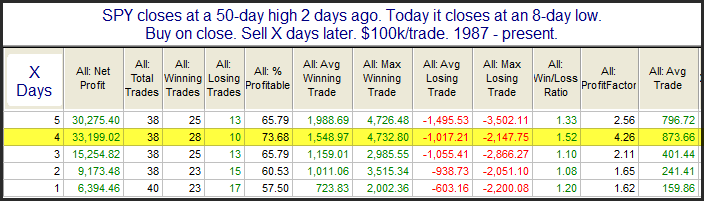
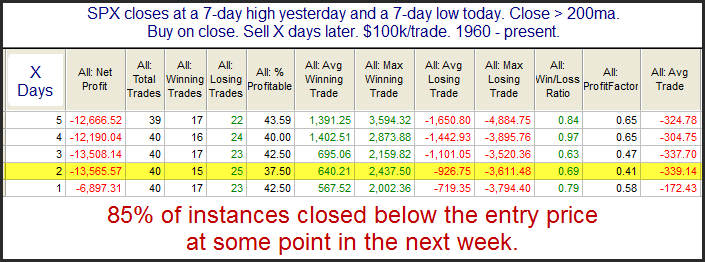
After closing at a new high on Friday, SPY reversed so hard on Monday that it closed at a 7-day low.  Way back in the 6/19/09 blog I looked at 1-day moves from a 7-day high to a 7-day low.  I have updated those results below and also incorporated a 200-day moving average filter.

There appears to be a bit of a downside edge over the next few days, and much of that edge has played out during days one and two.  Perhaps the quick move through 7 days of resistance causes weak hands to bail and further selling to ensue.

It will be interesting to see how it plays out today because it appears SPY may have a large gap up when the market opens in about an hour.  Gaps up from low areas are less likely to fill, leaving shorts stuck and chasing the markets upwards.  If the gap can hold, then we may avoid the further selling suggested by the study.  If the gap up fills, then the move lower could quickly accelerate.

Comparatively Large Drops From 50-day Highs

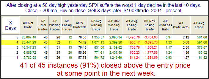
While the SPX selloff yesterday was not terribly large (0.4%), it probably seemed it to most traders since we have not seen an SPX decline that large in a few weeks.  The drop from a 50-day high triggered the study below.

While the size of the move over the next few days is not overwhelming, the consistency is impressive. The stats certainly seem to suggest an upside edge.

2012 (and prior) Trade Ideas Results from the QE Subscriber Letter

I don’t often discuss trade idea results from the subscriber letter here on the blog. The last time I did was in July. But 2012 was another solid year and I hope to help traders in 2013 as well.  I don’t post results regularly because while I’ve always tracked trade ideas in the subscriber letter, it isn’t the main focus of the service. I don’t consider Quantifiable Edges to be a stock picking service. I consider it one where traders can gain market and trading knowledge through the published research, systems, and tools. The objective is to provide tools and instruction to help traders improve their own trading and results.

But the published trade ideas have done quite well. In fact, during 2012 August was the only month where the trade ideas failed to add up to positive gains. I’ve had several letters from subscribers lately telling me they’ve done quite well following certain ideas and that is always nice to hear.

I don’t suggest position sizes, and I would never suggest that the trade ideas represent any kind of complete portfolio strategy. They are what they are – ideas about certain stocks or ETFs that have historically provided a statistical edge.

It is important to note that all of the trade ideas are in either ETFs or in highly liquid large cap stocks (almost exclusively S&P 100 components). I do this so that executing trades and getting fills at reasonable prices is not an issue. I think traders feel the most frustrating aspect of following trade ideas offered by some services is not being able to get into or out of the trades that they suggest at a similar price. I’ve addressed this problem with limit prices and highly liquid securities.

Some of my goals with a gold subscription have always been to help people improve their trading through the use of quantified research, and while doing so to help them offset the costs of the subscription by offering easy-to-execute trade ideas with a long-term positive profit expectancy. To date I believe Quantifiable Edges has succeeded in doing this.

As I did 6 months ago, I have again broken down the results by year.  For tracking purposes I only count trades after they have been closed out. With most trades being of the swing variety this doesn’t normally skew results much. But it does occasionally when a big trade lasts over a month or year-end.

Below are the results by year.

2012 was a standout year in a number of ways.  I’ve become more selective over the years and that selectivity paid off nicely in 2012.  Despite being the year with the lowest number of trade ideas published (97), it was #2 in total gains.  It showed the highest win % at over 78%, the lowest average loss, and the highest profit factor by far, with gross gains over 9x the size of gross losses.

For those that are interested, the complete list of trade ideas from 2008 – Jan 2013 can be downloaded from the systems page of the members’ section of Quantifiable Edges. (Available to paid and trial subscribers.) And with the full archive of subscriber letters available on the site, gold subscribers can also go back and see what I wrote about any trade and my reasons for entry and exit when it happened.

With a subscription to Quantifiable Edges I try and provide traders with ideas and instruction to improve their trading. These ideas may come in the form of previously published studies identified by the Quantifinder, or they may be something I discuss in the current subscriber letter, or perhaps it’s a webinar focused on a certain trading approach or indicator, or any other number of tools that I’ve designed and made available. (For a more complete list of tools, see the “Using Quantifiable Edges” series of posts.) The trade ideas found in the subscriber letter are examples of how I put these tools and ideas to work. While past performance is not necessarily indicative of future results, over the long run they’ve performed well enough that many subscribers have used them for their benefit.

For more information on a gold subscription, or to subscribe, click here.

Lastly, below is the explanations and disclaimer from the Trade Ideas Results Spreadsheet.

All trade ideas ever tracked in the Quantifiable Edges Subscriber Letter may be found on this spreadsheet. I don’t suggest position sizes. The primary reason for this is I’m not acting as a financial advisor. I don’t feel it is appropriate to suggest allocation sizes without understanding someone’s financial situation and risk tolerance. Even for my own trading I run different portfolios with different levels of aggressiveness. For instance, my most aggressive may use options to sometimes get 300-400% leveraged. Other portfolios on the other hand normally take much more conservative stances and some rarely reach or exceed 100% exposure.


Since I don’t suggest position sizes this is should not be considered a performance report, but rather a trade idea scorecard. Therefore, no matter how objective I try to be the reporting of the results is always going to be skewed depending on how you approach the trades. For instance, I always recommend scaling into the Catapult positions in 3 parts, whereas the “System” trades (whatever system I unveil other than Catapult) are normally one entry. The “Index” trades I normally recommend scaling into as well. For my own trading I trade much larger size with the index trades than any of the individuals. I also control my exposure by limiting the total amount invested per day. As I mentioned, this will vary depending on the account I’m trading. My most aggressive account I may put in up to 100%/day and get heavily leveraged using options. A more conservative account may max out at 15%-20% per day.


It’s unlikely anyone would have taken all of the trades with equal amounts, so personal results would vary greatly depending on the trader’s approach. Simply adding up the results of the individual triggers as I do is an admittedly poor representation of returns. A net positive or negative does not necessarily mean a person following the ideas would have made or lost money during the period measured. And the sum total is certainly not representative of what a portfolio would return. 


Feel free to contact me at support @ QuantifiableEdges.com if you have any questions.


As required by the NFA: Except where otherwise specifically stated, all trades are based on hypothetical or simulated trading. Hypothetical or simulated performance results have certain inherent limitations. Unlike an actual performance record, simulated results do not represent actual trading. Also, since the trades have not actually been executed, the results may have under-or-over-compensated for the impact, if any, of certain market factors, such as lack of liquidity. Simulated trading programs in general are also subject to the fact that they are designed with the benefit of hindsight. No representation is being made that any account will or is likely to achieve profits or losses similar to those shown. Commissions, fees, and slippage have not been included. This is neither a solicitation to buy/sell securities or listed options.