What the Stretced VXO is Suggesting

The VIX and VXO have dropped sharply over the last 7 days. These are measures of options premium. When they are falling it means premium is declining, and options traders are less fearful. The study below looks for times when the VXO becomes stretched more than 20% below its 10-day moving average. I have updated all the statistics.

2015-10-08 image1

Reward/risk appears to strongly favor the bears based on the limited sample size. Traders may want to take this into consideration when considering their bias over the next few days.


Want research like this delivered directly to your inbox on a timely basis? Sign up for the Quantifiable Edges Email List.

What Reversals Like SPY Had On Friday Have Often Led To The Next Day

Friday had an exceptionally weak start and strong finish. Such reversals during long-term downtrends have often failed to see further buying the next day. This can be seen in the study below.

2015-10-05 image1

The numbers here are solidly bearish. 70% of the time SPY has closed down the next day and the average instance lost over 0.75%.


Want research like this delivered directly to your inbox on a timely basis? Sign up for the Quantifiable Edges Email List.

Another CBI Spike And The Edge That Suggests For The Short And Intermediate-Term

The Quantifiable Edges Capitulative Breadth Index (CBI) rose up and closed at 12 on Monday afternoon.  Discussion of the CBI has been fairly regular over the years here at Quantifiable Edges, but for those that are new or would like a refresher, a detailed description of the CBI can be found here.  Or if you want to review past studies I have published on the indicator click here for more research related to the CBI..


The CBI measures the number of signals among S&P 100 stocks for my Catapult System.  While the system is proprietary, I have used it since mid-2004 and published all the signals in the Quantifiable Edges Subscriber Letter real-time since the letter’s inception in 2008.  The basic idea is that the more capitulation selling that is evident among individual stocks, the more likely it is that the market as a whole is capitulating and primed for a bounce.


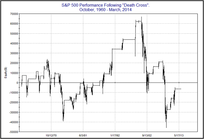
While the record has not been perfect, it has been extremely good, and it has helped me to identify many high-probability trades during over-emotional market periods.  The study below is one I have shown in the past.  It examines CBI readings of 10 or higher while the SPX is under its 200-day moving average.  Ten has been a level I have often referenced where the reading is getting relatively high and the market is typically within a few days of a bounce.  Three or lower represents a CBI reading that I consider market-neutral.  The study looks to enter on readings of 10 or higher and exit the market only when the CBI returns to 3 or lower.

2015-09-29 image1

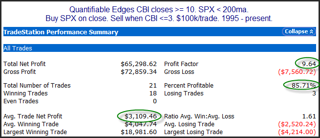
The record is impressive. Below is the profit curve.

2015-09-29 image2

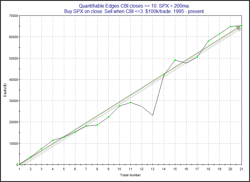
The strong persistent upslope serves as confirmation of the upside edge.


I’ll also note that the move in the CBI to 11 or higher has often suggested an intermediate-term edge, not just a short-term edge.  In July I posted a study showing how spikes to 11 or higher have typically led to intermediate-term bounces.  And measuring out 20 days from the trigger day the market was higher all 23 times from 1995 through early this year.  As it turned out the July and August spikes were the first instances since 1995 (as far back as CBI history is available) that did NOT see the market close up 20 days later.  But they were not total failures.  They both did see bounces over the next few weeks and both were positive as late as 17 days later.  They just couldn’t make it to 20.


Want research like this delivered directly to your inbox on a timely basis? Sign up for the Quantifiable Edges Email List.

Some Simple Shorting Systems For Downtrends

SPX closed at a 10-day high on Tuesday. New short-term (and intermediate-term) highs will sometimes get traders excited. When the market is in long-term downtrend mode, this excitement is often misplaced. Way back in a blog post on 4/3/09 I showed a number of “systems” that looked to sell short when the SPX made X-day highs but was below the 200ma. I have updated the results table of those little systems below.

2015-09-16 image1

Stats here are solid across the board. The Win Rate, Profit Factors, and Average Trade stats all suggest a good chance at market dip. Hitting new short-term highs is generally not something that bulls should get excited about while the long-term trend appears down.


Want research like this delivered directly to your inbox on a timely basis? Sign up for the Quantifiable Edges Email List.

When A Follow Through Day Is Immediately Followed By Strong Selling

Yesterday I discussed Tuesday’s Follow Through Day (FTD) and some possible implication based on breadth and volume statistics. Wednesday was interesting because we saw a big selloff immediately follow Tuesday’s FTD. Past occurrences of this have been somewhat rare, but also somewhat suggestive on a 1-day timeframe. This can be seen in the study below.

2015-09-10 image1

As I mentioned, the number of trades is a bit low. But the early indications appear to strongly favor another day of selling. Especially impressive is the fact that the average of the 9 down instances was nearly 4x as large as the biggest up day. That is a risk/reward scenario that strongly suggests a 1-day downside edge.


Want research like this delivered directly to your inbox on a timely basis? Sign up for the Quantifiable Edges Email List.

Tuesday’s Follow Through Day Lacked 2 Important Things

One notable bit of evidence that emerged on Tuesday was the fact that it qualified as an IBD Follow Through Day (FTD). I have done a lot of research on FTDs over the years. Much of that research can be found on the blog. Here is a link.

https://quantifiableedges.com/category/ibd-follow-through-day/

A couple of filters that have appeared useful in examining FTDs are breadth and volume. Tuesday’s FTD was accompanied by moderate breadth and volume. So let’s examine results of other instances with FTDs that occurred on modest breadth and modest volume.

2015-09-09 image1

The failure rate here is substantial no matter how you look at it. A short-term downside edge is suggested which largely plays out in the 1st 2 days. Every instance closed below the entry price over the next few days. And these FTDs have demonstrated a paltry 20% success rate. All these stats are impressive and point to a downside inclination over the next few days.

(Definitions for “successful” rallies as well as FTD determination criteria can be found in this post from 2008.)


Want research like this delivered directly to your inbox on a timely basis? Sign up for the Quantifiable Edges Email List.

SPX Performance Following Selloffs Into 3-Day Weekends

One of my former studies I looked at over the weekend examined how the market performed following large selloffs before U.S.-only three day weekends. These include Labor Day, Martin Luther King Day, Presidents’ Day, Memorial Day, and Fourth of July. Since 2000 there have been 12 instances where there was a greater than 1% selloff prior to the US-only 3-day weekend. Statistics from 1-5 days out are shown in the table below.

2015-09-08 image1

The initial reaction over the 1-4 day shortened week has been for downside follow-through. Instances are a bit low.  But with moves lower occurring in 11 of the 12 instances, this may be worth keeping in mind as we head into this shortened holiday week.


Want research like this delivered directly to your inbox on a timely basis? Sign up for the Quantifiable Edges Email List.

I’ll Be Appearing on TimingResearch’s Webshow Tuesday 9/8 At 1pm EST

I am excited to once again be able join host, friend, and fellow analyst Dave Landry (along with other guests) for TimingResearch’s weekly show on Tuesday.  Information about the show, along with links to sign up are below.  All shows are recorded, so if the time is not convenient for you, just register and you’ll receive the recording.

Click here to learn more and sign up!

Date and Time:
– Tuesday, September 8, 2015
– 1PM ET (10AM PT)

Guests:
– Rob Hanna of QuantifiableEdges.com
– Thomas DeLello of OrderFlowEdge.com
– Jason Jankovsky of TheLionOnline.net

Guest Host:
– Dave Landry of DaveLandry.com

Click here to learn more and sign up!

A Look At The S&P 500 Death Cross

Notable on Friday was that the 50-day moving average of the SPX closed below its 200-day moving average. This is often referred to as a “Death Cross”. (When the 50ma is above the 200ma that is a “Golden Cross”.) This is the first Death Cross since early 2012. Let’s take a brief look at Death Crosses for SPX and see if they have lived up to their name.

Below are stats if someone was to invest $100k into the SPX each time the market entered a Death Cross, and then held until the 50-day moving average moved back above the 200-day moving average.

2015-08-31 image1

As you can see, this would actually have been a winning strategy over 71% of the time. The problem is the losing trades were very large, with the largest being almost a 40% hit. It also needs to be noted that the above stats are not compounded. They just look at $100k/trade. If we reinvest all the gains & losses, the impact of the giant losers becomes more pronounced. Below is a profit curve for a hypothetical portfolio taking these same trades that includes compounding.

2015-08-31-2 image2

As you can see the net result since 1960 would have been a loss of 6.35% to the hypothetical portfolio. (Assumes no interest while out of the market, and no other expenses.) So most of the time the Death Cross turns out to mark nothing more than a moderate market correction. And long-term traders would be better off riding out that correction than jumping in and out based on the Death Cross / Golden Cross formation. BUT there is a risk that the correction could turn into a nasty bear. In those cases, long-term investors would get slammed. And it does not take many big bear markets to ruin the long-term profit curve. So while not a reliable timing device, it is notable that the market has failed to generate long-term profits under the Death Cross. Traders that are concerned with preserving capital could utilize Death Crosses to possibly avoid big portions of nasty bear markets.


Want research like this delivered directly to your inbox on a timely basis? Sign up for the Quantifiable Edges Email List.

Why Thursday’s Volume Was Disappointing For Bulls

Thursday’s rally was accompanied by the lightest volume in 5 days. The relatively low volume could be worrisome for bulls. The importance of volume can be seen in the studies below. The first one looks at 2%+ SPX gains when volume comes in relatively high.

2015-08-28 image1

A week later ¾ of the instances closed higher and the average instance saw the SPX up about 0.9%. Those are some fairly bullish numbers. But Thursday did not post a 5-day high in volume. It posted a 5-day LOW. Below are the results under these conditions.

2015-08-28 image2

Numbers here are completely different. Now ¾ of the instances closed DOWN 5 days later – and by a substantial amount. This could be a warning sign that the bounce is not healthy.


Want research like this delivered directly to your inbox on a timely basis? Sign up for the Quantifiable Edges Email List.

A Gap -n- Go From A 50-Day Low

The study below is one that appeared in the Quantifinder yesterday afternoon. There were a few like it. This study looks at big gaps up from 50-day lows that go unfilled and close above the open.

2015-08-27 image1

The suggestion here is that the overwhelming 1-day bullishness (big gap and move higher) immediately after a new low is probably overdone, and unlikely to carry through for a 2nd day. I believe this study deserves some consideration, but I would also keep in mind that based on other indicators (like the elevated CBI, which closed at 67 on Wednesday) the bounce should have further to go over the course of the next several days.


Want research like this delivered directly to your inbox on a timely basis? Sign up for the Quantifiable Edges Email List.

Thoughts / Stats on Current Extreme Selling

The Quantifiable Edges CBI reached an unprecedented 73 on Tuesday, besting the 2002 record of 52.  (More info on the CBI can be found here.)  Part of the reason the CBI is spiking so high is that we have seen a highly unusual number of consecutive days with strong (and broad) selling. In fact, Tuesday marked the 4th day in a row in which SPX closed down at least 1.25%. Below is the (short) list of other instances along with their 4-day returns.

2015-08-26 image1

While there are only 3 other instances, these 3 instances provide a wonderful example of the kind of extreme conditions the market is experiencing and what we may see going forward. You note that all 3 instances occurred “near” multi-week bottoms that were eventually retested. Even if I used criteria less strict than what is above, you would see a tendency for the market to bounce over the short-term.

Perhaps the biggest “lesson” from the above study is the one provided by the 2008 instance. The other instances saw strong, and almost immediate bounces. But 2008 saw a strong bout of selling before the bounce kicked in. When I said they all occurred “near” a bottom, I meant in time. The 2008 instance saw the market bottom just 3 days after it triggered. But during those 3 days the SPX declined an additional 15.6%! And by the time day 4 closed the entire drawdown had been overcome and the trade was positive. Of course traders would have had to endure a big, scary decline and hold on tight to realize that small profit in 2008.

Bringing it back to the present, with the strong selling and extreme indications we are seeing via price action, breadth, and VIX movement, I believe the environment is quite similar to those we see in the short list above. I also believe a strong bounce is likely to occur in very short order. The difficulty is that in the time between now and when the bounce truly kicks in there could be a substantial amount of short-term pain. Will the market rocket upwards from here like it did in 1987 and 2002? Or will it require an even bigger washout before bouncing as it did in 2008?
Want research like this delivered directly to your inbox on a timely basis? Sign up for the Quantifiable Edges Email List.

Updating The Bullish Intermediate-Term Tendency Following High CBI Readings

I’ve written an awful lot about the Quantifiable Edges Capitulative Breadth Indicator (CBI) here on the blog. The CBI moved up from 8 to 15 on Friday. While 10 has been a strong indication for a short-term bounce, 11 or higher has been a reliable indication for the intermediate-term.  This is something I showed on the blog last December. Friday was just the 24th time the CBI reach as high as 11. Looking out 20 days later, every other instance has been trading higher. Below is the full listing of triggers and the 20-day results.

2015-07-27 image1

As you can see, SPX has been a perfect 23-0 when looking out 20 days from the first CBI reading of 11+. Drawdowns have been sizable in some cases. Still, it appears a reading of this magnitude often suggests a washout is in progress that should set the stage for at least a multi-week bounce. We may not reach the “final” bottom here, but this study indicates a good chance at least a temporary bottom forms soon.


A detailed description of the CBI can be found here.  Or click here for more research related to the CBI.


Want research like this delivered directly to your inbox on a timely basis? Sign up for the Quantifiable Edges Email List.

Quantifiable Edges CBI Reaching Bullish Levels

One indicator starting to give bullish readings is the Quantifiable Edges Capitulative Breadth Index (CBI). It reached 8 at the close on Thursday. While 10 is the level I often refer to as a very strong bullish indication, levels as low as 7 or 8 have often been followed by market bounces when the market has been in a long-term uptrend. Below I have produced a table showing results if you entered SPX long at differing CBI levels and then exited the position when the CBI returned to 3 or lower. (I consider 3 or lower to be neutral.)

2015-07-24 image1

As you can see, results have been solid across the spectrum. The 8 level is highlighted since that is where we are at currently. Below is a profit curve of this strategy.

2015-07-24-2 image1

The strong, steady upslope increases confidence in the bullish edge.


A detailed description of the CBI can be found here.  Or click here for more research related to the CBI.


Want research like this delivered directly to your inbox on a timely basis? Sign up for the Quantifiable Edges Email List.

Quantifiable Edges Big Time Swing System Stays Strong in 1st Half 2015

I’ve updated the Quantifiable Edges Big Time Swing System overview page with results through July 13th (when the most recent trade closed out). The system only averages about 1 trade per month, so I typically update the results bi-annually. The QE Big Time Swing System has been on a roll in 2015. It has had 6 trades. All six signals in 2015 have realized profits. The signals produced a net return of 9.87% for SPY (including dividends, commissions of $0.01/share, and an assumed interest rate on cash of 0.1%). The system also continues to make new equity highs.

The Big Time Swing System provides easy to follow mechanical rules. The standard parameters are not optimized, have never been changed, and have performed quite well (they are the ones used for all performance metrics). There are only about 11 trades per year averaging 7 trading days per trade. All entries and exits are either at the open or the close. And to be sure you have everything set up properly traders may follow the private purchasers-only blog that tracks all SPY signals and possible entry/exit levels. This service is free for 12 months from the date of purchase.

For system developers looking for a system that they can use as a base to build their own system from, the Big Time Swing is an attractive option. It is all open-coded and comes complete with a substantial amount of background historical research. And since it is only in the market about ¼ of the time, it can easily be combined with other systems to provide greater efficiency of capital. Once you’re ready to try and improve the system yourself you can also refer to the system manual or the August 2010 purchaser-only webinar – both of which discuss numerous ideas for customization.

For more information and to see the updated overview sheet, click here.

If you’d like additional information about the system, or have questions, you may email BigTimeSwing @ Quantifiable Edges.com (no spaces).