The Strength Of Two Unfilled Up Gaps & A 50-Day High

One interesting study that I discussed in last night’s subscriber letter considered the fact that SPY left an unfilled upside gap for the 2nd day in a row while closing at a 50-day high. The results table I shared can be found below.

2018-06-05

The size of the follow-through isn’t terribly large, but it has been quite consistent that some follow through was achieved in the next few days. The market is certainly overbought here. But overbought does not always mean an immediate reversal. While evidence is mixed, (for instance, an expected substantial SOMA decline this week is creating a bearish headwind) this study suggests the kind of strength we have seen over the last couple of days is often followed by more strength. And it can serve as a nice little piece of evidence for traders to consider as they establish their market bias.


Want research like this delivered directly to your inbox on a timely basis? Sign up for the Quantifiable Edges Email List.

The Bullish Tendency of the Thursday after Memorial Day

Thursday after Memorial Day has been a day that has exhibited a bullish bias for many years. I last showed this on the blog last year. The chart below shows updated results.

2018-05-30

Single-day seasonality can certainly be overrun by other forces, but the Thursday after Memorial Day has been a good one for many years. That may be something that traders want to keep in mind for Thursday.


Want research like this delivered directly to your inbox on a timely basis? Sign up for the Quantifiable Edges Email List.

How Seasonality The Week Of Memorial Day Has Changed Over The Years

Happy Memorial Day! The week of Memorial Day has shown some interesting seasonal tendencies over the years. But it has faltered greatly the last few. The chart below is one I have shown in the past, and have now updated. It examines SPX performance from the Friday before Memorial Day to the Friday after it.

2018-05-28

There was no substantial edge apparent throughout the 70s, but starting in 1983 through 2009 there was a bullish tendency. The last 8 years this week has mostly struggled.  That said, Thursday continues to look seasonally strong, and I will update that study later this week.


Want research like this delivered directly to your inbox on a timely basis? Sign up for the Quantifiable Edges Email List.

Is The Russell Breakout Likely To Spark A Rally In The SPX?

The new high in the Russell is notable, since it is the 1st major index to get there. But it does not necessarily mean the other indices will follow. In the study below I looked at SPX performance following instances of a fresh RUT breakout while SPX had still not broken out.

2018-05-17

Whether you are looking at % Profitable, Win/Loss Ratio, Profit Factor, or Avg Trade, the numbers here appear quite neutral, and do not suggest a strong edge. Looking out further did not change them much, either. The Russell 2000 may lead the way following Wednesday’s new high, and the SPX could soon follow, but history does not indicate a high likelihood of that.


Want research like this delivered directly to your inbox on a timely basis? Sign up for the Quantifiable Edges Email List.

SPX Performance Based on SOMA Action During the Present QT Initiative

The Fed’s System Open Market Account (SOMA is the account at the Fed that contains all of its bond purchase holdings. Fed SOMA data going back to 2003 can be downloaded from the New York Fed’s website. Over this time, there has been a strong relationship between the changes in the SOMA and movement in the stock market. I detail this relationship in the recently released Fed-Based Quantifiable Edges for Stock Market Trading research paper. (Available for free.)

I have also tracked SOMA information and influence closely in the subscriber letters since 2010. This weekend in the subscriber letter I looked at SPX since Quantitative Tightening (QT) began in October of 2017. The chart below shows SPX performance during any rising SOMA week vs any declining SOMA week.

2018-05-14

The blue line assumes you are invested in the SPX during weeks in which the SOMA rose and in cash (not earning interest) during all other weeks. The red line is in cash (no interest) during rising SOMA weeks and then invested in the SPX during down SOMA weeks.

Positive SOMA weeks have shown very positive SPX results, while down SOMA weeks have seen the SPX struggle. Of course, this is not unexpected for any Quantifiable Edges subscribers, since we have tracked this behavior since 2010 in our subscriber letters. Longer-term charts, more detail, resources, and system filtering ideas related to the SOMA can be found in the recently released Fed-Based Quantifiable Edges for Stock Market Trading research paper. Feel free to check it out. Or take a free trial of Quantifiable Edges to see what we are anticipating for the next few weeks.


Want research like this delivered directly to your inbox on a timely basis? Sign up for the Quantifiable Edges Email List.

Introducing Fed-Based Quantifiable Edges for Stock Market Trading! (Research Paper)

I have shown Fed-based studies here at Quantifiable Edges since inception in 2008. And since 2010 I have closely tracked SOMA movement and its influence on the market in the Quantifiable Edges subscriber letter. This has proven extremely valuable in my research and trading.  Now, after years of Fed-related work, I have put together a detailed research paper:


Fed-Based Quantifiable Edges for Stock Market Trading

An Examination of Rate Changes and SOMA Changes & their Impact on Market Movement


The research paper is available for free download by all registered users at Quantifiable Edges. (Anyone that has ever bought anything or signed up for a free trial or registered for our free downloads. In other words, anyone with a username and login.) If you do NOT qualify, but would like to get a copy of the Fed-Based Quantifiable Edges for Stock Market Trading, you may sign up for a Free Trial, or register for our Free Downloads.


If you already have a username and login at Quantifiable Edges, just login and follow the simple instructions below to download the research paper. I hope you find it to be a useful resource and are able to take advantage of these quantified Fed-based edges!

2018-05-09

A Historical Look At Employment Days

Friday the employment report will be released about an hour before the NYSE open. Employment days have an interesting history and they have contributed to some worthwhile studies over the years. Below is a chart of SPX performance on Employment Days going back to 1993.

2018-05-04

What I find interesting about the chart is that Employment Days have shown such streaky performance – and the streaks lasted a long time. While it’s a bit unusual to see such abrupt changes in market dynamics, it does serve as a nice reminder that such changes are always possible. And with two of the last three employment days seeing a 2% decline in the SPX, perhaps dynamics may be changing again. I will note that employment days are often volatile, and that has been especially true in 2018. The 4 employment days in 2018 have posted the following results: +0.7%, -2.1%, +1.7%, -2.2%. In other words, it has been a market mover.  Be ready.


Want research like this delivered directly to your inbox on a timely basis? Sign up for the Quantifiable Edges Email List.

A Look at Fed Days from 1982 to Present

On Wednesday the Fed will conclude its policy meeting and announce any changes. This happens 8 times per year. I have long referred to these days as “Fed Days”. Fed Days have a long history of having a bullish tendency. This can be seen in the chart below, which shows Fed Day performance back to 1982.

2018-05-01F

Of course not all Fed Days are created equal. To learn more about Fed Days, and where the strongest edges lie, I’d encourage you to check out the collection of Fed Day studies here on the blog, or read The Quantifiable Edges Guide to Fed Days.


Want research like this delivered directly to your inbox on a timely basis? Sign up for the Quantifiable Edges Email List.

Why Seasonality “May” Be Bullish Today

The 1st trading day of the month is often a bullish day for the market. In the past I have broken down the tendency by month. And since 1987 May has produced the most profits. Below are results for May dating back to 1987. (Note performance is measured on a close to close basis.)

2018-05-01

Stats here are strongly lopsided in favor of the bulls. Winning %, win:loss ratio, profit factor, and average trade are all outstanding. Perhaps the saying should be “Sell in May, but not the 1st day!”.


Want research like this delivered directly to your inbox on a timely basis? Sign up for the Quantifiable Edges Email List.

Two Seasonal Cycles Colliding Suggest A Possibly Volatile Period Ahead

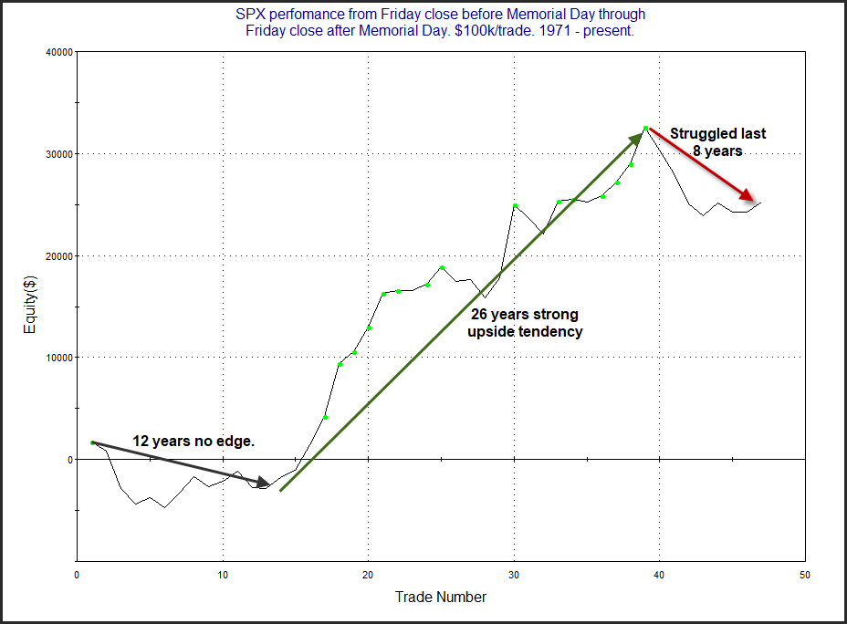
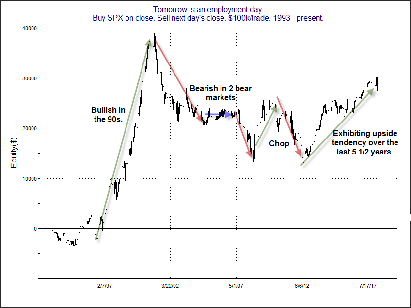
As we head towards the summer, the stock market has two long-term cycles converging that suggest it could be a rough ride. The 2 cycles are the “Best 6 Months” and the “Presidential Cycle”. I cover both of these cycles in detail in the Quantifiable Edges Market Timing Course. Here I will show how the market has performed historically when these two cycles have been in unfavorable phases at the same time.

The “Best 6 Months” cycle was originally published by Yale Hirsch of the Stock Traders’ Almanac. It notes that the market has performed substantially better between November and April than it has from May to October. In fact, a massive portion of the total market gains over time have occurred just in the November – April period.

The Presidential Cycle looks at the 4-year presidential term. The basic idea is that the market performs better during years 3 and 4 of a presidential term than it does during years 1 and 2. When a new US president comes into office, he will often spend much of the 1st year discussing what a bad job his predecessor did, and how tough times are upon us. This allows him to push through policy changes. These changes will often take up much of the 1st two years, and there tends to be significant arguing about whether they are positive changes or not. In general, the 1st two years have a fair amount of turmoil, and this is often reflected in the action of the stock market. Years 3 and 4 the big policy changes are over with and the president is thinking about re-election. Therefore, the rhetoric will change from negative to positive. The improved mood will often be supportive of stock market rallies. One exception to the Presidential Cycle basic rules is that Year 1 has not been negative when we have a 2nd term president. He’s not going to tell you how bad the last guy was, because it was him! So the unfavorable periods of a Presidential Cycle are: Year 1s of a 1st-term president and all Year 2s.

The end of April is upon us. And the market will therefore be facing the “Worst 6 Months” during an unfavorable Presidential Cycle year. The table below shows how the SPX has performed during all such years since 1960.

2018-04-29

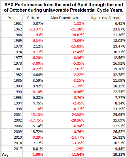
Eleven years finished higher and twelve lower for an average loss of just over 1%. But what was most interesting was the wild rides the market experienced during these 23 years. The average drawdown from the close of April entry point is -11.54%. And the last column is very eye-opening. This looks at the difference between the max run-up and the max drawdown over the 6 month period to see how wide of a range the SPX traded in. On average, the market saw a high-low range of 19.11% during the 6-month periods. That is exceptionally large. And only 4 of the 23 instances failed to see a range of at least 10%! If seasonal cycles have any say, the market could be in for a wild ride over the next 6 months. Traders may want to be prepared for volatility this summer!

Traders can learn a lot more about these indicators, and how they combine with some of our favorite long-term price action based indicators in the Quantifiable Edges Market Timing Course.


Want research like this delivered directly to your inbox on a timely basis? Sign up for the Quantifiable Edges Email List.

Three-day Pullback Pattern Into Turnaround Tuesday Potentially Bullish

SPY’s move lower over the last 3 days has set up a potential “Turnaround Tuesday” scenario. The fact that it made a lower high, lower low, and lower close for at least the 3rd day in a row triggered the following study.

2018-04-241

The numbers are impressive and the bounces couldn’t get much more reliable. In all but two instances SPY has managed to bounce at some point in the next four days. Much of the edge has played out in the first 3 days. Below is a 3-day profit curve that I shared on StockTwits / Twitter yesterday about 30 minutes before the NYSE closing bell.

2018-04-23

The strong, steady upslope is encouraging. I will note that while SPY closed down slightly yesterday and was able to qualify for this setup, SPX actually closed up slightly. This could leave the study in doubt. But as I discussed in last night’s subscriber letter (free trial here), QQQ clearly met the criteria on Monday. And QQQ’s stats have been similarly impressive. So traders may want to keep this study in mind when establishing their trading bias.


Want research like this delivered directly to your inbox on a timely basis? Sign up for the Quantifiable Edges Email List.

A SPY Setup Suggesting A Short-Term Upside Edge

Friday’s action caused SPY to close in an interesting position. Traders could look at the chart and say it is “short-term oversold” due to the fact that it closed at a 5-day low for the 1st time in a while. They might also say it is “short-term overbought” since it closed above its 10-day moving average. I have found that edges often arise when something is overdone in one timeframe, but overdone in another direction in another timeframe. The study below looks at the current discrepancy along with the fact that it was the 1st 5-day low in at least 2 weeks.

2018-04-22

Results here suggest a solid edge over the next 1-10 days. And half of the gains have been realized in just the 1st 3 days. Traders may want to keep this in mind as they establish their bias over the next few days.


Want research like this delivered directly to your inbox on a timely basis? Sign up for the Quantifiable Edges Email List.

April Opex Week’s Bullish Tendency

Last month I shared a table that showed performance of opex weeks by month. April was one of the most bullish. The study below looks specifically at April opex week. I last showed it on the blog in 2016. Results are all updated.

2018-04-15

The numbers are impressive, and suggest a bullish edge. Traders may want to keep this in mind the first few days of this week.


Want research like this delivered directly to your inbox on a timely basis? Sign up for the Quantifiable Edges Email List.

CBI To Remain At 0. No Edge Apparent Despite Potential 50-Day Low Close.

The Quantifiable Edges Capitulative Breadth Indicator (CBI) is a tool I have spoken about quite a bit lately, since we have seen a few recent spikes in the CBI. In the Quantifiable Edges CBI Research Paper I published last month (download information here) I examined the CBI a multitude of ways. Below is an excerpt from a section of the paper where I looked at 50-day lows and different CBI levels.


By combining CBI readings with a market that is hitting new lows, the results are often even more interesting. Let’s consider some studies that examine how the market has performed after hitting new lows, and break down those returns by CBI readings. The first one looks at performance following 50-day low closes when the CBI is 0.

2018-04-02

Other than perhaps a very quick bounce this has not been a favorable setup for the bulls. From 1-4 weeks out the results have nearly all been net negative…Lastly, let’s look at high CBI readings of 10 or above.  {Note: I removed a couple of studies here on the blog for brevity. The full suite can be seen in the report.}

2018-04-021

These are by far the most appealing results, from Day 1 right through day 20. And 20 days out there was just one loser and it only lost 0.2%. Meanwhile, the average gain of the other 18 instances was a sizable 5.7%.

Unfortunately for bulls, today is highly likely to finish with a CBI of 0. So no strong edge is suggested if we do finish at a 50-day low. I do see some other indications of a possible bounce, but the CBI certainly is not one of them. I will be sure to alert readers if it does spike in the coming days.


To learn more about the CBI, check out the CBI Research Paper.


Want research like this delivered directly to your inbox on a timely basis? Sign up for the Quantifiable Edges Email List.