A Long-Term Look At Put/Call Ratios

In June of 2008 I posted a discussion on the importance of normalizing put/call ratios when considering whether their readings were significant. In that post I showed that the average put/call ratio had risen steadily and substantially from 2000 into mid-2008 when the post was done. I included a “starry night” graph where weekly closing levels of the CBOE Put/Call Ratio were seen as dots and the 40-week moving average was drawn with a line. I’ve reproduced that chart below updated through 8/7/09.

(click to enlarge)

What you’ll notice is that right around the time of the original post the put/call ratio began to decline. In fact the average put/call ratio is now about 20% lower than it was at its peak in ’08. A few thoughts on this:

1) A drop in the average put/call is not something you would expect during the worst bear market 70+ years. The 2000 – 2002 bear market is when the ratio began its 8-year ascension. Did traders actually become more complacent as the market cratered? The VIX action last year would suggest this was not the case. So why the drop in the put/call ratio? I suspect it has much to do with the emerging popularity of inverse ETF’s. With a new hedging tool at traders’ disposal, the demand for puts has waned.
2) “Why” really isn’t a big concern for me. What is important is that my analysis takes this information into account. Normalization remains just as important on the way down as it was on the way up. If last year you were viewing readings of 0.8 or 0.75 as possible complacence, then you need to realize that this year those readings aren’t much below average. And if the pace keeps up they’ll be average by the end of the year. Meanwhile readings that were just slightly above average last year are now fairly extreme.

Normalization can be done a number of different ways. Moving average envelopes around long-term moving averages is one simple way to do it. Another would be to use Bollinger Bands. The exact method is not what’s vital. What’s vital is that your strategies and analysis account for the fact that – like the market – the put/call ratio (and many other gauges) evolves over time.

A Look At Low Equity Put/Call Ratings Since March

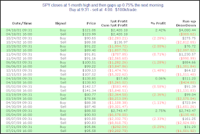
One notable from Friday was the extremely low reading in the CBOE Equity Put/Call Ratio. It closed at 0.49 – more than 31% below its 200-day moving average. In June I looked in detail at other times the Equity Put/Call closed more than 25% below its 200ma. It suggested a bearish edge for the following day has existed since the end of 2007. Concerned that the results were just a byproduct of a bear market I also showed all of the trades since the March low. Below I’ve updated that list with some additional observations.

(click to enlarge)

The far right hand column shows the intraday runup/drawdown. I’ve circled in green the -$393.90 result from July 31st. Since the trades are based on $100,000 each, $393.90 represents a move down of about 0.4%. What you’ll notice when looking at the list is that the 0.4% drop that day was the smallest intraday drop of any of the 15 instances listed since March 10th. In red I have circled every instance where the intraday runup the next day was less than 0.4%. As you can see of the 15 instances, 7 of them had an intraday runup of less than 0.4%. This is all during a huge rally off the March lows. While it’s just one of the studies I looked at in last night’s Subscriber Letter, this one suggests risk/reward favors the downside for Monday.

QQQQ Closes at 5-day Low for 1st Time in a Month

The QQQQ closed at a 5-day low Thursday. This is the 1st time it has closed at a 5 day low in 21 days. It seemed to me that the 1st decent pullback after a long run higher could provide a bullish edge. So I tested it. There were only 7 previous instances of runs of 20-days or longer. In a search for more meaningful results I lowered the requirement to 10-days. Those results are below:

(click to enlarge)

There does appear to be a small edge based on the size of the average trade. The winning percentage is a bit disappointing. It isn’t much better than random. In all I’d say there’s a mild edge that largely plays out in the 1st 2 days.

An Old Study & A New Blog

Two days of sideways action has left me little to say this morning. One notable from yesterday was the very low CBOE Equity Put/Call Ratio. In June I published a study that triggered again last night and was noted by the Quantifinder both intraday and after the close yesterday. Below is a link to that study.

https://quantifiableedges.blogspot.com/2009/06/equity-putcall-ratio-suggests-down-day.html

Also this morning I added CSS Analytics to the blogroll. Rarely do I add brand new blogs to the blogroll but David has been publishing some very interesting work on some indicators he devleloped. If you haven’t already, it’s well worth checking out.

https://cssanalytics.wordpress.com/

Most Overdone Breadth In At Least 23 Years

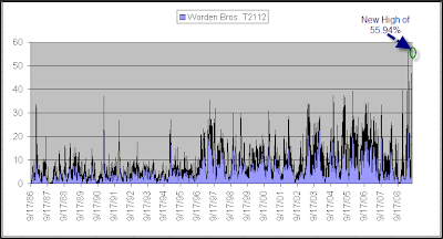
I almost showed a bullish study this morning for all the bulls who’ve been screaming for one. But when an indicator like T21112 hits a new all time high, it deserves a mention. T2112 measures the percent of stocks that are trading at least 2 standard deviations above their 40-day moving average. It set an all time-high in May and I noted it then. It went on to peak 2 days later (May 6th). After that the market experienced a 3-day pullback and a bit of a consolidation.

Monday it barely broke the old record. To provide some perspective as to how extended this indicator is I’ve shown below the full history going back to 1986.

(click to enlarge)

Spikes anywhere near what we are seeing now have been unsustainable in the past. This would seem to suggest a pullback is likely. (Of course, as the bulls will point out – there have been a lot of things suggesting that lately and the market has ignored most all of them.)

P.S. I also noticed T2112 got a mention from Cobra in his last commentary.

In Indicator Suggesting Short-term Downside

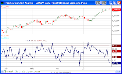
One indicator I track on the website is the Nasdaq Volume Spyx. The volume Spyx calculation is proprietary but in general it looks at relative volume across multiple Nasdaq securities. Historically, very low readings have often been followed by quick declines and high readings have been followed by quick bounces. Below is a copy of the chart from the website.

(click to enlarge)

As you can see, the -13.76 reading is quite unusual. I ran a test back to 2000 to see how the QQQQ has performed following other readings below -10.

(click to enalarge)

While instances are a bit low there appears to be a significant downside edge over the next 2 days.

What Thursday’s Unfilled Gap & Poor Close Might Mean

The late-day selloff may have felt bearish on Thursday. One very simple study I ran last night suggested otherwise…

(click image to enlarge)

The number of instances was a little bit low. These results are strongly suggestive of upside over the next few days, though. The profit factor (gross gains / gross losses) over the first 3 days is especially impressive. Also compelling is the fact that every instance saw at least 1 close above the trigger day close within the next day or two.

Consistently Strong Last Hour

The last hour rally has been common lately. The last hour is often viewed as the “smart money” hour, when institutions place many of their trades. Some indicators track either just last-hour movement or 1st hour and last hour. While the market has consolidated the SPY has moved up in the last hour for 4 days in a row now. I looked at other situations like this.


Strong moves in the last hour are often interpretted as bullish. My rather simple test here shows no evidence of that going forward over the next week. I intend to explore the last hour concept in greater detail in the future.

Year Over Year Volume Decline

One observation I explored last night was the fact that volume is decreasing not only since the March bottom, but on a year over year basis as well. July volume appears likely to come in lower than in 2008. Since the long-term trend of volume has been steadily up I decided to look at other times the market’s monthly volume had declined on a year over year basis. There were 543 months in the test and the average month gained a little over ½%. There have been 125 times where volume has come in lower than the same month the year before. Results following such months were in line with all months as a whole. I also checked to see if it mattered whether the month was positive or negative, or whether it closed at the highest monthly level in 6 months made any difference. Somewhat surprising to me, I was unable to decipher any edge, bullish or bearish, to a year over year decline in volume.

NYSE New Highs Contract While SPX Makes 50-day High

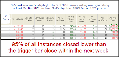
Also notable from Friday afternoon is the fact that new highs contracted substantially while the S&P made a 50-day high. The percentage of stocks hitting new 52 week high dropped from a little over 7% on Thursday to under 5% on Friday. I looked at other times the SPX made a 50-day high while the drop in new highs equaled 2% or more of the total issues.

(click image to enlarge)

What I found interesting and compelling about the above test was NOT the size of the average decline. In fact that was somewhat weak. It was the fact that 95% of instances closed below the trigger day close at some point in the next 5 days. This suggests that while the lagging new highs might not indicate an immediate selloff, the market has consistently struggled to move higher.

My Take On the Nasdaq Streak

The Nasdaq’s winning streak reached 12 on Thursday. It’s all over the news. In Tuesday night’s Subscriber Letter, when the streak had hit 10, I posted the following commentary. I think you may find my take a bit different than others who have examined the streak.

I have seen much written about the Nasdaq’s current winning streak. As of Tuesday the Nasdaq has now closed higher for 10 days in a row. I ran a study to examine performance following such runs since the inception of the Nasdaq.

(click table to enlarge)


These results appear to be quite bullish. Rather than just taking them at face, though, let’s give it some further thought and consideration. A closer examination of the results would show that the last occurrence was in 1997, which means it happened 26 times in 26 years and then not again for 12 years. Let’s consider what might cause this to happen and what this suggests about the above results. I’ve shown the Trend vs. Chop chart many times for the S&P 500, but never for the Nasdaq Composite. I decided to produce that for examination below. As a quick refresher, a downward moving line suggests the market is dominated by chop while an upward trending line suggests daily follow through is more prevalent.

For those who would like to read more on the Trend vs. Chop concept you may click here.


As you can see the Nasdaq saw a strong and steady tendency to follow through on a day to day basis during the 70’s, 80’s and much of the 90’s. Strong follow through means that strength suggests more strength. Therefore, the fact that the results were bullish over the 1971-1997 period shouldn’t come as a surprise. From a Trend vs. Chop perspective the nature of the market is so different today than it was during that period, that I don’t think it would be reasonable to extrapolate the results of the above test to the current environment. This essentially means that there is no historical precedent for 10 consecutive up days in a choppy trading environment…

My inclination was that in a mean-reverting environment, results would likely be worse than those above. To this point that hasn’t proven to be the case. I’m still expecting some short-term weakness, though.

See What I’m Reading With The New Linkfest Widget

I’ve added a new feature on the right hand column of the blog. One thing I’ve done a poor job of over time is posting links. It seems I only manage to get linkfest posts up once every couple of months. I do read a fair amount that I believe is worth sharing, but putting together posts full of links is arduous and I rarely get around to it. Fortunately I’ve now found a way to share some of the things I find most interesting on a daily basis.

The widget on the right hand side of the page titled “Other recent notable reading” contains links to the work of others. You can see the last five posts from my reader that I decided were worth sharing.

For a longer history and a full view of the readings simply click “View All” at the bottom of the box.

Hopefully you’ll find this new feature beneficial. Check back often as I’ll update it with fresh links as I read them.

Lagging Banks Potentially Bearish

Despite the rise in the S&P 500 on Tuesday the banks (BKX) fell over 3%. Historically when the banks have fallen sharply while the S&P has risen, it has often been followed by weakness in the S&P. Below is a study that exemplifies this.

(click table to enlarge)

Both the low winning percentages and the fact that losers were larger than winners suggest a downside edge over the next 1-5 days.