Using QE to Your Advantage Part 4 – Does an edge equal a trade?

This post is the next in the series “Using Quantifiable Edges to Your Advantage“. The first few posts examined how I lay out the studies, and what I look for when examining results that would make a study compelling. Today I will touch on what it means to have a compelling edge. Does it justify a trade? What if multiple studies appear to contradict each other?

First I should say that one of the biggest misconceptions about the studies I post on the blog is that they are market calls. They are not. They simply examine market action or conditions from one narrow perspective. It is rare that I would enter an index trade based on a single study. More often it is a combination of studies that helps provide me the confidence to put capital at risk.

I use studies as many traders use indicators. It is rare that someone might see all of their indicators line up perfectly at the same time. Often price action may be suggesting one thing, while breadth, or sentiment, or intermarket action may be suggesting something else. The tool I use to help me weight my studies and determine a market bias is the Aggregator. The basic method of the Aggregator is that it takes estimates from any studies I consider open and active, and combines them into one estimate. A more detailed description of the Aggregator can be found in this post.

But information about market tendencies that suggests compelling edges are useful for more than just index trades. No matter what securities you deal in, it helps to have a market bias. A bias doesn’t have to be formed mathematically, but by taking a reasoned approach traders can incorporate information from Quantifiable Edges, as well as other sources, in helping to establish their market bias. I’ll discuss this concept in more detail in a future post. The takeaway today is that a single study is not a market call, but rather a somewhat narrowly-focused examination of market tendencies. It’s a piece of the puzzle. A useful piece, but still just a piece.

And for my money, even if there is a combination of studies strongly suggesting a directional move, I still need to factor in risk/reward. I also need to consider what would constitute a trigger. My next post in this series will examine how I look at overbought/oversold and the role that plays in determining risk/reward. And hopefully by the end of the series I will be able to clearly demonstrate how narrowly focused studies can be used as part of a solid foundation when building your trading plan…or how experienced traders can incorporate them to improve an already solid trading plan.

A Tough Streak After Positive First Days

Last year I showed how the SPX has performed after the first day of the year was positive. Often you see a couple more days of upside followed by a selloff. In fact, there has been quite a streak of January dips after strong first days. Below are the last 10 instances going back to 1988, and their 13-day returns.

Most instances showed a decent amount of runup prior to the market rolling over. In fact the last five instances, starting in 2002 and ending in 2010, all saw the market rise 1%-3% before the move down ensued.

Using QE to Your Advantage Part 3 – What Makes A Study Compelling?

This post will be the third in the series that looks at using quantifiable edges to your advantage. Today I will discuss considerations I use that help determine whether a study is compelling and whether I want to include that study in my analysis. I will be discussing nine things to consider. I have listed them all below.

1) Average Trade
2) Percent Profitable
3) Profit factor
4) Win / loss ratio
5) Equity Curve
6) Timing of instances
7) Average and max runup and drawdowns for the trades
8) Robustness across parameters
9) Robustness across securities

Average Trade – The average trade column on the results sheet is the first thing I tend to notice. It’s the number that’s most often used to determine expectations. Strong positive or strong negative numbers in this column would suggest a possible bullish or bearish edge.
Percent Profitable – Percent profitable helps to illustrate an edges consistency. It is a relatively important number because a high percent profitable suggests the odds of an extended drawdown would be low. As a trader controlling drawdown is important to me so I like to see high numbers in this column for bullish edges and low numbers for bearish edges.
Profit Factor – Profit factor is influenced by both win/loss ratio and average trade. It shows how large gross gains are versus gross losses. Here again I want to see high numbers for bullish studies and low numbers for bearish ones. I prefer to see a profit factor of at least two for bullish studies or at least 0.5 for bearish studies.

Win/loss ratio – This is probably the ratio I give the least amount of consideration to among those listed. Still it is preferable to see a strongly favorable win/loss ratio when considering a study’s worth. A positive win/loss ratio means you typically have more to gain on a trade than you have to lose. It will give a setup with a 50/50 chance of success (or sometimes worse) a positive expectancy.

Equity Curve – The equity curve is a visual representation of how the study has performed over time. It is important to consider for a few reasons. First, you want to see whether the edge has been steady or whether it is recently waxing or waning. Second, you want to see if the apparent statistical edge is the result of a few large outliers. This would suggest that a perceived edge may not be reliable. I could spend a lot of time discussing intricacies, but I think just a few pictures will provide a good idea of what I look for. Below are some equity curves that I have recently run and discussed in the subscriber letter. They are all real curves, but I have erased the setup criteria.
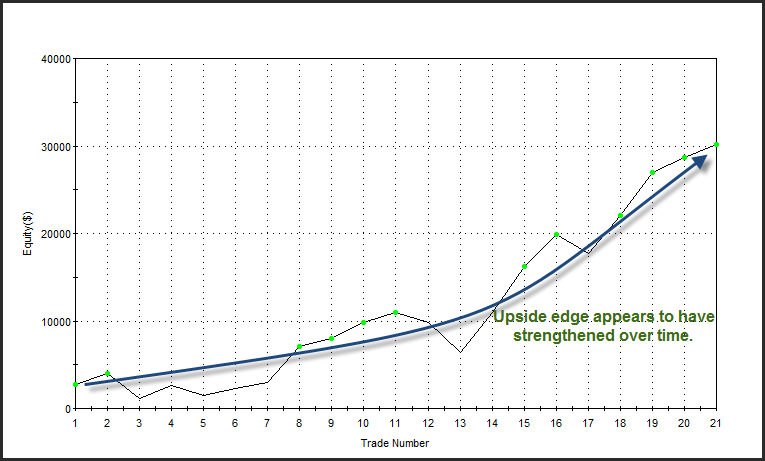
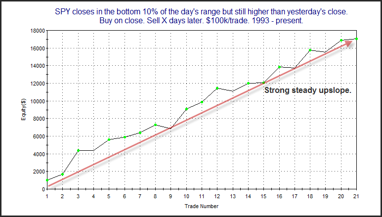
This first curve is one that I find especially appealing. When you can draw an arrow from the lower left to the upper right section of the chart and have it never be very far from the equity curve, then that suggests a steady, solid edge.

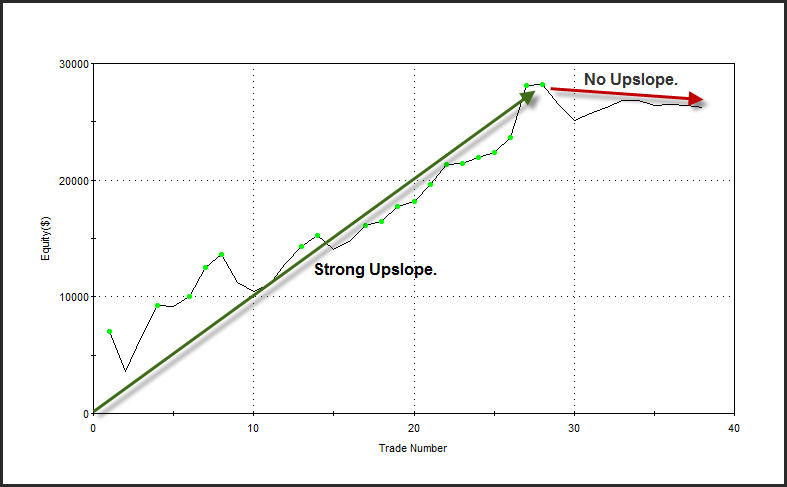
I also find this next curve appealing. The edge is not as steady, but you can see that there has always been an upward slope and that slope has recently increased.

This next curve is one that I do not find appealing. While it looked like the setup provided an edge for a period of time, it now appears that edge is either waning or no longer present. This is a setup I may continue to keep an eye on in the future, but would not include it as part of my current analysis.

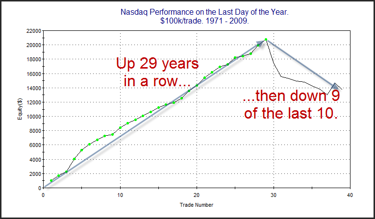
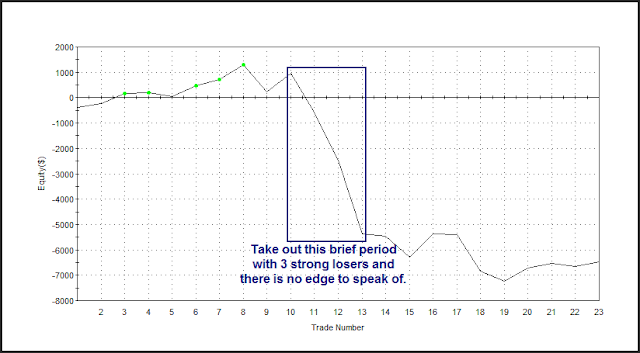
This last curve is an example of one that was heavily affected by a few outliers. When the statistics were generated it appeared there may be a downside edge. A closer look at this equity curve tells a different story. What we see are three big losers in the middle of the curve that account for nearly all of the downside edge. If you take out those three instances, the rest of the curve is just sideways chop.

That should give you a decent sampling of things to look for when examining an equity curve. If you’re able to find curves that looked like the first one, then you should do very well in identifying edges.  I don’t commonly show equity curves in the blog, but it is an extra bit of information that I often include in the Subscriber Letter.
Timing of instances. Recent or distant history? – You want to look at more than just the statistics and the equity curve. You also want to look at when past setups similar to the one you’re examining have occurred. Was the trading environment substantially different then than it is now? For instance, I recently ran a study whose results were very positive and it had a very strong, steady equity curve. But when I looked at the dates I found that most of the instances had occurred in the 60s and 70s. In fact the current setup was the first occurrence since 1996. While the setup looked good from all other aspects, I was wary of including it in my analysis due to the fact that it hadn’t triggered in over 14 years. I would much rather rely upon results that have been achieved in the recent past as opposed to results that were all achieved in the distant past.
Average and max runup and drawdowns for the trades – I also make sure to note runup and drawdown statistics for each of the setups. This is helpful for number of reasons. Runup stats give me some idea of how much of a move to expect. If the market moves in the expected direction much beyond where a typical runup might take it, then I will often eliminate that study from my “Active List”. I do this because any further move in the expected direction is likely due to forces other than that particular study. Looking at drawdown statistics provides further insight into how the market typically reacts to the setup being studied. Is there typically a fast move in the expected direction with little or no drawdown? If so, a move up opposite expectations could suggest the market is sicker than usual. Drawdown statistics are also very useful in helping determine appropriate position size. If the environment is volatile and trades often take a lot of heat before moving in the expected direction, then more conservative position sizing is likely appropriate.

Robustness (part 1) – Robust results serve a better chance of performing similar to expectations going forward. Robustness can mean a few different things. One way to test robustness is to see whether a minor change in parameters causes a big difference in results. Ideally you want to see a setup work across a range of parameters. If the parameters are too fine tuned, then the perceived edge may be more a result of data mining and not an actual edge. If a new study is being conducted and the current setup barely qualifies for the parameters being described, then there is a much higher chance that study is not robust. Researchers should strive to ensure the setup they are describing is typical of the sample set that makes up the results, and not an extreme case or an outlier. Of course this isn’t always possible, but when a study appears robust and the setup is typical of the sample set, then I have a greater confidence level in those results.

Robustness (part 2) – Another way to test if a study or concept is robust is to run the setup across a broad list of securities. This isn’t something I typically do with the index studies that I publish on the blog and in the Subscriber Letter. It is something I do when I develop systems. So systems like the Quantifiable Edges Big Time Swing System or any of the “numbered systems” that are available to Gold subscribers are all tested across a broad range of securities. A system that tests well across a broad range of securities, rather than one that is tailored to a specific security, stands a better chance of performing well in real-time.

 
Those are my top criteria when determining whether a study is worthy of consideration in formulating my market bias.  In my next installment of this series I will discuss whether an edge justifies a trade, and how I weigh different edges when considering trading opportunities.

Quantifiable Edges 2010 Highlights

Happy New Year! Before starting my 2011 posts I thought I would provide a list of Quantifiable Edges highlights from 2010. I have selected below a post from each month of 2010 to serve as a sort of “Best Of” list. There are also a few highlights mentioned beneath that.
January – Why I always look deeper than the stats.
https://quantifiableedges.blogspot.com/2010/01/why-i-always-look-deeper-than-stats.html

February – What a weak early tick has led to in the past.
https://quantifiableedges.blogspot.com/2010/02/what-very-weak-early-tick-has-led-to-in.html

March – Back to Back Outside Days in QQQQ
https://quantifiableedges.blogspot.com/2010/03/back-to-back-outside-days-in-qqqq.html

April – EEM:SPY as a Sentiment Indicator
https://quantifiableedges.blogspot.com/2010/04/examining-traderfeeds-eemspy-sentiment.html

May – Strong 1-Day Nasdaq Rally on Weak Volume
https://quantifiableedges.blogspot.com/2010/05/strong-rally-on-weak-volume-for-nasdaq.html

June – Quantifiable Edges Capitulative Breadth Indicator (CBI) Suggests a Bounce
https://quantifiableedges.blogspot.com/2010/06/cbi-hits-14-suggesting-bounce.html

July – Short-term Persistence an Intermediate-Term Positive
https://quantifiableedges.blogspot.com/2010/07/short-term-persistence-positive-for.html

August – AAII Investors Survey Showing Extreme Bearishness
https://quantifiableedges.blogspot.com/2010/08/aaii-investors-survey-reaching-extreme.html

September – Strong Breadth on a Breakout
https://quantifiableedges.blogspot.com/2010/09/strong-breadth-on-breakout.html

October – Quantifying How Market Analysis Can Enhance Individual Stock & ETF Trading Methods
https://quantifiableedges.blogspot.com/2010/10/quantifiying-how-market-analysis-can.html

November – POMO Stimulus Hitting A New High
https://quantifiableedges.blogspot.com/2010/11/1-month-pomo-inflows-set-to-hit-record.html

December – A Rare SPY Pattern That Has Always Been Followed By Short-term Gains
https://quantifiableedges.blogspot.com/2010/12/rare-spy-pattern-that-has-always-been.html

I was also involved in a few projects in 2010 that I thought needed mention.

John Forman’s Trader FAQ’s – In May John Forman released his New Trader FAQ’s Book. While my contribution was a small one, I was excited to be included in such a top-notch effort. I got word from John recently that a 2nd edition is going to be released soon, so keep your eye out for that!
In June I released “The Quantifiable Edges Guide to Fed Days”. This guide was a comprehensive collection of my research on and around Fed Days. I was delighted to have contributions from Tom McClellan and Scott Andrews included in the book. I was also very pleased by the response from those who purchased it.

New Guide on Blog – Near the end of the year I started a series of posts focused on “Using Quantifiable Edges to Your Advantage”. The series has only just begun, but I plan on adding to it quite a bit in the New Year. I hope it turns out to be a nice reference guide for new and experience Quantifiable Edges readers alike.

When SPY Closes Near the Bottom of its Range but Still Positive

Yesterday’s late selloff was something that many chart readers might view as ugly on a chart. My research has shown quite the opposite. When SPY has closed near the bottom end of its range but still positive on the day that has generally been a good thing. Below is a simple study from last night’s Subscriber Letter that exemplifies this.

Even though the number of instances is near the low end of what I prefer the results are strongly suggestive of an upside edge. The profit factor and winning % are especially compelling.

Below is an equity curve using a 3-day exit strategy.

Equity curves don’t get much straighter or more attractive than this. In one of my next few posts I’ll be discussing some of the things I look for in a study that make it compelling. This one has numerous compelling aspects and will act as a nice example.

Quantifiable Edges Big Time Swing System Overview Page Updated

I’ve updated the Quantifiable Edges Big Time Swing System overview page with results through December 21st. There is not a trade currently open and it’s unlikely we’d see a trade open and close before the end of the year so I figured I might as well do it now. I don’t update results that often since the system only trades about once per month on average. While 2010 was a subpar year, I am pleased to report that on a total of 12 trades it did post a little over a 4% gain.


It’s important not to overreact to a small sample of trades and any single year with this system is a small sample. So I’m not terribly concerned that the performance was subpar. 2010 was marked with moves that were more persistent than usual. Examples would be the March-April rally, the September-October rally and the recent December rally – all of which plugged forward without the sort of oscillations that are typically seen. For the Big Time Swing, which often looks to play oscillations, this meant some extended sidelined periods. There has only been 1 trade in the 4th quarter.

Profits were also cut in half thanks to a few positions that signaled an exit for the next morning. Exits can be taken at the close or the next day’s open. Historical analysis has shown an edge in holding certain trades overnight after the exit is triggered. Doing so in 2010 would have cost about 4%, so this did cause me some frustration. Still, I’m not inclined to change my approach due to a small number of unfortunate overnight moves. Of course since it is an open system traders have the option of tweaking it any way they want.

For those looking for a system that they can use as a base to build their own system from, the Big Time Swing is an attractive option. It is all open-coded and comes complete with a substantial amount of background historical research. And since it is only in the market about ¼ of the time, it can easily be combined with other systems to provide greater opportunities. Once you’re ready to try and improve the system yourself you can also refer to the system manual or the August 2010 purchaser-only webinar – both of which discuss numerous ideas for customization.


And if system development isn’t your thing, the Big Time Swing System provides easy to follow mechanical rules that you can follow. The standard parameters have performed quite well. There are only about 12 trades per year averaging 7 trading days per trade. All entries and exits are either at the open or the close. And to be sure you have everything set up properly traders may follow the private-purchasers only blog that shows all SPY signals and possible entry/exit levels. This service is free for 12 months from the date of purchase.


For more information and to see the updated overview sheet, click here.


If you’d like additional information about the system, or have questions, you may email BigTimeSwing @ Quantifiable Edges.com (no spaces).

How many instances are needed when considering study results?

This post is the 2nd part of a series I started a few weeks ago that will discuss using quantifiable edges to your advantage.  Today I’ll discuss a common question I get about the studies.  How many instances are needed for valid and usable results?  It will lead into “What makes a study compelling?” in the next post.

Many of the posts I put on the blog are what I refer to as studies. In this previous post I showed the layout of the studies. A study is simply test results of an idea. Most of the time the idea is based in technical analysis. It looks to answer the question, “How has the market performed in the past after…”

Some studies are fairly general. For instance, I might look at how the market performs after it has traded down 3 days in a row. Others are more specific with added filters. Perhaps I notice that not only is the SPX down 3 days in a row, but it also is trading at a 10-day low, and is above the 200ma and volume has increased each of the last 3 days.

Both studies could tell me something about the market in relation to its current condition (assuming I’m describing current conditions, which is typically my approach). If I am able to describe conditions that more closely match the current market then I have a better shot at seeing behavior over the next several days match up with the study results. Of course there is a trade-off between general and specific, and that is the number of instances.

A general test may have hundreds or thousands of instances which it can refer to in order to generate expectations. A very specific test may have an extremely low number of instances. If the number of instances is too low then the results may have little or no meaning. For instance if my parameters are run and I find that the market had only set up in a similar manner 1 other time over my test period, is it reasonable to assume that the market will act the same way this time? Most people would correctly assume “no”. What if there were 2 instances and they both had similar reactions in the past. Could I assume this suggests a directional edge? 3 instances? 4? 10? 30? 50? More? How many instances is “enough” to have some level of confidence that your results are actually suggesting an edge and they are not the result of luck?

Before answering let me address 1 common misconception people have about statistical testing. That misconception is that you need 30 instances in order to demonstrate statistical significance. This idea originates in the fact that a sample size of 30 is needed in order to calculate a Z-score or run a chi-square test. The reason that 30 instances are necessary is that Z-scores assume a normal probability distribution. Without 30 instances it is not possible to resolve the shape of the normal probability distribution clearly enough to make certain statistical measures valid. One thing traders should be aware of is that the stock market does not have a normal distribution anyway. It has “fat tails”. In other words, there are more outliers present in stock market movements than one would expect under a normally distributed curve. So relying on standard statistical measures and assuming a normal distribution could expose a trader to more risk than his results would imply.

Still, these tests are helpful in determining whether your results were likely due to a real edge or whether there is a high risk that luck played a big part. But what if you don’t have 30 instances? In that case you could use a t-table statistic.

To better understand statistical significance and see how to run some of these tests I’ll refer you to the below post from a couple of years back:

https://quantifiableedges.blogspot.com/2008/05/significance.html

Note that this post also contains a t-table. One interesting thing we can see when looking at a t-table is the minimum number of instances you would need to have different confidence levels that your edge is actually an edge and not due to luck. For instance, if all instances were followed by a market rise, you would want at least 6 instances in order to be 95% confident that there was an actual edge. A 99.9% confidence would be reached if you had 11 instances that all resulted in a rise over the next X days.

So if you look back at the study I showed Wednesday, SPY only set up in that pattern 12 times in the past, but every time it was trading higher 5 days later. This means statistically there is about a 99.9% chance that the positive results were due to more than luck. That there has in fact been a real edge in that pattern in the past. Does this mean there is a 100% chance it will be higher 5 days after the setup? No! Not even close. A high degree of confidence means there is likely some kind of an edge. It doesn’t mean the past winning % or net expectations are likely to persist indefinitely.

So how many instances do I require before I’m willing to accept a study as part of my analysis and place it on my active list? It varies depending on things like the strength of previous reactions and other stats I’ll get into in my next post, but I’ll generally use a t-table to help me decide. Will I incorporate a study with only 10 or 11 instances? Yes, but it will have to have strong win/loss stats and a high win %. Personally, I tend to favor studies that have somewhere between 20-70 instances. Too low and they are less reliable. Too high and the setup is often too broad to have much meaning.

I’ve spent far more space discussing this than I wanted, but it is an issue that has come up time and again with readers, so I wanted to be somewhat thorough.

In fact, of the list of things I look at in a study to help me decide whether it is compelling or not, the number of instances (assuming it isn’t minuscule) is near the bottom .

I intend to accelerate this series of posts over the next couple of weeks and I’m sorry it’s taken so long to get rolling. In the next post I will discuss a list of other things I examine when determining whether I find a study compelling.

A Rare SPY Pattern That Has Always Been Followed by Short Term Gains

The pattern of the last 2 days is quite interesting.  Both days we saw a gap higher, a move up above the previous day’s high, and then a reversal that led the SPY to close below its open but still in positive territory.  I looked at this 2-day setup in the subscriber letter in March using a long-term trend filter.  I have updated the study below.

Only 12 instances but the results are overwhelmingly positive.  In last night’s Subscriber Letter I shared some additional details, including all the dates.  There are actually a very large number of studies I am currently monitoring.  They are somewhat mixed. This particular study makes a compelling arguement for a short-term bullish outlook.  If you’d like to trial the Quantifiable Edges Subscriber Letter a free trial is offered here.  If you have already trialed it but not in the last 6 months, you may request another trial via email to support at QuantifiableEdges dot com.

I’ll Be Speaking at the Traders Expo in New York in February

The Traders Expo will be held at the Marriot Marquis Hotel in from February 20 – 23, 2011.  I’ve decided to make the trip. 

I’ll be speaking on the 21st from 1:30 – 2:30pm.  I’ll be discussing some of of my favorite research and trading ideas.  I hope to have the opportunity to meet severall blog readers and subscribers at the event.

I’ll send out another reminder as we get closer.  Registration is free and you may sign up using the link below:

https://secure.moneyshow.com/msc/nyot/registration.asp?sid=nyot11&scode=020867

The Most Wonderful Tiiiime of the Yearrrrrr!

Over several time horizons op-ex week in December has been the most bullish week of the year for the SPX. The positive seasonality actually has persisted for up to 3 weeks. I demonstrated this last year in the 12/14/09 blog. I’ve updated that study below to include 2009 stats.

Last year saw the market move higher on Monday and then pull back the rest of the week before rallying into year-end. 

I’m generally seeing a mix of bullish and bearish studies right now.  Friday’s blog is an example of an active bearish study.  This one certainly favors the bulls.

SPY Consecutive 50-day Highs On Lower Volume

Declining volume at new highs can often lead to short-term difficulties.  Below is a study related to SPY and SPY volume that I’ve shown a few times in the Subscriber Letter.  It popped up in the Quantifinder again on Thursday.

This appears to suggest a mild downside edge.  The high probability of some kind of decline despite the fact that it always occurs in an intermediate-term uptrend makes the study compelling enough to me to take under consideration.

Large Gap to New Highs Not the Edge They Once Were?

I’ve shown in the past using numerous studies that a large gap to a new high has a tendency to pull back during the day.  Below is a study that represents some of what I was looking at this morning.

The stats here appear quite bearish.  But below is the equity curve.

It appears over the last few years this setup has failed to deliver consistent downside movement.  I looked at this a number of ways this morning and most of the equity curves looked like this.  So be careful getting overcondfident trying to short this gap.

POMO Stimulus Indicator At New High and Still Climbing

Last week on the blog I showed an indicator that measured the amount of POMO stimulus the Fed has injected into the system over a 1-month (20 day) timeframe.  As a review POMO stands for Permanent Open Market Operations and it is how the Fed goes into the open market to buy (or sell) treasury securities. The net effect of this buying is an influx of cash into the system. It appears a portion of that cash makes its way through the banking system and into the stock market. It also appears that the net effect of all this Fed buying is a positive influence on the stock market.

Today I have updated the chart from last week.  The top panel shows the S&P 500.  The indicator on the bottom is the total POMO buying in dollars that the Fed has done.  I’ve zoomed in to just show the last year and a half. 

As you can see the POMO buying over the last month has now far exceeded any 20-day period in 2009 (or ever).  According to the Fed’s website Mon-Thurs of this week are also scheduled for POMO activity.  And a new schedule is due out on Friday so there is a chance we’ll continue to see strong Fed buying in the weeks ahead.  Evidence suggests to me that this should have a bullish influence on the market.