2% Gaps Down & Other Disasters
It can be difficult to know whether a very strong reaction is an overreaction. It can sometimes help to compare it to similar moves in the past. The table below is one I last showed in the 2/2/2009 blog. It looks at all the times the SPY gapped down at least 2% to start the day. The column on the right shows how long it took for SPY to close above its gap down open (up to a week). Today I’ve also added some red arrows. These mark the other times the gap down occurred following a close above the 200ma. As you’ll note, a 2% gap in an uptrend is quite unusual.
And for those wondering about event comparisons that is a VERY difficult thing to do. Two events I looked at last night were the 1995 Kobe earthquake in Japan and the 1986 Chernobyl nuclear disaster in the Ukraine. While their local markets were hurt badly, neither event caused much reaction in the U.S. They were essentially 3-5 day pullbacks totaling between 2% and 3.5% in the SPX.
God bless the people in Japan and the Mideast.
Reminder: Fed Day Tomorrow
A quick reminder that tomorrow is a Fed Day. I have written a lot about edges that occur on and around Fed Days. A good amount of information can be had by clicking the “Fed Study” label on the right hand side of the blog. (Or the link below.)
https://quantifiableedges.blogspot.com/search/label/Fed%20Study
And of course much more information can be found in the “Quantifiable Edges Guide to Fed Days” ebook and book.
Op-ex Returns By Month
About a year ago I showed a table on the blog that broke down op-ex week by month. Op-ex week in general is normally pretty bullish. March, April, and December it has been especially so. S&P 500 options began trading in mid-1983. The table below is an updated version of the one I produced last year. It goes back to 1984. I excluded op-ex week of September 2001 due to the extreme (and horrific) circumstances.
While December has been more reliable, total gains have been the largest during March op-ex.
Triangle Breakdowns in a Long-Term Uptrend
About three years ago I did a post on triangle formations. I looked at success rates and profit potential of playing breakout of them. You may view those previous findings here. Last night in the subscriber letter I took a new look at these formations and what a break (like we saw yesterday) might mean.
For coding purposes I simply defined a triangle as a pattern where the most recent swing high was lower than the previous swing high, and the most recent swing low was higher than the previous swing low, and the market was currently between those two points. This admittedly isn’t the most sophisticated description, and some market technicians might suggest additional nuances should be included. Still, it seemed to be enough to identify the basic pattern of a tightening range.
I set the entry parameter to be a break above the most recent swing high or below the most recent swing low. Here it could certainly be argued that a trend line break might be more effective. I personally don’t believe it would make a whole lot of difference.
Once entered the strategy was designed to exit when price either reached its target or its stop area. To calculate the target price I simply took the height of the triangle and extended that past the entry point. The stop was set at the opposing swing high or swing low that would have triggered an entry in the opposite direction had the triangle broken the other way. No trailing stops or other trade management techniques were incorporated.
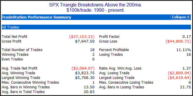
Results in general were much like those results I discussed 3 years ago. I did break it down a number of different ways, though. One interesting set of results came from looking at triangle breakdowns in the SPX when it was in a long-term uptrend. Those results can be seen below.
Entries and exits are as I described above. So in this case the results show the performance of shorting a breakdown. As you can see there has been an strong tendency for this trade to reverse back up and be stopped out before reaching its downside target.
More information on triangles can be found in last night’s letter. Subscribers are also being provided with the code so that they may explore triangle formations more on their own. If you’d like to read Thursday’s letter just click here to register for a free trial.
This Pattern Has Frequently Preceded A Pop In The SPX
The market has been stuck in a trading range for the last couple of weeks, and that range has tightened even further in the last week. Looking at the SPX we have now seen 5 closes in a row that have occurred within the range of the 3/1/11 bar. Inspired by some gap-related research by Scott Andrews over at Master the Gap using a similar setup, I decided to take a more detailed look at this set of circumstances. What stuck out to me is that 1) the SPX has been in a long-term uptrend. 2) There was a sizable 1-day selloff. 3) The bears failed to follow through on that selloff, yet the bulls have not managed to move the SPX back out of the range either.
Over the last 22 years or so the SPX has burst higher out of this “failed selloff” and consolidation on a consistent basis. But the implications are only bullish for a few short days. After that there does not appear to be a decided edge for either the bulls or the bears.
Aggregator System Riding a Hot Streak
The Aggregator has been a terrific tool that has helped me greatly in both my index swing trading and for establishing a market bias for other trades.
The Aggregator System is based on the Aggregator and it calls for a position of 100% long, 100% short, or 100% cash. For my own trading I will often scale in and out of positions depending on factors such as the strength of the evidence, perceived risk, recent market volatility, the underlying trend, my intermediate-term outlook, and more. Still, the Aggregator System can be (and is) traded mechanically. After two stellar years (2008 and 2009) it hit a rough patch last summer. But more recently the Aggregator System has been on fire. Below is a chart showing every entry and exit signal since around Thanksgiving.
(click chart to enlarge)
Signals occur at the close and are posted to the Quantifiable Edges Systems Page 10-15 minutes beforehand. They are accessible by all gold subscribers. The signal is also published and discussed in each night’s subscriber letter. If you’d like to check out the Aggregator System in more detail (including a complete history as well as current signals) you may do so with a free trial to Quantifiable Edges.
Trading Interview At The Trading Elite
The Trading Elite is a new site that features interviews with professional traders. The site is run by Jared Mast.
I was honored to be one of the first traders interviewed by Jared. The interview took place a few months ago, but it was posted when the site came on line in the last few weeks. You may check it out at
https://www.thetradingelite.com/?p=22
There are also interviews with other traders whom I greatly respect, including Scott Andrews, Ray Barros, Dave Landry, and more. So check out The Trading Elite. I have also added it to my blogroll.
Large Moves Up On The Day Before Employment
POMO Stimulus Indicator Update
(click chart to enlarge)
1st Week Without A Higher High Since November
Last week was the 1st in which the SPX failed to make a new high since November. Prior to this it had been 12 straight weeks of higher intraweek highs. In last night’s subscriber letter I took a look at other times similar streaks existed and what happened after they ended. Below is a study that showed results of instances with at least 10 consecutive higher highs.
It’s tough to draw too much from the low number of instances. Early indications suggest the market is not immune from a short-term pullback, but that past instances have not marked major tops. If you want to take a closer look at other instances like the present where the SPX made higher highs for at least 12 weeks before faltering, it occurred on 11/5/65, 3/17/72, 1/8/93, 8/15/97, and 4/17/98.
A theme I have found in my research is that persistent uptrends rarely end abruptly. Often they will chop for a while and lose their persistence before rolling over. While much of this research has been focused on the daily timeframe, studies like this suggest it may also apply to weekly timeframes as well.
One Sign SPY is Ready to Bounce
Sparked by overseas news the SPY has closed down 3 days in a row. I’m starting to see evidence that it is at a point where a bounce is becoming likely. The study below was posted in the Quantifinder yesterday. It was last shown in the 10/28/09 blog. I have updated the results.
Reminder: I’ll be Speaking at the NY Traders Expo on Monday
The Traders Expo will be held at the Marriot Marquis Hotel in NY from February 20th – 23rd. I’ll be making the trip.
I am scheduled to speak on the 21st from 1:30 – 2:30pm. Topics in my talk include Fed-based edges, how market position affects short-term patterns, aggregating studies, and more.
Registration is free and you may sign up using the link below:
https://secure.moneyshow.com/msc/nyot/registration.asp?sid=nyot11&scode=020867
I’d welcome the opportuntiy to meet blog readers and subscribers. Feel free to stop me if you see me, or come by after the presentation and introduce yourself. I look forward to meeting some of you there.


