Quantifiable Proof That Chicks Don’t Dig Me

Google Analytics is a tool that is used by most websites that allows you to evaluate activity on your site. You can see how much traffic there is, where that traffic is coming from, and more. With it being Valentine’s Day, I thought I would see how popular Quantifiable Edges is with the ladies. Below is the gender breakdown of recent site visitors from Google Analytics.

2018-02-14

My wife would be happy to see this…except she’ll probably never see it. Because like most women, she doesn’t ever visit Quantifiable Edges.

Happy Valentine’s Day!


Want quantitative market research delivered directly to your inbox on a timely basis? Sign up for the Quantifiable Edges Email List.

What SPY’s Gap Up, Reverse Down & Rebound Back Up From Friday Suggest For This Week

The sizable gap up, pullback, and then move back higher on Friday triggered an old Quantifinder study for the 1st time in a long time. Below is the full list of trades with a 5-day holding period.

2018-02-11

All 8 instances saw run-ups of at least 1%, and they all closed positive. While instances are low, the initial inclination appears quite bullish. This study may be worth some consideration when thinking about this upcoming week.


Want research like this delivered directly to your inbox on a timely basis? Sign up for the Quantifiable Edges Email List.

Thoughts On Dealing With Historically Abnormal Markets

I have discussed some lately that the market is acting outside of historical norms. Thursday’s action reinforced that. The pullback has come so fast and been so extreme that it is going beyond even many of the most extreme moves in similar situations. For instance, I looked back to 1960 with the SPX for to find other times SPX closed down > 10% from a 250-day closing high within 2 weeks of that high. Thursday marked the 1st time this has ever happened. If I loosened the criteria to a 9% drop from a 250-day high within a 2 week period, then there were 2 instances. They occurred in 1980 and 1986. Below are charts of them.

2018-02-08

I don’t read too much into just two instances. They did both bounce in short order, but more significant to me is that SPX is doing something it has never done before with the 10% drop from a 250-day high within 2 weeks. Running the same test on the Dow I found only 2 instances. They occurred in 1928 and 1933. So you need to look back 85 years to see such a sharp drop from a high level.

Trading based on historical probabilities becomes more difficult when the market does not comply to historical norms. And when action is so extreme (115% 1-day VIX moves, 10% drops from all-time highs within 2 weeks, etc) that there are little or no comparisons, then keeping some powder dry and not blowing up your accounts becomes more important than timing entries perfectly. It is tough to quantify risk in a market like this. While a strong bounce in the next few days appears highly likely, using too much leverage may not allow an account to survive a few days. Stay in the game. Trade well.
 

Want research like this delivered directly to your inbox on a timely basis? Sign up for the Quantifiable Edges Email List.

When The Quantifiable Edges Capitulative Breadth Indicator Hits 25

As I Tweeted out (@QuantEdges) as we approached the close yesterday, the CBI spiked on Monday from 6 to 25. Twenty-five is an extremely high number. And while readings that high have been rare, they have also been quickly followed by a bounce in the SPX. Below is the list of the 5 previous instances, dating back to 1995, and their 5-day returns.

2018-02-06

You’ll note when looking at the dates they were all significant historical market events. Long-Term Capital, Post 9/11 attacks, 2002 crash, 2008 crash, and 2015 China-induced crash. Every instance bounced over the next 5 days, but 3 of them saw further declines between 4% and 8.5% before the bounce occurred. The message appears to be that the market is likely within a few days of a capitulative bottom, but price may have to fall further before the big reversal kicks in. And with XIV/SVXY news pending and possible implications not yet known, it could be a scary ride.


Want research like this delivered directly to your inbox on a timely basis? Sign up for the Quantifiable Edges Email List.

A Closer Look At Historical Performance Following New Fed Chairmen

A couple of weeks ago I did a little study that looked at performance following the induction of a new Fed Chairman. With Jerome Powell starting his new job on Monday, I decided to expand on that study below.

2018-02-04

Obviously it appears to be a bit of a mixed bag. The most positive results came in the 1st 3 weeks (15 trading days). Perhaps the market view the new chairman with enthusiasm. The most negative results were 50-day out. These were also greatly skewed by the crash of ’87 and another giant swoon in 1930. Below I have listed the 13 new chairmen and the results 15 and 50 days after their start.

2018-02-03

As I mentioned a few weeks ago, what stands out to me is that the last 10 instances all saw the Dow higher 15 days later. Looking back as far as I am and using such a low sample size, I do not view these results as significant. But as an exercise in curiosity I found it interesting.


Want research like this delivered directly to your inbox on a timely basis? Sign up for the Quantifiable Edges Email List.

SPX at Highs with XIV at Lows

XIV is an inverse-VIX ETN. In other words, it was designed to generally trade inversely to VIX futures on a daily basis. Since VIX and SPX typically trade opposite each other, you would think that XIV and SPX would often close in the same direction. And you would be right. Of course, XIV depends on more than just the movement in the VIX to determine its price. Among other things, it is influenced by short-term VIX futures movement and the term structure of the 1st couple months of VIX futures contracts. This is not the place to get into a deep discussion of XIV price influences. But it is important to understand that it 1) generally trades inverse to VIX movement, and 2) will often trade in the same direction as SPX. XIV has diverged with SPX in recent days. In fact, while SPX closed at an all-time high on Thursday, XIV closed at the lowest level of 2018. This can be seen in the chart below.

2018-01-25qe

The divergence between the 2 is highly unusual. In fact this is the 1st time ever (since 2011 XIV inception) that SPX has closed at even a 10-day high while XIV has closed at a 10-day low. If we loosen the criteria to only require a 6-day SPX high and a 6-day XIV low we can find 7 previous instances. Their 1-day results can be found below.

2018-01-26

The number of instances is low, but early indications suggest a possible 1-day downside edge.


Want research like this delivered directly to your inbox on a timely basis? Sign up for the Quantifiable Edges Email List.

When New Years Begin With A Steady Stream Of Up Days

The start to 2018 has been fairly remarkable. The SPX has only closed down 3 days so far, while closing up 11 days. That is a substantial hot streak, and one might think that such a strong run to start the year would almost certainly have to pullback soon. So I checked.

2018-01-23

The imminent pullback theory certainly does not seem to work here. All 6 previous instances were higher 2, 7, 8, and 9 days higher. And the worst loser over the 1-10 day period was only 0.3%. The kind of early-year strength we are currently seeing has always been followed by more upside in the past. The years where this occurred were: 1965, 1967, 1976, 1979, 1987, and 2012.

With just 6 previous instances, and only one in the past 30 years, this study does not get me enthused about jumping into a long position here. But it does make me a little more wary of trying to short into this strength.


Want research like this delivered directly to your inbox on a timely basis? Sign up for the Quantifiable Edges Email List.

How the Quantifiable Edges Aggregator uses expectations and risk/reward analysis to establish a reliable market bias

When it comes to predicting market movement, there are an endless number of indicators out there. And they are based on an ever-growing number of ideas. The most common indicators are based on things like price action, volume, breadth, sentiment, government policy, or cross market analysis. But people might also look at sun spots, moon cycles, weather, or any number of things where they find a correlation to market movements. No matter what indicators a trader favors, it does not take long to realize that none of them work perfectly. And even if you find one that is incredibly reliable, it may not be providing strong readings often enough to generate consistent returns. Therefore, every trader I know looks at more than one input or indicator to try and find an edge.

Of course the more indicators you use the more likely it is that some of them disagree. It is rare that a trader will see all of their indicators line up perfectly at the same time. Often price action may be suggesting one thing, while breadth, or sentiment, or intermarket action may be suggesting something else. So traders need to determine whether the mix of evidence is suggesting a bullish or bearish indication, and how strong that indication is.

At Quantifiable Edges, I use indicators in a slightly different way. Rather than simply interpret readings or patterns that I am seeing, I generate market research studies to understand how similar situations have performed historically. It is these studies that I publish in the Quantifiable Edges Subscriber Letter (and sometimes the blog or elsewhere) that help me to establish my market bias. But like other traders indicators, my studies don’t always agree. So the tool I use to help me weight my studies and determine a market bias is the Aggregator. A chart with the Aggregator included can be seen below. It shows readings from December 2017 into January 2018.

2018-01-22q

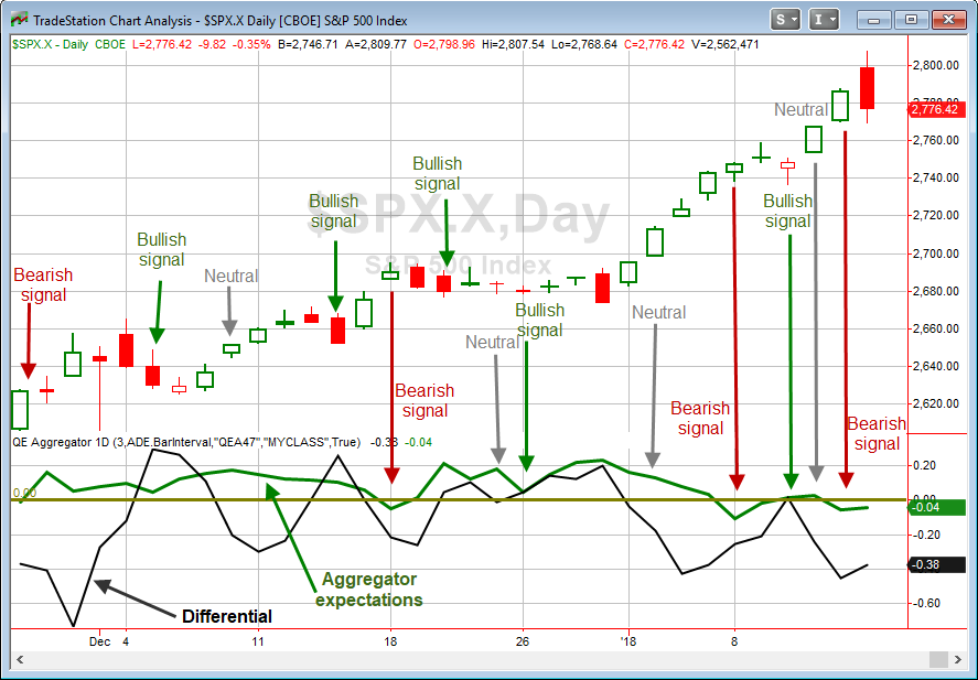
Each day, the Aggregator takes the current studies on the Quantifiable Edges Active List and creates a composite estimate. That estimate looks out over the next few days, and is represented by the green line. If it is above zero, then estimates are looking for the market to rise over the next few days. When the green line is below zero, then estimates are anticipating a decline.

The black line I refer to as the Differential. It shows the difference between recent estimates and actual market movement, and it provides an overbought/oversold indication. When it is above zero, that implies the market has failed to meet recent expectations and could be considered oversold. When it is below zero, that means the market has exceeded recent expectations and could be considered overbought.

Combining expectations with overbought/oversold means there are 4 possible formations on the chart.

  1. Both lines above zero
  2. Both lines below zero
  3. The Aggregator expectation line is above zero and the Differential line is below zero.
  4. The Aggregator expectation line is below zero and the Differential line is above zero.

Formation 1 I generally consider to be a bullish setup. Oversold with bullish expectations is often a good place to buy.

Formation 2 I generally consider bearish. Overbought with bearish expectations can mean a good shorting opportunity.

Formations 3 and 4 I generally consider to be neutral. Positive expectations in an overbought market often don’t offer great risk/reward. And neither do negative expectations and an oversold market. So I will not normally be looking to take on new index positions when the Aggregator is in formation 3 or 4. But both of these still provide valuable information. Oversold with negative expectations keeps me from trying to go long a pullback that does not show a high probability of bouncing. And knowing there are positive expectations when the market is overbought helps me to avoid shorting into overbought situations where the historical indications are for further gains.

To help you easily spot where the Aggregator formation has changed to bullish, bearish, or neutral, I have included arrows and signals on the chart. Keep in mind, the signals occur at the end of the day and suggest a bias for the next few days. As you can see, the Aggregator has done a nice job of anticipating short-term market movements.

The bottom line is the studies help me determine whether there is an upside or downside edge. The Differential measurement helps to assess risk/reward. The Aggregator chart combines them and helps me to establish a short-term market bias. The Aggregator chart is published each night in the Quantifiable Edges Subscriber Letter, and it has proven invaluable to me since I began using it in 2008.


Want research like this delivered directly to your inbox on a timely basis? Sign up for the Quantifiable Edges Email List.

A Historical Look At Market Reaction To New Fed Chairmen

Jerome Powell is expected to take over for Janet Yellen as the new Fed chairman on Feb 3rd. A few days ago in the letter I looked at SPX performance after a new chairman takes over. I used the SPX and looked back to 1970. Tonight I decided to take the analysis back to 1923 using my Dow data. Like with the SPX, I found the first few weeks to be the most consistent and interesting data. Once we look out much further, the results become more mixed. So below is a list of past Fed chairman changes along with the 15-day performance of the Dow.

2018-01-21

After 3 rough instances to begin the study, the rest of the chairman have been greeted with enthusiasm by the market in their early days. It did not always last. (Greenspan saw the crash of ’87 after just a few months on the job.) But if the last ten chairmen are any indication, the market rally may continue during February. Or if the market decides it really does not like Mr. Powell, then a Eugene Meyer nosedive would make for a tough few weeks. Personally, this was more an exercise in curiosity, than anything I plan to base a big trade on. Good luck Mr. Powell! We hope you are met with at least as much enthusiasm as Thomas McCabe was.


Want research like this delivered directly to your inbox on a timely basis? Sign up for the Quantifiable Edges Email List.

Highly Unusual Behavior Between SPX and VIX

Wednesday saw both SPX and VIX close at 40-day highs (about 2 months). Since they commonly trade opposite each other, to have them both be extended up like this is very rare. In fact, it has only happened 4 other times. Below is a list of those instances along with their 4-day results.

2018-01-18

The takeaway here is not that they all lost money over the next few days. Though that is notable, it would be dangerous to draw conclusions from just 4 instances. But I do think it is worth considering the fact there have only been 4 instances, and none since Y2K. The very low number of instances in itself demonstrates how unusual it is to have the SPX and the VIX pushing higher together. Current market conditions appear abnormal.


Want research like this delivered directly to your inbox on a timely basis? Sign up for the Quantifiable Edges Email List.

January Opex A Weak Week

Opex week in January is one that the market has seen some struggles over the last 19 years. Below is the list of January op-ex weeks from 1999 – 2017 with their full week performance results. There have been 8 years in which January op-ex week occurred in conjunction with Martin Luther King Day. These were 4-day weeks and they are denoted with blue boxes around them.

2018-01-15

There has been a decided downside tendency during January opex week over the last 19 years. The run-up / drawdown stats are especially notable. Traders may want to keep this in mind this upcoming week.


Want research like this delivered directly to your inbox on a timely basis? Sign up for the Quantifiable Edges Email List.

Quantifiable Edges Gold Subscriptions Continue To Shine

2017 was another strong year for the Quantifiable Edges Gold subscribers. The Gold subscription contains the Quantifiable Edges Subscriber Letter, which is published on a nightly basis. The Letter uses historical studies and quantitative evidence to evaluate the market and help traders establish both a short and intermediate-term trading bias. The Letter also shares trade ideas for trading index securities, large-cap stocks, VIX-based ETFs and occasionally other high-volume ETFs. The letter has been published for nearly 10 years (anniversary coming in February!), and the trade ideas have generated positive results every one of those years. The index trades were especially consistent in 2017, as 14 of them were initiated and published in 2017 and 13 of those closed out profitably. The full list of published trade ideas since the 2008 inception can be downloaded by anyone that takes a free 7-day trial.

Of course QE Gold subscriptions come with much more than just the letter. They include research, open coded systems, full archive access, educational videos, and annual subscribers even get free access to the Quantifiable Edges Market Timing Course.

I’d encourage all levels of traders to take a free look at a Quantifiable Edges subscription. And don’t hesitate to contact me with any questions as you determine whether a subscription could help you with your trading and investing.


Note: If you took a trial in the past, but would like another one, simply email support and we will set you up with one!


Below are some recent testimonials:

Rob,

  I am a re-subscriber who began following you years ago not too long after you started showing a public face (so to speak).  At that time, I was impressed with your whole approach to investing, and that remains true today.  After my early retirement a few years back, my wife and I begin travelling extensively and so my active trading became quite passive … we were often in places where the reliability of the grid was suspect (if it existed).  With the arrival of a first grandchild, we’re back in the modern world and I must say that I’m very much enjoying the morning read that comes from your hand.  Sane and sober advice is all too rare, and I really appreciate what you have to say.

 Best wishes to you and yours,

David – 12/26/17


Rob,

Love the service, and will probably subscribe as long as you do it!

Alan – 12/20/17

A Down Day After A Persistent Upmove To New Highs

One compelling study from last night’s Quantifinder suggested the recent persistent upmove is unlikely to abruptly end. (This is a theme we have seen many times over the years.) It considers what happens after the market moves up at least 5 days in a row to a 50-day high, and then pulls back. I have updated the stats in the table below.

2018-01-11

We see here a decent edge that becomes stronger and more consistent as you look out over the next several days. The 9-10 day time frame shows exceptional stats. Traders may want to keep this in mind over the next few days.


Want research like this delivered directly to your inbox on a timely basis? Sign up for the Quantifiable Edges Email List.

Historical Results Following 4 Up Days To Begin A New Year

The simple fact that the SPX posted a gain on the first 4 days of the year is a pretty rare occurrence, with 2018 only being the 9th instance since 1961. While instances have been low, the intermediate-term performance following such strong starts to the year has been impressive. And looking at most timeframes from 50 days to 250 (or more) days, the returns have been strong. Below is the list of instances and their 250-day returns, which is approximately 1 year.

2018-01-08

Not only were they all winners, but run-up has outsized drawdown in every instance. I noted the four instances above that were similar to 2018, since they were already making new 200-day highs when the setup triggered. While it is dangerous to read too much into just 8 instances, this may be worth keeping in the back of our minds. I will be interested to see if this year plays out like the rest.


Want research like this delivered directly to your inbox on a timely basis? Sign up for the Quantifiable Edges Email List.

When A New Year Starts On A Positive Note

Last night’s subscriber letter featured (an expanded version of) the following study, which looks at performance in the 1st couple of days following a positive 1st day of a new year.

2018-01-03

The stats and curve all suggest some immediate follow-through has been typical. There have now been 9 winners in a row, with the last loser occurring in 1998.  Also notable is that 24 of the 26 instances (92%) closed higher than the entry price on either day 1 or day 2. Interestingly, the 2 instances that didn’t also didn’t manage to post a close above the entry price at any point during the rest of the month.


Want research like this delivered directly to your inbox on a timely basis? Sign up for the Quantifiable Edges Email List.