Why Tuesday’s 90% Up Day May Not Be Bullish

Lowry’s has shown 90% days to be effective in determining market bottoms. For those who are unaware a 90% day is a day where volume and points are 90% one directional. A 90% up day would occur when 90% of the volume traded and points traded on the NYSE are to the upside.

Tuesday was a 90% up day. Lowry’s looked for cluster of them in order to determine a bottom. (You can find a free copy of their report Identifying Bear Market Botoms” here.) Unfortunately, I’ve found 90% days coming directly after a bottom tend to lead to market weakness. For the below study I ignored the points qualification and just looked for 90% up volume days.

(click to enlarge)

Both 1 and 8 days later all of the instances saw the S&P trading lower. Interestingly, while the test went back to 1970, 6 of the 8 instances found have occurred in the last 2 years. Prior to that it was unusual for a 90% day to occur directly following a low.

Light Volume Bottoms Study Part 2

In the March 6th blog I showed a study that looked at 50-day lows occurring on heavy volume (highest in 5 days) and light volume (lowest in 5 days). A 50-day low on light volume was found to be significantly more bullish. On Monday the market made a new low on the lightest volume in 5 days.

Unfortunately when I went through some of those studies Monday night I realized something quirky was happening in Tradestation. I had run them using imported volume data that went back to 1992. I also ran them on the Tradestation volume data from 1992 – present. I did this to check and see that the sets were similar. Upon finding they were I removed the 1992 – present restriction and looked back from 1960 – present. When I did that for some reason the tests ran improperly and they continued to only look back as far as 1992. There’s good news and bad news associated with this. The bad news is that when looking back further the numbers aren’t quite as enticing. The good news is that with a larger data set I was able to examine 200-day lows as well.

So here are the 50-day low numbers all the way back to 1960. First looking at high volume:

(click on any table to enlarge)

Still an edge, although a bit weaker from an Avg Trade standpoint. The last 16 years or so that were looked at last week have done better than the long-term average.

Now let’s look at low volume.

The edge here again isn’t nearly as pronounced when looking across the longer period as it was from 1992 – present. It is still quite a bit better than the high volume scenario though.

With the added data I was able to run 200-day moving average data back to 1960 as well. Again I’ll show the high volume scenario first:

Not much of an edge here. Perhaps a slight upside tendency. Next is again the low volume setup, but now using the 200-day low.

Here the edge appears fairly solid. When I looked at it in more detail I found that the bullish edge really began to exert itself around 1977. Below is a test only going back that far:


Instances are a little light but the results here are very strong.

Can The Market Bottom On Light Volume?

One common misconception about steep selloffs is that they need to be accompanied by high volume in order to mark a bottom. October 10th and (to a lesser degree) November 20th, 2008 are two examples of big down days that came on big volume that soon led to a reversal. While this pattern can precede a bounce, you’d much rather see your new low accompanied by very low volume than very high volume.

Let’s look at some studies to illustrate this claim. First let’s look at performance following a 50-day low that has neither very high nor very low volume: {edit: the following tests were inadvertently run from 1992 – present, not 1960 – present. See March 10th follow-up blog for more details and longer-term results.}

(click to enlarge)

So this is the base case and as you can see there is a slight upside edge over the next 1-20 days.

Now let’s look at the ever-popular high volume selloff:

(click to enlarge)

Results here are nearly indistinguishable from the base case. The high volume, while not a deterrent, does not seem to provide an additional edge.

Now let’s look at the less common case of a 50-day low occurring on light volume:

(click to enlarge)

While the number of instances is less than desired these results are clearly superior to the other scenarios. Over 90% winners after both 4 days and once you get out over 3 weeks. The average trade over the next week and over the next 4 weeks is about 4 times the size of the base case. While they didn’t all mark the exact low, some success stories included 10/7/02, 3/10/03, and 1/24/05.

There are plenty of technical reasons we should see a strong rebound soon. Thursday’s light volume can be added to the list. Now let’s just hope the market stops ignoring these reasons.

Breadth Indicators With Confirming Extremes

Yesterday I noted my Capitulative Breadth Indicator (CBI) spiked above 10 up to 12. On Tuesday the number reached even higher to 18. Eighteen is an extreme reading that has only been reached during 5 other periods since 1995.

Before I show those dates I want to mention another breadth indicator I look at which also measures oversold breadth. Worden Bros. T2114 and T2116 measure the % of stocks trading 1 and 2 standard deviations below their 40-day moving average. Both are in extreme territory at the current time. T2114 (1 standard deviation stretch) is reading almost 87% currently. Data is available back to 1986. Since then there have only been 6 other periods where similar levels were reached.

Below is a table comparing the CBI>=18 to a Worden Bros. T2114 > 85:

Both indicators are now at similar extremes only reached during some sharp selloffs that resulted in sharp rebounds.

CBI of 12 Suggests Bounce is Near

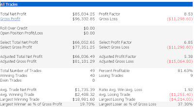
I’m beginning to see some indicators hit truly extreme readings – most of them breadth indicators. One indicator I track that finally spiked up to an extreme reading Monday is the Capitulative Breadth Indicator (CBI). It now stands at 12 and could spike quite a bit higher on Tuesday if the market fails to rally. I’ve discussed in the past that there is a strong bullish edge when the CBI moves over 10. A “system” I’ve discussed in the past is buying the S&P when the CBI reaches 10 or above and then selling when it returns to 3 or lower. This system was perfect from 1995 until July 2008. In July it suffered its 1st loss and in October it suffered its 2nd loss. November spike above 10 nailed the bottom and turned into the a 19% gain – the biggest ever for the system. Some detailed statistics are below ($100k/trade, 1995-present):

The CBI is one indicator suggesting a bounce is near.

For more detail on the CBI, click the label below or click here to read the intro post.

My Take On The VIX

Another big day down today and still the VIX isn’t stretched. An observation I’ve seen several traders make is that while the S&P fell hard last week, the VIX (and VXO) didn’t rise. The interpretation by some is that this suggests a lack of fear and is short-term bearish. I was unable to find evidence to support this theory. Below is one test I ran that looked at other times the S&P fell at least 2.5% while the VXO also fell.

I wouldn’t call the results bullish but I wouldn’t call them bearish either. I would suggest that perhaps the VIX is simply an indicator lacking a solid edge for the time being.

Bank Action And The Market

The one sector that held up very well Thursday was the Banking Index (BKX). Yesterday I showed a study that suggested a bullish bias following a negative SPX day where the SOX thrives. Below is a similar test using the BKX instead of the SOX:

(click to enlarge)

This study would have triggered both on Wednesday and Thursday. Instances are too few here to draw any solid conclusions. It does appear worthwhile to keep an eye on the BKX as well as the SOX, though. Interesting about this study is that there were two occurrences in 2008. They were on 1/22/08 and 10/10/08. Both near notable market lows.
Edit: Citigroup is trying its best to ruin these results as I type this. Expect the banks to remain front and center. Looks like we’ll have another action filled day.

SOX Gives Intermediate-Term Bullish Market Indication

A positive intermediate-term sign Wednesday was the fact that the Semiconductor Index (SOX) rose even as the S&P and Nasdaq suffered 1% declines. I first showed the below study on the blog last August. I’ve updated the stats to run up until the present.

(click to enlarge)

These are solidly bullish results with the winning percentage, the profit factor, and the average trade all posting strong numbers throughout the test period.

Not shown above is that over the next week the S&P has posted a close higher than the trigger day close 89% of the time. If you look out 12 days there has been at least 1 close higher than the trigger day in 42 of 43 instances (98%). The only loser came after the 7/21/98 signal. This has been a solidly bullish intermediate-term signal.

VXO Collapse May Indicate A Brief Pullback Is Likely

The VXO fell over 15% on Tuesday – a fairly rare occurrence, especially when the S&P 500 is moving off a 50-day low. Below I took a look at how the S&P has performed following such instances:

Notable above is that only 1 of 10 instances saw the S&P rise the next day. Not shown in the chart is that the lone day 1 winner closed lower than the entry on day 3 – meaning there was a short-term pullback in every case. Instances are a bit low in this study but notable and quite suggestive nonetheless.

Another Study Suggesting A Short-term Bounce

Monday marked the 5th day in a row that the S&P 500 closed below its lower Bollinger Band (20 period, 2 std dev). Looking back to 1960 I found only 23 other occurrences. Of those, 22 managed to close higher than the trigger-day close at some point in the next 3 days.

Unfortunately, as you can see from the table below, the edge has been very short-term:

As this selloff has worsened more and more evidence is suggesting a bounce is well overdue. To this point, though, the bounce has evaded us. I expect it shouldn’t be too much longer until we see it.

CBI Hits 7 For 1st Time Since November

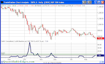
I haven’t mentioned the Capitualtive Breadth Indicator (CBI) for a while. For those unfamiliar it is a proprietary method of measuring the amount of capitulation evident in the market. You may read the intro post here or the entire series here. Since the November lows it has been pretty much dormant except for a quick blip in January. It began to move up last week and at Friday’s close it hit 7. Long-time readers will recall that this is a level where I feel a decent bullish edge exists. Below is a chart of the CBI from the Quantifiable Edges members section.

(click to enlarge)

In the past I’ve demonstrated that it can be used as a market timing tool for swing trades. One “system” I’ve shown here on the blog is to purchase the S&P 500 when the CBI hits a certain level (7 being one of them) and then sell the S&P when it returns back to 3 or below.

Below is an updated performance report of the above “system” covering 1995-present.

I’ll keep readers informed of significant changes in the CBI over the next several days until it returns to neutral.

Short-Term Oversold At An Intermediate-term Low Provides Bullish Edge

Short-term oversold at intermediate-term lows can be a powerful combination. Let’s look at the current situation. The 2-day RSI of the SPX closed basically right at 2. The SPX also closed at a 50-day low. Below is a test that shows how this combination has performed since 1985.

We see here a strong inclination for an almost immediate bounce. The edge is very short-term though as it begins to dissipate after just 2 days. Not seen in the table above is that an astonishing 30 of 31 instances closed higher than the entry price at some point over the following four days. The only failure was on March 25, 1994.

Mild Selloff After Sharp Drop Sets Up S&P For A Bounce

In the past I’ve found that weak bounces after strong selloffs have had bearish short-term implications. Wednesday’s action just missed the weak bounce as the S&P finished marginally lower. So tonight I looked at S&P performance following a sharp drop and then a marginally lower day. Below I show the 5-day return across a spectrum of possible % declines between 0 and X%.

(click to enlarge)

Rather than the bearish results found when the market undergoes a weak bounce, we see here that limited additional selling carries a bullish expectation over the following week. The edge remains fairly consistent regardless the level of decline between 0% and 1%.

Observations On NYSE Issuers 1929 – 2008

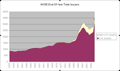
A reader pointed me to the data I needed to produce a graph going back to 1929 showing the total issuers on the NYSE. The data is annual and can be located on the NYSE’s website using the following link:

http://www.nyxdata.com/nysedata/NYSE/FactsFigures/tabid/115/Default.aspx

(click to enlarge)

A little difficult to see is that the total issuers peaked in 1930 and declined until 1934. The market bottomed in 1932. The next true bull market didn’t emerge until 1942 though. (The 1942 Dow low was at 1933 levels.) Issuers crept higher for 8 years before the next great bull market environment emerged in 1942. When that bull market emerged the pace of increase in new issuers did also – confirming the rapid economic expansion.

*Note that the breakout of U.S. / Non-U.S. was not available until 1956.

NYSE Total Issues Contracting

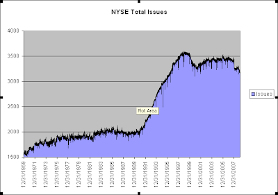
One number that has been hitting low levels lately is the number of issues traded on the NYSE. The chart below goes back to 1970, which is as far back as my database goes. During the difficult economic environment during the 70’s the total issues crept higher without much in the way of sharp rises or falls. Following the crash of ’87 the total issues only suffered a mild setback. The 90’s saw a rapid expansion in total issues. The 2000-2003 bear market saw a sizable contraction. In the last year there has been another fairly sharp contraction. With increased bankruptcies, floundering stock prices, and a dormant IPO market this number may continue to contract. A true economic expansion that could be accompanied by a multi-year bull market would likely see the IPO market revived and the NYSE total issues expand as well. I’d be wary of the sustainability of a bull market that saw continued contraction in the total issues traded on the NYSE.

(click to enlarge)

P.S. It would be interesting to see how this chart would look in the 30’s and 40’s. I haven’t been able to locate that data yet. Should any blog readers know a resource I’d be happy to link to it.