What The McClellan Oscillator Is Suggesting

The McClellan Oscillator is a measure of breadth developed by Sherman and Marian McClellan. If you are not familiar with the McClellan Oscillator I would suggest you familiarize yourself with it, as it can be quite valuable in assessing the market. Here is a link to the McClellan’s website. In general, strong breadth numbers (NYSE advancing issues minus declining issues) cause the oscillator to rise, and weak breadth numbers cause it to fall. A good portion of the time you’ll find the oscillator value to lie between -100 and +100.

As with most breadth and volume indicators, the value for the McClellan Oscillator varies a bit depending on your data provider. For instance, tonight the reading on the McClellan’s website was about -245, Tradestation was showing -240, and Worden Bros. TC2000 was showing -204. Since I was encountering some issues with the Tradestation data and don’t currently have the McClellan’s official historical database, I used the TC2000 data for tonight’s testing. TC2000 users may find it listed as T2106 on their symbol list. In general, the data provider doesn’t normally matter as long as you are consistent in your testing. The data goes back to 1986.

Readings of less than -200 are uncommon and often signal an impending short-term reversal. To illustrate I ran a few tests. The first one looks to buy the S&P 500 on any dip in the McClellan Oscillator below -200 and sell “X” days later. Results below:

Sixteen for seventeen 11 and 12 days out. High average trade. This appears to provide a quantifiable edge.
For the next test I devised a strategy that would buy when the oscillator dropped below -200 and then sell when it moved back above zero. Below is a screenshot of the performance report for this strategy.

Seventeen for seventeen with an average profit of 3.25% and an average holding period of 8 days.

The CBI isn’t the only breadth indicator suggesting an edge to the long side.

CBI Hits 7 – Some Hypothetical Results

The Capitulative Breadth Indicator (CBI) edged up to “7” today. As I’ve discussed many time in the past, this is a level where I typically begin to take on long index exposure. Below is a strategy report of the standard entry/exit technique I’ve discussed before of buying the S&P 500 when it hits “7” or higher and then exiting on a drop to “3” or lower. Under normal circumstances a bounce would likely arrive in the next few days. The question is whether this is one of those times where things are a little different and become a lot scarier – like August of 1998, September of 2001 or July of 2002. In cases like those you’d prefer not to get “all in” too soon.

All hypothetical trades in the below report were done with $100,000.

Draggin’ Breadth

Looking at the price changes in the major indices it might appear that Monday was a quiet day with little out of the ordinary. In fact, the higher closes in the S&P 500 and Dow masked some substantial selling that took place. Breadth was strongly negative on the NYSE, both in terms of advancers vs. decliners and in terms of up volume vs. down volume.

In fact up volume was nearly doubled by down volume. It made up less that 35% of the total of the two. I looked back to 1970 to see other times when up volume was less than 35% of up plus down volume while the S&P 500 closed positive on the day. I was fairly surprised to find only 4 other cases. They were 3/27/80, 1/25/82, 10/4/94, and 3/23/05.

To see what poor breadth on an up day may suggest I then loosened the requirements some. In this case I changed the requirement from 35% up volume to 45% or lower up volume. Below is a summary of the results.


It appears that the weakness in the broad market tends to act as a drag on the S&P over the subsequent two weeks. Whatever was holding the S&P 500 up in the face of the instance-day weakness eventually ends up falling as well.

On another note, the CBI moved up to “6” today. Any higher and we’ll be at levels where I normally being scaling into long index positions.

Market Scared – But Perhaps It Should Be

Tonight I’m just going to share a few quick observations that may put the current situation into perspective:

1) Brian C., sent me a study he did on VIX spikes hitting extreme levels. On Friday the VXO closed over 20% above its 10ma. I looked at this in a study and compared my results to his. They both said pretty much the same thing. More often than not the VXO spike leads to an S&P bounce fairly quickly. Those times that it doesn’t – watch out.
2) I looked back in history to find all the times when the S&P 500 gained at least 2% in one day and then lost all of its gains and more the next day – similar to this Thursday and Friday. No need for an elaborate display of the results here. It only happened once – March 24, 2003. In other words, 2% rises are simply not supposed to get wiped away in one day. There is no reliable precedent for what happens next.
3) The CBI didn’t budge and remains at “3”. This indicator remains neutral. In a market that is selling off in an unprecedented way I’d be more comfortable taking a shot on the long side if this was spiking. Perhaps with a few more days of selling, but right now I’m not seeing anything that is screaming buy.

Why You Need To Normalize The Put/Call Ratio

No time for research tonight. I spent the night at the Garden. Yeah Celts.

In lieu of a study, I instead prepared a chart of the CBOE Total Put/Call Ratio. One thing traders need to keep in mind when looking at certain indicators is that they may change over time. The put/call ratio is a prime example of that. The chart below is weekly. The green dots are the Friday closing prices of the put/call ratio and the brown line is a 40-week moving average.

Often times I hear traders refer to absolute levels in put/call ratios as if they are significant. What you can see by looking at the chart above is that “significant” has change over time. From ’97 to ’02 a “spike” in the ratio over 1.00 could have been viewed as significant. A trader seeing such a reading may conclude that fear among option traders was running high. Now a reading of 1.00 is below average. A reading of 0.5 would sure be significant, though. In 2000 it was about average. Strategies that may have been developed 7 or 8 years ago that looked for a move to a certain number are now likely obsolete. That doesn’t mean the put/call ratio has stopped working as an indicator, though.

The issue lies in the fact that the popularity and use of options for traders and institutions has changed over time. It will continue to change. To adjust for this you should normalize the readings over a certain time period and then compare the current readings to “normal”. There are a number of ways to do this. Comparing to a moving average using percentages is a simple and effective one. Another way to normalize the put/call ratios would be to use Bollinger Bands (try varying lengths). The specific method is not terribly important. The fact that it is done is important if you don’t want your strategy or study to become obsolete.

Nasdaq Stays Strong

Bank rumors and speeches from Bernanke turned a positive start to the day into an afternoon selloff. The Dow and S&P 500 lost all of their gains but the Nasdaq went virtually unscathed, with the Nasdaq 100 finishing over 1% higher. I looked back at all the times the S&P closed lower while the Nasdaq 100 closed at least 1% higher. Below are some summary statistics:

Additionally, about 86% of these instances closed higher than the trigger day close sometime in the next week.

You may also notice that some sentiment gauges like the put/call ratio and the VIX have spiked a bit in the last few days. Traders seem to be getting a bit jumpy. Compare this week’s selloff to the one two weeks ago and you’ll see the indicators spiking just as sharply or more so even though this selloff is more benign. That is generally a good thing.

Most everything I’ve been looking at since Monday says we are likely to bounce. There seem to be a few wildcards to keep in mind, though. The banks are one. They need to halt their freefall. Friday’s unemployment report is another. Markets tend to react to that report more severely than most.

When Months Start Bad

After shooting higher to begin the month the previous few months, the market decided to throw a curveball in June. These first two days have been a fairly rough start. I decided to see how SPY has historically reacted when the month got off to a bad start. For purposes of the test I shall define “bad start” as a down close the first 2 days and a loss of at least 1.5% over those two days.
Going back to 1993 I found 14 occurrences. Here are their stats over the next week:
Also notable is the fact that all 14 closed higher than the trigger day at some point over the next week.

Tough to put too much stock in a seasonal-type study like this one. (They are my least favorite from a trading perspective.) Still, combined with some other positives I’m seeing, such as last night’s breadth study and last week’s volume study, I’m inclined to believe we may see some upside sometime in the next few days.

This Setup’s Been Favorable Since The Last Time They Met In The Finals

The market sold off fairly hard on Monday with decliners swamping advancers by more than 2 to 1. Volume was light, though.

I ran a test to see how the S&P has reacted following a day when it was down at least 1% on 2:1 or higher declining breadth. What was most interesting about this test is that results were significantly different in the last 21 years than they were before that. From 1960 up until the Crash of ’87 the results were as follows:

From the Crash of ’87 until today they look like this.

Buying and holding for a week after such a day would have been a winning strategy every year since 1987 except in 2006. Prior to that – consistent loser. In case you’re wondering, using lower volume as a filter improved results slightly.

I’m not sure why the change. Perhaps the Crash changed the psyche of the market. Traders may have decided if it could bounced back from that, it could bounce back from anything – and so dip buying became fashionable and profitable.

Whatever the reason, since 1987 days like Monday have fairly consistently provided an upside edge over the next couple of weeks.

And speaking of 1987…they’re baaaaack!

Put/Call Drop

After spiking a little the week before last, the CBOE Put/Call Ratio dropped fairly sharply over Wed-Fri. Below is a study I ran last night showing the implications of similar drops:

Not the most bearish study I’ve ever seen, but it hints that the market may struggle to add to its gains over the next 2-4 days. I’m seeing some warning signs that the going could be tough here very near-term. Caution may be warranted.

Friday also posted an “inside day”. If you’d like to review possibe implications of this, you may want to check out the old inside days studies.

Subscriber Letter Results For May

Below are the summary results for the trade ideas that were closed during the month of May. Results in May were above average in most areas.

A few notes:

The above results do not include currently open trade ideas.

All trade ideas come with specific entry and exit criteria and are tracked daily.

All trade ideas are in highly liquid stocks and ETF’s. The Quantifiable Edges Subscriber Letter does not deal with small caps.

All trade ideas are quantified through testing prior to entry. Subscribers may use the backtest results to help judge whether the idea may be appropriate for them.

This is not a performance report. I don’t know subscriber’s financial situations and risk tolerances. Therefore I do not suggest trade sizes.

There are essentially 3 kinds of trade ideas: 1) CBI trades, 2) System trades, and 3) Index trades.

For those that may be interested in the Index trades, they mostly use the S&P 500. All S&P index trades are entered using SPY. I don’t use leveraged etf’s like SDS or SSO to juice the performance numbers. Many times I will suggest scaling in to these trades in either 3 or 4 parts. Below are all SPY trade ideas that received fills since the 2/19/2008 inception:

If you’d like to either take advantage of Quantifiable Edges market timing, track the individual trades that construct CBI, or learn new systems (like this one) whose code is available for subscribers to download into Tradestation, you may want to give the Quantifiable Edges Subscriber Letter a look. For a free 3-day trial simply send an email with your name and email address to QuantEdges@HannaCapital.com For further information or to subscribe, click here.

A Volume Pattern That Makes A Huge Difference

On Thursday the market finished higher for the third day in a row. In my “Count To Three” post back in February I showed how 3 higher closes when the market is trading below its 200-day moving average has a negative expectation over the next week or so.

Below are some more detailed statistics of how the market has responded to this pattern:

So the move we’ve seen over the last 3 days creates a negative expectancy in the near future, right? Not so fast. Notice how NYSE volume rose over the prior day on both Wednesday and Thursday. Higher volume on up days is supposedly a good thing. So let’s break it down further.

In this next table I show all instances when our volume pattern of rising two days in a row didn’t occur:


In this case things look even worse.

So now let’s look at those times when the supposedly positive volume pattern of the last two days played out:


Quite a striking difference. The increasing volume changed the expectation of the price pattern from strongly negative to solidly positive. This is an example of why traders should not simply look at price in a vacuum.

Those who would like to see more research on how the market reacts following rising or falling periods may want to check out Dr. Steenbarger’s recent interesting post on the subject.

Also, for those that may not have noticed, the CBI dropped back to “3” today. This puts is back in what I consider to be a neutral state. The “5” reading I discussed a couple of days ago turned out to be a winning signal – perhaps a good sign for the market that pullbacks may be less severe than they were in late 2007 – March 2008. We’ll see.

Do The Banks Need To Lead The Next Rally?

There is a school of thought that says the banks and financials got the stock market into this mess and they will likely need to lead the market out of it. The sectors that get beat up the most on the way down do tend to bounce the best off the bottom, and it would seem difficult for the market to kick off a strong bull phase without at least some participation from the banks. Expecting them to lead may be a bit much, though. Let’s take a historical look at the BKX vs. the SOX from a relative strength standpoint. I use the SOX here because of its reputation to lead.

The current ratio of the BKX to the SOX is about 0.18. On January 1st 1995 it was also about 0.18. It has traveled quite a bit to get nowhere. In early July of ’98 the ratio hit a high of close to 0.36 and in March of ’00 it hit a low of about 0.05.

In the chart below I show the S&P 500, the BKX and the SOX. At the bottom of the chart is an intermediate-term relative strength measure. It looks at the current ratio as opposed to the 20-week moving average. When the red line is above the blue, that means the BKX is outperforming the SOX. When the red line is below the blue, that means the SOX is outperforming the BKX.


Since the beginning of January 1995 the S&P 500 has gained about 924 points. (I did these calculations mid-day on Wednesday.) When the SOX has outperformed the BKX the S&P has gained 1264 points. When the BKX has outperformed the SOX, the S&P 500 has lost 340 points. The BKX has spent roughly 6 years and 2 months leading and 7 years and 3 months lagging.

What if we compare the BKX to the S&P 500? This may provide a better picture of leader/laggard without worrying about the SOX. The BKX/SPX ratio is about 0.054 now. In January 1995 it was 0.056. In this case the S&P has gained about 979 points when the BKX was a laggard, and lost 55 points when the BKX was a leader. Not quite as severe, but the point remains the same – historically the BKX has not been a leader of strong rallies. The market may have trouble rallying strongly without faith in the banks, but that doesn’t mean these classic laggards will all of a sudden become powerful leaders.

The CBI Wakes Up

The CBI has begun to wake up this past week. For those new to the blog CBI stands for Capitulative Breadth Indicator. An introduction to it is here. A list of posts here. Completely dormant since dropping to “0” on March 24th, it has perked up in the last week and reached “5” today. “5” is the first level where I normally begin to pay attention. First I’ll show some raw numbers and then I’ll offer a few thoughts.
Generally the higher the CBI the higher the percentage of qualifying large-cap stocks that are undergoing extreme selling and likely to bounce. When you get a broad group of stocks primed to bounce, it usually hints at a market that is likely to bounce as well. A CBI trade normally consists of entering an index position when the CBI hits a certain threshold (5, 7, and 10 are the ones I typically look at) and exiting when it returns to a neutral state, normally defined as a reading of 3 or lower.

Below is a performance report showing what would have occurred had you bought the S&P 500 whenever the CBI hit 5 and then sold when it returned to 3 or lower. It goes from January 1995 to present and does not include dividends, commissions, or slippage. All trades were executed at the 4pm close and assume $100,000 per trade.


As you can see, even a CBI of 5 can provide the tools for a pretty robust system. I don’t typically use a 5 as a reason to go long, though. I do use it as a reason to avoid entering new short positions and tightening stops on old ones. I prefer to save most of my ammo for more significant cluster sizes like 7 or 10 depending on my overall market outlook.

Recent action for a 5 reading has been sub-par. Four of the last five occurrences, dating back to July 2007, have been losers. Prior to that, from April of 2005 through June of 2007, there were 11 trades – 10 of which were winners. A possible reason for this is that the recent period has seen much more severe selloffs. The mid-2005 through mid-2007 period saw mostly shallow pullbacks.

My current market analysis suggests patience. I’d rather wait for a higher reading before becoming too aggressive. On the other hand, the moves up can be quick and powerful so I wouldn’t want to be caught short right now either. This particular indicator does indicate a short-term upside edge.

Significance

One term that sometimes gets mentioned here by me and others via the comments section is “significance”. It is a statistical term that most readers are likely familiar with but many perhaps do not fully understand. Rather than try and explain it myself, below I have pasted an excerpt from the late Arthur Merrill’s August 1986 newsletter. It was passed along to me from a colleague a while back. I found it to be clear, concise, and a much better explanation than I could possibly write:

If, in the past, the records show that the market behavior exhibited more rises than declines at a certain time, could it have been by chance? Yes. If a medication produced cures more often than average, could it have been luck? Yes.

If so, how meaningful is the record?

To be helpful, statisticians set up “confidence levels.” If the result could have occurred by chance once in twenty repetitions of the record, you can have 95% confidence that the result isn’t just luck. This level has been called “probably significant.”

If the result could be expected by chance once in a hundred repetitions, you can have 99% confidence; this level has been called “significant.”

If the expectation is once in a thousand repetitions, you can have 99.9% confidence that the result wasn’t a lucky record. This level has been called “highly significant.”

If your statistics are a simple two way (yes-no; rises vs declines; heads-tails; right-wrong), you can easily determine the confidence level with a simple statistical test. It may be simple but it has a formidable name: Chi Squared with Yates Correction, one degree of freedom!

Here is the formula:

Χ2 = (D – 0.5)2 / E1 + (D – 0.5)2 / E2

Where D = O1 – E1 (If this is negative, reverse the sign; D must always be positive)
O1 = number of one outcome in the test
E1 = expectation of this outcome
O2 = number of the other outcome
E2 = expectation of this outcome
Χ2 = Chi squared
If above 10.83, confidence level is 99.9%
If above 6.64, confidence level is 99%
If above 3.84, confidence level is 95%

An example may clear up any questions:

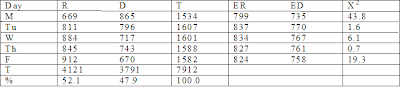
R = number of times the day was a rising day in the period 1952 – 1983
D = number of times it was a declining day
T = total days
% = percent
ER = Expected rising days
ED = Expected declining days

Overall, there were more rising days than declining days, so that the expectation isn’t even money. Rising days were 52.1% of the total, so the expectation for rising days in each day of the week is 52.1% of the total for each day. Similarly, ED = 47.9% of T.

For an example of the calculation of Χ2, using the data for Monday:

O1 = 669
E1 = 799
O2 = 865
E2 = 735
D = 669 – 799 = -130 (reverse the sign to make D positive)

Χ2 = (130 – 0.5)2 / 799 + (130 – 0.5)2 / 735
= 43.8, a highly significant figure; confidence level is above 99.9%

If expectation seems to be even money in your test, such as right/wrong), the formula is simplified:

Χ2 = (C – 1)2 / (O1 + O2)

Where: Χ2 = Chi squared
C = O1 – O2 (If this is negative, reverse the sign, since C must always be positive)
O1 = number of one outcome in the test
O2 = number of the other outcome.

[Chi squared is not always the correct statistical tool. When the number of observations is less than 30, Art used a test based upon the T-table statistic:]

The problem: In a situation with two solutions, with an expected 50/50 outcome (heads and tails, red and black in roulette, stock market rises and declines, etc.) are the results of a test significantly different from 50/50?

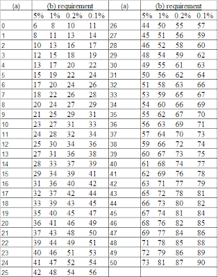
Call the frequency of one of the outcomes (a), the frequency of the other (b). Use (a) for the smaller of the two and (b) for the larger. Look for (a) in the left hand column of the table below. If (b) exceeds the corresponding number in the 5% column, the difference from 50/50 is “probably significant”; the odds of it happening by chance are one in twenty. If (b) exceeds the number in the 1% column, the difference can be considered “significant”; the odds are one in a hundred. If (b) exceeds the numbers in the 0.2% (one in five hundred) or 0.1% (one in a thousand), the difference is “highly significant.” Note that the actual number must be used for (a) and (b), not the percentages.

Example: In the last 88 years, on the trading day before the July Fourth holiday, the stock market went up 67 times and declined 21 times. Is this significant? On the day following the holiday, the market went up 52 times and declined 36 times. Significant?

For the day before the holiday, (a) = 21 and (b) = 67. Find 21 in the left hand column of the table; note that 67 far exceeds the benchmark numbers 37, 43, 48, and 50. This means that there is a significantly bullish bias in the market on the day before the July Fourth holiday.

For the day following the holiday, (a) = 36 and (b) = 52. Find 36 in the table. The minimum requirement for (b) is 56; 52 falls short, so that no significant bias is indicated.

Table for Significance of Deviation from a 50/50 Proportion: (a) + (b) = (n)

This is essentially the T-table statistic. It should be used instead of Chi Squared when the number of observations is less than 30.


Source: Some of the figures were developed from a 50% probability table by Russell Langley (in Practical Statistics Simply Explained, Dover 1971), for which he used binomial tables. Some of the figures were calculated using a formula for Chi Squared with the Yates correction.

In the next few days I’ll offer some opinion on the importance and use of significance testing.

WR7 NR7 is back

On April 15th I showed what happens when a wide range selloff is followed by a narrow range day. (Hint: it appears to be bullish for the Nasdaq 100.) You can re-read that post here.

For those with Tradestation who would like to download and play with that study tonight, I have just reduced the price from $12.00 to $2.00. It comes with an .eld to import and a pre-set workspace. All open code. Click here to go to the studies page.

In my recent post on system discussion the other day I neglected to mention the new work BZBtrader is doing. If you haven’t visited his blog in a while, it’s changed a bit in the last couple of weeks as he is now starting to focus on system trades as well as his normal QQQQ stuff.