One thing traders need to keep in mind in the current environment is that when the market is bouncing off of intermediate-term lows it is more likely to get overbought and STAY overbought than when it’s simply consolidating in a downtrend. Shorting bounces off lows typically carries an extra level of risk because of this.
Let’s look at the how the market set up as of Tuesday’s close as an example. SPY closed higher 3 days in a row. Tuesday was the narrowest range in the last 5 days. When trading under the 200-day moving average, this combination can signal the market is likely to pull back. See the test below:
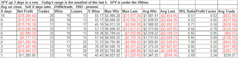
The propensity to pull back is most pronounced over the first 4 days.
Now let’s break down the above results a little differently. First let’s look at times the SPY set up as above but was NOT coming off a 50-day low:
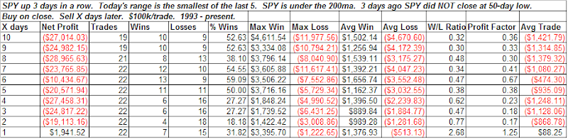
Results here are decidedly more negative than in the original study. Two days out for example there are only 18% winners.
Now let’s look at the first setup again, but this time we only want to see those trades that were coming of a 50-day low:
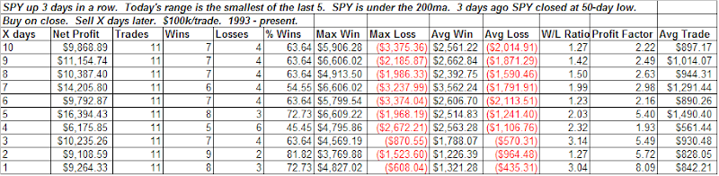
There is no longer a bearish edge to the setup. In fact, there appears to be a bit of a bullish one. Now 2 days out there are 82% winners. (Although instances are low and that’s not really the point.) The point is that it is much more dangerous to short a market coming off of fresh lows. This is especially true when the lows occurred on extremely oversold conditions.
While previous attempted rallies did quickly roll over the last 2 months, that’s not always the case. Examples of oversold bounces off lows that would have been especially dangerous to short include August 2007, October 2002 and September 2001.


