Columbus Day Performance
Considering This Morning’s Gap
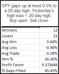
The SPY is looking to gap up over 1% as I write this. It has also closed higher 3 days in a row. Back in April I looked at large gaps up after the market ha already risen. This study suggests risk/reward favors the downside should SPY gap more than 1% this morning. The fact that the SPY closed within a range rather than at a 10-day high makes it a little less encouraging.. Overall, should this gap hold until the open, I would estimate a mild edge to the downside from open to close.
What’s Happened To "2 Days Up In Chop"?
A few weeks ago I discussed the performance of the “2 Days In Chop” systems. After doing extremely well through June, I noted the systems had faltered a bit lately. The primary reason for the struggle over the last few months has been that the “2 Days Up In Chop” system has done poorly.
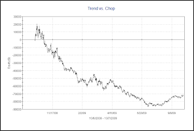
Below is an equity curve of “2 Days Up In Chop”.
The poor performance of “2 Days Up In Chop” can be attributed the strongly trending rally that has taken place. “2 Days Up In Chop” triggered again on Tuesday afternoon. I effectively suspended use of it as an indicator a while back. Should the market top out or enter a period of consolidation, or even simply undergo a deceleration in its uptrend, then “2 Days Up In Chop” may begin working again. I’ll continue to monitor the equity curve as a gauge of market behavior. Equity curves of simple systems such as this are a nice way to look under the hood of the market and understand what’s working and what isn’t in the current environment.
The Trend vs. Chop equity curve is one I update weekly on the subscriber site. It shows the effect of buying all up days and shorting all down days. In a choppy environment the line will fall. A rising line suggests a more trendy environment. For more discussion on this chart you may see this post from a little over a year ago. A current chart is below.
As you might suspect, the strong move up has been accompanied by unusually trendy behavior.
Deceleration of Decline Suggests Bounce
When there is a rapid deceleration in what was once a sharp selloff that often indicates a bounce is near. I’ve shown some examples of this concept over time. One way to look at deceleration would be by looking the size of the bars. Friday’s Quantifinder found the following study from the 6/24/08 blog. This study uses WR7 and NR7 days. A WR7 is a day whose range is the widest in the last 7 days. An NR7 is a day whose range is the narrowest in the last 7 days. All stats are updated.
This study suggests a decent upside edge over the next week-plus. One aspect of this study that I find particular appealing is that it has been consistent over time. Below is a profit curve using a 5-day exit strategy.

The consistent upward slope shown here is preferable to a jagged equity curve or one where most of the profits were made in a small number of trades.
Bad Ends To The Quarter
Below is an excerpt from a special report that was sent to subscribers yesterday around noon. This study examined performance after the SPX declined the last 2 days of a quarter.
86% of instances were trading higher 2 days later and the average trade was 1.2%. This suggests a decent upside edge for the next couple of days.
A more detailed look at this study may be found in last night’s Subscriber Letter. To view it in full you may take a free trial. If you have trialed Quantifiable Edges before but not since 6/1/09 you may send a request to support @ quantifiableedges.com (no spaces).
Low Volume When The Market Rises Strongly
I showed yesterday how a very-low volume day during a decline can often lead to a short-term reversal. Today I will review a study that first appeared in the blog on 5/13/2008. It looks at extremely low volume on strong up days – like Monday. (Volume studies typically use the symbol $TVOL in Tradestation, which is their measure of NYSE volume. This is what is being used in the below study.)
We’ve seen several studies like this over time and many of them were identified by the Quantifinder on Monday. With so many studies confirming each other, it seems the downside edge in these very low volume rises is for real. One caveat with Monday’s action though is that it was Yom Kippur, meaning a lot of traders were out of action and somewhat lower volume could be expected. Still, it’s been a steady enough edge that I decided to it was worth review.
Friday’s Very Low Volume Provides An Upside Edge
One hint from Friday that suggests a bounce is likely is the fact that volume came in very low. It was the lowest volume in over 2 weeks. Below are some tests which demonstrate the potential importance of this.
First, let’s look at 3 day pullbacks that don’t occur on extremely low volume.
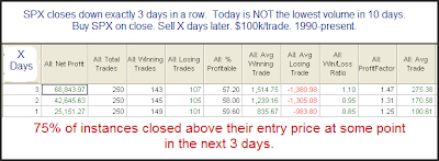
As you can see there is a slight upside edge. The % winners were between 57% and 60% and the average gains days 1-3 were between 0.1% and 0.275%.
Now let’s look at times were the volume was extremely low:

Here the upside edge is significantly stronger over the next few days. The % winners were between 68% and 76% and the average gains days 1-3 were between 0.59% and 0.94%. The reliability of a bounce occurring at some point in the 3 day period increased from 75% to 87%.
Volume can often provide some valuable clues. For more volume-related analysis, you can check out the volume label on the right hand side of the blog.
Fed Day Selloffs
Wednesday’s Fed day reversal acted much like the one that appeared on April 30, 2008. The May 1, 2008 blog featured a couple of studies that were relevant again today. They were just some of what the Quantifinder identified as relevant last night. I re-ran those studies below. This 1st one looks at times the SPX made a 20-day high and then closed in the bottom 10% of its daily range.

There appears to be an upside edge here. Although it isn’t the most powerful edge we’ve seen it still appears to suggest bullish inclinations over the next few days and weeks.
Also in that May 1, 2008 blog I looked specifically at Fed days that closed in the bottom 10% of their daily range. I re-ran that study as well tonight.
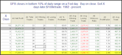
Much of the edge here appears in the first day. Poor closes on Fed days have rarely seen significant follow through in the coming days. More often the selling is viewed as an overreaction and the market is able to rebound a bit.
If you’d like to trial Quantifiable Edges premium services including the Quantifinder and the Subscriber Letter you may sign up for a free trial here. (Those that have trialed before but not since the Quantifnder was released in June may email support @ quantifiableedges.com (no spaces) and I’ll be happy to set you up with a new trial.)
A Long-Term Look At Fed Days
Below is a long term chart of market performance on scheduled Fed days. I didn’t include non-scheduled meetings. Those are generally surprise rate cuts that are aimed at boosting the market. They’re inherently bullish yet unpredictable since the meetings aren’t scheduled. Therefore there is no point in including them in this study.

Over the last 27 years there’s been a persistent upside edge. The average Fed day has ourperformed the average day by about 7.5 times.
For more studies on Fed days make sure to check out the Fed day link.
Last Week’s Equity Put/Call Ratios Suggest A Pullback
The CBOE Equity put/call ratio was consistently low last week. The 5-day average is 0.53, which is nearly 22% below the 200-day average of 0.68. When the 5-day average gets extremely low as it is now that can lead to a short-term market pullback. Below is a study that exemplifies this.
Most notable and also most compelling about this study is the fact that all instances have occurred after the March bottom. Prior to that the 5-day ratio had never stretched 20% below the 200-day. This is another example of just how extreme the current bull move has become. It also makes the results that much more impressive from a negative standpoint since they were achieved during a 60% run-up in the market.
The 2009 Rally – Breadth Without Compare
Yesterday I looked at Worden Bros. T21111, which measures the number of stocks trading at least 2 standard deviations above their 200ma. As you’ll recall, it was hitting an all-time high. (Data goes back to 1986.)
With Wednesday’s big rally, we are now seeing even more extraordinary numbers. Not only is T2111 up to 58.51%, but T2112, which measures the % of stocks trade at least 2 standard deviation above their 40-DAY moving average, is also in record territory. It is showing that a remarkable 57.19% of stocks are now stretched far above their 40-ma’s.
The action in T2112 truly exemplifies the uniqueness of the rally since March. Below is a long-term look at the indicator. Note that from 1986 through 2008 the highest reading this indicator ever registered was 37.22% in November of 2004. That record has been blown away repeatedly over the last 6 months.
Let’s now zoom in on this year to better see what I’m saying.
Never Have So Many Stocks Been So Stretched Above Their 200ma.
Near the end of August I discussed that some of the breadth measures tracked by Worden were near all-time highs. This situation corrected itself as the market embarked on a brief selloff. Tonight two of their indicators actually registered their highest readings ever. These are T2109 and T21111 which track the number of stocks 1 and 2 standard deviations above their 200-day moving averages. Below is a long-term chart of T21111 with full history of the indicator going back to 1986.

I marked on the chart the 4 other instances that came close to the current reading. What you may notice is that these spikes were generally brief. Every case was followed by at least a mild selloff that worked off the severely overbought conditions. In no case did the extreme spike mark the end to the bull market that created it. It’s dangerous to read too much into only 4 instances, but a short-term pullback does seem reasonable. The current reading does not suggest a long-term top, though.
The 1st Profitable Close Exit Strategy – When It’s Appropriate
Today I just want to touch briefly on the exit parameters for the “2 Days In Chop” systems that I discussed yesterday. The exit strategy is basically a time stop married with a “first profitable close” exit. For many traders, a “first profitable close” exit may seem like nothing more than a ploy to inflate the winning % of the system and not an appropriate exit technique to put into practice.
Sometimes this is true. In other cases though, the 1st Profitable Close exit is appropriate and effective. “2 Days In Chop” is one of those cases. Recall the premise of the system was based on taking advantage of the extremely choppy market conditions that had been identified. It’s those choppy conditions that make the 1st Profitable Close strategy viable.
When conditions are especially choppy and the market is constantly swinging back and forth, the expectation is for that chop to persist. This would suggest a move in the direction of the trade is more likely to be reversed than to follow through. So with a system like “2 Days in Chop”, the expectation flips as soon as the trade becomes profitable. Since a reversal is more likely than continued follow through the correct play is to take the quick profit.
Obviously an exit strategy like this only works well when trading a reversal / mean reverting system in a choppy environment. In a different environment, or if trading a breakout system, an exit strategy that looks for quick profits would be a disaster.
Other techniques that work well when trading overbought/oversold conditions would include using a short term oscillator and waiting for that oscillator to revert back to a neutral state, or using a short-term moving average (such as a 5-day) and then exiting the trade on a cross of the moving average.
2 Days In Chop Systems – 1 Year Later
Long System (2 Days Down In Chop):
1) Buy the SPX any time it closes lower 2 days in a row.
2) Sell the 1st profitable close up to 3 days later.
3) Sell on the 3rd day regardless of profitability.
Short System (2 Days Up In Chop):
1) Short the SPX any time it closes higher 2 days in a row.
2) Cover the 1st profitable close up to 4 days later.
3) Cover on the 4th day regardless of profitability.
A few quick notes:
At the time the market was locked in a downtrend which is why I gave the shorts an extra day.
I noted the systems were very raw and were not something I would trade “as is”.
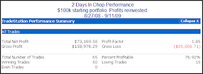
Below I will show the combined performance of the 2 systems since I introduced them. In upcoming posts I’ll discuss how I use the systems and also discuss some thoughts on them and some ideas in which the basic systems could be improved.
Here is the performance over the last year +.
A 73% return would seem very impressive for something so simple. It has had a bit of a drawdown lately, though. Below is a profit curve.

The system peaked on 6/22 and has had a few rough trades as of late. Still, the recent drawdown is very small compared to the overall gains of the system.
So why haven’t I simply traded the system “as is” for the last year? I guess you could say that I’m just not smart enough to blindly trade a system this dumb.
I’m getting a little smarter, though. And I’ll have more in upcoming posts.

