What A Very Weak Early TICK Has Led To In The Past

The market is off to a horrible start today. Back in November I looked at days that started off strong and did not register a negative TICK reading for the entire first half-hour. Strong starts often led to strong finishes. Today there were no positive TICK readings for the 1st half-hour. This kind of weakness happens quite rarely. When it has occurred in the past, it’s made for some very rough days. Below are statistics showing the 10am – 4pm EST performance after such weak starts.


Certainly not a knife you want to normally try and catch.

For those who would rather view it as a short-selling opportunity, here’s how it looks from the short side.


No matter how you view it, very weak starts like today tend to carry big risk and little reward for the bulls for the remainder of the day.

Low Volume Bounces Since July

Yesterday I showed a study that demonstrated how Monday’s low volume at the beginning of the bounce was in fact bullish, and not bearish. This is something that many people have difficulty believing. For the more visually inclined I’ve created a chart below that examines many of the moves up since July.

(click chart to enlarge)

Note that in basically every instance where the market was coming off a strong pullback, technicians could’ve complained about the volume. Volume can be a useful indicator, but it is constantly overvalued and misinterpreted. It’s certainly possible that this bounce could roll right over and substantial downmove could ensue. If it happens it isn’t because of the relatively low volume the last 2 days.

How Does Monday’s Low Volume Affect The Bounce Chances?

NYSE volume came in at the lowest level in over 2 weeks as the market rallied on Monday. Conventional wisdom suggests this low volume is a bad sign and it hurts the chances for a further bounce/rally. I’ve seen many comments in the last 24 hours stating the bounce cannot be trusted because of the low volume. So below is one test I ran examining this theory.


I compared these stats to days when volume was not at a 10-day low and they are quite a bit better here. From this standpoint it doesn’t seem the low volume is any kind of a warning sign. In fact it appears this setup provides a bullish edge. Perhaps very weak volume leaves just enough doubters that they end up chasing the market higher over the next several days as they become more convinced.

4 Lower Lows Above The 200ma

The SPX has now made 4 lower lows. In the May 9, 2008 blog I showed a study that examined 4 lower lows. It broke it out above and below the 200ma. Updated results above the 200ma are below:

Results here are fairly bullish. This is just one of several studies I am following at the moment. The vast majority are suggesting a short-term upside edge. A word of caution that I’ve been discussing in the subscriber letter is that the market has been acting abnormally for the last 5-6 days. This increases risk and traders must decide how they want to handle it.

From A 50-Day High To A 50-Day Low In 8 Days

Amazingly, Thursday’s close marked a 50-day low in the S&P. It was just last week that the S&P closed at a 50-day high. Moving from a 50-day closing high to a 50-day closing low so quickly is quite rare. I only found 6 other instances. Unfortunately, while it appears rare, it doesn’t appear predictive. Below is the stats table.


Examining the individual charts left me with no deeper insights. I’ve listed the dates of each instance in case anyone else would like to have a closer look.

Poor Closes Going Into A Fed Day

Wednesday is a Fed Day. I’ve written a lot about Fed Days and they’ve historically shown a positive bias. Despite this bias they represent an event that is often anticipated with some anxiety by market participants. This anxiety is natural as participants await potentially market-moving news. What’s interesting is that those times where anxiety is the highest have typically proven much more profitable. To demonstrate this I examined where the SPY closed within its daily range. I used SPY rather than SPX for this test because the daily range is typically more accurate with the ETF thanks to the staggered market opening. Below are all times like Tuesday where the SPY closed in the bottom 25% of its daily range prior to a Fed Day.


Stats here are strongly bullish. Last night’s Subscriber Letter examined the results in even more detail. It also showed what happens when SPY closes in the TOP 25% of its daily range on the day before a Fed Day. You may sign up for a free trial subscription by clicking here if you’d like access to that report.

You may also check the Fed Day label to see previous blog posts about Fed Days.

Poor Breadth On Bounce Somewhat Discouraging

I’ve shown numerous studies over the last couple of years that illustrate weak bounces from oversold conditions are often followed by downside.

A study that appeared in last night’s Quantifinder is an example of this. The study was last shown in the 6/24/09 blog post and is updated below:

Notable about the above study is that 4 of the last 5 instances showed positive returns 5 days out. The one instance that never closed below the entry was the last instance on 11/2/09. Still, the stats are convincing enough that I’m not inclined to completely ignore them.

Gaps Up From 10-day Lows

SPY is set to gap up just over 1% as I type this morning. I’ve shown before that large gaps up from low areas will often spark short covering rallies. Let’s look at some stats. First, here is a look at 1% + gaps up from 10-day lows (all stats look at the last 17 years):

Decidedly bullish edge here. The average loss size suggests risks are high, though.

Buy what if the market pulls back and the gap up is only between 0.5% and 1%?

Now you’re looking at basically a coinflip.

Why I Always Look Deeper Than The Stats Table

The evidence I most often show when illustrating a study is a statistics table like the one below. But it’s not all I look at and it never tells the whole story. In the subscriber letter I’ll often go into more detail on some of the studies. Tonight I thought I’d show an example of one study whose stats table I consider to be a poor representation of the truth.

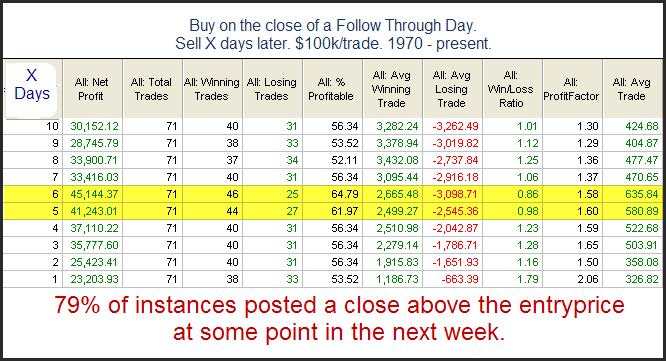
Tuesday’s rally was the biggest % gain in at least 10 days. It followed Friday’s selloff which was the biggest % drop in at least 10 days. With the market trading above the 200ma and a new 10-day high being made on Tuesday, it made for an unusual setup. Below is a stats table showing similar setups in the past.


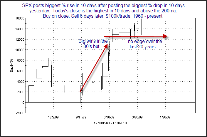
From the stats table it appears there is a fairly strong inclination for more upside over the next several days. Now let’s zoom in a bit on some of the results. I chose to zoom in on the 6-day here exit since that had the highest win %. Below is an equity curve with the 6-day exit strategy.

While the surface stats looked good, this chart tells a much different story. For one, there haven’t been any instances in nearly 10 years. Also, the 10 years prior to that there were only 5 instances and the return from them was breakeven. In other words, it’s been over 20 years since any edge has been exhibited by this study. In fact, just about the entire “edge” appears to be thanks to the 80’s. So while the initial results looked substantially bullish, this is definitely not a study that I would want to base a trade on. Traders who conduct their own studies should keep this lesson in mind. It’s important to carefully examine all results and not jump to conclusions based of the first set of numbers.

2 Up Days In A Market Dominated By Upside Momentum

In August of 2008 I wrote about a simple system that looked to take advantage of the choppy market environment by shorting any time SPX closed up 2 days in a row. I tracked the system and used it as an indicator in the subscriber letter from August of 2008 until August of 2009. In August of 2009 it was becoming apparent that the market had shifted from one dominated by chop to one dominated by upside momentum. In last night’s subscriber letter I ran some studies that showed just how dominant short-term momentum has become. Below is one of those studies:

We see here that since the middle of August, 11 of the 12 times the market has gone up 2 days in a row it has managed to follow through with more gains the next day. It’s also shown a profit 2 days later on 11 of 12 occasions. Shorting 2-day upmoves has been an exceptionally poor strategy in this environment. There are at least a couple of ways traders could use this information. 1) They could look for strategies that try and take advantage of this kind of momentum. 2)They could also simply monitor the action of “2 Up Days” going forward to try and get a feel for when momentum may be waning and the environment changing.

If you’d like to see more on my recent short-term momentum study, you may take a free trial of the Quantifiable Edges Subscriber Letter by clicking here (email address required).

Declining SPY Volume At New Highs

Over the holidays it was easy to ignore the low volume and dismiss it as typical holiday traffic. Traders may have now returned but trading volume is still lacking. The low volume isn’t blatantly obvious because it’s still higher than it was during the holidays. Still, it’s definitely going in the wrong direction here. Below is a study I looked at last night using SPY.

The edge isn’t huge here but it does suggest a bit of downside is likely in the very near future. (And based on the futures the pullback could be starting this morning.)