Using QE to Your Advantage – Subscriber Tools, part 2
In the last installment of “Using Quantifiable Edges to Your Advantage” I began discussing some of the tools available to subscribers. In that post I discussed the Catapult & CBI in great detail. Today I will review several other tools available to subscribers (though not in as much detail). I’ve discussed several of these before so blog readers may be familiar with some of the below.
The Aggregator – Much of my market bias is determined by the studies I conduct and consider “active”. The Aggregator is the tool I developed that weighs the estimates from those studies and gives me a bottom line bullish or bearish expectation. I also use a separate calculation called the Differential that measures recent market performance versus recent expectations. The Aggregator is the number one tool I use in determining my bias and setting up my index trades. More information on the Aggregator can be found by clicking the link below.
https://quantifiableedges.blogspot.com/2008/07/quantifiable-edges-aggregator.html
The Quantifinder – Over the course of the last three years I have published over 1000 studies in either the blog, the subscriber letter, or both. Studies that appeared to me to either have a substantial edge or to be notable and worth reviewing in the future are included in the Quantifinder. The Quantifinder is an engine that examines the current day’s market action and determines whether any of about 900 studies would trigger based on today’s action. Any studies that appear pertinent are automatically referenced and a link is provided so that users can go back and read what I wrote about the current setup the last time it occurred. More detailed information on the Quantifinder can be found by clicking the link below.
https://quantifiableedges.blogspot.com/2009/05/quantifinder-unveiled.html
The Numbered Systems – Quantifiable Edges subscribers have access to 11 different mechanical systems. These systems are designed for trading either large cap stocks or ETFs. Each night I publish a spreadsheet that shows any stock among the S&P 500 or any ETF among the 100+ on my ETF list that has triggered one of the numbered systems. Each system has its own webpage that comes complete with detailed rules for entry and exit. Also on the webpage is Tradestation code for each system. Subscribers may take the code and use it for their own testing, or they may change it-using it as a starting point to develop one of their own systems. (Those who are interested in developing their own systems and testing across a large group of securities using Tradestation will find detailed instructions on the website on how to do so.)
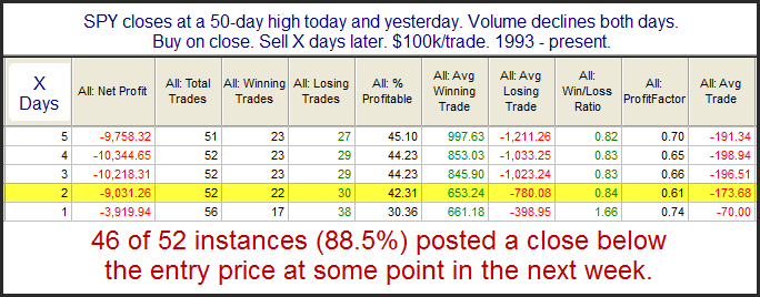
The Charts Page – Quantifiable Edges tracks a number of unique indicators on its charts page. These include indicators such as the CBI, the 3/10 Offset HV, the Volume SPYX indicators, and more.
The Archives – The Quantifiable Edges Subscriber Letter is now three years old. Over the last three years there has been some amazing market action which has led to a massive amount of research. All of Quantifiable Edges past letters and published research are available to subscribers for easy viewing in the archives section of the website. Many subscribers find themselves reviewing old letters thanks to being sent there by the Quantifinder, but if you feel current action is similar to something you’ve seen over the last few years and you want to see what research I was discussing then, you can simply pull up those letters on the archives page.
The Downloads Page – Over the last three years I have created a number of studies and special reports. Several of these along with special coding and spreadsheets can be found on the downloads page in the members section of the website.
Educational Videos – in 2010 I began hosting webinars for subscribers once or twice a month. In these webinars I discuss topics such as the Aggregator, the Catapult System, how to run back tests across large lists of securities, POMO indicators, day trading opening-range breakouts, and more. I have archived many of these webinars and made them available for subscribers to view any time.
Proprietary Data Download – Subscribers that like to do their own tinkering and development can download historical data on several Quantifiable Edges indicators. Data is available for the Volume SPYX indicators, the CBI, and the Aggregator.
The Subscriber Letter – The tool most utilized by subscribers is the nightly letter. It arrives nightly and is complete with my research and studies for the day along with my interpretation of recent studies. The Aggregator chart is always included and discussed, and the intermediate-term outlook is updated at least once per week. Additionally, it contains trade ideas that have been tracked and recorded over the last 3 years. It is not a tip-sheet, but the trade ideas, whether they are index trades, Catapult trades, or something else, have done quite well since the inception of the letter. They can all be found on the Trade Idea Results Spreadsheet, which is downloadable from the System page on the website by members at any time.
It all began with the subscriber letter. And while that has changed some over the years, the majority of the enhancements have come on the website. How traders ultilize the research, the letter, the indicators, and the systems is up to them. There is a lot available. Hopefully this series of posts will help new and experienced readers alike to better take advantage of Quantifiable Edges, regardless of whether you have a subscription or whether you just read the blog.
This completes “Using Quantifiable Edges to Your Advantage” – for now. New features will be released over the next several months and I’ll be sure to add them to the end of this series once they are available.