This post will be the third in the series that looks at using quantifiable edges to your advantage. Today I will discuss considerations I use that help determine whether a study is compelling and whether I want to include that study in my analysis. I will be discussing nine things to consider. I have listed them all below.
1) Average Trade
2) Percent Profitable
3) Profit factor
4) Win / loss ratio
5) Equity Curve
6) Timing of instances
7) Average and max runup and drawdowns for the trades
8) Robustness across parameters
9) Robustness across securities
Average Trade – The average trade column on the results sheet is the first thing I tend to notice. It’s the number that’s most often used to determine expectations. Strong positive or strong negative numbers in this column would suggest a possible bullish or bearish edge.
Percent Profitable – Percent profitable helps to illustrate an edges consistency. It is a relatively important number because a high percent profitable suggests the odds of an extended drawdown would be low. As a trader controlling drawdown is important to me so I like to see high numbers in this column for bullish edges and low numbers for bearish edges.
Profit Factor – Profit factor is influenced by both win/loss ratio and average trade. It shows how large gross gains are versus gross losses. Here again I want to see high numbers for bullish studies and low numbers for bearish ones. I prefer to see a profit factor of at least two for bullish studies or at least 0.5 for bearish studies.
Win/loss ratio – This is probably the ratio I give the least amount of consideration to among those listed. Still it is preferable to see a strongly favorable win/loss ratio when considering a study’s worth. A positive win/loss ratio means you typically have more to gain on a trade than you have to lose. It will give a setup with a 50/50 chance of success (or sometimes worse) a positive expectancy.
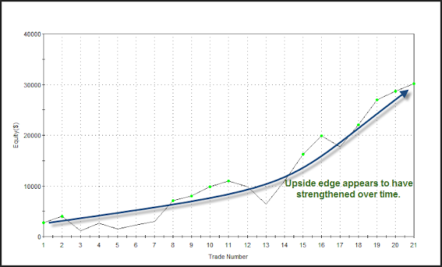
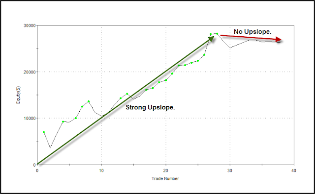
Equity Curve – The equity curve is a visual representation of how the study has performed over time. It is important to consider for a few reasons. First, you want to see whether the edge has been steady or whether it is recently waxing or waning. Second, you want to see if the apparent statistical edge is the result of a few large outliers. This would suggest that a perceived edge may not be reliable. I could spend a lot of time discussing intricacies, but I think just a few pictures will provide a good idea of what I look for. Below are some equity curves that I have recently run and discussed in the subscriber letter. They are all real curves, but I have erased the setup criteria.
This first curve is one that I find especially appealing. When you can draw an arrow from the lower left to the upper right section of the chart and have it never be very far from the equity curve, then that suggests a steady, solid edge.
I also find this next curve appealing. The edge is not as steady, but you can see that there has always been an upward slope and that slope has recently increased.
This next curve is one that I do not find appealing. While it looked like the setup provided an edge for a period of time, it now appears that edge is either waning or no longer present. This is a setup I may continue to keep an eye on in the future, but would not include it as part of my current analysis.
This last curve is an example of one that was heavily affected by a few outliers. When the statistics were generated it appeared there may be a downside edge. A closer look at this equity curve tells a different story. What we see are three big losers in the middle of the curve that account for nearly all of the downside edge. If you take out those three instances, the rest of the curve is just sideways chop.
That should give you a decent sampling of things to look for when examining an equity curve. If you’re able to find curves that looked like the first one, then you should do very well in identifying edges. I don’t commonly show equity curves in the blog, but it is an extra bit of information that I often include in the Subscriber Letter.
Timing of instances. Recent or distant history? – You want to look at more than just the statistics and the equity curve. You also want to look at when past setups similar to the one you’re examining have occurred. Was the trading environment substantially different then than it is now? For instance, I recently ran a study whose results were very positive and it had a very strong, steady equity curve. But when I looked at the dates I found that most of the instances had occurred in the 60s and 70s. In fact the current setup was the first occurrence since 1996. While the setup looked good from all other aspects, I was wary of including it in my analysis due to the fact that it hadn’t triggered in over 14 years. I would much rather rely upon results that have been achieved in the recent past as opposed to results that were all achieved in the distant past.
Average and max runup and drawdowns for the trades – I also make sure to note runup and drawdown statistics for each of the setups. This is helpful for number of reasons. Runup stats give me some idea of how much of a move to expect. If the market moves in the expected direction much beyond where a typical runup might take it, then I will often eliminate that study from my “Active List”. I do this because any further move in the expected direction is likely due to forces other than that particular study. Looking at drawdown statistics provides further insight into how the market typically reacts to the setup being studied. Is there typically a fast move in the expected direction with little or no drawdown? If so, a move up opposite expectations could suggest the market is sicker than usual. Drawdown statistics are also very useful in helping determine appropriate position size. If the environment is volatile and trades often take a lot of heat before moving in the expected direction, then more conservative position sizing is likely appropriate.
Robustness (part 1) – Robust results serve a better chance of performing similar to expectations going forward. Robustness can mean a few different things. One way to test robustness is to see whether a minor change in parameters causes a big difference in results. Ideally you want to see a setup work across a range of parameters. If the parameters are too fine tuned, then the perceived edge may be more a result of data mining and not an actual edge. If a new study is being conducted and the current setup barely qualifies for the parameters being described, then there is a much higher chance that study is not robust. Researchers should strive to ensure the setup they are describing is typical of the sample set that makes up the results, and not an extreme case or an outlier. Of course this isn’t always possible, but when a study appears robust and the setup is typical of the sample set, then I have a greater confidence level in those results.
Robustness (part 2) – Another way to test if a study or concept is robust is to run the setup across a broad list of securities. This isn’t something I typically do with the index studies that I publish on the blog and in the Subscriber Letter. It is something I do when I develop systems. So systems like the Quantifiable Edges Big Time Swing System or any of the “numbered systems” that are available to Gold subscribers are all tested across a broad range of securities. A system that tests well across a broad range of securities, rather than one that is tailored to a specific security, stands a better chance of performing well in real-time.
Those are my top criteria when determining whether a study is worthy of consideration in formulating my market bias. In my next installment of this series I will discuss whether an edge justifies a trade, and how I weigh different edges when considering trading opportunities.


