The Difference ADX Makes When Examining Reversals of Breakdowns

In the past I’ve discussed how breaks from consolidations are often much less reliable when looking for a reversal than if you hit a new high or low during a trending market. This is because the breakout will often create new excitement in the direction it occurs. Some of that is stops being blown and some of that is from breakout players looking to take advantage of a newly emerging trend.
One way to measure the strength of a trend is with the ADX indicator. It was pointed out to me today by a subscriber that the SPX 14-day ADX was dropping under 12 – which is an extremely low level. (The 14-period reading is the default reading for ADX with most charting packages.)
So using ADX as a measurement of trend strength I created a study that demonstrated low-ADX vs. high-ADX breakdowns, and how the implications were much different. First let’s look at situations like the present where the SPX breaks down and ADX is under 20.

As you can see, there is no substantial edge suggested when you are looking at a sharp move out of a consolidation with a low ADX.

Next I ran a 2nd test. This one used all the same parameters except I required the ADX to close above 20 instead of below it. This suggests the market has been moving instead of meandering. Those results are below.

What we see here are vastly more compelling results.
Unfortunately, with the ADX now just under 12, there does not appear to be a substantial upside edge offered by the break lower.

How the NYSE Closing TICK can be Utilized as a Valuable Indicator

One market analyst whose work I’ve become familiar with and whom I have a great deal of respect for is Tom McClellan. Tom created an oscillator based on the closing TICK reading on the NYSE. The TICK simply measures the number of securites that last traded on an uptick versus. a downtick.  The closing value tells you how many finished the day on an uptick versus a downtick.  Tom told me he first got the idea to measure closing TICK values from Peter Eliades. The oscillator Tom created takes a 10-day moving average of the closing TICK, then a 10-day moving average of that value, and then subtracts the two. In November 2010 Tom published on his website a detailed overview and description of the indicator. Below is a link to Tom’s article.

https://www.mcoscillator.com/learning_center/weekly_chart/tick_not_just_a_bloodsucking_insect/

Tom has demonstrated that, like many overbought/oversold indicators, oversold readings will often lead to a bounce, and the market will often struggle after overbought readings.

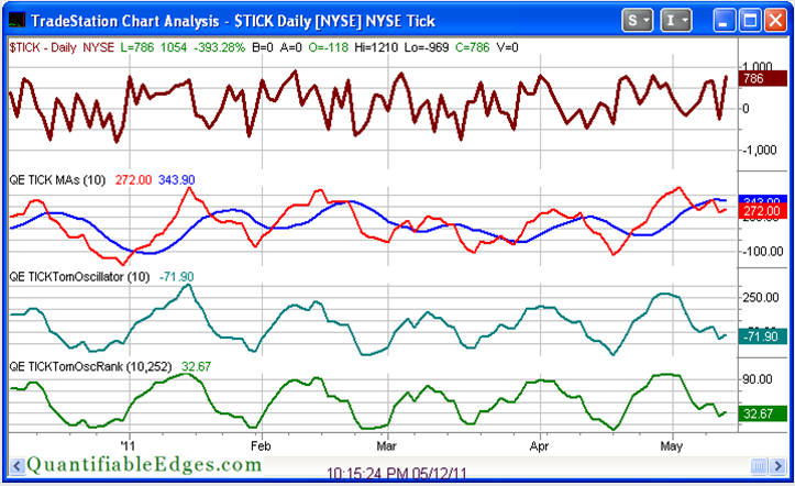
I’ve done some work with Tom’s TICK Oscillator (which I have begun calling the TICK Tomoscillator.) As a visual indicator it is excellent on its own. But for conducting quantitative research I had some concerns with simply using raw readings. TICK ranges have evolved over time. They are affected by the number of securities traded on the NYSE (which constantly changes), and in 2007 they were impacted by the elimination of the uptick rule for shorting. Therefore I thought it might be worthwhile to use a relative reading rather than an absolute one. To do this I used a trick I learned from David Varadi of CSS Analytics and simply created a % Rank of the TICK Tomoscillator over a defined period.

The chart below is taken from the charts page in the subscriber section of the Quantifiable Edges site.  (Click here for a free 1-week trial.) On it you can see the closing TICK moving averages, the TICK Tomoscillator, and the 1 yr. % Rank of Tomoscillator. It isn’t at an extreme currently, but you can see where recent extremes took place. The April 18th dip in the Tomoscillator % Rank marked the market low, and it became extremely overbought at the end of April just before the early May market dip.

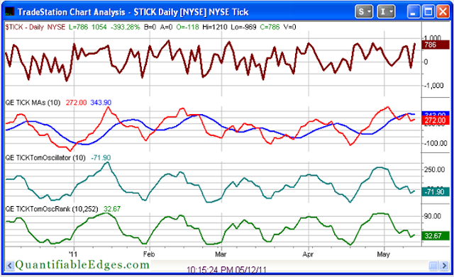
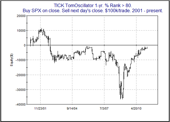
I’ve published a few studies in the Subscriber Letter that have shown very strong edges based on a combination of extreme readings and price action. But even on its own I have found substantial value in paying attention to the TICK Tomoscillator % Rank. Below are two equity curves from some research I published in the 4/19/11 Subscriber Letter. The first one looks at owning the SPX the day after the TICK TomOscillator 1-yr % Rank comes in under 20%. The 2nd one looks at TICK TomOscillator 1-yr % Ranks above 80%.

As is clearly demonstrated by the equity curves, closing TICK values, and the TICK Tomoscillator % Rank, are well worth monitoring.

Quantifiable Edges subscribers can see the TICK Tomoscillator readings every night on our charts page. The Tomoscillator indicators are also included in the Quantifiable Edges Tradestation Indicators & Functions package, which is free for all subscribers (or may be purchased by non-subscribers). The code package allows Tradestation users to place the Tomoscillator readings on their own charts and conduct their own research.

This SPX Pattern is Offering Some Compelling Bullish Evidence

Last night I decided to explore the pattern the SPX has carved out over the last several days. What I noted was that after making a new high it then pulled back for 4 days in a row. That 4 day drop has now been followed by a 3-day rally. At this point the SPX has not managed to overcome the recent highs. So I plugged those observations into a study and found some very compelling results.

While the number of instances was smaller than I would prefer the statistics appear to heavily favor the bull side.

A New Tool For Quantifiable Edges Subscribers

Quantifiable Edges subscribers were recently treated to a new feature available with their subscriptions.

Over time I have had numerous requests from members who wanted to utilize some of the Tradestation indicators and functions I’ve designed. Many of the indicators requested are shown on the Quantifiable Edges Charts page in the members section of the site. Others are discussed from time to time in the subscriber letter. I recently completed putting a few of these indicators together in a package. It is now available to the public (free of charge to all subscribers as long as their membership is active, or $125 for non-subscribers with no expiry on the code).

A list of calculation groupings is shown below:

1) Fast/Slow Offset Historical Volatility

2) Fed Days (today and tomorrow)

3) Breadth %

4) Breadth % Rank

5) Ratio Adjusted McClellan Oscillator (RAMO)

6) McClellan % Ranks

7) McClellan % Ranks (Pos/Neg)

8) Closing TICK TomOscillators

More detailed information on all of the calculations as well as instructions and examples can be found in the Quantifiable Edges Tradestation Analysis Techniques User Guide. The user guide may be downloaded by anyone who takes a free 1-week trial of Quantifiable Edges subscriber service (only name and email required).

Purchase includes Tradestation formatted .eld files for import as well as the 15-page guide. More indicators and functions will likely be added to the package over time. Purchasers may download updated versions free of charge for up to 1-year after purchase.

For a free Quantifiable Edges trial and to access the detailed user guide you may register here. The user guide can be found by clicking on the “QE Indicators/Functions for Tradestation” tab on the left hand side of the members’ pages.

Large Gaps Up On 1st Friday of the Month

The employment report nornally comes out on the 1st Friday of the month.  Today’s report is helping to trigger a large gap up in the SPY.  I looked back at other times since 2003 where the SPY gapped up more than 1% on the first Friday of the month.

Results here are a little dissapointing in that they don’t seem to suggest much of an edge in either direction.  Also a little surprising is that the employment report hasn’t triggered more big gaps up.  In any case, I’ll keep this test in mind in the future in case a more definite edge appears to emerge, but I’m not basing any trades on it right now.

Unusual Action on the 3-day Pullback

A 3-day pullback on its own doesn’t provide much of an upside edge. An edge tends to appear when the pullback happens in conjunction with other things. “Other things” might include a very low 3/10 Offset HV, a deceleration in the pullback, or a seasonal advantage. None of those things are appearing right now. But I did note one interesting aspect of this pullback that seemed worth further examination. While the SPX has declined the last three days, the VIX has risen the last three days. This isn’t unusual. What is unusual is the fact that Wednesday’s drop was the biggest for the SPX, yet the rise in the VIX was the smallest of the last 3 days.  I looked at other times this had occurred since 1990.
Not a whole lot of instances but early indications are that the setup may be bullish.  I examined the instances a bit further in last night’s subscriber letter.  I tossed around whether to incorporate these results into my estimates.  Ultimately I decided not to.  The results were very variable, the number of instances was low, and the last time it occurred was 2003.  I did find it compelling enough to monitor going forward, though.

When Months Finish Strong

Bullish early-month seasonal tendencies have been well documented both here and elsewhere.  But what happens if we close the month at a high?  Does that sap some of the typical early-month strength?  Or is the market more likely to continue higher?  Below I show all instances since 1995 where the SPY finished a month with the highest closing price of that month.

The numbers are very compelling. Most of the upside edge occurs in week 1, but there is some follow through into week 2.

The low VIX:VXV ratio with the SPX at a new high

Examining the VIX:VXV ratio is a concept I first heard from Bill Luby at VIX & More.  The VIX is a measure of short-term (30-day) volatility expectation and the VXV measures intermediate-term (93 day) volatility expectations.  The ratio right now is quite low – a little below 0.85.  This means that short-term volatility expectations are substantially below intermediate-term volatility expectations.  When readings this low coincide with 50-day SPX highs it suggests a possible bearish edge for the next day.  This was demonstrated in a study that the Quantifinder identified yesterday afternoon.  It last appeared in the 1/13/11 subscriber letter.  I updated it last night.  Below is an equity curve showing a 1-day holding period for this setup.

When SPY Gaps Down Below 2 Up Closes

SPY is currently (9am pre-open) trading below the close of the last 2 days – both of which were up days.  Below is a study that shows how the market has performed open to close when this has occured in the past.

Not encouraging stats if you’re a bull.  Below is an equity curve to see how it has played out over time.

The consistent downslope acts as confirmation of the bearish edge. 

One other note: I also checked to see how many instances occured when the close of 2 days ago was a 10-day low (like now).  There was only 1.  It was 1/20/09.  It was the “worst” performer, losing about 4.3% from open to close.  Even if we sell off, I’d be very surprised to see that duplicated.

Comparative Performance of VIX-based ETFs

A few weeks ago I held a webinar for subscribers where I discussed VIX-based ETFs. I examined the performance of several of the ETFs. I also presented ideas on how they could be traded as an alternative to a standard index trade, and under what conditions doing so might be appropriate. Below is a chart from the presentation. It shows the performance returns of the SPX, VIX, and a few of the more popular VIX-based ETFs. I have updated the chart through 4/14/11. It goes back to 11/30/10, which was the first day that XIV was available to trade.

(Click on chart to enlarge)

A few quick observations:

1) XXV is a product that is “supposed” to act as an inverse of VXX. It seems to do a horrible job of that. Instead it has almost exactly matched SPX performance. I can’t imagine ever wanting to trade something that matches SPX performance, but carries greater risk. XXV is useless.

2) VXX has been a poor long-term performer. (I discuss reasons in the video.) TVIX will likely suffer long-term as well. If you are buying for a short-term trade, then TVIX looks like a decent high-powered alternative to VXX.

3) XIV appears to be a nice alternative to a short VXX or a long XXV position.

More detailed insights are in the video. If you would like to view it, you can gain access by signing up for a free 1-week trial subscription.  (Then check out the educational videos section of the members site.)

Also, for a more complete list of VIX-based ETFs and some great information, I’d recommend visiting Bill Luby’s VIX and More blog.

Turnaround Tuesday?

With the SPX now falling 3 days in a row I’m begining to see signs that a bounce is becoming likely.  One bit of evidence identified by the Quantifinder last night was based on the “Turnaround Tuesday” concept.  I’ve shown before that of all days Tuesday has historically had the highest propensity to halt a short-term pullback.  The study below is specific to a 3-day pullback leading up to a Tuesday.  It was last seen in the blog on August 24, 2010.  I’ve updated the results.

Results still appear to strongly favor the bulls.  The market is looking at a gap down this morning so it will be interesting to see if it can overcome the negaive momentum and make the turnaround today or in the next few days.

Low SPY Volume A Concern

SPY volume came in at the lowest level in a long while on Monday.  I’ve shown numerous volume studies in the past suggesting price highs and volume lows are typically followed by a pullback.  Below is a study from last night’s letter that examines the current setup.

The numbers here are fairly compelling, especially considering the studies used a long-term trend filter.  Bulls may not want to get overly aggressive in the next few days.  Risk appears elevated.

April’s Early-Month Hot Streak

1st Day of month bullish tendencies have been well documented here and elsewhere. April is an interesting month in that not only is the 1st day typically strong, but since 1994 the first week has performed especially well. This is illustrated in the table below.

Quite the little hot streak. And in case you’re wondering, the last time the 1st 4 days of April netted out to a loss was 2002.

VXO Stretch Now So Extreme It Is Suggesting A Pullback

In last Wednesday’s blog I showed a study that the quick move from overbought to oversold in the VIX appeared suggestive of further upside.

But now we find ourselves in a situation where the VXO got extremely stretched has remained so for three days in a row. I decided to take a look at other times where this kind of extended stretch had occurred.

The numbers here appear to strongly suggest a short-term downside edge. More detailed analysis was done on the instances in last night’s subscriber letter. That analysis also supported the case for a short-term pullback.

To take a trial of Quantifiable Edges and see last night’s detailed version of this study, click here to take a free 1-week trial.