What Yesterday’s Partial Gap Fill Suggested

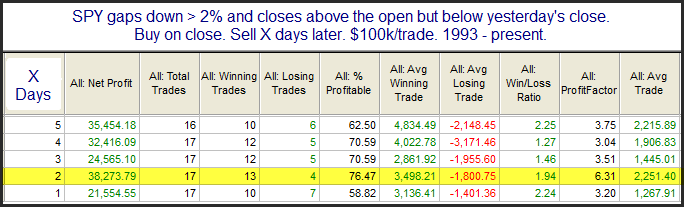
The market is gapping up large this morning so I feel a little silly discussing how yesterday’s action suggests good things for the next few days.  Still, I did not note anything bearish  about yesterday so I thought I would show one of the studies that I found compelling that appeared in the Quantifinder as we approached the close.

There have typically been 1-2 days of buying following such setups.  It will be interesting to see if the upside edge exhausts itself early here or whether bulls can follow through and add to this mornings gains over the next day or so.

September Performance After Bad Augusts

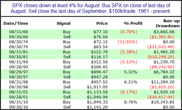
September has a well-earned reputation as the worst month of the year for the stock market. Last night both Woodshedder and Michael Stokes provided nice historical breakdowns of September. For the 2nd year in a row the market has suffered a difficult August with the SPX closing down about 5.6%. This left me to wonder how September has performed following bad Augusts. Below I have compiled a list of all Septembers after August lost 4% or more.

There doesn’t appear to be a strong directional edge, but one thing that is evident in all of these Septembers is that there was high volatility. The 1966 instance saw the smallest range with the market moving a little over 5% from high to low. Six of the eight instances saw ranges of 9.5%+ in September. So I would not look for the action to dull this month.

What the SPX/VIX Action Hinted at on Tuesday

I am seeing some signs that the market is likely to pull back in the next few days.  On Tuesday the SPX closed just slightly higher while the VIX also rose.  This triggered the study below, which I have showed before in the subscriber letter, but never here on the blog.

The reason it only looks at Tuesday, Wednesday, and Thursday is that Monday and Friday VIX prices tend to be affected by weekend time decay in the options market.  Instances are a little low but really could not appear more bearish over the next 2 days.  

Short-term Implications of Breadth on a Follow Through Day

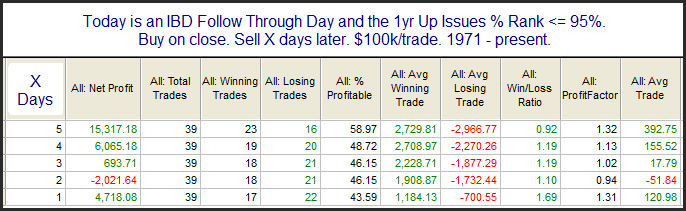
The strong move higher on increased volume meant that Tuesday was a Follow Through Day (FTD). FTDs are a concept that was created by William O’Neil, founder of Investors’ Business Daily. I have written about them extensively on the blog. In June for the 1st time I showed that FTD’s have a better chance of success when they are also accompanied by strong breadth. Tonight I also examined the short-term implications to FTDs with strong breadth vs. FTDs without. This first study below looks at performance following FTDs that came along with an Up Issue % reading that was among the top 5% of all readings over the previous year.

As you can see there appears to be an tendency for the market to continue higher after these strong-breadth FTDs. Now let’s examine performance after FTDs on days that did not show exceptional breadth strength.

Here there appears to be no edge or short-term upside inclination whatsoever. With Tuesday’s FTD coming on breadth that put it in the top 2% of all days for the last year the short-term outlook appears better.

Big Gaps Up After 2 Strong Days of Selling

After 2 hard days of selling the SPY looks to be gapping up strong this morning.  I looked back at other times that the SPY gapped up big after 2 large down days.  Below are the results since 2003 of buying all instances at the open and then selling at the close.

There appears to be a bit of an inclination to follow through on the gap to the upside.  Most of the instances were quite volatile, and all of them pulled back at least 0.4% below the open at some point during the day.  Most of them also took place during 2008 when volatility (both intraday and overnight) was elevated.

Related Quantifiable Edges Studies

A Post-QE2 POMO Indicator Update

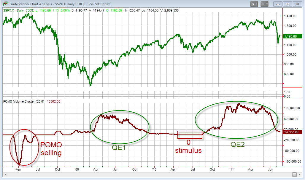
I haven’t shown an updated POMO chart on the blog in a while, and with QE2 now in the rearview mirror for the calculations I thought readers might find it interesting.

POMO stands for Permanent Open Market Operations and it is how the Fed goes into the open market to buy securities. The net effect of this buying is an influx of cash into the system. It appears a portion of that cash makes its way to the stock market and works as a bullish influence. A “POMO Day” is simply a day where these operations take place. The chart below shows my POMO Volume indicator. The top pane is the S&P 500. The bottom pane is the total amount of money infused into the system (POMO buying) over the previous 20 days.

The obvious takeaway here is that periods of heightened POMO buying have led to strong stock market rallies. Periods of weak or negative stimulus have been followed by market drops. This chart only goes back to 2008. For a longer view back to 2005 you may use the link below.

https://quantifiableedges.blogspot.com/2011/05/long-term-look-at-pomo-stock-market.html

Looking at the far right side of the chart you can see POMO volume has dipped substantially since the end of QE2 (end of June). It has now reached a level where it is expected to be maintained for the foreseeable future. In the past when POMO stimulus ended – it ended. This time the end of QE2 has led to a period of substantially less stimulus, rather than none. This made it tricky in determining whether the end of QE2 would be followed by a sharp market drop. (It was.) While there IS still liquidity pumping going on, it appears the reduced level is akin to providing a heroin addict a couple of aspirin to try and get high.

The link below shows the POMO activity schedule on the Fed’s website.

https://www.newyorkfed.org/markets/tot_operation_schedule.html

If you click it you will notice there is a tab on the page where you can see “All Schedules” rather than just the “Current Schedule”. Clicking that tab you will see that the monthly estimate of POMO activity for last month and this month is about $14 billion. During QE2 the level was normally around $100 billion/month. So is the market capable of mounting a serious new bull move with the modest amount of stimulus currently being provided? So far I have seen no evidence of that, but I suspect it could if it starts from a “low enough” level…

Large Gaps Down After 3 Up Days

This volatility continues this morning with a big gap down.  The study below shows performance for the day following large gaps that occur after 3 consecutive up days.
These stats do not appear encouraging for the bulls.  Below I have listed all instances.

This view isn’t any better.  It appears there is some potential for another ugly day. I’d use caution buying today.

Related Quantifiable Edges Studies

Historical Extremes

This selloff is setting new extremes. Whether you look at volatility, price action, breadth, or volume, recent readings are off the charts. The table below is from last night’s subscriber letter. It highlights some of the extremes I noted in these areas on Monday.

Mondays 2% Gap Down

I’ve shown before that 2%+ gaps down almost always bounce at some point in the next few days.  The last time I reviewed this can be found here:

https://quantifiableedges.blogspot.com/2011/03/2-gaps-down-other-disasters.html

This morning I added a few filters and looked at just what might be expected on the day of the gap.  This first study shows what has happened when the 2% gap down occured after a 100-day low.

Low instances but a possbile upside tendency.  But next is the bad news.  The study below looks at 2% gaps down on Mondays.

Tough call this morning.  I think we should see a bounce in the next few days, but it may not be immediate.

A Look At This Mornings Gap Probabilities

The gap down this morning is coming after a recovery attempt yesterday. I ran a few tests to see how the day has played out in the past under similar circumstances. The market has been moving around quite a bit this morning so I am showing 2 sets of results below.

The 1st one looks at times the market gapped down at least 1%.

Winners outnumber losers 7-3 but the losers are so much larger on average that the net expectation is about flat.

This next one looks at gaps between 0.5% and 1%.

Here again the odds appear to favor a rise over the course of the day. Losers were a bit larger here as well, but not nearly to the same degree.

Bottom line is that it appears likely the gap down will be bought up during the day, but if it isn’t then this could turn into another huge down day.

"Turnaround Tuesday" After 5+ Lower Closes

I’ve discussed before the propensity for Tuesday to serve as a day where short-term selloffs reverse. Historically it has outperformed every other day of the week in this regard. Last night I examined SPY performance following at least 5 straight down days going into Tuesday. Those results are below.

Instances are low but the stats are overwhelmingly bullish over the 1st 3 days. Of further note, all 10 instances managed to close above the entry price at some point in the next 3 days. So even when Tuesday failed, it was made up for on Wednesday or Thursday.

Gaps Up From A 20-Day Low

Debt ceiling progress has the market gapping up this morning. As I type the SPY is up between 1% and 1.5% pre-market. Below I take a look at gaps up from a 20-day low based on the size of the gap. First are gaps between 0.75% and 1.5%.

12 of the last 13 have been losers with the 1 winner only posting a gain of 0.1%.

Next is a look at gaps of 1.5% or more.

It appears the larger the gap the higher the propensity for it to run after the open.

One other factor that traders may want to consider about the potential of today’s gap is the 1st of the month seasonality. I looked at this in combination with large gaps last December.

Gaps Down After 4 Lower Lows

The market is already short-term oversold and now SPY is gapping down large this morning. I looked at other times there were 4 lower lows followed by a gap down below the previous day’s low. Below are results looking back to 2006.

Not a ton of instances but the stats lean quite heavily to the long side. Between 2003 and 2006 the upside tendency was not apparent. I was unable to look back past 2003 this morning. Below are all instances from 2006 – present.

If you find morning gap analysis like this useful, you may want to check the work of my friend, Scott Andrews over at MasterTheGap.com.  I look at studies like this occassionally, but it is his primary focus.

Very Low Volume At A New Short-Term High

I have been away for a while.  When I’m away subscriber services continue pretty much as normal but blog posts tend to suffer.  I’m back and will have a couple of posts this week and then get back to the 3 or so per week starting next week.

Very light volume at new highs as we saw on Friday often indicates a rally is running out of buyers.  Frequently such light volume is followed by a pullback in the next few days.  There were several studies that appeared in the Quantifinder Friday that demonstrated this point.  I’ve chosen one that was also in the Subscriber Letter to highlight below.  Blog readers last saw this study on April 5, 2011.

This study looks back to the inception of the SPY in 1993.  The numbers above look fairly compelling.  I also found the edge to be quite steady over the tested period.  Of course with the gap down in the futures, much of the downside edge may be realized quicker than usual today.  It’s possible it won’t persist for as long.  Nonetheless, as I’ve shown many times before, volume does matter and traders should pay attention to it.

Edges After Poor Employment Days

The gap down on Friday occurred in reaction to the release of the employment report. The employment report is typically released on the first Friday of the month, though in some cases such as this month it occurs on a different day. This weekend I spent a good amount of time going through the BLS website and programming in all the employment days from 1993-present.

I looked at Friday’s action a few different ways with regards to employment days. I found it was only the 10th time that the SPY has gapped down over 1% and failed to fill that opening gap. While I didn’t find the results significant, below I have listed the other 9 instances along with their 1-day returns.

These results seem to imply a mild inclination towards further selling the next day. Another way that I looked at employment day gaps was by using a 200ma filter and eliminating the 1% size requirement. Overall the results of doing this didn’t suggest much. I did find it interesting though that there have been three instances since the March 2009 bottom and all three instances were followed by further declines ranging from 2.4% to 4.3% during the course of the following week. Those three instances occurred on 7/2/09, 8/6/10, and 6/3/11.

I don’t believe either of these employment day studies is worth heavy consideration. My main take away is that the reaction to the employment report is not necessarily an overreaction. As the employment day results showed there does not appear to be an inclination for an immediate reversal. In fact, downside follow-through may be more likely.

Employment day seasonalities aren’t typically as pronounced as Fed Day seasonalities, but they can be worth examining on occasion. Therefore I went ahead and incorporated the employment day code into the QE Tradestation Indicators & Functions Package. This way package purchasers or Quantifiable Edges subscribers may explore employment days further on their own. (Those who previously purchased the package may download this updated version at no additional charge.)