A Couple Of Links Courtesy of the Quantifinder
I’ll try and get a new post up later. In the meantime, below are 2 studies the Quantfinder picked out yesterday from former blog posts:
1) 4 Lower Lows
I’ll try and get a new post up later. In the meantime, below are 2 studies the Quantfinder picked out yesterday from former blog posts:
1) 4 Lower Lows
Some technical problems this morning delayed my routine and didn’t allow me to post a fresh study before the market opened. I thought I would discuss a point I made in last night’s Subscriber Letter about the strongly bullish short-term study from Sunday night.
The indication was that following a day like Thursday, the SPY had closed up strongly over every 1 and 3 day period. Monday closed marginally higher in the S&P 500, although the SPY closed down 1 cent. Compared to the other 7 instances that were identified in the study, Monday’s action was the weakest. This can serve as a warning sign. When the market doesn’t rally as it is supposed to it may be suggesting a move in the other direction.
It may help some traders to think of such scenarios as they might failed patterns. Take a breakout for instance. When breakout from a triangle or other consolidation pattern fails, it can often lead to a sharp reversal in the opposite direction. The same concept applies to historical studies. When the market doesn’t do what it is supposed to, you need to reassess. Like any other type of analysis, historical analysis requires constant reassessment. The market isn’t static and your analysis shouldn’t be either.
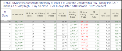
Thursday’s action was extreme in that the gap down was large and the SPY opened at its high and closed at its low. Often reactions this strong and persistent are overreactions. Overwhelming negativity such as this has led to quick, sharp, bounces in the past. Below is a study that exemplifies this:
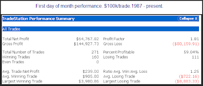
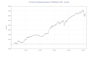
The Stock Traders Almanac noted that the Dow Has been up 16 of the last 19 years on the 1st trading day in July. It’s been a while since I last looked at 1st day of the month tendencies.
Friday night the Quantifinder identified the below study. I haven’t updated it in over a year so I thought it would be interesting to do so.
Results are much the same as they were a year ago. Low QQQQ volume in an uptrend has often signalled at least a short-term drying up of buying interest. Historically this has created negative expectations over the next several days and weeks.
Much of the net negative thrust has often been found in the 1st two days following the setup.
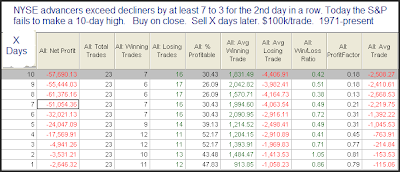
Below is a study that has been shown a few times in the Subscriber Letter. It popped up last night via the Quantifinder. It looks at what happens when two days of strong breadth fail to take the SPX to a new 10-day intraday high. I’ve re-run the stats and posted them below.
The failure to make a 10-day high after two strong up days suggests there was a strong move down prior to this. Most often the strong down move will reassert itself or at least cause a pullback. As a point of comparison, below are the numbers when the back-to-back the strength does coincide with a 10-day high:
Strong negative expectations turn positive under this scenario. I’ve shown before how positioning is important when interpreting action. This is another example of that.
Originally published in the blog on 9/11/2008, the Quantifinder noted the below breadth-based study for Tuesday’s close. I re-ran it in last night’s Subscriber Letter and have updated it below. (Note: Up Volume % is tracked in the members chart area each night. It is equal to (Up volume / (Up volume + down volume).
The fact that there was a pullback within three days every time is a fairly compelling stat. There have been 2 upmoves occur in the 6-day holding period since I published the first set of results last September. They both had pullbacks first though, allowing either opportunity for profit or at least a chance to move your stop to breakeven. Below I’ve listed all the trades along with their 6-day exit:
We spent Father’s Day at my in-laws. My father-in-law actively trades and a lot of what he does is pairs trading. He’s been getting more involved with pairs lately and comes up with some crazy ones. He does some testing on the computer but a lot of his testing is done “old school” with a pen and paper.
So I brought my laptop over armed with Jeff Pietsch’s ETF Rewind tool. As part of ETF Rewind, Jeff has one worksheet that is set up to do pairs analysis. I rarely see him mention it on his blog, but it is really a cool tool. You can put in any ETFs or stocks (or combination) and see how playing mean reversions following extreme divergences would have played out over the last 6 months. It comes with an optimization feature that allows you see how extreme the optimal settings are and what the best lookback period would be. Running an optimization takes about 15 seconds.
My father-in-law does swing trading so we focused on finding pairs that performed well with short lookback periods and less extreme divergences. He had a whole list he wanted to try out and we were able to zip through them and see which ones had potential and which ones didn’t.
The tool doesn’t do detailed system testing but it’s a great idea checker. So if you’ve thought about playing growth vs. value, or gold vs. gold miners, or even something crazy like AMZN vs. silver, it takes about 30 seconds to find out whether your ideas are worth exploring further, or whether you’re better off scrapping them.
Personally, what I like best about the tool is that it also seems to act as an idea machine. There’s really no end to the possibilities and the more you play with it the more ideas you end up wanting to explore. It also gives you a sense of what to look for when considering certain securities for pairs. Some securities seemed to work well with almost anything paired up with them while others struggled with all combinations. It makes you think deeper about the nature and tendencies of certain sectors and security types.
Anyway, enough from me. Check it out for yourself if you want. I know Jeff offers a 3-day free trial with all his subscription plans (yes – that includes Blogger Triple Play). Just make sure you spend some time playing with the pairs worksheet if you trial it.
One relationship I’ve been watching lately is the S&P vs. the US dollar. To illustrate the relationship I’ve created a chart below. In red is the closing prices of the S&P 500. The blue is closing prices of UDN, which is the US Dollar Bearish Fund ETF.
As you can see they’ve pretty much moved in concert over the last year-plus. Since UDN is a bearish fund this means that the S&P has actually moved opposite the dollar. A weak dollar has been cause for celebration and a strong dollar has closely preceded most of the drops in the S&P.
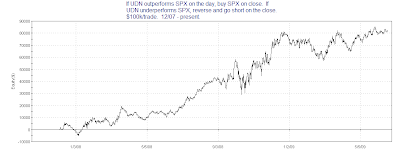
But can the performance in the dollar provide a trading edge in the S&P? Below is the equity curve of an incredibly simple system. If UDN outperforms SPX on the day, go long SPX at the close. If UDN underperforms, go short SPX at the close. Basically you’re either 100% long or 100% short depending on how the dollar (inverse) performed that day relative to the SPX. For purposes of the test, no commissions or slippage are included.
That’s more than an 82% non-compounded gain over the last 18 months. This edge won’t last forever. Still, this should demonstrate that the correlation between the dollar and the S&P is important. Moves in the dollar have a definite impact on the S&P. S&P traders would be well served to monitor the dollar’s performance closely and on an ongoing basis.
Also notable about Wednesday’s action was that while the market has declined for at least 3 days in a row, the rate of decline has lessened both of the last 2 days. Back in September I found this pattern to have bullish consequences when the market was trading below its 200-day moving average. I decided to test it out when above the 200ma as well. I found that prior to 1987 there was no bullish influence based on the pattern. Since 1987 one has appeared. Here is the test using the SPY. First the base case without the slowing rate of decline requirement.
I noted in a tweet last night that big moves down are more short-term bullish when they aren’t occurring from a high. This was a bit of an understatement. They’re often short-term bearish. Yesterday’s drop moved the S&P 500 from a 10-day closing high to a 10-day closing low. Since 1960 there have been only 10 other times this has happened. In last night’s Subscriber Letter I show the results of those 10 instances.
To get a larger sample size I also reduced the requirements from a 10-day high and low to a 7-day high and low. Those results are below. (Click table to enlarge.)
These results suggest more downside, especially over the next 2-4 days.
For more discussion on big drops from highs you may want to review this former study.
P.S. I just noticed that Dr. Brett also looked at the 10-day high to 10-day low move this morning. See what he has to say here.
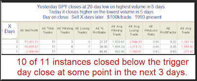
Below is a study from Friday night’s Quantifinder that was originally published in the Weekly Research Letter. (click to enlarge)
Instances are a bit low, but 17 of 19 occurences had at least one close below the trigger day close within the next 4 days. This study seems to suggest decent chance of some downside over the next few days.
—————————————————————————
Don’t re-search the research…Quantifind it! The Quantifinder finds the pertinent studies for you. Check it out with a free trial.
For those readers who happen to be in the Boston area I thought I’d let you know that I will be giving a presentation at the next Boston Investors’ Group meeting on Wednesday, June 24th.
The meeting will take place at MIT. It is free and open to the public, although the organizers request that you RSVP. More information, including a tentative agenda, may be found using the link below:
https://www.meetup.com/BostonIBD/calendar/10627009/
I hope to get to meet some of you there.
One blog I enjoy reading is Cobra’s Market View. He shows a lot of charts and often does a good job finding where there is unusual action. On Thursday night he noted the CBOE Equity Put/Call Ratio had come in extremely low. I decided to do a study on performance following extremely low 1-day readings.
When looking at put/call ratios I always normalize them with a long-term moving average. To understand why you may review this post from June of 2008. For today’s study I normalized using the 200-day moving average. The Equity P/C Ratio today came in at 0.55, which is a little over 25% below the 200ma of 0.74. I then looked at all other times the Equity P/C came in more than 25% below its 200ma.
As you can see in the above table, while there seem to be negative implications from such readings, they only last 1 day. Now let’s take a deeper look at those 48 trades and see what the results looked like over time. (Chart from Tradestation.) Click to enlarge.)
From 2004 until near the end of 2007 there wasn’t much of an edge provided. From November 2007 – present though there has been a strong bearish tendency. Seeing this graph would make many people wonder whether the negative performance is primarily just a byproduct of a horrible bear market.
There’s no way to answer this for sure. One thing we can do though is to see what performance has looked like since the March bottom. All qualifying trades are listed below:
Even during the furious rally of the last 3 months low readings in the Equity P/C Ratio have been followed by strongly negative action. This leads me to conclude that the CBOE Equity P/C Ratio may provide a short-term edge and its suggesting downside for Friday’s trading. I’d recommend checking out Cobra’s Market View for several interesting charts and observations on a daily basis.
P.S. – Would you like to be notified every time the above setup occurred? The Quantifinder can do it. Let the Quantifinder search through my blog and Subscriber Letters and alert you to studies relevant to current market action. Available with all Gold and Silver subscriptions.
A few weeks ago I wrote a post that illustrated the edge buying 3 down closes has produced over time. There are a lot of ways to expand on the research in that post. Today I’m going to look briefly at what its meant to be down “X” number of days in terms of an edge for the next trading day.
The table below looks at performance the day following a drop in the SPX of exactly X days in a row.
A few things caught my eye here. The first is the % Wins column. It stayed pretty close to 50% no matter how many down days you’ve had. Basically a coin flip either way. The 2nd column that caught my eye was the Avg Win column. This is the column that provides an edge when you get further out. In general the more stretched market the stronger the bounce is likely to be.
As I showed in the post that focused on 3 days down, the edge has changed over the years. More recently there has been a greater tendency for the market to reverse rather than trend. Below is the same table for the 1989 – present time frame.
The % wins column here shows that the tendency to reverse after being down several days has grown stronger in the last 20 years. As in the 1st table, the Avg Win increases as the SPX gets more stretched.
I demonstrated with the “Down 3 Day” trade that much of the edge has come quite recently. Below is an equity curve for being down 5 days.
Much the same here. A good majority of the edge is attributable to the last several years.
My takeaway is this. There is a long-side edge after the market has pulled back for several days in a row. A large part of the edge comes not from the chances the market will rise the next day, but the fact that you will be rewarded amply if it does. If you understand this and perhaps combine the fact that the market is down multiple days with other indications that a reversal is likely, then you can likely identify a strong upside edge.