Never Have So Many Stocks Been So Stretched Above Their 200ma.

Near the end of August I discussed that some of the breadth measures tracked by Worden were near all-time highs. This situation corrected itself as the market embarked on a brief selloff. Tonight two of their indicators actually registered their highest readings ever. These are T2109 and T21111 which track the number of stocks 1 and 2 standard deviations above their 200-day moving averages. Below is a long-term chart of T21111 with full history of the indicator going back to 1986.


I marked on the chart the 4 other instances that came close to the current reading. What you may notice is that these spikes were generally brief. Every case was followed by at least a mild selloff that worked off the severely overbought conditions. In no case did the extreme spike mark the end to the bull market that created it. It’s dangerous to read too much into only 4 instances, but a short-term pullback does seem reasonable. The current reading does not suggest a long-term top, though.

The 1st Profitable Close Exit Strategy – When It’s Appropriate

Today I just want to touch briefly on the exit parameters for the “2 Days In Chop” systems that I discussed yesterday. The exit strategy is basically a time stop married with a “first profitable close” exit. For many traders, a “first profitable close” exit may seem like nothing more than a ploy to inflate the winning % of the system and not an appropriate exit technique to put into practice.

Sometimes this is true. In other cases though, the 1st Profitable Close exit is appropriate and effective. “2 Days In Chop” is one of those cases. Recall the premise of the system was based on taking advantage of the extremely choppy market conditions that had been identified. It’s those choppy conditions that make the 1st Profitable Close strategy viable.

When conditions are especially choppy and the market is constantly swinging back and forth, the expectation is for that chop to persist. This would suggest a move in the direction of the trade is more likely to be reversed than to follow through. So with a system like “2 Days in Chop”, the expectation flips as soon as the trade becomes profitable. Since a reversal is more likely than continued follow through the correct play is to take the quick profit.

Obviously an exit strategy like this only works well when trading a reversal / mean reverting system in a choppy environment. In a different environment, or if trading a breakout system, an exit strategy that looks for quick profits would be a disaster.

Other techniques that work well when trading overbought/oversold conditions would include using a short term oscillator and waiting for that oscillator to revert back to a neutral state, or using a short-term moving average (such as a 5-day) and then exiting the trade on a cross of the moving average.

2 Days In Chop Systems – 1 Year Later

About a year ago I showed 2 systems that looked to take advantage of the market’s choppy nature. Since that time I have tracked the performance of these two incredibly simple systems in the Quantifiable Edges Subscriber Letter. I’ve referred to them as the “2 Days In Chop” systems. As a quick refresher the rules for each are below:

Long System (2 Days Down In Chop):
1) Buy the SPX any time it closes lower 2 days in a row.
2) Sell the 1st profitable close up to 3 days later.
3) Sell on the 3rd day regardless of profitability.

Short System (2 Days Up In Chop):
1) Short the SPX any time it closes higher 2 days in a row.
2) Cover the 1st profitable close up to 4 days later.
3) Cover on the 4th day regardless of profitability.

A few quick notes:
At the time the market was locked in a downtrend which is why I gave the shorts an extra day.
I noted the systems were very raw and were not something I would trade “as is”.

Below I will show the combined performance of the 2 systems since I introduced them. In upcoming posts I’ll discuss how I use the systems and also discuss some thoughts on them and some ideas in which the basic systems could be improved.

Here is the performance over the last year +.

A 73% return would seem very impressive for something so simple. It has had a bit of a drawdown lately, though. Below is a profit curve.


The system peaked on 6/22 and has had a few rough trades as of late. Still, the recent drawdown is very small compared to the overall gains of the system.

So why haven’t I simply traded the system “as is” for the last year? I guess you could say that I’m just not smart enough to blindly trade a system this dumb.

I’m getting a little smarter, though. And I’ll have more in upcoming posts.

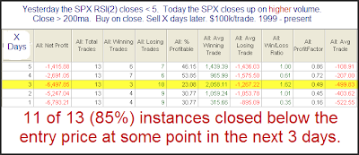
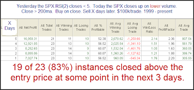
SPY Rising While SPY Volume Declines

In May of 2008 I showed how 3 higher closes in the SPX (while under to 200ma) had different implications depending on the volume pattern. Tuesday we had this 3-higher closes pattern appear in the SPY while SPY volume declined all three days. This is a slightly different twist and one worth examining:

(click table to enlarge)

This setup appears especially bearish over the 1st week. Possible bearish implications extend out much further than just a week, though.

Would you like to be made aware any time this setup triggers in the future? The Quantifinder does it for you! Versions of the Quantifinder are available with both gold and silver subscriptions.
As I ready to publish this I see that Cobra also noticed this pattern last night. Check out his take as he identifies several recent occurrences on his chart.

Labor Day Week Edges

From a seasonality standpoint, Labor Day week has historically been a bit weak.

(click table to enlarge)


Tuesday through Thursday have shown risk/reward to favor the bears, though whether the market is up or down has basically been a coin toss. If we look at times like the present where the market has made gains in the weeks leading up to Labor Day, you’ll find the implication is a bit more bearish.
(click table to enlarge)

This isn’t the most compelling edge I’ve ever published, but for a study based primarily on seasonality, it’s not bad.

Is Thursday’s Low Volume Troubling?

In last night’s Subscriber Letter I examined whether the relatively low volume on Thursday’s bounce should be concerning. I examined it a few different ways. Below is one series of tests I showed. First let’s look at what happened when volume came in higher on a bounce following some severe short-term oversold conditions.

(click table to enlarge)

Interesting that the high volume bounces failed to follow through. The number of instances is a bit low but the numbers are fairly compelling anyway. Let’s see how this compares to low volume bounces:

(click table to enlarge)

Here the results have a solid bullish tilt.

These tests suggest that Thursday’s light volume should not be of any concern. In fact, it may be a market positive.

A Long-Term Look At the Nasdaq Advance/Decline

Woodshedder is starting a new series called “Indicators and edges” in which he will be testing the effectiveness of different indicators. I’m looking forward to reading it. Last night he posted some baseline results of the general market. In doing so he noted that the percentage of up days on his list of stocks fell much below the % of up days for the major indices. In noticing this he asked if anyone had a possible explanation.

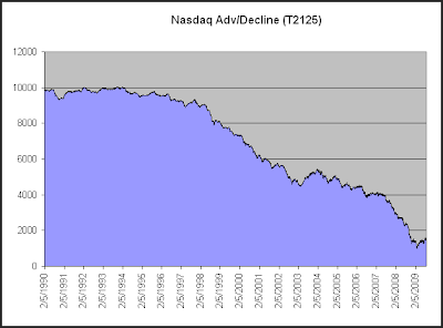
I think a long-term look at the Nasdaq Advance/Decline line could explain a lot of it. I pulled the below data from Worden Bros. TC2000.

Here we see that the Nasdaq Adv/Decl has consistently dropped over the years. While this chart only goes back to 1990, the strong negative bias exists all the way back to the inception of the Nasdaq in 1971. Even during the Nasdaq bubble days of the late 90’s the Nasdaq Advance/Decline couldn’t muster a rising slope. Worden Bros. was obviously aware of this tendency when they set their beginning value at 10,000 rather than 0.

Over the 1990 – present time period shown above the NYSE Advance/Decline line has seen a slight decline, but it doesn’t have the consistent negative bias of the Nasdaq.

This is mostly due to the fact that the Nasdaq has lower listing standards than the NYSE, so if a company is going to go broke it is more likely to do so on the Nasdaq. An issue which IPOs at $25 and heads to $0 will contribute a lot of declining votes each day along the way, and that is more likely to take place in the Nasdaq.

This was first explained to me by Tom McClellan. If you’re interested in breadth statistics, I’d highly recommend checking out some of the work of the McClellans.

You may also want to check back on Woodshedder’s studies over the next few weeks as well. I’m sure there will be some interesting results.

False Breakdown Often Leads to Move Higher

The fact that the market tried to break down from its recent range Thursday and then reversed to close at a new high could be interpreted as bullish. Below is a test that describes Thursday’s action:

(click table to enlarge)

Pretty solid results across the board suggest an upside breakout appears more likely than a pullback at this point.

Percent of Stocks Above Their 200ma’s Hitting Extreme Levels

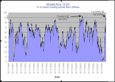
Some extreme readings are appearing in a few Worden Bros. indicators that look at stocks relative to their 200 day moving averages. One is T2107, which simply looks at the percentage of stocks trading above their 200ma. The other is T2109, which looks at the percentage of stocks trading at least 1 standard deviation above their 200ma. Both indicators are near all time highs (dating back to 1986). In fact, the only period of time in which these indicators registered higher readings was in the beginning of 2004. Below is a chart of T2107 which illustrates this:

This demonstrates just how extreme the current move is in terms of breadth. Also interesting about the chart is that we aren’t that far removed time-wise from extremely low readings. Extreme overbought doesn’t necessarily mean a decline is about to begin. In fact the last time these levels were reached in 2004, the market continued to trudge higher for about 2 ½ months before finally beginning a meaningful correction.

Relative Equity Put/Call Reading on Friday is Lowest Ever

I’ve discussed the equity put/call ratio a few times recently. In the June 12th blog I showed how extremely low readings have often been followed by selloffs. I also did a follow up to that study in the August 14th blog. The criteria I used was a put/call ratio of more than 25% below its 200-day moving average.

The CBOE has only reported the equity put/call ratios since 10/2003. On Friday the CBOE reported the lowest relative equity put/call ever. It came in at 0.39, which is nearly 45% below its 200-day moving average. This is only the 2nd time it has closed as much as 40% below the 200. The other time was 11/15/04. The SPX dropped 0.7% the next day but that was basically the end of the selloff. A few more days of chop was followed by a further market rally.

Below I’ve listed all instances where the equity put/call came in 33% or more below its 200ma.


It will be interesting to see if the inclination to sell off following extremely low equity put/call ratios can overcome the market’s recent positive momentum.

Distribution Days Quantified

I’m out of action most of this week and unable to post much. Therefore I decided to take an excerpt from this past weekend’s Subscriber Letter and post it to the blog:

One sign of a potential top that some traders monitor is distribution days. It was popularized by Investors Business Daily. The essential idea is that when the market falls on increasing volume that suggests institutions are selling stock. When clusters of distribution days occur, it is a topping signal. Below are some quotes from an IBD column published on August 4th that discusses distribution.

“What you’re looking for is distribution. If one or more of the major indexes (the NYSE composite, the Nasdaq, the S&P 500 or Dow industrials) falls more than 0.2% in higher volume than in the prior session, that’s a distribution day.

Distribution means the big money — mutual funds, investment banks and other institutional investors — is dumping shares. That’s bad news for the little guy, because institutions make up roughly three-fourths of the market and chart its direction.

IBD studies show that when you get a series of three to five distribution days over a few weeks during an uptrend, that’s a red flag.”

“Identifying distribution days is crucial: If you don’t, you might have the wrong take on the market’s direction. Then you’ll be wrong about every move you make. That’s a nice recipe for financial agony…Once distribution days pile up, it’s wise to scale back your portfolio. Ease off margin, and get rid of any laggard stocks first. Raise cash and move entirely off stocks if necessary.”

So the bottom line is that if the market rallying, and you see a cluster of distribution days occur within a fairly short time period, you should begin selling stocks. The market is likely heading for a tumble. Let’s take a quantified look at it.

First, before I show test results I will say that clusters of distribution days do often occur near market tops – so they got that part right. But are they predictive of a top and should they be used for purposes of early identification?

I actually devised this test 4 years ago when I wrote an article for TradingMarkets about distribution days. To test the concept I looked for the following criteria:
1) The S&P closes above the 200-day moving average (remember – we’re looking for a top.)
2) Sometime within the last 12 days the S&P closed within 1% of its 200-day high. (Again, confirming we are near a top.)
3) Over the last 12 days there have been at least 4 distribution days.

Looking for 4 distribution days within 12 trading days was the criteria I used in the original test based on information at that time. It still seems like a good number according to the above article that suggests “a series of three to five distribution days over a few weeks during an uptrend, that’s a red flag.”

So if you wanted to use this red flag as a short signal, how would you do looking out over the next 1, 2, and 3 month periods?

(click to enlarge)

Needless to say these results are horrible. It appears that following a bout of distribution is NOT a good time to be selling. What if we flip the study on its head and instead BUY after such instances when distribution day counters are unloading positions?

(click to enlarge)
Not the most explosive results I’ve ever posted in term of average trade, but a decent edge nonetheless. Wins are bigger than losses and the winning percentage is pretty good. This makes for decent looking profit factors (gross gains / gross losses = profit factor).

Is this a new phenomenon? Did distribution day counting formerly work and in recent years it has failed? That might explain why IBD has discussed it for so long. Sadly, no. Below is the equity curve for the 1st test above using a 20-day holding period.

While the results have been helped out by some horrible bear markets in the last decade, it’s never been a winning concept.

So why preach it? Well, it’s rare that you’ll get a top without a bout of distribution days. Therefore, when a top actually does occur, the service or person who talks about their importance can point to the top and say “See, the distribution days signaled it. You would’ve been fine if you’d just used this tool.”

This is somewhat similar to the perception that has been created with regards to follow through days for calling market bottoms. They occur there, but they are not predictive and are pretty much a worthless tool. For detail on follow through days, you may refer to the series I wrote last year. The primary difference here is that while follow through days are generally worthless, counting distribution days to try and identify tops is worse than that – it’s hazardous.

The bottom line reality of distribution days is that when the market endures a pullback after an extended uptrend, it’s often a buying opportunity and NOT a time to sell.

Of course there are still reasons to be cautious here, but of the things I am seeing that are of concern, distribution days are at the bottom of the list.

Since I’m out of action most of this week and I’m sure this post will be viewed as controversial in the eyes of some, I’ve decided to give away the code. Rather than debate or re-run the tests different ways (I’ve already done that myself), Tradestation users may feel free to download the code themselves from the free download page on the website. Login is required. Sign-up is free and only requires a name and email address.

Big Gaps From Congestion

In the past I’ve looked at gaps that occured after the marekt was already extended. This morning the market is set to open down big. It closed Friday in the middle of its recent range and was not extended. Below is one way to look at it.

(click to enlarge)

There appears to be a mild upside edge, though it’s nowhere near as strong as it would be if the market were already extended downwards.