The Fed’s System Open Market Account (SOMA is the account at the Fed that contains all of its bond purchase holdings. Fed SOMA data going back to 2003 can be downloaded from the New York Fed’s website. Over this time, there has been a strong relationship between the changes in the SOMA and movement in the stock market. I detail this relationship in the recently released Fed-Based Quantifiable Edges for Stock Market Trading research paper. (Available for free.)
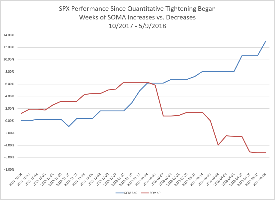
I have also tracked SOMA information and influence closely in the subscriber letters since 2010. This weekend in the subscriber letter I looked at SPX since Quantitative Tightening (QT) began in October of 2017. The chart below shows SPX performance during any rising SOMA week vs any declining SOMA week.

The blue line assumes you are invested in the SPX during weeks in which the SOMA rose and in cash (not earning interest) during all other weeks. The red line is in cash (no interest) during rising SOMA weeks and then invested in the SPX during down SOMA weeks.
Positive SOMA weeks have shown very positive SPX results, while down SOMA weeks have seen the SPX struggle. Of course, this is not unexpected for any Quantifiable Edges subscribers, since we have tracked this behavior since 2010 in our subscriber letters. Longer-term charts, more detail, resources, and system filtering ideas related to the SOMA can be found in the recently released Fed-Based Quantifiable Edges for Stock Market Trading research paper. Feel free to check it out. Or take a free trial of Quantifiable Edges to see what we are anticipating for the next few weeks.
Want research like this delivered directly to your inbox on a timely basis? Sign up for the Quantifiable Edges Email List.
