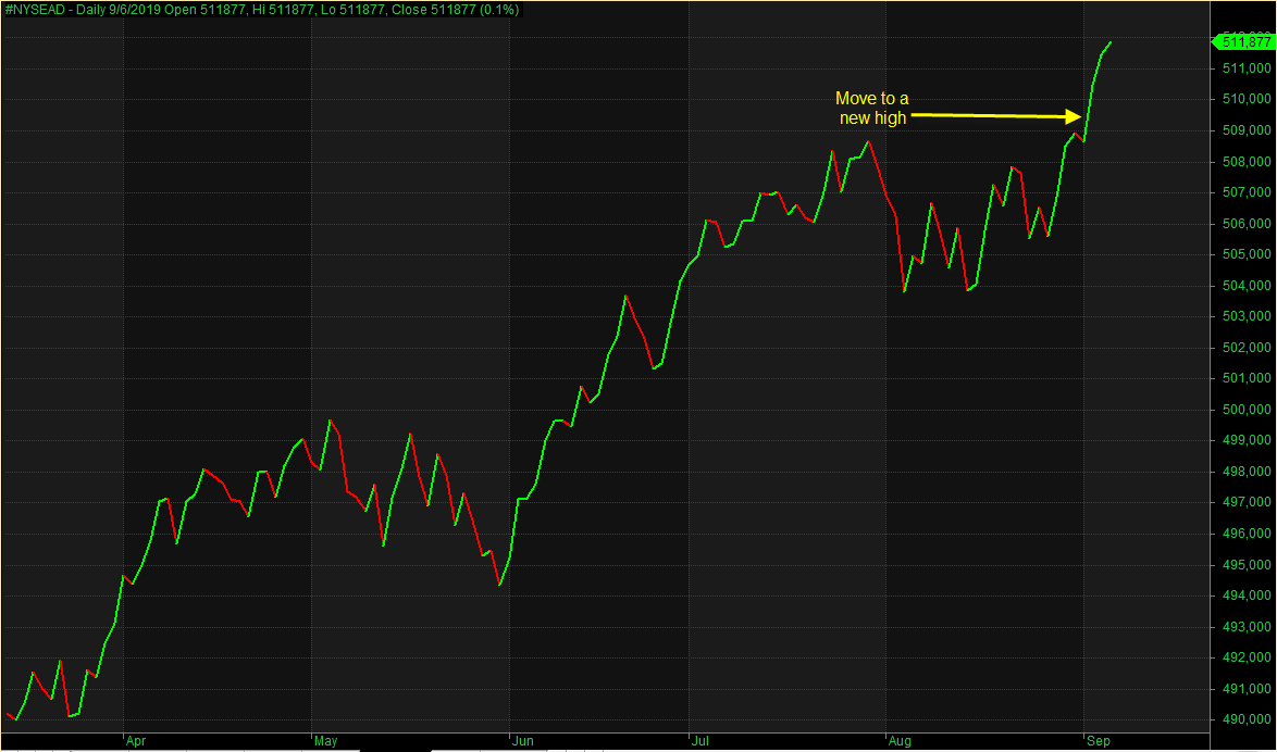
I have seen a good amount of chatter this week about the recent highs in the NYSE Advance/Decline line and other breadth measures showing bullish strength. The advance/decline line simply takes the net number of advancing NYSE stocks on a daily basis and then sums that number from one day to the next, making a line. If the line is moving up, that means there are more advancing stocks than declining stocks. A move lower mean there are more decliners. My A/D line Amibroker chart can be seen below.

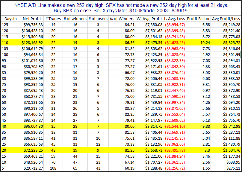
The move to a new high is clear. And having that happen ahead of an SPX new high is generally regarded as a positive. So I decided to run some studies and examine other times the NYSE A/D line broke out to a 1-year high while SPX had not hit a new high for at least a month. The table below shows results going back to 2003.

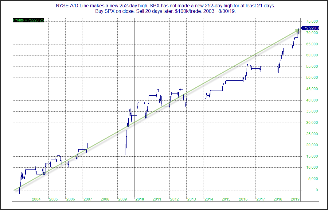
Numbers here are strong across the board. I looked at several profit curves in this weekend’s subscriber letter (click for free trial). I’ll focus on the 20-day results here on the blog. Below is a look at the profit curve for the 20-day test.

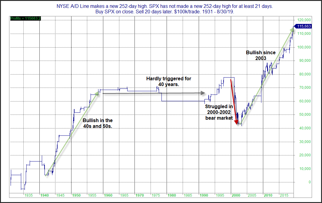
That is a steady and impressive upslope. The intermediate-term implications of the A/D line hitting leading new highs since the end of the 2000 – early 2003 bear appear to have been quite bullish. Interestingly, I found performance of this study prior to 2003 to be streaky and less reliable. This can be seen in the chart below, which goes back to 1931.

It certainly appears the leading A/D line has been a positive over the last 16 years. And I am viewing it as a positive right now. But the edge has not always been as reliable. So as with all studies, it is worth keeping an eye on to make sure the bullish message persists.
Want research like this delivered directly to your inbox on a timely basis? Sign up for the Quantifiable Edges Email List.
Learn how to identify edges and formulate swing trading strategies with the Quant Edges Swing Trading Course!
