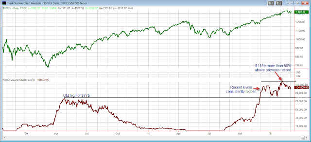
A few months ago I shared my POMO Stimulus Indicator. The POMO Stimulus Indicator simply measures the total volume that the Fed either pumps into or withdraws from the system through POMO activity over a running 20-day period. Indicator data is taken directly from the Fed’s POMO database. “Par accepted” is the measurement used. In the November 30th blog I showed a long-term chart with the indicator applied. At the time the indicator was readying to make new all-time highs. Below is an updated chart in which I have zoomed in just to examine the last year and a half.
(click chart to enlarge)
As you can see, POMO Stimulus levels have remained above the 2009 highs ever since moving above them in November. The indicator posted its highest reading in early February, and while the amount pumped this past 20 days is down from its peak, it is still over 35% higher than the 2009 highs. It has now remained somewhere between 30% and 50% above those 2009 highs for an extended period of time. “Don’t fight the Fed” is an old market adage. The market has been responding very well to the massive amounts of stimulus the Fed has been pumping into the monetary system. QE2 is supposed to last until around June. Traders would be well advised to keep track of POMO stimulus levels over the next several months and beyond. I believe there is ample evidence suggesting such activity is capable of providing a strong wind to the back (or the face) of the market. I personally update this chart on a weekly basis and post it in my subscriber letter.
If you’re interested in seeing the upcoming schedule for POMO activity, you can find that on the Fed’s website. It’s worth noting that the current schedule calls for POMO buying every day from now through March 9th, and the schedule is set to be updated on March 10th for the following month. In other words, no slowdown yet.

